1px calculation issue with browsers (sub-pixel problems)
That's because of Sub-Pixel Problems.
Each image takes 50% of the container. For example, if the container is 100px wide, each image will be 50px wide.
But the width of container could be an odd number of pixels, e.g. 101px. Then there are three reasonable possibilities:
- Make one image 50px wide and the other 51px. Then the images won't be equally wide, even if you specified the same width to both of them.
- Make both images 50px wide. Then there will be a 1px gap
- Make both images 51px wide. Then they won't fit, overflowing the container or wrapping to the next line.
Each choice has its downsides, but nowadays browsers seem to prefer the first option. However, in this case, the images have an intrinsic aspect ratio, so different widths will produce different heights, and then the 1px gap is created horizontally instead of vertically.
It seems Firefox detects than, and thus makes the smaller image as tall as the other one, breaking the aspect ratio. Chrome prefers to enforce the aspect ratio.
There is no way to change this. It's completely implementation dependent:
The especially strange part, in all of this, is that there’s really no
right, or wrong, here. How this behavior is supposed to play out by
the rendering engine isn’t dictated by the CSS specification, having
it be left up to the implementation to render as it sees fit.
Sub-Pixels calculated and rendered differently among browsers
As you already know, the problem arises from a different approach to subpixel calculus between browsers
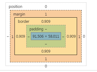
In Chrome, for instance, borders can have a fractional size, but margins are handled different (as integers).
I don't have documentation about it from the Chrome team, but it's what can be seen in dev tools:
AFAIK, there is not a way to change that.
Instead, you can transfer the use of the margin in the button to a border.
Since you need to get space for the 1px border of the input, do the same in the button, set a 1px border (instead of a margin), and set it transparent.
The remaining trick is to set the background-clip property to padding box, so that this transparency is not affected by the background
There is another bug in Chrome, the padding expressed in em is not reliable at this level of precision when the browser is zoomed. I changed this in the snippet.
Since we are using the border button to get the dimension ok, we can style the border using instead a inset shadow.
* {  margin: 0; padding: 0; box-sizing: border-box;}button, input, wrapper {  display: inline-block; border-radius: 3px;}
.wrapper {  position: relative;    width: 60%;  margin: 1em;  background-color: #ccc;}
input {  border: 1px solid red;  width: 100%;    background-color: limegreen;  line-height: 3em;/*  padding: 0.75em; */  padding: 10px;}
button {  position: absolute;  right: 0;  top: 0;  bottom: 0;  border: 1px solid transparent;  width: 7em;  margin: 0px;  background-clip: padding-box;  box-shadow:  inset 0px 0px 0px 2px  black;}
<div class="wrapper"> <input type="text"> <button>Test</button></div>A border of 1px in chrome and 0.8px in firefox?
I think this is related to the Windows Display Settings. It happens if you have the Windows Display set at 125% instead of 100%. I had the same problem, changed Windows display to 100% and it was fine. As you said, it seems to be a Firefox problem, Chrome is ok.
See also this Firefox Bug Report:https://bugzilla.mozilla.org/show_bug.cgi?id=1427391
On here, they recommend using box-sizing: border-box and including the border width in the width of your element.So if the element was 30px with 1px border either side then the width would be 32px now.
How to make sure the 1px border always show up regardless how much the user zoom in chrome (or any browser)?
The only solution I found (see here) that doesn't change the HTML is to use 'thin' instead of '1px' in the CSS. It seems to reliably make a 1px border.
Also, I was not able to replicate the issue with the codepen you shared so in case a future developer sees this and wants to replicate the problem this site consistently produces the bug (for me) when zoomed out.
safari rounding down on subpixel calculations
There isn't a whole lot you can do about how different browsers render subpixels, sadly. It'd be great if we could choose how the rounding should be handled through CSS, but nope.
Simply using pixels rather then percentages would solve the problem but that's obviously not what you want. I guess you could get around with static pixels if you change the values (possible to a percentage value) through media queries.
Whenever I find myself in a similar scenario I float the last child to the right. A few additional pixels between the last and second last elements don't usually hurt as much as a few additional pixels between the last element and its parent.
Why 1px padding around image renders different in major browsers?
instead of doing the same thing twice (border-radius, height and width on the span and on the image) why not do it one go?
remove all styling from the span and use:
img {
width: 17px;
height: 17px;
border-radius: 50%;
padding: 1px;
border: 1px solid #b76e4d;}
This will render (as far as I tested) correct in different browsers.
I would advice to give the img a class and do the styling on that class
else all images will be round.
Difference in computed height in Firefox and Chrome
Run the below snippet in Chrome & Firefox - you will get the height of a single line of text (minus the 2px contribution from the border) as:
Chrome :
59Firefox :
59.5
var height = document.querySelectorAll('body > div')[0].clientHeight;console.log(height);* { padding: 0; margin: 0;}div { font-family: "Roboto"; font-size: 35px; width: 500px; line-height: 1.7; border: 1px solid;}<link href="https://fonts.googleapis.com/css?family=Roboto" rel="stylesheet">
<div> Lines of text</div>Unexpected resulting box height
As I wrote in my comment earlier: The pixel values are being rounded, first to font-size 13px and then the result to 19px, due to the nature of pixels (which are a whole pixel or no pixel, except possibly on retina displays)
Related Topics
Show My Location on Google Maps API V3
Post Values from a Multiple Select
Remove HTML Scrollbars But Allow Mousewheel Scrolling
Making Buttons - <Button> or <Div>
How to Change an HTML Output of Wcf Service with My Own Content
Android: How to Add HTML Links Inside a Listview
How to Control The Height of an Option Element in Webkit
How to Render a String with Jsx in React
Export HTML Content to PDF Using Jasperreports
How to Center a Checkbox in a Table Cell
Browser Doesn't Scale Below 400Px
100% Width Table Overflowing Div Container
Making a Div Fit The Initial Screen
Telephone Numbers and Screen Readers
HTML 5 Input Type="Number" Element for Floating Point Numbers on Chrome