what units do you use for css for mobile web apps?
Check out this and that from Luke Wroblewski. Googling his name will find more.
Using cm/mm on the CSS of a web app that replicates paper interaction is a good practice?
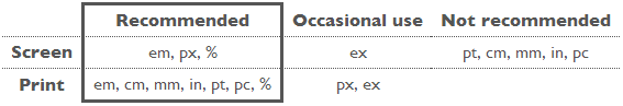
W3C has a great post on the subject of CSS units. In particular:
cm: Not recommended for screen / recommended for print
The so-called absolute units (cm, mm, in, pt and pc) mean the same in CSS as everywhere else. A length expressed in any of these will appear as exactly that size (within the precision of the hardware and software). They are not recommended for use on screen, because screen sizes vary so much. A big screen may be 60cm (24in), a small, portable screen is maybe only 8cm. And you don't look at them from the same distance.
The only place where you could use pt (or cm or in) for setting a font size is in style sheets for print, if you need to be sure the printed font is exactly a certain size. But even there using the default font size is usually better.
Which unit I should use in CSS when designing a web page
Different units depending on context. If there was one that was best for every situation, then there wouldn't be so many units.
As rules of thumb go:
If you are working on screen media:
- Use
%for font sizes - Use
pxfor images - Use
px,%, oremfor box sizes - Use ratios for line height
If you are working in print media:
- It might be wise to avoid
px(this is not a hard rule by any means) and everything else is fair game. It really depends how much control you want.
Best font size em or px to use for Website and Web apps?
This is an extremely subjective question. In addition, there are more options than just em and px: rem, em, px, vw/vh. Understanding how they all work is the key to picking which one is best for you and you app depending on the situation. Most of the time I use rem/em for responsive reasons, but there are times with vw/vh or px are a better option for me. It totally depends on what you're trying to accomplish.
What's dp (density independent pixels) units with CSS?
http://www.w3.org/TR/css3-values/#lengths
The closest unit available in CSS are the viewport-percentage units.
- vw - Equal to 1% of the width of the initial containing block.
- vh - Equal to 1% of the height of the initial containing block.
- vmin - Equal to the smaller of vw or vh.
- vmax - Equal to the larger of vw or vh.
The only mobile browser to be aware of that doesn't support these units is Opera. http://caniuse.com/#feat=viewport-units
Should I use px or rem value units in my CSS?
TL;DR: use px.
The Facts
First, it's extremely important to know that per spec, the CSS
pxunit does not equal one physical display pixel. This has always been true – even in the 1996 CSS 1 spec.CSS defines the reference pixel, which measures the size of a pixel on a 96 dpi display. On a display that has a dpi substantially different than 96dpi (like Retina displays), the user agent rescales the
pxunit so that its size matches that of a reference pixel. In other words, this rescaling is exactly why 1 CSS pixel equals 2 physical Retina display pixels.That said, up until 2010 (and the mobile zoom situation notwithstanding), the
pxalmost always did equal one physical pixel, because all widely available displays were around 96dpi.Sizes specified in
ems are relative to the parent element. This leads to theem's "compounding problem" where nested elements get progressively larger or smaller. For example:body { font-size:20px; }
div { font-size:0.5em; }Gives us:
  <body> - 20px
      <div> - 10px
          <div> - 5px
              <div> - 2.5px
                  <div> - 1.25px
The CSS3
rem, which is always relative only to the roothtmlelement, is now supported on 99.67% of all browsers in use.
The Opinion
I think everyone agrees that it's good to design your pages to be accommodating to everyone, and to make consideration for the visually impaired. One such consideration (but not the only one!) is allowing users to make the text of your site bigger, so that it's easier to read.
In the beginning, the only way to provide users a way to scale text size was by using relative size units (such as ems). This is because the browser's font size menu simply changed the root font size. Thus, if you specified font sizes in px, they wouldn't scale when changing the browser's font size option.
Modern browsers (and even the not-so-modern IE7) all changed the default scaling method to simply zooming in on everything, including images and box sizes. Essentially, they make the reference pixel larger or smaller.
Yes, someone could still change their browser default stylesheet to tweak the default font size (the equivalent of the old-style font size option), but that's a very esoteric way of going about it and I'd wager nobody1 does it. (In Chrome, it's buried under the advanced settings, Web content, Font Sizes. In IE9, it's even more hidden. You have to press Alt, and go to View, Text Size.) It's much easier to just select the Zoom option in the browser's main menu (or use Ctrl++/-/mouse wheel).
1 - within statistical error, naturally
If we assume most users scale pages using the zoom option, I find relative units mostly irrelevant. It's much easier to develop your page when everything is specified in the same unit (images are all dealt with in pixels), and you don't have to worry about compounding. ("I was told there would be no math" – there's dealing with having to calculate what 1.5em actually works out to.)
One other potential problem of using only relative units for font sizes is that user-resized fonts may break assumptions your layout makes. For example, this might lead to text getting clipped or running too long. If you use absolute units, you don't have to worry about unexpected font sizes from breaking your layout.
So my answer is use pixel units. I use px for everything. Of course, your situation may vary, and if you must support IE6 (may the gods of the RFCs have mercy on you), you'll have to use ems anyway.
Related Topics
CSS: Show Style on Hover Over Multiple Divs Placed One Over Another
Why Is Safari 4/Mac Not Rendering Top and Bottom Margins in This Nested Div
This Ie and Ie6 Hack with Only CSS
Scroll Bug in Ie7 and Ie9 When Using CSS3Pie Gradient
Flexboxes Overlapping Instead of Pushing Aside
CSS How to Properly Use Ems Instead of Pixels
Bootstrap Jumbotron Under Nav Bar
React Bootstrap - How to Center Image Vertically in a Row
How to Add Custom Breakpoints in Bootstrap4 and How to Use Responsive Breakpoint Mixins in SCSS
CSS Font Twitter Like Close Button, What Did I Missing
How to Set Height of Element to Match Height of Another Element
Rounded Corners on Divs with Background Color
CSS3 Transform: Translate3D Doesn't Affect The Z-Axis
How Do Make Ionic 4 Ion-Col The Same Height
Conditional CSS in CSS Not Working
Integrate Less Version of Bootstrap-Material-Design to Rails Project
How to Make The Scrollbar on a Div Only Visible When Necessary