Vertical line with dots in ends and between
Here's a quick snippet that might help you with your problem:
.bar { list-style: none;}.bar >li { position: relative;}.bar>li:before { content: '\25CF'; margin-right: 10px; font-size: 20px;}.bar>li:after { position: absolute; left: 0; top: 0; content: ''; border-left: 2px solid black; margin-left: 5px; height: 100%;}.bar >li:first-of-type:after { top: 50%;}.bar >li:last-of-type:after { top: -50%;}<ul class="bar"> <li>element 1</li> <li>element 2</li> <li>element 3</li> <li>element 4</li> <li>element 5</li></ul>How to make vertical lines with connecting dots?
Use display:inline-block instead of display:block
.progress .circle,
.progress .bar {
  display: block;
}
And interchanged width and height of progress bar
.progress .bar {
  position: relative;
  width: 6px; // already given 80px in question
  height: 80px; // already given 6px in question
}
*,
*:after,
*:before {
  margin: 0;
  padding: 0;
  box-sizing: border-box;
  font-family: "Open Sans";
}
/* Form Progress */

.progress {
  margin: 20px auto;
  text-align: center;
  padding-left: 80px;
}
.progress .circle,
.progress .bar {
  display: block;
  background: #fff;
  width: 40px;
  height: 40px;
  border-radius: 40px;
  border: 1px solid #d5d5da;
  vertical-align:top;
}
.progress .bar {
  position: relative;
  width: 6px;
  height: 80px;
  margin: 0 0px 0px 16px;
  border-radius: 0;
  top:0;
  vertical-align:top;
  left:0;
}
.progress .circle .label {
  display: inline-block;
  width: 32px;
  height: 32px;
  line-height: 32px;
  border-radius: 32px;
  margin-top: 3px;
  color: #b5b5ba;
  font-size: 17px;
}
.progress .circle .title {
  color: #b5b5ba;
  font-size: 13px;
  line-height: 18px;
  padding-left: 55px;
  display: block;
  width: calc(100vw - 130px);
  margin-top: -25px;
  text-align:left;
}
/* Done / Active */

.progress .bar.done,
.progress .circle.done {
  background: #eee;
}
.progress .bar.active {
  background: linear-gradient(to right, #EEE 40%, #FFF 60%);
}
.progress .circle.done .label {
  color: #FFF;
  background: #8bc435;
  box-shadow: inset 0 0 2px rgba(0, 0, 0, .2);
}
.progress .circle.done .title {
  color: #444;
}
.progress .circle.active .label {
  color: #FFF;
  background: #0c95be;
  box-shadow: inset 0 0 2px rgba(0, 0, 0, .2);
}
.progress .circle.active .title {
  color: #0c95be;
}
<div class="progress">
<div class="circle done"> <span class="label">1</span>
<span class="title">When the text characters are more the alignment changes and not overlaps with circle and bar </span>
</div> <span class="bar done"></span>
<div class="circle done"> <span class="label">2</span>
<span class="title">Address</span>
</div> <span class="bar active"></span>
<div class="circle active"> <span class="label">3</span>
<span class="title">Payment</span>
</div>
</div>How to create a vertical dotted line between icons (with example image)
You can achieve this using border-left.
Check this fiddle: fiddle
.icon {    text-align: center;    width: 50px;    background: lightgray;    border-radius: 50%;    border: 2px solid grey;}
.icon > i {  margin: 33% auto;}
.dotted:after {    content:"";    position: absolute;    z-index: -1;    top: 0;    bottom: 0;    left: 50%;    height: 100%;    height: inherit;    border-left: 2px dotted lightgrey;}
.dotted {    position: relative;    margin: 10px auto;    width: 50px;}
<link href="http://netdna.bootstrapcdn.com/font-awesome/4.4.0/css/font-awesome.min.css" rel="stylesheet"/><div class="dotted"> <div class="icon"> <i class="fa fa-camera-retro"></i> </div> <br> <br> <br> <br> <br> <div class="icon"> <i class="fa fa-camera-retro"></i> </div></div>Vertical dotted Line between two or multiple points in Flutter
I have made almost same looking widget by using https://pub.dev/packages/flutter_dash, you can also customise this widget according to your style.
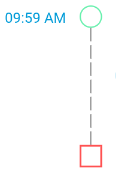
Here is the code,Hope it helps.
  Column(children: <Widget>[
                  Container(
                    margin: EdgeInsets.only(top: 16),
                    height: 25,
                    width: 25,
                    decoration: BoxDecoration(
                        shape: BoxShape.circle,
                        border:
                            Border.all(width: 1.5, color: Colors.greenAccent)),
                  ),
                  Dash(
                      direction: Axis.vertical,
                      length: 130,
                      dashLength: 15,
                      dashColor: grey),
                  Container(
                    height: 25,
                    width: 25,
                    decoration: BoxDecoration(
                        shape: BoxShape.rectangle,
                        border: Border.all(width: 2, color: red)),
                    child: Container(
                      height: 20,
                    ),
                  ),
                ],
              ),
CSS - Vertical line between bullets in an unordered list
I doubt that this is achievable using just borders and "fiddling with margins" as others have suggested, at least I've had no luck in doing so.
This solution uses CSS-generated content (:before and :after) to draw bullets and lines. It allows for
a high degree of customization and it keeps the markup clean, but note the browser support.
JSFiddle (scroll through CSS until the /* BORDERS AND BULLETS */ comment)
ul.experiences li {
    position:relative; /* so that pseudoelements are positioned relatively to their "li"s*/
    /* use padding-bottom instead of margin-bottom.*/
    margin-bottom: 0; /* This overrides previously specified margin-bottom */
    padding-bottom: 2.5em;
}

ul.experiences li:after {
    /* bullets */
    content: url('http://upload.wikimedia.org/wikipedia/commons/thumb/3/30/RedDisc.svg/20px-RedDisc.svg.png');
    position: absolute;
    left: -26px; /*adjust manually*/
    top: 0px;
}

ul.experiences li:before {
    /* lines */
    content:"";
    position: absolute;
    left: -16px; /* adjust manually */
    border-left: 1px solid black;
    height: 100%;
    width: 1px;
}

ul.experiences li:first-child:before {
   /* first li's line */
   top: 6px; /* moves the line down so that it disappears under the bullet. Adjust manually */
}

ul.experiences li:last-child:before {
    /* last li's line */
   height: 6px; /* shorten the line so it goes only up to the bullet. Is equal to first-child:before's top */
}
NOTE: if the line's border-color has an alpha-channel specified, the overlap between first and second elements' borders will be noticeable.
Can we do a vertical line with curve in CSS?
Is this what you are looking for?border: px dashed color mixed with border-radius
div {
    margin: 5px;
    display: inline-block;
    width: 300px;
    height: 300px;
    border: 1px dashed #000;
    border-radius: 50px;
}<div></div>Displaying a vertical dashed line centrally in a div
The way I would do it is the following:
.wrapping-container {
    position: relative;
    display: flex;
}
.progress-indicator {
    position: relative;
    display: inline-block;
    margin-bottom: 40px;
    color: #fff;
}
.progress-indicator::after {
    content: "";
    width: 30px;
    height: 30px;
    background: #000;
    position: absolute;
    top: 50%;
    left: 50%;
    transform: translate(-50%, -50%);
    border-radius: 50%;
    z-index: -1;
}
.progress-indicator::before {
    content: "";
    height: 40px;
    border: 1px dashed #000;
    position: absolute;
    left: 50%;
    top: -50px;
    transform: translateX(-50%);
    z-index: -1;
}
.input {
    margin-left: 30px;
}
<div class="wrapping-container">
<div class="progress-indicator">2</div>
<div class="input">Input</div>
</div>
<div class="wrapping-container">
<div class="progress-indicator">3</div>
<div class="input">Input</div>
</div>How to create a vertical line with multiple dots using css?
I'm hoping the code below will help you figure things out. If you require more, you can use the vertical wizard to conduct a Google search and obtain additional code like this:
ul {
  list-style: none;
  margin: 0;
  padding: 0;
  position: relative;
}

ul:before {
  content: "";
  display: inline-block;
  width: 2px;
  background: red;
  position: absolute;
  left: 3px;
  top: 5px;
  height: calc(100% - 10px);
}

ul li {
  position: relative;
  padding-left: 15px;
  margin-bottom: 15px;
}

ul li:before {
  content: "";
  display: inline-block;
  width: 8px;
  height: 8px;
  background: red;
  position: absolute;
  left: 0;
  top: 5px;
  border-radius: 10px;
}
<ul>
<li>item 1</li>
<li>item 2</li>
<li>item 3</li>
<li>item 4</li>
<li>item 5</li>
</ul>Related Topics
CSS Background Color Extend as Far as Text
CSS Zebra Stripe Background Without Image
How to Turn Off View Encapsulation for One Property in Angular 2
Negative Left and Right Margin of .Row Class in Bootstrap
Is It Somehow Possible to Style an Iframes Before/After Pseudo-Element
What Is The Use of @Namespace in CSS
How to Change Focus Glow of Textarea in Bootstrap 3
Svg, Text, Font with Fixed Width/Height
Gray Out a Section of an Image with CSS
CSS: :Before: :After Pseudo-Element of Class Not Working
Adding Class to React Component After a Certain Amount of Time
Ie8/9 - Maximum Bytes for CSS File
Is There a Way (Or a Plugin) to Make Vim Generate a Code Outline for CSS
Padding Between Checkbox and Label