Twitter Bootstrap radio/checkbox - how to put glyphicon
On the official website, the javascript section has examples of styling groups of checkboxes and radio buttons as buttons groups. It's under the buttons section here.
Instead of having text inside the button that reads "Option 1", you would place your glyphicon instead. If you wanted only one checkbox, I suppose you could eliminate the button group and just go with a single button.
To remove the button appearance and only show your icon, use the "btn-link" class.
I haven't tried this myself, but I see no reason for it to not work.
How to switch a radio button out with a glyphicon
Use radio toggle buttons: http://getbootstrap.com/javascript/#buttons-checkbox-radio
JS Fiddle: https://jsfiddle.net/DTcHh/6561/
   <div class="btn-group" data-toggle="buttons">
  <label class="btn btn-primary active">
    <input type="radio" name="options" id="option1" autocomplete="off" checked> <span class="glyphicon glyphicon-unchecked unchecked"></span> <span class="glyphicon glyphicon-check checked"></span>
  </label>
  <label class="btn btn-primary">
    <input type="radio" name="options" id="option2" autocomplete="off"> <span class="glyphicon glyphicon-unchecked unchecked"></span> <span class="glyphicon glyphicon-check checked"></span>
  </label>
  <label class="btn btn-primary">
    <input type="radio" name="options" id="option3" autocomplete="off"> <span class="glyphicon glyphicon-unchecked unchecked"></span> <span class="glyphicon glyphicon-check checked"></span>
  </label>
</div>
CSS:
.checked{
    display:none;
}
.active .checked {
    display:inline-block;
}
.active .unchecked {
    display:none;
}
Is it posible to make an input checkbox a Bootstrap glyphicon?
You can achieve that in a couple of methods:
Method 1
- inside a
<label>tag, two<tags>that represent the icons that you want need to be placed(or outside, per use scenario) - then toggle these two
<tags>, when theinput[type='checkbox']is checked or unchecked - done.
Method 2
- a cleaner approach to the above one, would be to use the css from bootstraps icons, and place them in a
:before(or:afterdepending on your scenarion) on the<label>tag - then toggle the
contentprop. of the:beforeclass, that the icons that you want have, when theinput[type='checkbox']is checked or unchecked - done.
Check out the demo here and also, a couple of more through documentation on this matter:
- Add boostrap icon to input boxes
- Boostrap checkbox documentation
Add Twitter Bootstrap icon to Input box
Updated Bootstrap 3.x
You can use the .input-group class like this:
<div class="input-group">
    <input type="text" class="form-control"/>
    <span class="input-group-addon">
        <i class="fa fa-search"></i>
    </span>
</div>
Working Demo in jsFiddle for 3.x
Bootstrap 2.x
You can use the .input-append class like this:
<div class="input-append">
    <input class="span2" type="text">
    <button type="submit" class="btn">
        <i class="icon-search"></i>
    </button>
</div>
Working Demo in jsFiddle for 2.x
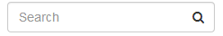
Both will look like this:

If you'd like the icon inside the input box, like this:
Then see my answer to Add a Bootstrap Glyphicon to Input Box
Customize Bootstrap checkboxes
Since Bootstrap 3 doesn't have a style for checkboxes I found a custom made that goes really well with Bootstrap style.
Checkboxes
.checkbox label:after {  content: '';  display: table;  clear: both;}
.checkbox .cr {  position: relative;  display: inline-block;  border: 1px solid #a9a9a9;  border-radius: .25em;  width: 1.3em;  height: 1.3em;  float: left;  margin-right: .5em;}
.checkbox .cr .cr-icon {  position: absolute;  font-size: .8em;  line-height: 0;  top: 50%;  left: 15%;}
.checkbox label input[type="checkbox"] {  display: none;}
.checkbox label input[type="checkbox"]+.cr>.cr-icon {  opacity: 0;}
.checkbox label input[type="checkbox"]:checked+.cr>.cr-icon {  opacity: 1;}
.checkbox label input[type="checkbox"]:disabled+.cr {  opacity: .5;}
<link rel="stylesheet" href="https://maxcdn.bootstrapcdn.com/bootstrap/3.3.7/css/bootstrap.min.css" integrity="sha384-BVYiiSIFeK1dGmJRAkycuHAHRg32OmUcww7on3RYdg4Va+PmSTsz/K68vbdEjh4u" crossorigin="anonymous">
<!-- Default checkbox --><div class="checkbox"> <label> <input type="checkbox" value=""> <span class="cr"><i class="cr-icon glyphicon glyphicon-ok"></i></span> Option one </label></div>
<!-- Checked checkbox --><div class="checkbox"> <label> <input type="checkbox" value="" checked> <span class="cr"><i class="cr-icon glyphicon glyphicon-ok"></i></span> Option two is checked by default </label></div>
<!-- Disabled checkbox --><div class="checkbox disabled"> <label> <input type="checkbox" value="" disabled> <span class="cr"><i class="cr-icon glyphicon glyphicon-ok"></i></span> Option three is disabled </label></div>styled bootstrap radio buttons not clickable in browser
you didnt have the bootstrap js file
<script src="https://ajax.googleapis.com/ajax/libs/jquery/2.1.1/jquery.min.js"></script>
.btn span.glyphicon { opacity: 0; }.btn.active span.glyphicon { opacity: 1; }<script src="https://ajax.googleapis.com/ajax/libs/jquery/2.1.1/jquery.min.js"></script><script src="http://maxcdn.bootstrapcdn.com/bootstrap/3.3.1/js/bootstrap.min.js"></script>
<link href="https://maxcdn.bootstrapcdn.com/bootstrap/3.3.5/css/bootstrap.min.css" rel="stylesheet"/><div class="container"> <h1 class="text-center">Checkbox/Radio - CSS Only</h1></div>
<div class="container">
<div class="well well-sm text-center">
<h3>Checkbox</h3> <div class="btn-group" data-toggle="buttons"> <label class="btn btn-success active"> <input type="checkbox" autocomplete="off" checked /> <span class="glyphicon glyphicon-ok"></span> </label>
<label class="btn btn-primary"> <input type="checkbox" autocomplete="off"> <span class="glyphicon glyphicon-ok"></span> </label> <label class="btn btn-info"> <input type="checkbox" autocomplete="off"> <span class="glyphicon glyphicon-ok"></span> </label> <label class="btn btn-default"> <input type="checkbox" autocomplete="off"> <span class="glyphicon glyphicon-ok"></span> </label>
<label class="btn btn-warning"> <input type="checkbox" autocomplete="off"> <span class="glyphicon glyphicon-ok"></span> </label> <label class="btn btn-danger"> <input type="checkbox" autocomplete="off"> <span class="glyphicon glyphicon-ok"></span> </label> </div>
</div>
</div>
<div class="container">
<div class="well well-sm text-center">
<h3>Radio</h3> <div class="btn-group" data-toggle="buttons"> <label class="btn btn-success active"> <input type="radio" name="options" id="option2" autocomplete="off" chacked/> <span class="glyphicon glyphicon-ok"></span> </label>
<label class="btn btn-primary"> <input type="radio" name="options" id="option1" autocomplete="off"/> <span class="glyphicon glyphicon-ok"></span> </label>
<label class="btn btn-info"> <input type="radio" name="options" id="option2" autocomplete="off"/> <span class="glyphicon glyphicon-ok"></span> </label>
<label class="btn btn-default"> <input type="radio" name="options" id="option2" autocomplete="off"/> <span class="glyphicon glyphicon-ok"></span> </label>
<label class="btn btn-warning"> <input type="radio" name="options" id="option2" autocomplete="off"/> <span class="glyphicon glyphicon-ok"></span> </label>
<label class="btn btn-danger"> <input type="radio" name="options" id="option2" autocomplete="off"/> <span class="glyphicon glyphicon-ok"></span> </label> </div>
</div>
</div>Twitter bootstrap radio buttons not working
The problem is <button> doesn't submit anything when clicked. You will need to have a hidden input field, and trigger a value change within the input when clicking the button
<input type="hidden" name="option" value="" id="btn-input" />
<div class="btn-group" data-toggle="buttons-radio">
  <button id="btn-one" type="button" data-toggle="button" name="option" value="1" class="btn btn-primary">Option One</button>
  <button id="btn-two" type="button" data-toggle="button" name="option" value="2" class="btn btn-primary">Option Two</button>
</div>

<script>
  var btns = ['btn-one', 'btn-two'];
  var input = document.getElementById('btn-input');
  for(var i = 0; i < btns.length; i++) {
    document.getElementById(btns[i]).addEventListener('click', function() {
      input.value = this.value;
    });
  }
</script>
In the case of the bootstrap the 'radio' only affects the button state & behavior. It doesn't effect the form behaviour.
Related Topics
Styling Links Inside a Div with a Specific Class
How to Apply Drop-Shadow Filter via CSS to Svg Specific Element/Path
How to Center and Middle a Figure in HTML Xaringan R
Putting an Image as a Frame Around an Iframe
100% Height Div and Overflow:Auto
Center Text Larger Than Container? (Without Using Separate Child Element)
Absolute Positioned Item in a Flex Container Still Gets Considered as Item in Ie & Firefox
Webkit-Font-Smoothing: Suddenly Different Results in Chrome and Safari
How to Customize Responsive Columns and Inputs Fields in Twitter Bootstrap
Div Elements to Follow a Curved Path with CSS3
Position Relative, Float Takes Div Out of The Normal Flow
Definition List with Inline Pairs
Remove Dotted Border/Outline of Focused Dropdown Menu
Wkhtmltopdf CSS Sizes in Cm/Mm
"Dynamic" CSS Id Names? How to Add Them to The CSS File
Using CSS Mix-Blend-Mode with a Child of a Position Fixed Element