Center Text Larger than Container? (Without using separate child element)
This fiddle shows three div elements illustrating the "problem" and both the following "solutions".
One Possible "Solution"
I'm not sure of your needs, but so far the only real solution I have found is to set display: table to your text container. But that will allow the container to stretch to the needed width to contain the longest word, which may not be desirable to you. If that is okay, that is the best solution.
Another Possible "Faked" Solution
If you must keep the apparent size of the element at least, then you can fake the look by some creative pseudo-element use:
.fakeIt {
    text-align: center; /* what you wanted all along */
    display: table; /* key to get centered */
    position: relative; /* allow reference for absolute element */
    z-index: 2; /* set up for a background to be pushed below */
    width: 40px; /* what you want, but table resizes larger if needed*/
    border: none; /* transferring border to the "fake" */
    background-color: transparent; /* transferring background to the "fake" */
}

.fakeIt:after {
    content: ''; /* before or after need it, even if empty */
    width: 40px; /* the original width you wanted for the container */
    position: absolute; /* need this to position it */
    z-index: -1; /* push it behind the foreground */
    left: 50%; /* push it to center */
    top:0; /* give it height */
    bottom: 0;  /* give it height */
    margin-left: -20px; /* half the width to finish centering */
    border: 1px solid red; /* the border you wanted on the container */
    background-color: yellow; /* the background you wanted on the container */
}
However, depending upon your particular application, the "faked" solution may not work. Also, the original element will still take up the wider "space" in the document, it just won't look like it is. That could cause issues. Negative margin on the container could solve that, but you don't know what the value needs to be set at, as it would differ with text width.
You mention in a comment you are not familiar with pseudo-elements in css, so you may want to have a quick intro.
Center text even when larger than container
You can give a try to the flex properties :
Sample of modification of your codepen forked
  .option {
    color: $silver;
    display: flex;
    flex-flow: column;
    align-items:center;
    box-shadow:0 0 0 1px;/* see me , remove me */
Centering div that is wider than its parent without setting negative left margin
How about using position: absolute; with left:0;right:0; and margin: auto;
Also, you'll need to place position: relative; on a parent element which has greater width than the outer element. (In the fiddle below it's relative to the body by default)
FIDDLE
<div class="outer">
    <div class="inner"></div>
</div>
css
.outer
{
    width: 400px;
    height: 400px;
    background: beige;
    margin: 0 auto;

}
.inner
{
    width: 600px;
    height: 200px;
    background: pink;
    position: absolute;
    left:0;right:0;
    margin: auto;
}
How to center an element that is wider than its parent element?
.container {
    width:900px
}

iframe {
    margin-left:-25px;
    width:950px;
}
Why text-align affect child div, but not font-size?
See the working snippet below:
.coverTitle.one {  text-align:center;}
.coverTitle.two {  font-size: 10px;}
<div class="coverTitle one"> <h1> text-align: center </h1></div>
<div class="coverTitle two"> <h1> font-size: 10px </h1></div>Center parent div vertically based on child element
Don't use a negative margin unless absolutely necessary. In this case, it is not. Use flex on parent with align-items: center;
.content {
  width: 80%;
  margin: 0px auto;
}

#container .col {
  border: 1px solid #00acd4;
  background-color: white;
  padding-top: 2em;
  padding-bottom: 2em;
  position: relative;
}

#parent {
  background-color: #f0f9fb;
  max-height: 80px;
  display: flex;
  align-items: center;
}

#container {
  margin-top: 50px;
  margin-bottom: 50px;
}
<link rel="stylesheet" href="https://cdn.jsdelivr.net/npm/bootstrap@4.5.3/dist/css/bootstrap.min.css" integrity="sha384-TX8t27EcRE3e/ihU7zmQxVncDAy5uIKz4rEkgIXeMed4M0jlfIDPvg6uqKI2xXr2" crossorigin="anonymous">
<div id="container">
<div id="parent">
<div class="content">
<div class="row">
<div class="col ">
<h3>$500</h3>
</div>
<div class="offset-1 col">
<h3>$3500</h3>
</div>
<div class="col offset-1">
<h3>50%</h3>
</div>
</div>
</div>
</div>
</div>How can I center text (horizontally and vertically) inside a div block?
If it is one line of text and/or image, then it is easy to do. Just use:
text-align: center;
vertical-align: middle;
line-height: 90px;       /* The same as your div height */
That's it. If it can be multiple lines, then it is somewhat more complicated. But there are solutions on http://pmob.co.uk/. Look for "vertical align".
Since they tend to be hacks or adding complicated divs... I usually use a table with a single cell to do it... to make it as simple as possible.
Update for 2020:
Unless you need make it work on earlier browsers such as Internet Explorer 10, you can use flexbox. It is widely supported by all current major browsers. Basically, the container needs to be specified as a flex container, together with centering along its main and cross axis:
#container {
  display: flex;
  justify-content: center;
  align-items: center;
}
To specify a fixed width for the child, which is called a "flex item":
#content {
  flex: 0 0 120px;
}
Example: http://jsfiddle.net/2woqsef1/1/
To shrink-wrap the content, it is even simpler: just remove the flex: ... line from the flex item, and it is automatically shrink-wrapped.
Example: http://jsfiddle.net/2woqsef1/2/
The examples above have been tested on major browsers including MS Edge and Internet Explorer 11.
One technical note if you need to customize it: inside of the flex item, since this flex item is not a flex container itself, the old non-flexbox way of CSS works as expected. However, if you add an additional flex item to the current flex container, the two flex items will be horizontally placed. To make them vertically placed, add the flex-direction: column; to the flex container. This is how it works between a flex container and its immediate child elements.
There is an alternative method of doing the centering: by not specifying center for the distribution on the main and cross axis for the flex container, but instead specify margin: auto on the flex item to take up all extra space in all four directions, and the evenly distributed margins will make the flex item centered in all directions. This works except when there are multiple flex items. Also, this technique works on MS Edge but not on Internet Explorer 11.
Update for 2016 / 2017:
It can be more commonly done with transform, and it works well even in older browsers such as Internet Explorer 10 and Internet Explorer 11. It can support multiple lines of text:
position: relative;
top: 50%;
transform: translateY(-50%);
Example: https://jsfiddle.net/wb8u02kL/1/
To shrink-wrap the width:
The solution above used a fixed width for the content area. To use a shrink-wrapped width, use
position: relative;
float: left;
top: 50%;
left: 50%;
transform: translate(-50%, -50%);
Example: https://jsfiddle.net/wb8u02kL/2/
If the support for Internet Explorer 10 is needed, then flexbox won't work and the method above and the line-height method would work. Otherwise, flexbox would do the job.
How can I mix vertically-centered elements with different font sizes and retain consistent line height?
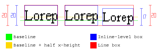
§10.8 explains how the height of the line boxes is calculated:
As described in the section on inline formatting contexts, user
agents flow inline-level boxes into a vertical stack of line
boxes. The height of a line box is determined as follows:
The height of each inline-level box in the line box is calculated.
[...] For inline boxes, this is their 'line-height'Since
.smallerinheritsline-height: 20pxand is an inline box (i.e. non-replaced withdisplay: inline), its height is20pxThe inline-level boxes are aligned vertically according to their
'vertical-align' property..smallerhasvertical-align: middle, which meansAlign the vertical midpoint of the box with the baseline of the parent
box plus half the x-height of the parent.The line box height is the distance between the uppermost box top and
the lowermost box bottom.
So both the text and .smaller have a height of 20px, but they have different alignment. Therefore, the line box grows:

Then, as other answers explain, a way to solve the problem is reducing .smaller's line-height:
However, there is an alternative solution, without modifying line-height: negative margins can be added to prevent .smaller from increasing the height of the line box.
As quoted above, the height of an inline box is its line-height, so to make the margins work, display: inline-block is also needed:
The height of each inline-level box in the line box is calculated. For
[...] inline-block elements [...] this is the height of their margin
box.
Note this solution won't break the alignment, because since .smaller has vartical-align: middle, if we use the same amount in margin-top and margin-bottom, it will remain centered.

To summarize, you can use this code:
.smaller {
    vertical-align: middle;
    display: inline-block;
    margin: -1em 0;
}
body { line-height: 20px; font-size: 14px;}.smaller { font-size: 0.9em; vertical-align: middle; display: inline-block; margin: -1em 0;}<div class="body"> <div class="why-not-twenty-px"> nor<span class="smaller">•</span>mal </div> <div class="why-not-sixty-px"> multiline multiline multiline multiline multiline multiline <span class="smaller">•</span> multiline multiline multiline multiline multiline multiline multiline multiline multiline multiline multiline multiline multiline multiline multiline multiline multiline multiline multiline multiline multiline multiline multiline multiline multiline multiline </div></div>How can I center a div within another div?
You need to set the width of the container (auto won't work):
#container {
    width: 640px; /* Can be in percentage also. */
    height: auto;
    margin: 0 auto;
    padding: 10px;
    position: relative;
}
The CSS reference by MDN explains it all.
Check out these links:
- auto - CSS reference | MDN
- margin - CSS reference | MDN
- What is the meaning of
autovalue in a CSS property - Stack Overflow
In action at jsFiddle.
Related Topics
Why Does Firefox Treat Helvetica Differently from Chrome
How to Get Bootstrap Tour to Work with a Jquery Dialog
CSS Rules for Webkit Based Browsers
Highlighting All Rowspans Within a Table Row Using CSS Only
Combining Ie6 and Ie7 CSS Hacks in Same Stylesheet
Roboto from Materializecss Weird Font Rendering in Chrome, Firefox, Ok with Ie
CSS, Centering Links Inside Div
Changing Jupyter's Matching Parenthesis Color
Working with CSS Floats in HTML2Pdf
CSS - Horizontal Navigation List Items to Fill All Available Space
Text in Outlook Doesn't Use Line-Height
Ionic - Center Text Vertically in Item-List with Item-Avatar Class
Reactjs Change Background Image Dynamically