Position fixed not working is working like absolute
The issue here lies with your .content-container wrapper class, which has a CSS declaration of webkit-transform: translate3d(0,0,0). The transform declaration, as this answer illustrates, changes the positioning context from the viewport to the rotated element, which essentially means that your fixed element behaves as if it were absolutely positioned. Here's an example showing the difference between a fixed element inside a transformed div and a fixed element outside of that div.
.rotate {

  transform: rotate(30deg);

  background: blue;

  width: 300px;

  height: 300px;

  margin: 0 auto;

}

.fixed {

  position: fixed;

  background: red;

  padding: 10px;

  color: white;

  top: 50px;

}
<div class="rotate">
<div class="fixed"> I am fixed inside a rotated div.</div>
</div>
<div class="fixed"> I am fixed outside a rotated div.</div>CSS - position: fixed acting like absolute in Firefox
Through the process of elimination I was able to determine that having the following in my body was causing all the problems with fixed divs in Firefox:
-o-backface-visibility: hidden;
-moz-backface-visibility: hidden;
-webkit-backface-visibility: hidden;
backface-visibility: hidden;
I had originally added this code to prevent flickering in certain CSS transitions throughout the site, but I guess I'll have to add it to each individual class now.
position fixed is not working
you need to give width explicitly to header and footer
width: 100%;
Working fiddle
If you want the middle section not to be hidden then give position: absolute;width: 100%; and set top and bottom properties (related to header and footer heights) to it and give parent element position: relative. (ofcourse, remove height: 700px;.) and to make it scrollable, give overflow: auto.
position fixed div in absolute positioned div works - but why?
An element with position: fixed is indeed positioned relative to the viewport (or browser). However, because it is an absolutely positioned element, it is "positioned relative to the initial containing block established by the viewport".
This is laid out in the position documentation:
An absolutely positioned element is an element whose computed
positionvalue isabsoluteorfixed. Thetop,right,bottom, andleftproperties specify offsets from the edges of the element's containing block. (The containing block is the ancestor relative to which the element is positioned.) If the element has margins, they are added to the offset.
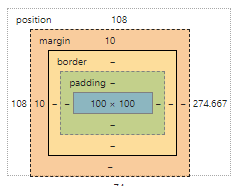
That is to say, when you specify margin-top and margin-left, these values are relative to the parent. And because the element is positioned relative to the parent, the default top and left are inherited from the parent. In your example, the .fixed element has a top value of 100px because it inherits the top value of 100px from .sidebar (the parent). When you set top: 0 on .fixed, you are overriding this value (going from top: 108px to top: 0):
Because of this, the element appears to be taken 'out of flow'. However, it is still always positioned relative to the viewport; it just had an initial offset (which it inherited from its parent).
Position absolute behaving like position fixed when adding dynamic HTML via javascript
Why not use relative positioning? Here is your example using some alternative style rules, specifically
.icon {
    float:right;
    position: relative;
    bottom: 15px;
}

.upper-controls {
    position: relative;
}
JSFiddle Link
Why position fixed doesn't work as expected?
Remove transform property from body and it will work
body {
    transform: scale(1.0);
}
and remove bottom from .social and add something like top:100px; instead of bottom:600px;
.social {
    top: 100px;
}
Fixed position but relative to container
Short answer: no. (It is now possible with CSS transform. See the edit below)
Long answer: The problem with using "fixed" positioning is that it takes the element out of flow. thus it can't be re-positioned relative to its parent because it's as if it didn't have one. If, however, the container is of a fixed, known width, you can use something like:
#fixedContainer {
  position: fixed;
  width: 600px;
  height: 200px;
  left: 50%;
  top: 0%;
  margin-left: -300px; /*half the width*/
}
http://jsfiddle.net/HFjU6/1/
Edit (03/2015):
This is outdated information. It is now possible to center content of an dynamic size (horizontally and vertically) with the help of the magic of CSS3 transform. The same principle applies, but instead of using margin to offset your container, you can use translateX(-50%). This doesn't work with the above margin trick because you don't know how much to offset it unless the width is fixed and you can't use relative values (like 50%) because it will be relative to the parent and not the element it's applied to. transform behaves differently. Its values are relative to the element they are applied to. Thus, 50% for transform means half the width of the element, while 50% for margin is half of the parent's width. This is an IE9+ solution
Using similar code to the above example, I recreated the same scenario using completely dynamic width and height:
.fixedContainer {
    background-color:#ddd;
    position: fixed;
    padding: 2em;
    left: 50%;
    top: 0%;
    transform: translateX(-50%);
}
If you want it to be centered, you can do that too:
.fixedContainer {
    background-color:#ddd;
    position: fixed;
    padding: 2em;
    left: 50%;
    top: 50%;
    transform: translate(-50%, -50%);
}
Demos:
jsFiddle: Centered horizontally only
jsFiddle: Centered both horizontally and vertically
Original credit goes to user aaronk6 for pointing it out to me in this answer
FlexBox - absolute position behaves like fixed
From MDN:
An absolutely positioned element is an element whose computed position
value is absolute or fixed. The top, right, bottom, and left
properties specify offsets from the edges of the element's containing
block. (The containing block is the ancestor relative to which the
element is positioned.) If the element has margins, they are added to
the offset.
You need to add position: relative to the ancestor that you want to position the element in relation to, in your case, that's .layout__content
body {

  display: flex;

  flex-direction: column;

}

.layout__body {

  display: flex;

  flex: 1;

}

.layout__content {

  flex: 1;

  overflow: auto;

  position: relative;

}

.layout__columns {

  flex: 0 0 12em;

}

.layout__nav {

  order: -1;

}

.layout__content {

  background: #3f3f00;

  position: relative;

}

.layout__columns {

  background: green;

}

header,

footer {

  background: #000;

  color: #fff;

  padding: 10px;

}

footer a {

  flex: 1;

}

h1 {

  margin: 0;

  font-size: 15px;

}

html,

body {

  height: 100%;

  margin: 0;

  font-family: Helvetica;

}

#absolutepositioned {

  position: absolute;

  left: 0;

  top: 0;

  width: 128px;

  height: 128px;

  background-color: #00ffff;

}
<header>
<h1>FLEXBOX LAYOUT PROOF OF CONCEPT</h1>
</header>
<div class="layout__body">
<main class="layout__content">
<div id="absolutepositioned">FIXED!</div>
<div style="color: #00FFFF;"><b>the blue box should be here</b> </div>
</main>
<nav class="layout__nav layout__columns">
NAV ITEMS<br> NAV ITEMS<br> NAV ITEMS<br> NAV ITEMS<br> NAV ITEMS<br> NAV ITEMS<br> NAV ITEMS<br> NAV ITEMS<br> NAV ITEMS<br> NAV ITEMS<br>
</nav>
<aside class="layout__aside layout__columns">YOUR VIAGRA ADS HERE</aside>
</div>
<footer> FOOTER
</footer>Related Topics
My Svg Image Ignores Its Stylesheet When Used as Background Image
What's the Purpose of Using CSS Browser Reset Code
Force Ckeditor to Add a Class to P-Tags
How Does CSS Computation for Background Percentages Work
Which CSS Selector Can Be Used to Select a Flex Box Item in Wrapped State
Apply a CSS Filter Only on Background
CSS Pseudo-Element to Apply the First Character of an Element
How to Make a Curve on a Rectangle's Top in CSS? Only in Top Edge
Limit the Width of a Column to the Width of a Particular Grid Item
Use Calc() Function in Makestyles
Continuously Adjust Element Size as Screen Size Changes
How to Override a Less Mixin Variable Based on a Parent's Variable
Vertical Space Created from Float
Sass:Making Underscore File Names Actually Create CSS Files