How does CSS computation for background percentages work?
A percentage value for background-position does not position the origin of a background image with respect to the background positioning area. It positions the entire image. This means the dimensions of the image itself are also taken into account (after resizing it with background-size).
A background position of 100% 100% is analogous to right bottom, positioning an image such that the bottom right corner of the image touches the bottom right corner of the background area. Similarly, 50% 50% is analogous to center center, placing the midpoint of an image on the midpoint of the background area.
Imagine sliding a rectangular tile around the interior of a rectangular frame; moving it all the way to the right (i.e. 100%) means having its right edge touch the right side of the frame (since you can't slide it through the frame), and moving it to the bottom means having its bottom edge touch the bottom of the frame.
Generally speaking, for any background-position: x y where the two values are percentages, the x point of the image is aligned with the x point of the background area, and the y point of the image is aligned with the y point of the background area.
CSS2.1's description is painful to read so I'll quote CSS3 Backgrounds and Borders instead, where there's even a graphical example:
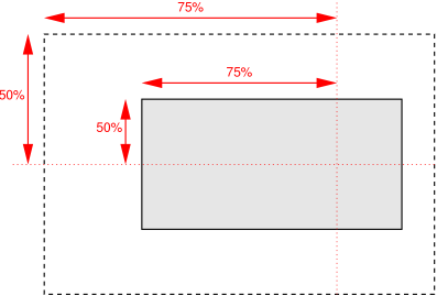
For example, with a value pair of ‘0% 0%’, the upper left corner of the image is aligned with the upper left corner of, usually, the box's padding edge. A value pair of ‘100% 100%’ places the lower right corner of the image in the lower right corner of the area. With a value pair of ‘75% 50%’, the point 75% across and 50% down the image is to be placed at the point 75% across and 50% down the area.
But if you're like me, and you're terrible at visualizing this in real time, then just think of a sliding puzzle instead.
Note that none of this applies to absolute values; absolute values do position the origin of the image. However, the reference point can be changed if you anchor the absolute value to the right and/or bottom sides, for example right 10px bottom 10px positions a background image 10 pixels away from the bottom right corner of the background area.
If you want to position a background image whose size is 100% of the background area, you won't be able to use a percentage, since you can't move a tile that fits its frame perfectly (which incidentally would make for either the most boring puzzle or the perfect prank). This applies whether the intrinsic dimensions of the background image match the dimensions of the element, or you explicitly set background-size: 100%. So, to position the image, you will need to use use an absolute value instead (forgoing the sliding-puzzle analogy altogether).
How is background-size percentage calculated?
As per the W3C Specs:
A percentage is relative to the background positioning area.
and background positioning area is one of either border-box or padding-box or content-box based on the background-origin property. Here you haven't specified any value explicitly for this and so its default value of padding-box is used. This element has no padding and so it's equal to content-box.
Your image is 126 x 112 px but width and height of the element is 56 x 56px, so a background-size: 100% (which is inferred as100% auto) would mean the image is scaled down till it has a width of 56px. Now to get to 56px, the width is scaled down by 44.44% of the image's original size. So, to preserve aspect ratio (as one value is auto), the height of the image is also scaled down to 44.44%, which is, 49.78px (or 50px approximately). As you can see the calculated background image's dimensions are 56px x 50px (and not 56px x 56px) and so it doesn't cover the box entirely. You can see this clearly in the below snippet.
.test {

  background: url(https://i.stack.imgur.com/KaIav.png) left top no-repeat;

  width: 56px;

  height: 56px;

  border: 1px solid red;

  background-size: 56px 50px; /* see how this is same as 100% or 100% auto */

}

.test.t2 {

  width: 56px;

  height: 56px;

  background-size: 100%;

}

.test.t3 {

  width: 56px;

  height: 56px;

  background-size: 100% auto;

}
<div class="test"></div>
<div class="test t2"></div>
<div class="test t3"></div>Percentages in CSS: How are they calculated internally?
Percentage Margin of an inner element depends on the size of outer container. see for example left margin of inner div is set 20% for both examples
 _______________
|    ___        |
|20%|   |       |
|   |___|       |
|_______________|
 _______________________
|      ___              |
|20%  |   |             |
|     |___|             |
|_______________________|
Use percentage with background position
You can do some calculation in order to convert the % value to pixel if you want to consider the % relative to width of the container (or the width of the initial image or any other value).
You can try this:
function call(value) {

  var w = document.getElementById("img").offsetWidth;

  var v = (value * w)/100

  document.getElementById("img").style.backgroundPositionX = -v + "px";

}
#img {
width: 400px;
height: 50px;
background: url("https://i.stack.imgur.com/fTyE3.png") no-repeat;
background-size: cover;
}
input {
margin-top:50px;
}<div id="img"></div>
<input type="text" oninput="call(this.value)" >How is padding calculated when using percentage (%)?
TL;DR
The padding is calculated according to the parent's width
First, you should note that:
Percentage:
The percentage is calculated with respect to the width of the generated box's containing block [...] (source: w3c, emphasis mine)
This means the padding is calculated according to the parent element width (it's worth to note that in non flexbox layouts, padding top and bottom are also relative to the width of the containing block).
With box-sizing: border-box
When you change the default box-model to border-box, the padding (and border) is included in the width of the element like in your example. So with
width:600px;
padding-right:50%;
box-sizing:border-box;
The right padding must be 50% of parent's width but the overall width of element is 600px wide. The only moment the padding right is 50% of element's width is when parent width = element width (Note that this can't happen in your example because the parent is body and body has a default margin).
Workaround:
If you want the padding to be 50% of the element's width, in this box model you can:
- set a fixed padding:
width:600px; padding-right: 300px; - give the element a fluid width :
width:50%; padding-right:25%;
Without box-sizing: border-box
In the default box-model, the padding isn't included in the width of the element so element width = 600px + 50% of parent's width as you can see in the following example:
#Test{

  width:600px;

  padding-right:50%;

  background:#ddd;

}
<div id="Test">
TEXT ETISI DHOASIHD I SAIDUHSILAUDH LISH ADBHSJADB JHSA DKH ASKDH KSAH DKLJS ADLK ASJKLD KLASH DLSJAH KLS ADKL S JS KSH KD KSJ HDKJSH DKH SDKH SKDH KSJH DKJSH DKJ HTEXT ETISI DHOASIHD I SAIDUHSILAUDH LISH ADBHSJADB JHSA DKH ASKDH KSAH DKLJS ADLK ASJKLD KLASH DLSJAH KLS ADKL S JS KSH KD KSJ HDKJSH DKH SDKH SKDH KSJH DKJSH DKJ HTEXT ETISI DHOASIHD I SAIDUHSILAUDH LISH ADBHSJADB JHSA DKH ASKDH KSAH DKLJS ADLK ASJKLD KLASH DLSJAH KLS ADKL S JS KSH KD KSJ HDKJSH DKH SDKH SKDH KSJH DKJSH DKJ HTEXT ETISI DHOASIHD I SAIDUHSILAUDH LISH ADBHSJADB JHSA DKH ASKDH KSAH DKLJS ADLK ASJKLD KLASH DLSJAH KLS ADKL S JS KSH KD KSJ HDKJSH DKH SDKH SKDH KSJH DKJSH DKJ H
</div>How to use background-position percentage correctly in this case?
When you use percentages in background-position:
The size of the background positioning area minus size of background image; size refers to the width for horizontal offsets and to the height for vertical offsets
https://developer.mozilla.org/en-US/docs/Web/CSS/background-position
.container {

  position: relative;

  display: block;

  width: 100%;

  font-size: 0;

}

.container>div {

  display: inline-block;

  height: 200px;

  background-repeat: no-repeat;

}

.container#example1>div {

  width: 50%;

  background-size: 200% 100%;

}

.container#example2>div {

  width: 33.33%;

  background-size: 300% 100%;

}

.container#example3>div {

  width: 25%;

  background-size: 400% 100%;

}

#example1 #d1 {

  background-image: url(http://placehold.it/500x400/333333/000000);

  background-position: 0% 0;

}

#example1 #d2 {

  background-image: url(http://placehold.it/500x400/666666/000000);

  background-position: 100% 0;

}

#example2 #d1 {

  background-image: url(http://placehold.it/50x400/333333/000000);

  background-position: 0% 0;

}

#example2 #d2 {

  background-image: url(http://placehold.it/50x400/666666/000000);

  background-position: 50% 0;

}

#example2 #d3 {

  background-image: url(http://placehold.it/50x400/999999/000000);

  background-position: 100% 0;

}

#example3 #d1 {

  background-image: url(http://weknownyourdreamz.com/images/park/park-07.jpg);

  background-position: 0% 0;

}

#example3 #d2 {

  background-image: url(http://weknownyourdreamz.com/images/park/park-07.jpg);

  background-position: 33.33% 0;

}

#example3 #d3 {

  background-image: url(http://weknownyourdreamz.com/images/park/park-07.jpg);

  background-position: 66.66% 0;

}

#example3 #d4 {

  background-image: url(http://weknownyourdreamz.com/images/park/park-07.jpg);

  background-position: 100% 0;

}
<div id="example1" class="container">
<div id="d1"></div>
<div id="d2"></div>
</div>
<hr>
<div id="example2" class="container">
<div id="d1"></div>
<div id="d2"></div>
<div id="d3"></div>
</div>
<hr>
<div id="example3" class="container">
<div id="d1"></div>
<div id="d2"></div>
<div id="d3"></div>
<div id="d4"></div>
</div>How do I calculate percentage based on pixels for CSS conversion?
It actually depends on the context where your elements live.
Always remember the simple formula target / context
I don't think you will find a converter since as I said, it depends on the context.
For example: to convert to percentage a 300px inside a 1000px container you would do
300/1000 = 0.3 which is 30%
If the 300px has a padding of 10px and you want to convert it, do apply the formula considering the 300px as your container (context). So
10/300 = 0.0333333333 which is 3.3333333% (keep the decimals)
For the font sizes, if you set the font-size to 100%, that will refer to 100% of the default font size of the browser, which is most probably 16px for the major browsers.
For an accurate reading on font-size check this: The font-size CSS property
Related Topics
How to Use CSS to Replace or Change Text
How to Combine and Use Multiple Next.Js Plugins
How to Recreate Perspective-Origin Effect by Transforming Child Elements
CSS Nth-Child Apply Odd-Even Rule But Switch Every 4 Items
How to Do Ie Conditionals in CSS
How to Override a Less Mixin Variable Based on a Parent's Variable
How to Make a Twitter Bootstrap Modal Slide from the Side or Bottom Instead of Sliding Down
CSS Media Queries, Pixel Density, Desktop and Mobile Devices
Why Do I Need an Empty 'Content' Property on an ::After Pseudo-Element
Keep Footer with Variable Height on Bottom
Vertically Center in Viewport Using CSS
Alternative for Nth-Child for Older Ie Browsers
Sass:Making Underscore File Names Actually Create CSS Files
Apply Background-Size to Individual Layer of a Multiple Background