CSS animations with Spritesheets in a grid image (not in a row)
Since this can be a difficult to debug task, I would like to start with the same problem, but in an easier to debug environment.
I chose to do it as a rectangle animation over the full image.
.hi {

    width: 320px;

    height: 315px;

    background-image: url("http://i.stack.imgur.com/CjMscm.jpg");

    position: relative;

    border: solid 1px black;

}

.hi:before {

    content: "";

    position: absolute;

    width: 100%;

    height: 53px;

    left: 0px;

    top: 0px;

    border: solid 1px red;

    -webkit-animation: playv 18s steps(6) infinite;

}

@-webkit-keyframes playv {

     0% { top:   0px; }

   100% { top: 315px; }

}

.hi:after {

    content: "";

    position: absolute;

    width: 53px;

    height: 100%;

    left: 266px;

    top: 0px;

    border: solid 1px red;

    -webkit-animation: playh 3s steps(6) infinite;

}

@-webkit-keyframes playh {

     0% { left:   0px; }

   100% { left: 320px; }

}
<div class="hi">
</div>CSS3 - Animating a sprite-grid
There's a couple issues at play here. The first is that your animation property has the incorrect values. You need to change it from:
animation:
  playv .6s steps(6) infinite,
  playh 1s steps(6) infinite;
to:
animation:
  playv 5s steps(5) infinite,
  playh 1s steps(7) infinite;
It's important that the steps function takes in the correct parameters, such that playv is contains the number of sprites there are in the y direction and playh contains the number of sprites there are in the x direction. The timing for playv also needs to be slow enough to animate the grid properly and is actually equivalent to being your duration multiplied by the amount of rows in the sprite grid. This can be simplified into the following formula:
animation:
  playv (duration * rows) steps(rows) infinite,
  playh duration steps(cols) infinite;
Secondly, the image you have provided as the sprite grid is too large. It contains blank space/padding to the right and bottom of the image. As a result of this, the following lines are calculated incorrectly:
@-webkit-keyframes playv {
  0% { background-position-y:   0px; }
  100% { background-position-y: 100%; }
}

@-webkit-keyframes playh {
  0% { background-position-x:   0px; }
  100% { background-position-x: 100%; }
}
You either need to update the sprite grid so that it matches perfectly, or specify the pixels exactly like so:
@-webkit-keyframes playv {
  0% { background-position-y: 0; }
  100% { background-position-y: -550px; }
}

@-webkit-keyframes playh {
  0% { background-position-x: 0; }
  100% { background-position-x: -903px; }
}
Here's the working codepen.
Animating a spritesheet using css
The way to handle an animation on grid sprites is to use 2 animations.
One for horizontal and one for vertical
Live Demo
.hi {
    width: 90px;
    height: 96px;
    background-image: url("http://i.stack.imgur.com/G7o8R.jpg");
    -webkit-animation: playv 6s steps(7) infinite, playh 1s steps(9) infinite;

}

@-webkit-keyframes playv {
     0% { background-position-y:   0px; }
   100% { background-position-y: 100%; }
}

@-webkit-keyframes playh {
     0% { background-position-x:   0px; }
   100% { background-position-x: 100%; }
}
My answer is based on this answer:
CSS animations with Spritesheets in a grid image (not in a row)
Animate a Sprite grid using CSS3?
I have added a background dimension style, and rearranged some of your properties
the result is almost ok; but your sprite grid seems to be out of order
.hi {

    width: 910px;

    height: 340px;

    background-image: url("https://simba-heroku.imgix.net/animation-homepage-tablet-retina.jpg?auto=format,compress");

    position: relative;

    animation: playh 2s steps(5) infinite, playv 10s steps(5) infinite;

    border: solid 1px blue;

    background-size: 500% 500%;

    background-repeat: no-repeat;

}

@keyframes playv {

     0% { background-position-y:   0px; }

   100% { background-position-y: 125%; }

}

@keyframes playh {

     0% { background-position-x:  0%; }

   100% { background-position-x: 125%; }

}
<div class="hi">
</div>CSS Sprite-sheet animation with Multiple Row Sprite-sheet
You need 1 row. Your example uses steps function. It use number of intervals from start to end. So if you have several rows in your sprite, height(rows) will not influence on width of one step (interval).
CSS Spritesheet animation keeps moving towards the left
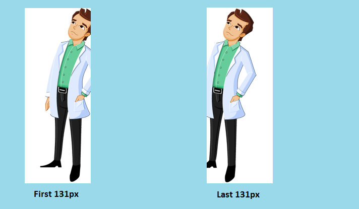
Though your actual sprite-sheet is 9170px wide, the individual sprites within it actually have a margin on either side. This is what is causing the sliding effect.
As per your code, there are 70 steps and the background moves by 9170px (which is 131px for each step). But each 131px of the sprite don't seem to exactly overlap one another. In the below image, we can see how the first 131px of the spritesheet and the last 131px look like (background added just for visual distinction).
Changing the background-position like in the below snippet seems to produce a much better output.
@-webkit-keyframes play {

  100% {

    background-position: -9144px;

  }

}

@keyframes play {

  100% {

    background-position: -9144px;

  }

}

.character-one {

  width: 131px;

  height: 350px;

  border: 1px solid #ddd;

  margin-left: 20px;

  background: url('http://i.imgur.com/gK3C2VZ.png');

  background-position: -28px center;

  -webkit-animation: play 2s steps(70) infinite;

  animation: play 2s steps(70) infinite;

}
<div class="character-one"></div>How to animate all sprite images?
Two separate keyframe animations are created to traverse 4 frames horizontally and 3 frames vertically. When one direction animation is in play, the other one must be frozen.
Since 1s is set to go through 4 horizontal frame, so the next vertical frame would start 1s later, and therefore duration of vertical direction equals to 1s x 3 vertical frames.
img {

  display: block;

  margin: auto;

}

.sample {

  margin: 0 auto;

  width: 75px;

  height: 100px;

  background-image: url("https://fermmm.files.wordpress.com/2011/02/preview.jpg");

  animation: playh 1s steps(4) infinite, playv 3s steps(3) infinite;

}

@keyframes playv {

  0% { background-position-y: 0px; }

  100% { background-position-y: -301px; }

}

@keyframes playh {

  0% { background-position-x: 0px; }

  100% { background-position-x: -299px; }

}
<img src="https://fermmm.files.wordpress.com/2011/02/preview.jpg" />
<div style="text-align:center;">Sprite image</div>
<div class="sample"></div>Related Topics
Grid-Area Does Not Seem to Work with the Attr Function, Is This by Design
Responsive Iframe (Google Maps) and Weird Resizing
How to Create Curved Line with Rounded Edges
How to Do Ie Conditionals in CSS
Bikeshedding CSS3 Property Alternative
How to Create a Triangular Shape with Curved Border
How to Hide Anchor Text Without Hiding the Anchor
Will CSS 3 Still Allow Omitting Final Semicolons
Jekyll Site Works Locally But Not on Github Pages
Is There Any Equivalent to Ie Conditional Comment for Chrome and Safari
How to Use CSS in Js for Nested Hover Styles, Material Ui
<Main> Element Not Working in Internet Explorer 11
How to Send an Inner <Div> to the Bottom of Its Parent <Div>
Downloaded Font Won't Display Properly
How to Expand a Child Div to 100% Screen Width If the Container Div Is Smaller
CSS - Parent's Position Is Absolute and Child's Position Is Relative and Vice Versa