How can I expand a child div to 100% screen width if the container div is smaller?
You can set the width based on the vw (viewport width). You can use that value too using the calc function, to calculate a left-margin for the div. This way you can position it inside the flow, but still sticking out on the left and right side of the centered fixed-width div.
Support is pretty good. vw is supported by all major browsers, including IE9+. The same goes for calc(). If you need to support IE8 or Opera Mini, you're out of luck with this method.
-edit-
As mentioned in the comments, when the content of the page is higher than the screen, this will result in a horizontal scrollbar. You can suppress that scrollbar using body {overflow-x: hidden;}. It would be nice though to solve it in a different way, but a solution using left and rightlike presented in Width:100% without scrollbars doesn't work in this situation.
-edit 2021-
Another work-around for the scrollbars, which may be acceptable or not depending on your situation:
By making the green div a little bit smaller, say 20px, you can keep a bit of space for the scrollbar. Half that reserved width can be added to the margin, to keep the wide div centered:
#wide-div {
  width: calc(100vw - 20px);
  margin-left: calc(-50vw + 50% + 10px);
div {
  min-height: 40px;
  box-sizing: border-box;
}
#container {
  position: relative;
}
#parent {
  width: 400px;
  border: 1px solid black;
  margin: 0 auto;
}

#something {
  border: 2px solid red;
}

#wide-div {
  width: calc(100vw - 20px);
  margin-left: calc(-50vw + 50% + 10px);
  border: 2px solid green;
}
<div id="container">
<div id="parent">
<div id="something">Red</div>
<div id="wide-div">Green
<br>Green
<br>Green
<br>Green
<br>Green
<br>Green
<br>Green
<br>Green
</div>
<div id="something-else">Other content, which is not behind Green as you can see.</div>
</div>
</div>How to expand child div with 100% of body width?
This makes inner-div stretch from left to right:
div.inner-div {
  position: absolute;
  left: 0;
  width: 100%;
}
How to make a child element wider than its parent div, but not fill the entire browser width and be responsive?
Use min() to take the minimum value between 1000px and the screen width (100vw). I am using margin-inline which is as shorthand for left/right margin.
.wrapper {
  max-width: 800px;
  margin:auto;
}

.alignwide {
  margin-inline: calc((100% - min(100vw,1000px)) / 2);
  background: red;
}
<div class="wrapper">
<div class="alignwide">
This div expands beyond .wrapper parent margins.
</div>
</div>How to force child div to be 100% of parent div's height without specifying parent's height?
NOTE: This answer is applicable to legacy browsers without support for the Flexbox standard. For a modern approach, see: https://stackoverflow.com/a/23300532/1155721
I suggest you take a look at Equal Height Columns with Cross-Browser CSS and No Hacks.
Basically, doing this with CSS in a browser compatible way is not trivial (but trivial with tables) so find yourself an appropriate pre-packaged solution.
Also, the answer varies on whether you want 100% height or equal height. Usually it's equal height. If it's 100% height the answer is slightly different.
Is there a way to make a child DIV's width wider than the parent DIV using CSS?
Use absolute positioning
.child-div {
    position:absolute;
    left:0;
    right:0;
}
Make child div stretch across width of page
Yes it can be done. You need to use
position:absolute;
left:0;
right:0;
Check working example at http://jsfiddle.net/bJbgJ/3/
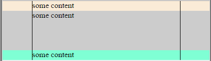
With #container div make child stretch to full width centering content
My suggestion:
I would create three basic containers for the full width support. Then nest content in it!
        html, body{
            padding: 0;
            margin: 0;
            border: 0; /*ie older versions*/
        }
        header {
            background-color: antiquewhite;
        }
        section{
            background-color: ActiveCaption;
        }
        footer{
            background-color: aquamarine;
        }
        .inner-wrapper{
            max-width: 300px;
            margin: 0 auto;
            border-left: 1px solid black;
            border-right: 1px solid black;
            height: 80px;
            text-align: center;
        }

        section .inner-wrapper{
            height: 200px;
        }
<header>
<div class="inner-wrapper">
<div>some content</div>
</div>
</header>
<section>
<div class="inner-wrapper">
<div>some content</div>
</div>
</section>
<footer>
<div class="inner-wrapper">
<div>some content</div>
</div>
</footer>How to force parent div to expand by child div width/padding/margin/box?
The key solution to your problem is to use display:inline-block;
HTML
body {
    background: gray;
}
div.page {
    color: white;
    background: black;
    margin: auto;
    padding: 1em;
    display:inline-block;
}
div.one {
    background-color: red;
    width: 10em;
    display:inline-block;
}
div.two {
    background-color: green;
    width: 40em;
    display:inline-block;
}
<div class="page">
<div class="one">One</div>
<div class="two">Two</div>
</div>Related Topics
How to Create a Chrome-Like Tab Using CSS
Label and Text Box on the Same Line Using CSS
CSS Change Custom Cursor Image Origin (Hotspot) to Center
Horizontally Centering/Evenly Distributed <Li> Inside of <Ul> Inside a <Div>
Compiling Issue in Bootstrap 3 with Namespace
Chrome Does Not Redraw <Div> After It Is Hidden
How to Add Space Between Elements So They Fill Their Container Div
@Font-Face Won't Load via Https in Ie
Why Is the Use of '!Important' Discouraged
How to Style Anonymous Flex Items Explicitly
Add a Text Suffix to <Input Type="Number">
Background:None VS Background:Transparent What Is the Difference
Line-Height as a Percentage Not Working
How to Properly Introduce a Light/Dark Mode in Bootstrap
How to Create Zebra Stripes on HTML Table Without Using JavaScript and Even/Odd Classes Generation
Display:None VS Visibility:Hidden VS Text-Indent:9999 How Screen Reader Behave with Each One