Large Background Images and Screen Sizes
I ended up choosing five breakpoint based on information from StatCounter:
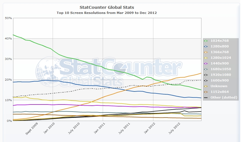
This is up till December 2012.
Based off of these numbers, my testing, and speaking to others I chose the following options:
/*Monitors Large than 1920px, image has "soft" edges to blend into background */
@media (min-width:1921px){
    html, body{
background: url(/images/backgrounds/1920-bg-large.jpg) no-repeat center top fixed #190303;
background-size:100% auto;
    }
}

/* Mointores ranging from 1367px - 1920px */
@media (min-width:1367px) and (max-width:1920px){
html, body{
background: url(/images/backgrounds/1920-bg.jpg) no-repeat center top fixed #190303;
background-size:100% auto;
    }
}

/* Mointores ranging from 769px - 1366px */
@media (min-width:769px) and (max-width:1366px){
html, body{
background: url(/images/backgrounds/1366-bg.jpg)  no-repeat center top fixed #190303;
background-size:100% auto;
    }
}
/* Tablets like the iPad 2 and iPad Mini */
@media (max-width:768px){
html, body{
background: url(/images/backgrounds/768-bg.jpg)  no-repeat center top fixed #190303;
background-size:100% auto;
    }
}

/* At a certain point the Background images become irrelevant as they are hidden behind other elements. Changed to a solid BG */
@media handheld, only screen and (max-width: 640px) {
html, body{
background:#190303;
    }
}
Fit website background image to screen size
you can do this with this plugin http://dev.andreaseberhard.de/jquery/superbgimage/
or
   background-image:url(../IMAGES/background.jpg);

   background-repeat:no-repeat;

   background-size:cover;
with no need the prefixes of browsers. it's all ready suporterd in both of browers
Organize images horizontally/vertically according screen size in center over background image
CSS grid or flex would be ideal for this (assuming modern-ish browsers).
It's not clear to me why you require an img element for your background image, but I've had plenty of reasons in the past so this would need a little extra to use an img element .
Here is the most basic example of my interpretation of what you're looking for: https://codepen.io/Ilkai/pen/abNdZQK
Basically:
- Set up your
sectionwith abackground-image, and also use it as your source of the container size (full screen with100 vw/vh)
<section class="bg">
  ...
</section>
.bg {
  background-image: url('...');
  background-size: cover;
  width: 100vw;
  height: 100vh;
}
- Create a div that will be dedicated to being your layout parent, with using
display: flex/grid(Flexbox is slightly older than Grid, so it has a bit better support). Center children withalign-itemsandjustify-content.
<section class="bg">
  <div class="layout">
    ...
  </div>
</section>
.bg { ... }

.layout {
  width: inherit;
  height: inherit;
  display: flex;
  align-items: center;
  justify-content: center;
  flex-direction: column;
}
- You'll also apply your media query to the layout div.
.bg {...}

.layout {...}

@media (min-width: 720px) {
  .layout {
    flex-direction: row;
  }
}
- Add your
imgelements as children of the layout div, size accordingly.
<section class="bg">
  <div class="layout">
    <img src="..." />
    <img src="..." />
    <img src="..." />
    <img src="..." />
  </div>
</section>
.bg {...}

.layout {...}

@media (...) {}

.layout img {
  width: 6rem;
  height: 6rem;
  object-fit: cover;
  margin: 1rem;
}
If I have misunderstood what you're after let me know in the comments
Related Topics
Align Text to The Right of an Image && Text Doesn't Wrap Around The Image
Ionic - How to Wordwrap a Long String in Ion-Header
Overflow-Y Scroll Always Show Even It Not Overflow
Twitter Bootstrap Thumbnail Caption to The Right
How Does This Responsive-Iframe-Container Snippet Work
How to Make a Div Stretch Its Height Between Two Other Divs and Center Its Content
How to Add Space After a Colon in CSS with Sublime Text 2
Margin Does Not Push Down Another Margin
CSS Terminology: What Are These Called
An Alternative to -Webkit-Transform: Transformy
CSS <Img> Relative Positioning VS. Background-Image + Background-Position
How to Make a Material UI Grid Element Sticky
Right Aligning Cell Content in a Datatable Column
How to Make a Div Full Screen and Scrollable
How to Prevent Shifting When Changing Border Width