Javafx ListView selection bar text color when using CellFactory
-fx-selection-bar-text is a color palette (not css property) defined in a root default CSS selector, which is selector of the Scene. I don't know how are you using it but if you define it (globally since it is scene's selector) like:
.root{
    -fx-selection-bar-text: red;
}
in your CSS file then all controls' css properties using -fx-selection-bar-text will be red. ListView will be affected as well (see commented out original usages below).
However if you want to customize the ListView's style only, override the default properties this way
(Note: only -fx-text-fill are overriden. Original values are commented out, where -fx-selection-bar-text is used):
/* When the list-cell is selected and focused */
.list-view:focused .list-cell:filled:focused:selected {
    -fx-background-color: -fx-focus-color, -fx-cell-focus-inner-border, -fx-selection-bar;
    -fx-background-insets: 0, 1, 2;
    -fx-background: -fx-accent;
    /* -fx-text-fill: -fx-selection-bar-text;  */
    -fx-text-fill: red;
}

/* When the list-cell is selected and selected-hovered but not focused.
    Applied when the multiple items are selected but not focused */
.list-view:focused .list-cell:filled:selected, .list-view:focused .list-cell:filled:selected:hover {
    -fx-background: -fx-accent;
    -fx-background-color: -fx-selection-bar;
    /* -fx-text-fill: -fx-selection-bar-text;  */
    -fx-text-fill: green;
}

/* When the list-cell is selected, focused and mouse hovered */
.list-view:focused .list-cell:filled:focused:selected:hover {
    -fx-background: -fx-accent;
    -fx-background-color: -fx-focus-color, -fx-cell-focus-inner-border, -fx-selection-bar;
    -fx-background-insets: 0, 1, 2;
    /* -fx-text-fill: -fx-selection-bar-text;  */
    -fx-text-fill: yellow;
}
These CSS properties and more are avaliable in built-in caspian.css.
UPDATE: I strongly advice you to read the Cell API. From there
... We represent extremely large data sets using only very few Cells.
Each Cell is "recycled", or reused.
Be warned about the different String items may use the same cell, ending with misleading visual effects/renderings, like isSelected() in your code. Additionally in API it says
Because by far the most common use case for cells is to show text to a
user, this use case is specially optimized for within Cell. This is
done by Cell extending from Labeled. This means that subclasses of
Cell need only set the text property, rather than create a separate
Label and set that within the Cell.
So I refactored your code as follows.
class RoomCell extends ListCell<String> {
    @Override
    public void updateItem(String item, boolean empty) {
        super.updateItem(item, empty);

        if (item != null) {
            Log.debug("RoomCell called, item: "+item);
            setFont(Font.font("Segoe UI", FontWeight.BOLD, 18));
            ImageView iView = new ImageView();
            if (Rooms.getBoolean(item, "OwnerStatus")) {
                iView.setEffect(new DropShadow(15, Color.BLUEVIOLET));
                iView.setImage(new Image(getClass().getResourceAsStream("images/universal.png")));
            } else  {
                iView.setEffect(new DropShadow(15, Color.WHITE));
                iView.setImage(new Image(getClass().getResourceAsStream("images/yin-yang.png")));
            }
            setGraphic(iView);  // The image will be displayed here
            setText(item); // The room name will be displayed here
        }
    }
}
All -fx-text-fill styles of the cell's text will change according to definitions in CSS file.
Now here is a trade-off between cell's text dropshadow effect and its fill colors from CSS file:
-- if you want to use dropshadow effect, you should go like current way, namely creating label, setting its text, give dorpshadow effect to the label and setGraphic(label). However this time you will not prefer to set the text (setText(item)) of the cell thus text color styles in CSS file will have no effect.
-- On other hand, if you prefer the code that I have refactored, then you should to disable -fx-background-color of the cell (which extends Labeled) by setting it to transparent or null and set the -fx-effect to dropshadow in CSS file to be able to apply dropshadow effect to the text directly. Clearing the background of the cell is not the preferred way either IMO. An explanation by the code:
Label lbl = new Label("This text will have a dropshadow on itself directly");
lbl.setEffect(new DropShadow(15, Color.BLUE));

Label another_lbl = new Label("This text will have a dropshadow applied on the background bounds, not to text");
another_lbl.setEffect(new DropShadow(15, Color.BLUE));
another_lbl.setStyle("-fx-background-color:gray");
Test them to see the difference. That's all.
JavaFX change the blue color of the TableView selection row bar
You can overwrite the .table-row-cell CSS style class:
.table-row-cell:selected {
    -fx-background-color: #005797;
    -fx-background-insets: 0;
    -fx-background-radius: 1;
}
Put this code into a CSS file and then add the file to the list of CSS stylesheets of the TableView.
javafx - How to set selected row text color in not focused TableView
This works for me, though there may be easier ways:
.table-row-cell:selected {
   -fx-background-color: steelblue;
}
.table-row-cell:selected .text {
       -fx-fill: red ;

}
JavaFX ListView multiple selection not working after applying CSS styling
The problem is just on the first line of your css, since the listView styleclass is missing:
Wrong:
.listView .list-cell:filled:selected:focused,
.list-cell:filled:selected {
    -fx-background-color: linear-gradient(#328BDB 0%, #207BCF 25%, #1973C9 75%, #0A65BF 100%);
    -fx-text-fill: white;
}
Correct:
.listView .list-cell:filled:selected:focused,
.listView .list-cell:filled:selected {
    -fx-background-color: linear-gradient(#328BDB 0%, #207BCF 25%, #1973C9 75%, #0A65BF 100%);
    -fx-text-fill: white;
}
JavaFx ObservableList want to change the color of each cells
As kleopatra said, you can't add Components as items. The items must be objects with data only.
If you are trying to add Label's I'm assuming that you want to show a String on each Cell, so you should be doing something like:
ListView<String> listView = new ListView<>();
listView.setPrefSize(400,450);
listView.getItems().addAll("Foo", "Bar", "Baz");
To customize the appearance is better just to use css.
.list-cell { -fx-text-fill: black; }
.list-cell:odd { -fx-background-color: white;}
.list-cell:even { -fx-background-color: #8f8; }
And... If you want to customize how each cell will be shown and behave you set a Cell factory like this:
listView.setCellFactory(new Callback<ListView<String>, ListCell<String>>() {
        @Override
        public ListCell<String> call(ListView<String> param) {
            ListCell<String> cell = new ListCell() {
                @Override
                protected void updateItem(Object item, boolean empty) {
                    super.updateItem(item, empty);

                    setGraphic(null);

                    if (empty || item == null) {
                        setText(null);
                    }
                    else {
                        setText((String) item);
                    }
                }
            };

            return cell;
        }
    });
Usually when creating a Cell Factory it's common to override the updateItem (to configure the cell to reflect the item content) and commitEdit (to persist in the item the result of the cell edition).
Dynamically change ListCell's width of ListView in JavaFX
Use a cell factory that sets the graphic to a Label, and style the label. E.g.:
import javafx.application.Application;
import javafx.scene.Scene;
import javafx.scene.control.Label;
import javafx.scene.control.ListCell;
import javafx.scene.control.ListView;
import javafx.stage.Stage;
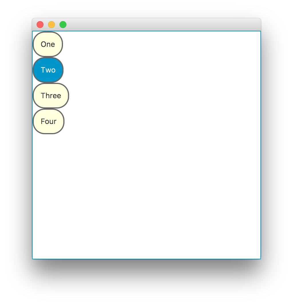
public class FormattedListCell extends Application {
@Override
public void start(Stage primaryStage) {
ListView<String> listView = new ListView<>();
listView.getItems().addAll("One", "Two", "Three", "Four");
listView.setCellFactory(lv -> new ListCell<String>() {
private final Label label = new Label();
@Override
protected void updateItem(String item, boolean empty) {
super.updateItem(item, empty);
if (empty) {
setGraphic(null);
} else {
label.setText(item);
setGraphic(label);
}
}
});
Scene scene = new Scene(listView, 400, 400);
scene.getStylesheets().add("formatted-list-cell.css");
primaryStage.setScene(scene);
primaryStage.show();
}
public static void main(String[] args) {
launch(args);
}
}
and modify the stylesheet:
.list-cell .label {
  display: inline-block;
  -fx-min-width: 50px;
  -fx-background-color: lightyellow;
  -fx-background-radius: 30px;
  -fx-border-radius: 20px;
  -fx-border-width: 2px;
  -fx-border-style: solid;
  -fx-border-color: #666666;
}
.list-cell:empty .label {
  -fx-background-color: transparent;
  -fx-border-width: 0px;
}
You may need to actually style the list cell (as well as the label inside it) to get the exact style you want, but this should get you started.

Here is a more complete CSS file, which uses -fx-background so that the text color will automatically adjust, manages the selection color, and also adds some styles to the list cell itself:
.list-cell {
    -fx-background-color: transparent ;
    -fx-padding: 0 ;
}

.list-cell .label {
  display: inline-block;
  -fx-background: lightyellow;
  -fx-background-color: -fx-background ;
  -fx-background-radius: 30px;
  -fx-border-radius: 20px;
  -fx-border-width: 2px;
  -fx-border-style: solid;
  -fx-border-color: #666666;
  -fx-padding: 12px ;
}
.list-cell:empty .label {
  -fx-background-color: transparent;
  -fx-border-width: 0px;
}
.list-cell:selected .label {
    -fx-background: -fx-selection-bar ;
}
Related Topics
Datatables with Bootstrap 4 Looks Messy
How to Revert Webkit-Appearance for Input[Type="Search"] of Normalize.CSS
Apply Different Styles to Input Text Field When Empty (Using CSS)
CSS3 Display:Table, Overflow-Y:Scroll Doesn't Work
Is The CSS3 Transform Translate Percentage Values Relative to Its Width And/Or Height
Firefox Select Element Doubles Text-Indent Value
Why Does an Absolute Position Element Wrap Based on Its Parent's Right Bound
Variable Height Scrolling Div, Positioned Relative to Variable Height Sibling
HTML5 Video with Fixed Height, But Scale Width to 100%
Nested Mixins or Functions in Sass
Why We Are Using Sass, Even We Are Using SCSS
Does Repeating a Classname in a CSS Rule Increase Its Priority
iPhone Viewport Height Too Large in Landscape Mode