How do I scale an SVG background-image without honoring aspect ratio in Firefox?
I needed to set the background-size. This snippet did the trick:
background-size: 100% 100%;
Part of the "stricter rendering model" was deferring sizing information to the page, rather than intrinsically within the SVG.
I thought I was defining this inside the background shorthand, but apparently instead I was specifying the background-position. I feel pretty silly about that, but it does appear to be the gnarliest and most-overgrown shorthand in CSS.
The HTML box containing an SVG image does not match the Aspect Ratio of the image
I can't find any consistent way to do this with only CSS. I did, however, find a solution that works across browsers using SVG.
I added a <rect/> that fills the entire width and height behind your drawing. Then I used CSS to set that <rect/>'s fill to use the same color you assigned to the SVG element's background-color.
My updated JSFiddle
Tested and working in Google Chrome v31.0.1650.57 (1650.57), Safari v7.0 (9537.71), and Firefox v23.0 (2313.7.30) on OS X 10.9 (13A603)
IE10 does not scale background SVG correctly when zoomed (on Surface/Windows 8 phone)
The problem is that IE, and other browsers such as Firefox rasterise the SVG before displaying it, so it will become blocky when zoomed.
The easiest way to fix this is to make the SVG file larger than is needed. For example double the size, or more if the user is likely to zoom in further. You can then resize the SVG image with CSS to display it at the correct size. This way the image will be naturally larger, so wont become blocky, unless you zoom in even further. At default zoom level the image is scaled down rather than up, which browsers usually handle better.
Edit: You can find further info on this issue under the “SVG and CSS Backgrounds” heading at http://dbushell.com/2012/03/11/svg-all-fun-and-games/
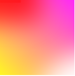
Building a 4 corners-colors CSS3 gradient
in your case

Method 1:
jsFiddle Demo
div{
overflow: hidden;
background: #f06;
background: linear-gradient(45deg, #fff722, #ff26f9);
min-height: 100%;
width: 256px;
height: 256px;
position: relative;
z-index: 1;
box-shadow: inset -20px 0 38px -18px #ff26f9,inset -3px -13px 65px -18px yellow;
}

div:before,div:after{
    content:'';
    position:absolute;
    width:100%;
    height:100%;
}
div:before{
    background: red;
    box-shadow: 0 0 140px 64px red;
    z-index:2;
    top: -96%;
left: -72%;
    opacity: 0.8;
}
div:after {
background: white;
z-index: 3;
bottom: -96%;
right: -72%;
box-shadow: 0 0 140px 64px white;
opacity: 1;
border-radius: 100%;
}
Method 2:
div{
overflow: hidden;
background: #f06;
background: linear-gradient(45deg, #fff722, #ff26f9);
min-height: 100%;
width:256px;
height:256px;
position:relative;
    z-index:1;
}

div:before,div:after{
    content:'';
    position:absolute;
    width:100%;
    height:100%;
}
div:before{
    background: red;
    box-shadow: 0 0 140px 64px red;
    z-index:2;
    top: -96%;
left: -72%;
    opacity: 0.8;
}
div:after {
background: white;
z-index: 3;
bottom: -96%;
right: -72%;
box-shadow: 0 0 140px 64px white;
opacity: 1;
border-radius: 100%;
}
jsFiddle Demo
Method 3: multiple background:

div{
background: #f06;
background: linear-gradient(45deg, #fff722, #ff26f9),linear-gradient(142deg, transparent, white),linear-gradient(108deg, red, transparent);
min-height: 100%;
width:256px;
height:256px;
position:relative;
    z-index:1;
}
jsFiddle Demo
Method 4: pseudo element
div{
background: #f06;
background: linear-gradient(45deg, #fff722, #ff26f9);
min-height: 100%;
width:256px;
height:256px;
position:relative;
    z-index:1;
}

div:before,div:after{
    content:'';
    position:absolute;
    width:100%;
    height:100%;
    opacity: 0.8;
}
div:before{
    background: linear-gradient(108deg, red, transparent);
    z-index:2;
    top:0;
    left:0;
}
div:after{
    background: linear-gradient(142deg, transparent, white);
    z-index:3;
    bottom:0;
    right:0;
}
the markup:
<div></div>
jsFiddle Demo
Method 5:
div{
overflow: hidden;
background: #f06;
background: linear-gradient(45deg, #fff722, #ff26f9);
min-height: 100%;
width:256px;
height:256px;
position:relative;
    z-index:1;
}

div:before,div:after{
    content:'';
    position:absolute;
    width:100%;
    height:100%;
}
div:before{
    background: linear-gradient(108deg, red, transparent);
    z-index:2;
    top:0;
    left:0;
    opacity: 0.8;
}
div:after {
background: white;
z-index: 3;
bottom: -96%;
right: -72%;
box-shadow: 0 0 110px 54px white;
opacity: 1;
border-radius: 100%;
}
jsFiddle Demo
Update: many thanks to Ana-Maria Tudor <3
body{
position:fixed;
top:0;
right:0;
bottom:0;
left:0;
}

body:before {
  content: '';
  position:absolute;
  top:0;
  right:0;
  bottom:0;
  left:0;
  display: block;
  width: 100%;
  height: 600px;
  border-radius: 0%;
  background:
    radial-gradient(circle at 50% 0,
         rgba(255,0,0,.5), rgba(255,0,0,0) 70.71%),
    radial-gradient(circle at 6.7% 75%,
         rgba(0,0,255,.5), rgba(0,0,255,0) 70.71%),
    radial-gradient(circle at 93.3% 75%,
         rgba(0,255,0,.5), rgba(0,255,0,0) 70.71%);
}
jsFiddle Demo
nested svg inherited sizes
OK, here is a solution that works for me, but only because the height of the #mbsvg is fixed, which I neglected to mention, although it was shown in the CSS. I found the technique here and have revised it to fit this situation.
The trick is to make #mbsvg an absolutely positioned child of the outer div, and give it a width of 100%. Because it is absolutely positioned, it gets demoted from contributing to the size of the parent, so the other items determine that size (since the parent is floated, it is shrink-to-fit) which is then inherited by #mbsvg. The other items can even be below #mbsvg, as I demonstrated by moving one line of text below it (using a filler div of the same height as #mbsvg to achieve that).
Edit I had length and width swapped in the viewbox value. Turned them around and mystery #1 is totally resolved.
.mbsvg{position: relative;height: 49pt;background-color: #80ffff;}.mbsized{height: 100%;}.nowrap{white-space: nowrap;}.flex{position: relative;float: left;}.flex > svg{position: absolute;width: 100%;}.svgfiller{height: 49pt;}<svg height="0"><defs> <rect id="r1" x="0" y="0" height="10" width="10" /> <rect id="r2" x="0" y="0" height="10" width="100" /> <rect id="r3" x="0" y="0" height="250" width="85" /></defs></svg><div class="flex"> <div class="nowrap">This is some text</div> <svg class="mbsvg"> <use xlink:href="#r1" fill="red"/> <svg class="mbfluid" x="10pt" y="16pt" height="17pt" viewbox="0 0 10 10" preserveAspectRatio="none"> <use xlink:href="#r2" fill="yellow"/> </svg> <svg class="mbfixed" x="0" y="16pt" height="17pt" width="10pt" viewbox="0 0 10 10" preserveAspectRatio="none"> <use xlink:href="#r1" fill="blue"/> </svg> <svg class="mbsized" viewbox="0 0 83 250" preserveAspectRatio="xMidYMid meet"> <use xlink:href="#r3" fill="green"/> </svg> </svg> <div class="svgfiller"></div> <div class="nowrap">This is some other text</div></div>Related Topics
CSS Sprite Techniques, CSS Background or Img's Clip
Dynamic CSS Properties in Less
React Native: "Auto" Width for Text Node
Vertical-Align and Inline-Block Behaving Annoyingly Different in Chrome and Firefox
Bootstrap - Spacing Between Form-Inline Elements
Overriding CSS on Github Pages Using Slate Theme
Angular 2: How to Correctly Automatically Import Normalize.CSS
CSS "Transform: Rotate()" Affecting Overall Design with "Position: Absolute" (Not Aligning Properly)
Right Aligning Cell Content in a Datatable Column
Vertically Center Div When Body Height: 100% Without Absolute Pos
Text Gets Cut When Using <Select>
Selecting Children Elements But Not Grandchildren
Is There a Way for a Particular Div to Ignore It's Parent Div's Positioning
Force Nested Divs to Have Min-Height of 100%
CSS Problem - Link (Position:Absolute) Above a Box Not Work in Ie + Opera