how to handle 'double opacity' of two overlapping divs
SUMMARY:
Depending on what is needed it can be tricky but the basic approach is pretty straight forward.
This approach is a little different from my first thought... but this has the same result.
- I made a black/transparent pattern for the circle and set it to
:before. - The circle is then transformed
rotate(180deg)and moved to fit on
the corner of the<div>. - Then I set the
opacityof that circle to0.6. - The
<div>itself is not affected by theopacity. - Next I added the
:afterelement and put an image asbackground
(you can control this via js if needed) - I added some effects to the image (
border-radius,box-shadow,border) to show how easily and independent this element can be
controlled. - I used a lighter background and set the
opacityto0.3to show
the result
HERE'S THE FIDDLE: http://jsfiddle.net/pixelass/nPjQh/4/
Look at this version for some crazy results: http://jsfiddle.net/pixelass/nPjQh/5/
each of these examples only use a single div element
Basic rules. (these rules "could" be used to create a dynamic behavior with js)
position = absolute;
top = circleHeight / -2;
left = circleHeight / -2; //(left = top)
rotation = 180deg;
opacity = valueAofBackground;
bgColor = valueRGBofBackground;
#inner {
    width: 100%;
    height: 100%;
    position: absolute;
    left: 0;
    top: 0;
    z-index: -1;
    background-color: rgba(0, 0, 0, 0.3);
    padding:20px;
    border-radius: 20px;
    border-top-left-radius: 0;
}
#inner:before {
    content: "";
    background-image: -webkit-linear-gradient(transparent 50%, rgb(0, 0, 0) 50%, rgb(0, 0, 0)),
        -webkit-linear-gradient(0deg, transparent 50%, rgb(0, 0, 0) 50%, rgb(0, 0, 0));
    height: 40px;
    width: 40px;
    border-radius: 40px;
    position: absolute;
    top: -20px;
    left: -20px;
    -webkit-transform: rotateZ(180deg);
    opacity:0.3;
}
#inner:after {
    content: "";
    background: url('http://lorempixel.com/10/10/sports/1/') no-repeat;
    background-position:0;
    height: 10px;
    width: 10px;
    border-radius: 10px;
    position: absolute;
    top: -6px;
    left: -6px;
    -webkit-box-shadow: 0 0 10px rgb(255,255,255);
    border: 1px rgb(255,255,255) solid;

}
Better explanaition
Original commented version
http://jsfiddle.net/pixelass/nPjQh/10/
see the comments in the code below
#inner {
background: rgba(0,0,0,0.5) /*this is the full color-code of the div (with alpha)*/
}
#inner:before {
    /*the solid color of the circle = rgbValue of the div*/
    background-image: -webkit-linear-gradient(transparent 50%, rgb(0, 0, 0) 50%, rgb(0, 0, 0)),
        -webkit-linear-gradient(0deg, transparent 50%, rgb(0, 0, 0) 50%, rgb(0, 0, 0));
    /*opacity of the circle = alpha of the div*/
    opacity: 0.5;
}
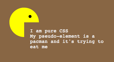
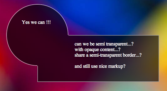
This example has a full transparent div ...the circle is a "pacman"- shape: http://jsfiddle.net/pixelass/nPjQh/14/
Managing the offset of the circle
Look at these examples that handle the offset of the circle (NOT USING PSEUDEO-ELEMENTS)
1:1 copy of the OP's code (15px offset): http://jsfiddle.net/pixelass/nPjQh/12/
With a lot smaller offset (5px): http://jsfiddle.net/pixelass/nPjQh/13/
(the content has the same opacity as the circle)
How does the offset work?
Control the background-size vs. the top and left
Rules:
top = left;
background-size = elementHeight * 2 + top * 2;
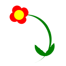
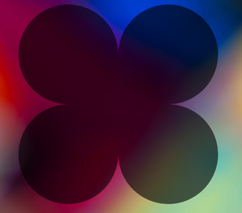
Look at the flower (it is also only one <div> with pseudo-elements)
the background-size is bigger than the circle. which creates the green leaves on the bottom
http://jsfiddle.net/pixelass/nPjQh/15/
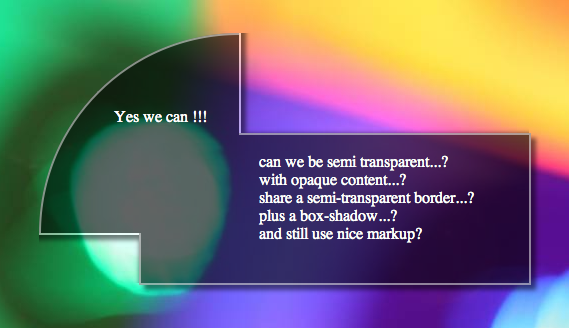
CURRENT PROBLEM
See this fiddle: http://jsfiddle.net/pixelass/nPjQh/16/
If not using another layer as seen in the examples at the top of the post the content will be transparent. So if you only need an image inside the circle the above examples will work fine.
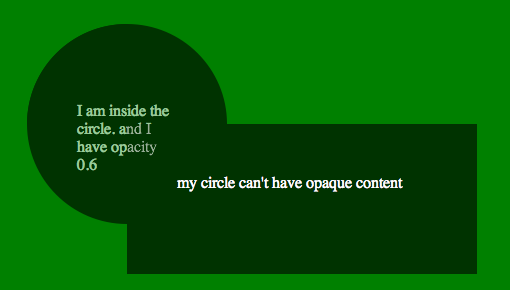
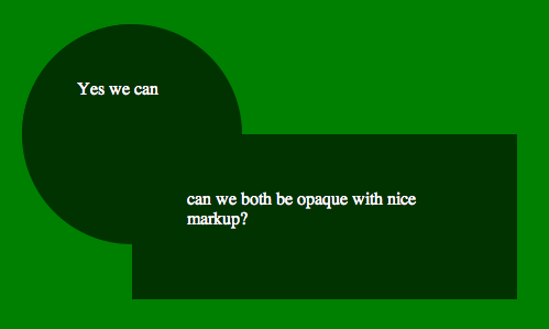
HOW TO SOLVE THIS ISSUE
If you need a canvas or another div inside the circle you would have to put the circle on the div and layer the needed div over the circle
See this fiddle: http://jsfiddle.net/pixelass/nPjQh/17/
change around a little and it will work fine. GET THE CODE FROM THE FIDDLE
Different shape /advanced Styling
If you use a different shape with flat sides, you could even put a border around the sum of the two divs.. or even add a box shadow
still using the simple markup of....
<div id="foo">
    <div id="bar">
    </div>
</div>
See the fiddle for the box-shadow: http://jsfiddle.net/pixelass/nPjQh/21/
Apply a border to the circle
Using -webkit-mask-image we could add a border to the circle.
http://jsfiddle.net/pixelass/nPjQh/24/
More examples:
Four circles around the div
http://jsfiddle.net/pixelass/nPjQh/25/
Markup:
<div id="foo">
    <div id="bar1"></div>
    <div id="bar2"></div>
    <div id="bar3"></div>
    <div id="bar4"></div>
</div>
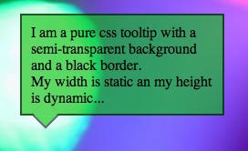
Using this technique to make a tooltip
http://jsfiddle.net/pixelass/nPjQh/31/
Markup:
<div id="foo">
    <div id="bar"></div>
    I am a pure css tooltip with a semi-transparent background and a black border. <br/>
    My width is static an my height is dynamic...
</div>
Overlapped elements with opacity and handling the 'hover' on those
There's a CSS only solution, which makes it a bit more efficient. Like this for example:
body {  background-image: linear-gradient(45deg, transparent 50%, #aaa 75%);  background-size: 20px 20px;}
#a {  position: absolute;  width: 150px;  height: 150px;  top: 50px;  left: 50px;  background: rgba(255, 0, 0, 1);}
#b {  position: absolute;  width: 150px;  height: 150px;  top: 125px;  left: 125px;  background: rgba(255, 0, 0, 1);}
#wrapper {  opacity: 0.5;}
/* instead of changing the classes,  you can use selectors like this:*/
#wrapper:hover #a:hover,#wrapper:hover #b:hover {  opacity: 1;  z-index: 10;}
#wrapper:hover {  opacity: 1;}
#wrapper:hover #b,#wrapper:hover #a {  opacity: 0.5;  z-index: -1;}
<div id=wrapper> <div id="a"> </div> <div id="b"> </div></div>CSS overlapping elements & opacity issue
Try and think of it like percentage sales. It's a bit different, but the analogy gives sense of what's happening. When a $10 item is 80% off, then you take off an additional 20%, it's' not 100% off (80% + 20%). You calculate final price like this:
$10 * (1 - 0.8) = $2 * (1 - 0.2) = $1.60.
50% opacity means, 50% of the light is blocked. So when you stack two 50% opacity elements, that means 50% of the light is blocked and 50% more light is blocked by the additional layer. Since only 50% light is coming through the first layer, only 50% of that additional light is blocked. So the calculation would be:
50% + (50% * 50%) = 75% opacity.
DEMO
.num2 {
    opacity: 0.75;
}
Double Div Centering And Overlapping Using FlexBox Only
For cross browser support, you need to use transform: translate, since browsers deal with absolute elements differently
text{
    position: absolute;
    left: 0;
    width: 100%;
    top: 50%;
    transform: translateY(-50%);
    text-align: center;
}
Stack snippet
container{    display:flex;    background: #DDD;    position: absolute;    color: rgba(0,0,0,0);    width: 300px;    height: 300px;}
svg {    margin: auto; /* CENTERSsvg graphic in the middle of container WORKS ELEGANTLY */    width: 100px;    height: 100px;    opacity:1;    fill: red;    transition: all 500ms ease;}
text{    position: absolute;    left: 0;    width: 100%;    top: 50%;    transform: translateY(-50%);    text-align: center;}
container:hover svg {    opacity: 0;}
container:hover text {    color: black;    opacity: 1;    transition: all 500ms ease;}
<a href="#"> <container> <svg viewBox="0 0 200 200"><rect width="200" height="200" /></svg> <text>Here Goes My Centered Text</text> </container></a>If two partially opaque shapes overlap, can I show only one shape where they overlap?
You can use a filter to tweak the opacity value. Say, both shapes have an opacity value of .5, then you want to make the area where both overlap to have an opacity value of .5 as well.
<svg xmlns="http://www.w3.org/2000/svg" width="300px" height="300px">
  <filter id="constantOpacity">
    <feComponentTransfer>
      <!-- This transfer function leaves all alpha values of the unfiltered
           graphics that are lower than .5 at their original values.
           All higher alpha above will be changed to .5.
           These calculations are derived from the values in
           the tableValues attribute using linear interpolation. -->
      <feFuncA type="table" tableValues="0 .5 .5" />
    </feComponentTransfer>
  </filter>

  <line x2="300" y2="300" stroke="black" stroke-width="10"/>
  <path d="M0 150h300" stroke="blue" stroke-width="10"/>
  <g filter="url(#constantOpacity)">
    <rect x="50" y="50" width="150" height="150" opacity=".5" fill="green" id="rect1"/>
    <rect width="150" height="150" opacity=".5" fill="red" id="rect2"
          x="100" y="100"/>
  </g>
</svg>
How can I independently detect hover on 2 partially overlapping div s?
Consider two elements, where the second one (green) is relatively positioned on top of the first one (yellow).
<div id="yellow"></div>
<div id="green"></div>
This is the problem: Problem
When you mouse over the yellow and green elements, it works great.
But if you are over the overlaped area, only the green div detects it, because the green is on top of the yellow.
The solution is to do a mousemove on the green, and temporarily hide it in order to read if there is any element at the current mouse position, then immediately show it back again. If there is some element underneath, then just trigger that element's mouseover.
Solution
Now, when you mouse over the overlaped area, both elements are notified.
EDIT
Now that you posted your fiddle, I can see your problem. You cannot "force" pseudo-classes as hover to happen on elements. You can check the specs here.
The easiest workaround, is to add another class myhover as
.table:hover,
.table.myhover {
    background-color: green;
}
and show it or removed it, when you enter or exit respectively.
$('.controlhover').hover(function () {
    $('.table').addClass('myhover');
}, function () {
    $('.table').removeClass('myhover');
});
http://jsfiddle.net/Gkgrx/1/
I think you got the idea. .table:hover is used naturally when the mouse is over the .table element. .table.myhover is used "artificially" when the mouse is over an element that overlaps the .table.
It was hard to understand where your .controlhover was, so I added a blue border.
Tip: You don't need to specify bottom: 0px in your css. 0px is the same as 0em, 0 whatever, so just use bottom:0 and top:0 and so on.
Related Topics
Browser Support for CSS :First-Child and :Last-Child
Webfont Smoothing and Antialiasing in Firefox and Opera
Font Weight Turns Lighter on MAC/Safari
On Ie CSS Font-Face Works Only When Navigating Through Inner Links
What's the Maximum Pixel Value of CSS Width and Height Properties
How to Use Apple's New San Francisco Font on a Webpage
Add Ellipses to Overflowing Text in Svg
Vertical Align Table-Cell Don't Work with Position Absolute
Less CSS: Abusing the & Operator When Nesting
Absolute Positioning Ignoring Padding of Parent
What Does @-Moz-Document Url-Prefix() Do
First-Child Full-Width in Flexbox
Input Height Differences in Firefox and Chrome
Put Background Image Over Text
Comparison of Loading CSS Inline, Embedded and from External Files