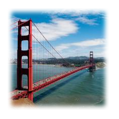
How to fade out sides of images?
Here's one way to skin this cat:
HTML:
<div class="frame">
  <div class="fade"></div>
  <img src="picture.jpg" alt="Sample Image"/>
</div>
CSS:
.frame {
    width: 315px;
    height: 165px;
    margin: 20px;
    position: relative;
}

.fade {
    height: 100%;
    width: 100%;
    position:absolute;
    background: -webkit-linear-gradient(left,
                rgba(0,0,0,0.65) 0%,
                rgba(0,0,0,0) 20%,
                rgba(0,0,0,0) 80%,
                rgba(0,0,0,0.65) 100%
    );
}
Personally, I'm not a huge fan of the (semantically) unnecessary fade div, and I'm sure there's probably a more clever way to do the same effect without it, but it'll work.
I only included the webkit prefixed rule, if you want to get legit you'd need to add the other vendor prefixes.
Fiddle here.
Update:
If the image is just serving as background—as is the case in your linked example—the gradient and image can both be set on the css for the containing element:
.frame {
  width: 315px;
  height: 165px;
  margin: 20px;

  background-image: url(picture.jpg);
  background-image: -webkit-linear-gradient(left,
    rgba(0,0,0,0.9) 0%,
    rgba(0,0,0,0) 20%,
    rgba(0,0,0,0) 80%,
    rgba(0,0,0,0.9) 100%
  ),
  url(picture.jpg);
}

...

<div class="frame">
  Content...
</div>
Less muss, less fuss: new-style fiddle with vendor prefixes and everything.
How to fade edges of background image of element to blend in with the main background image?
You can use the mask-* CSS properties to achieve the effect.
The following example produce a 10px long fading edge.
.body {
  display: grid;
  width: 200px;
  height: 200px;
  /* replace with the image you like here */
  background-image: repeating-linear-gradient(-45deg,
      yellow,
      yellow 20px,
      black 20px,
      black 40px);
}

.content {
  margin: 25px;
  /* replace with the image you like here */
  background-image: linear-gradient(to top, blue 0%, blue 100%);

  /* for webkit-based browsers */
  -webkit-mask-image:
    linear-gradient(to top, black 0%, black 100%),
    linear-gradient(to top, transparent 0%, black 100%),
    linear-gradient(to right, transparent 0%, black 100%),
    linear-gradient(to bottom, transparent 0%, black 100%),
    linear-gradient(to left, transparent 0%, black 100%);
  -webkit-mask-position:
    center,
    top,
    right,
    bottom,
    left;
  -webkit-mask-size:
    100% 100%,
    100% 10px,
    10px 100%,
    100% 10px,
    10px 100%;
  -webkit-mask-repeat:
    no-repeat,
    no-repeat,
    no-repeat,
    no-repeat,
    no-repeat;
   -webkit-mask-composite:
    source-out,
    source-over,
    source-over,
    source-over;

   /* for browsers which have implemented the official spec */
  mask-image:
    linear-gradient(to top, black 0%, black 100%),
    linear-gradient(to top, transparent 0%, black 100%),
    linear-gradient(to right, transparent 0%, black 100%),
    linear-gradient(to bottom, transparent 0%, black 100%),
    linear-gradient(to left, transparent 0%, black 100%);
  mask-position:
    center,
    top,
    right,
    bottom,
    left;
  mask-size:
    100% 100%,
    100% 10px,
    10px 100%,
    100% 10px,
    10px 100%;
  mask-repeat:
    no-repeat,
    no-repeat,
    no-repeat,
    no-repeat,
    no-repeat;
  mask-composite:
    subtract,
    add,
    add,
    add;
}
<div class="body">
<div class="content"></div>
</div>Blur the edges of an image or background image with CSS
If what you're looking for is simply to blur the image edges you can simply use the box-shadow with an inset.
Working example:
http://jsfiddle.net/d9Q5H/1/
HTML:
<div class="image-blurred-edge"></div>
CSS
.image-blurred-edge {
    background-image: url('http://lorempixel.com/200/200/city/9');
    width: 200px;
    height: 200px;
    /* you need to match the shadow color to your background or image border for the desired effect*/
    box-shadow: 0 0 8px 8px white inset;
}
How to have a image fade out without another div
Have you tried this?
.card-image {  opacity: 1;  transition: all 1s ease;}
.card-image:hover {  opacity: 0.75;  transform: scale(1.05);}
How do I fade the edges of an image in Java? (example given)
You would have to edit each of the pixels individually. The main idea of this solution is that you have the center of an image, and each pixel is changed as a function of the distance to the center.
More simply put, pixels farther from the center will be made darker.
This is what your code would look like:
BufferedImage cat; //assuming it is assigned
for(int i = 0; i < cat.getWidth(); i++) { // i is the x coord
    for(int j = 0; j < cat.getHeight(); j++) { // j is the y coord
        int color = cat.getRGB(i, j);
        int r = (color >> 16) & 0xff; //extract red value
        int g = (color >> 8) & 0xff;
        int b = color & 0xff;
        double scale = 0.75; /**** Change this to change the resulting effect ****/
        //pixel's distance from center
        double dist = Math.sqrt( Math.pow(i - cat.getWidth()/2, 2) + Math.pow(j - cat.getHeight()/2, 2) );
        r = (int) Math.max(0, r - dist*scale); //r - dist*scale makes px darker
        g = (int) Math.max(0, g - dist*scale); //Math.max makes sure r is always >= 0
        b = (int) Math.max(0, b - dist*scale);
        int newRGB = (r << 16) + (g << 8) + b; //convert r,g,b to single int
        cat.setRGB(i, j, newRGB); //finally, update rgb value
    }

}
And, when I ran this code: 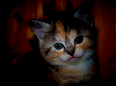
Remember, you can always change the effect by changing the scale variable in the code above.
Image Right Edge Fade/Blur CSS
Two methods
Let's make this:
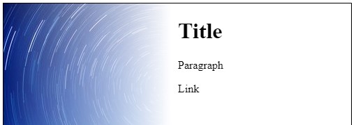
1. Using box-shadow
Browser Compatibility: IE 9 + for box-shadow.
Place appropriate
box-shadowinset in the divThe div is given left padding to line it's text up with the white part of the background (the
box-sizing: border-boxessentially absorbs the padding into the width)
Box-shadow example
div {
  background: url(https://i.stack.imgur.com/AF4np.jpg) no-repeat;
  height: 500px;
  width: 500px;
  border: solid 1px #000;
  padding-left: 300px;
  box-sizing: border-box;
  box-shadow: inset -350px 0 100px 0 #FFF;
}
<div>
<h1>Title</h1>
<p>Paragraph</p>
<a>Link</a>
</div>Fade in fade out images with scroll then scroll page content
I didn't see a possible solution to the problem by improving your code. This is a personal approach.
What I'm doing here, is changing the opacity of the element one inside the cover container as the user scrolls down the page, revealing the image below. After the opacity changes have been done, the script will change the filling container display style property from none to block. This element is just meant to fill the upper side of the cover container to prevent it from moving up when the position style property is changed from fixed to null.
And the reversed logic applies when scrolling back up.
const one = document.getElementById('one')
const cover = document.getElementById('cover')
const filling = document.getElementById('filling')

window.addEventListener('scroll', () => {
  let scrollY = window.scrollY
  let bottomHeight = window.innerHeight

  if(scrollY / bottomHeight <= 1){
    one.style.opacity = 1 - ( scrollY / bottomHeight )
    cover.style.position = 'fixed'
    filling.style.display = 'none'
  }
  else{
    cover.style.position = null
    filling.style.display = 'block'
  }
})
*{padding:0;margin:0;border-size: border-box}
body{
height: 3500px;
}
img {
width: 100%;
height: 100vh;
}
#filling{
height:100vh;
width:100%
}
#cover{
height:100vh;
width:100%;
}
#cover > div{
height:100vh;
width:100%;
position:absolute;
}
#one{
z-index:2;
}
#two{
z-index:1;
}<body>
<div id='filling' style='display:none'>
</div>
<div id='cover' style='position:fixed'>
<div id='one'>
<img src='https://picsum.photos/id/200/1000/1000'>
</div>
<div id='two'>
<img src='https://picsum.photos/id/201/1000/1000'>
</div>
</div>
<div>
<img src='https://picsum.photos/id/206/1000/1000'>
</div>
<div style='margin-top:-10px'>
<img src='https://picsum.photos/id/204/1000/1000'>
</div>
<div style='margin-top:-10px'>
<img src='https://picsum.photos/id/208/1000/1000'>
</div>
</body>Related Topics
CSS - Smooth Button Gradient Color Transition on Hover
Webkit-Font-Smoothing: Suddenly Different Results in Chrome and Safari
CSS Selector Wildcard Inside Class Name
Angular2 Module Level Stylesheets
Using CSS Approach How to Set an Image to Fill a Path in Svg
Stop Div Resizing Parent Div Using CSS
Make Entire CSS Sheet !Important
How to Change Parent Style by Child: Hover Action in Less
Applying a Clearfix to Nth-Child Without Additional Markup
How to Prevent CSS Declaration Dropped Errors Cross Browser
How to Make a Blinking Image in CSS3
How to "Hack" The Thunderbird Lightning Extension to Fully Color Categories
Why Do Browsers Render Rgba Differently on Osx
Targeting Specific Column in Table
Use Flexbox and Maintain an Aspect Ratio Even Though Content Is Sized Differently