How to easily change a font-sizing from px to em for a big, existing site?
It depends on your existing stylesheet, but it’s probably not going to be quick I’m afraid (assuming you want the site to look the same after you’re done).
Potential Problems
When text is sized in pixels, the visual size of the text will be the same as what you put in the CSS. For example, the CSS p {font-size: 12px;} will result in all <p> tags having a font size of 12 pixels.
However, when text is sized in ems, the visual size is calculated relative to the font size of its nearest ancestor.
So, if you had the following CSS:
body {font-size: .625em;}

p {font-size: 1.2em;}

.header {font-size: 1.5em;}
And the following HTML:
<body>

<p>Paragraph</p>

<div class="header>
    <p>Paragraph inside header</p>
</div>

</body>
Then the visual font size of the first paragraph would be 1.2 (paragraph’s size) × .625 (body’s font size) × 16 pixels (the default root font size of all modern browsers) = 12 pixels.
But the visual size of the second paragraph would be 1.2 (paragraph’s size) × 1.5 (.header’s size) × .625 × 16 pixels = 18 pixels.
If you don’t have a lot HTML elements with different font sizes nested within each other, then you’re fine. But you’ll need to check that yourself in the HTML — it could be difficult to tell from the stylesheet alone, especially if it’s a big site.
Approach
In terms of approach, when sizing fonts in ems, it’s easiest if the design for your site doesn’t have too many different font sizes. I prefer to set the <body> element to the most commonly-used font size, e.g.
body {
    font-size: .75em;/* 12px */
}
Then you only change from that when you need to, e.g.
h2 {
    font-size: 1.5em; /* 16px */
}
Otherwise you can end up sizing and resizing a lot when nesting happens. This can be particularly annoying for e.g. <li>s.
Of course, this approach only works if the design for the site doesn’t include lots of different font sizes.
Some people set body to 0.625em because that equals 10px (16 × 0.625 = 10), meaning for elements that don’t have an ancestor with a set font size, 1em = 10px, 1.1em = 11px and so on. Personally, I think that adds more complexity than it removes, but I’ve never done a comparison.
Either way, I find it really helpful to put the intended visual font size in comments after each use of font-size, as above. That way, you remember what font size the element was meant to be if it gets re-nested in the HTML.
Is sizing fonts using em still relevant?
Do not specify the font-size in absolute length units for screen stylesheets. They render inconsistently across platforms and can't be resized by the User Agent (e.g browser). Keep the usage of such units for styling on media with fixed and known physical properties (e.g print)
If you will use this method, no need to calculate
You can set the font-size of the body to 62.5%(that is 62.5% of the default of 16px), which equates to 10px, or 0.625EMs. Now you can set your font-size in EMs with an easy to remember conversion, divide the px by 10.
* 12px = 1.2EMs
* 13px = 1.3EMs
* 16px = 1.6EMs
* 8px = 0.8EMs
* etc…
This makes everything SUPER easy to remember and eliminates the need for conversion tables. Of course, you will still need to use a conversion table for nested elements when using EMs, if you are not being specific in your CSS, which is a whole separate issue.
But 76% is much better and you can use this to calculate http://pxtoem.com/
Yes it's still relevant:
IE6 is still widely used and is unable to resize the fonts defined in px. => Usability issues. That alone is a no-no.
and
IE 7 and 8 don't resize text sized with pixels either, actually. They do have page zoom, but some people prefer to incease text size only.
Here's a summary of what's good and bad about font sizing in general.
Font size in css http://easycaptures.com/fs/uploaded/213/2470522253.png
I personally like ems. Others, like Chris Coyier over at CSS-Tricks.com likes pixels. (Chris has an excellent article on the different font units).
It really comes down to personal preference.
Almost similar or related questions on SO
Should we still use em and % for defining the font-size of the website elements?
Is there really any point to using relative font sizing in CSS?
Why em instead of px?
Font size in CSS - % or em?
CSS font size: relative vs. absolute values. Which to use?
Problem with EM
Using relative instead of fixed size in CSS
Helpful online tool for px to em
http://pxtoem.com/
http://riddle.pl/emcalc/
http://convert-to.com/pixels-px-to-em-conversion.html
Convert entire site from px to em (This tool is still in development)
http://converter.elementagency.com/
EM Calculator AIR application (will work on all os)
http://jameswhittaker.com/journal/em-based-layouts-vertical-rhythm-calculator/
http://jameswhittaker.com/projects/apps/em-calculator-air-application/
Windows apps
http://www.thebrightlines.com/2009/11/16/pixem-pixel-to-em-converter/
http://www.storkas.com/Projects.aspx(go at bottom)
Pixels to Ems Conversion Table for CSS
http://jontangerine.com/silo/css/pixels-to-ems/
http://reeddesign.co.uk/test/points-pixels.html
emchart
http://aloestudios.com/tools/emchart/
http://aloestudios.com/code/emchart/
Some more articles on this issue
http://www.d.umn.edu/itss/support/Training/Online/webdesign/type.html
How to change font size to em
Generally I set the body size to a fixed pixelage and then em the rest:
body {
    font-size: 14px;
}
p {
    font-size: 1em;
}
h1 {
    font-size: 2em;
}
h2 {
    font-size: 1.8em;
}
This gives a p size of 14px, h1 of 28px, h2 of 25px.
Equally if you want to use whatever size the browser uses just use:
body {
    font-size: 1em;
}
When setting the font size in CSS, why not set body to 6.25% so that px and em units are the same?
Two issues.
I seem to remember that if you set your initial font size quite small using a relative unit like ems, if the user resizes the text Internet Explorer, the font size will change quite a lot between the settings.
It’s an odd phenomenon, and I’m not sure if it still occurs in IE, nor if you’re worried about users in IE who change the font size.
You’re potentially condemning yourself to re-setting the font size every time you nest elements.
An answer I wrote to another question tries its best to explain this, but in short, if you’re doing your font sizes in ems, you’re better off using
font-sizeas little as possible, rather than making it ever-so-slightly easier to usefont-sizewhen you do.For example: say you want all
<li>s on the site to use a font size of 12 pixels.li {
font-size: 12em;/* 12px */
}If you then use the following HTML:
<ul>
    <li>
        <ul>
            <li>
            ...
Then you need to do this:
li li {
    font-size: .083em;/* 12px */
}
Otherwise the inner
<li>s will be 12 pixels * 12 pixels = 144 pixels!Ems aren’t pixels. Ems refer to a percentage of the nearest ancestor’s font size, whereas pixels refer to actual pixels. In my opinion, trying to turn ems into pixels is more confusing than the alternative. You’re better off setting
<body>to the most commonly used font size on the site, only changing from that when you need to, and putting the intended size in pixels in a comment after your em-based declaration. (That way, it’s easier to tell later if you’ve got something wrong.)(Of course, the only reason we avoid pixels is because IE doesn’t change the size of text sized in pixels when the user changes the font size in the browser. If you’re not worried about that, then just use pixels.)
Why em instead of px?
The reason I asked this question was that I forgot how to use em's as it was a while I was hacking happily in CSS. People didn't notice that I kept the question general as I wasn't talking about sizing fonts per se. I was more interested in how to define styles on any given block element on the page.
As Henrik Paul and others pointed out em is proportional to the font-size used in the element. It's a common practice to define sizes on block elements in px, however, sizing up fonts in browsers usually breaks this design. Resizing fonts is commonly done with the shortcut keys Ctrl++ or Ctrl+-. So a good practice is to use em's instead.
Using px to define the width
Here is an illustrating example. Say we have a div-tag that we want to turn into a stylish date box, we may have HTML-code that looks like this:
<div class="date-box">
    <p class="month">July</p>
    <p class="day">4</p>
</div>
A simple implementation would defining the width of the date-box class in px:
* { margin: 0; padding: 0; }

p.month { font-size: 10pt; }

p.day { font-size: 24pt; font-weight: bold; }

div.date-box {
    background-color: #DD2222;
    font-family: Arial, sans-serif;
    color: white;
    width: 50px;
}
The problem
However, if we want to size the text up in our browser the design will break. The text will also bleed outside the box which is almost the same what happens with SO's design as flodin points out. This is because the box will remain the same size in width as it is locked to 50px.
Using em instead
A smarter way is to define the width in ems instead:
div.date-box {
    background-color: #DD2222;
    font-family: Arial, sans-serif;
    color: white;
    width: 2.5em;
}

* { margin: 0; padding: 0; font-size: 10pt; }

// Initial width of date-box = 10 pt x 2.5 em = 25 pt
// Will also work if you used px instead of pt
That way you have a fluid design on the date-box, i.e. the box will size up together with the text in proportion to the font-size defined for the date-box. In this example, the font-size is defined in * as 10pt and will size up 2.5 times to that font size. So when you're sizing the fonts in the browser, the box will have 2.5 times the size of that font-size.
Font scaling based on size of container
If the container is not the body, CSS Tricks covers all of your options in Fitting Text to a Container.
If the container is the body, what you are looking for is Viewport-percentage lengths:
The viewport-percentage lengths are relative to the size of the initial containing block. When the height or width of the initial containing block is changed, they are scaled accordingly. However, when the value of overflow on the root element is auto, any scroll bars are assumed not to exist.
The values are:
vw(% of the viewport width)vh(% of the viewport height)vi(1% of the viewport size in the direction of the root element's inline axis)vb(1% of the viewport size in the direction of the root element's block axis)vmin(the smaller ofvworvh)vmax(the larger orvworvh)
1 v* is equal to 1% of the initial containing block.
Using it looks like this:
p {
    font-size: 4vw;
}
As you can see, when the viewport width increases, so do the font-size, without needing to use media queries.
These values are a sizing unit, just like px or em, so they can be used to size other elements as well, such as width, margin, or padding.
Browser support is pretty good, but you'll likely need a fallback, such as:
p {
    font-size: 16px;
    font-size: 4vw;
}
Check out the support statistics: http://caniuse.com/#feat=viewport-units.
Also, check out CSS-Tricks for a broader look: Viewport Sized Typography
Here's a nice article about setting minimum/maximum sizes and exercising a bit more control over the sizes: Precise control over responsive typography
And here's an article about setting your size using calc() so that the text fills the viewport: http://codepen.io/CrocoDillon/pen/fBJxu
Also, please view this article, which uses a technique dubbed 'molten leading' to adjust the line-height as well. Molten Leading in CSS
What is the em font-size unit? How much is it in pixels?
Despite what you may read elsewhere, there is no direct relationship between em and px.
As one of the links states:
the "em" value is based
on the width of the uppercase M
So it's going to be different for every font. A narrow font might have the same height (in px) as an extended font, but the em size will be different.
EDIT three years later:
There are now lots of sources which say that 1em = font size (in px). That is, when you write font-size:16px, then 1em = 16px. This still doesn't agree with the Adobe source (which says 1em = the font size in pt), but in either case it seems bizarre; the em size would be far too large with condensed fonts and far too small with extended fonts.
I'm going to make some test pages and see for myself.
And also:
I see that nobody (including me) actually answered the question (which was kind of hidden):
I also read somewhere about some ie bug and to overcome that set body font-size to something
According to this page, you need to add this to your css: html{ font-size:100%; }. That page is six years old, and I haven't read the (hundreds) of comments, so I don't know if it's still relevant.
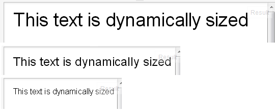
Responsive font size in CSS
The font-size won't respond like this when resizing the browser window. Instead they respond to the browser zoom/type size settings, such as if you press Ctrl and + together on the keyboard while in the browser.
Media Queries
You would have to look at using media queries to reduce the font-size at certain intervals where it starts breaking your design and creating scrollbars.
For example, try adding this inside your CSS at the bottom, changing the 320 pixels width for wherever your design starts breaking:
@media only screen and (max-width: 320px) {

   body {
      font-size: 2em;
   }

}
Viewport percentage lengths
You can also use viewport percentage lengths such as vw, vh, vmin and vmax. The official W3C document for this states:
The viewport-percentage lengths are relative to the size of the initial containing block. When the height or width of the initial containing block is changed, they are scaled accordingly.
Again, from the same W3C document each individual unit can be defined as below:
vw unit - Equal to 1% of the width of the initial containing block.
vh unit - Equal to 1% of the height of the initial containing block.
vmin unit - Equal to the smaller of vw or vh.
vmax unit - Equal to the larger of vw or vh.
And they are used in exactly the same way as any other CSS value:
.text {
  font-size: 3vw;
}

.other-text {
  font-size: 5vh;
}
Compatibility is relatively good as can be seen here. However, some versions of Internet Explorer and Edge don’t support vmax. Also, iOS 6 and 7 have an issue with the vh unit, which was fixed in iOS 8.
HTML5 Canvas Font Size Based on Canvas Size
Simply scale the font-size with a factor.
The basis
Lets say your canvas default size is 1000 pixels and the font size is 80 pixels (canvas converts pt to pixels - I use 80 here for simplicity, see bottom).
That will create a relationship of:
ratio = 80 / 1000 = 0.08
Lets verify when canvas width is 1000 by multiply with that ratio:
fontSize = 1000 * ratio = 80;
And we see we have 80 for the font as expected.
Now that the canvas size is smaller, lets say 500 pixels:
fontSize = 500 * ratio = 40;
That should correspond about to the relationship. Note that fonts do not behave linearly like that but it will be approximately correct.
Now simply set the size of the font:
ctx.font = (fontSize|0) + 'px myFont';
Solution
The final code from this is in essence very simple:
var fontBase = 1000,                   // selected default width for canvas
    fontSize = 70;                     // default size for font

function getFont() {
    var ratio = fontSize / fontBase;   // calc ratio
    var size = canvas.width * ratio;   // get font size based on current width
    return (size|0) + 'px sans-serif'; // set font
}
Every time you need to update the font (ie. resize) just call:
ctx.font = getFont(); // call getFont to set new font size
The default values are snapshot of whatever size works in the moment/during development.
Live demo
To convert point to pixel size you simply use system DPI / 72:
80 pt * (96 / 72) = 107 pixels @ 96 DPI.
Related Topics
Why Is The Top Border of This Inline Element Not Displaying and Why Does Using Float Correct This
How to Center an Inline Div Using CSS
Insert Ruby in HTML Class=" " Property
CSS: How to Make Left Float Div to Adjust Height Dynamically
Font Face Not Working for Custom Language Characters
How to Vertically Align Two or More (Side by Side) Elements in a Div
How to Show Image in Right Side of Text Box Instead of Left Side
Changing The Style of Radio Buttons in Jquery Mobile 1.4.0
HTML5 Video Background Color Not Matching Background Color of Website - in Some Browsers, Sometimes
@Import Browser Compatibility 2013
Where to Add Global CSS in an Angular 2 Application Made with Visual Studio 2017 Angular Template
CSS Text Replace with Image, Need Hyperlink
Div Gets Misplaced on Text Insertion and Text Goes Out of Div
How to Position Two Divs Above Each Over
Yii2 - Detailview Widget Float Left
Vertically Center Constrained Image in Bootstrap Thumbnail