How to draw a circle sector in CSS?
CSS and Multiple Background Gradients
Rather than trying to draw the green portion, you could draw the white portions instead:
pie {
    border-radius: 50%;
    background-color: green;
}

.ten {
    background-image:
        /* 10% = 126deg = 90 + ( 360 * .1 ) */
        linear-gradient(126deg, transparent 50%, white 50%),
        linear-gradient(90deg, white 50%, transparent 50%);
}
pie {
  width: 5em;
  height: 5em;
  display: block;
  border-radius: 50%;
  background-color: green;
  border: 2px solid green;
  float: left;
  margin: 1em;
}

.ten {
  background-image: linear-gradient(126deg, transparent 50%, white 50%), linear-gradient(90deg, white 50%, transparent 50%);
}

.twentyfive {
  background-image: linear-gradient(180deg, transparent 50%, white 50%), linear-gradient(90deg, white 50%, transparent 50%);
}

.fifty {
  background-image: linear-gradient(90deg, white 50%, transparent 50%);
}


/* Slices greater than 50% require first gradient
   to be transparent -> green */

.seventyfive {
  background-image: linear-gradient(180deg, transparent 50%, green 50%), linear-gradient(90deg, white 50%, transparent 50%);
}

.onehundred {
  background-image: none;
}
<pie class="ten"></pie>
<pie class="twentyfive"></pie>
<pie class="fifty"></pie>
<pie class="seventyfive"></pie>
<pie class="onehundred"></pie>Filling circle sector in CSS
I think that what you want is achieved changing this part of the script
var start =  hoursStart + 90;
var end = hoursEnd - 90;


$(".clock")
    .css("background-color", "blue")
    .css("background-image",
    "linear-gradient(" + end +"deg, #e74c3c 50%, transparent 50%),linear-gradient(" + start +"deg, #e74c3c 50%, transparent 50%)");
// These fields come from servervar start_hour = 7;var end_hour = 10;
var hoursStart = (start_hour + 0 / 60 + 20 / 60 / 60) * 360 / 12;$(".start").css("transform", "rotate(" + hoursStart + "deg)");var hoursEnd = (end_hour + 0 / 60 + 20 / 60 / 60) * 360 / 12;$(".end").css("transform", "rotate(" + hoursEnd + "deg)");

var start = hoursStart + 90;var end = hoursEnd - 90;
$(".clock")  .css("background-color", "blue")  .css("background-image",    "linear-gradient(" + end + "deg, #e74c3c 50%, transparent 50%),linear-gradient(" + start + "deg, #e74c3c 50%, transparent 50%)");
body { background-color: #e74c3c;}
.container { margin: 40px auto 20px; width: 250px;}
.clock { border: 5px solid #FFF; border-radius: 100%; display: block; height: 250px; width: 250px; position: relative;}
.clock .start { background: #fff; height: 0; left: 50%; position: absolute; top: 50%; width: 0; -webkit-transform-origin: 50% 100%; -moz-transform-origin: 50% 100%; -o-transform-origin: 50% 100%; -ms-transform-origin: 50% 100%; transform-origin: 50% 100%; margin: -105px -2px 0; padding: 105px 2px 0;}
.clock .end { background: #fff; height: 0; left: 50%; position: absolute; top: 50%; width: 0; -webkit-transform-origin: 50% 100%; -moz-transform-origin: 50% 100%; -o-transform-origin: 50% 100%; -ms-transform-origin: 50% 100%; transform-origin: 50% 100%; margin: -105px -2px 0; padding: 105px 2px 0;}<script src="https://ajax.googleapis.com/ajax/libs/jquery/2.1.1/jquery.min.js"></script>
<div class="container"> <div class="clock"> <div class="start"></div> <div class="end"></div> </div></div>Segments in a circle using CSS3
Yes, you can get such slices of custom angles using either one of the following two methods:
- If you don't need the slices to be elements themselves, the you can simply do it with one element and linear gradients - see this rainbow wheel I did last month.
- If you need the slices to be elements themselves, then you can do it by chaining rotate and skew transforms - see this circular menu I did a while ago.
For #2, see also this very much simplified example I did right now.
.pie {
  overflow:hidden;
  position: relative;
  margin: 1em auto;
  border: dashed 1px;
  padding: 0;
  width: 32em; height: 32em;
  border-radius: 50%;
  list-style: none;
}
.slice {
  overflow: hidden;
  position: absolute;
  top: 0; right: 0;
  width: 50%; height: 50%;
  transform-origin: 0% 100%;
}
.slice:first-child {
  transform: rotate(15deg) skewY(-22.5deg);
}
.slice-contents {
  position: absolute;
  left: -100%;
  width: 200%; height: 200%;
  border-radius: 50%;
  background: lightblue;
}
.slice:first-child .slice-contents {
  transform: skewY(22.5deg); /* unskew slice contents */
}
.slice:hover .slice-contents { background: violet; } /* highlight on hover */
<ul class='pie'>
<li class='slice'>
<div class='slice-contents'></div>
</li>
<!-- you can add more slices here -->
</ul>Drawing a circle (with sectors) using HTML, CSS, or jQuery
How about Raphael.js?
From the web site:
Raphaël is a small JavaScript library
that should simplify your work with
vector graphics on the web. If you
want to create your own specific chart
or image crop and rotate widget, for
example, you can achieve it simply and
easily with this library....
Raphaël currently supports Firefox
3.0+, Safari 3.0+, Chrome 5.0+, Opera 9.5+ and Internet Explorer 6.0+.
How to create a circle with links on border side
The key to creating a circle with segments is to find points along the circle which would be used in the SVG path elements as coordinates. Finding points on a circle can be done easily using trigonometric equations if we know the angles.
X Coordinate of point = Radius of the circle * Cos(Angle in Radians) + X Coordinate of center point
Y Coordinate of point = Radius of the circle * Sin(Angle in Radians) + Y Coordinate of center point
Angle in Radians = Angle in Degrees * Math.PI / 180
The angles depend on the no. of segments that we have to create. The generic formula is (360 / no. of segments). So to create a circle with 6 segments, the angle covered by each of the segment would be 60 degrees. The first segment would cover from 0 to 60 degrees, second from 60 to 120 degrees and so on.
Demo of Circle with 6 Segments:
Below table shows how the points are calculated for a circle with 6 segments (where radius of circle is 50, center point is 55,55):
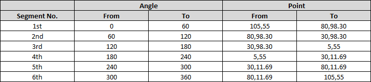
Once the points are calculated, coding the path itself is simple. The path should start and end at the center point (which is 50,50), from the center point, we should first draw a line to From Point and from there draw an arc to the To Point. Below is how a sample path would look like:
<path d='M55,55 L105,55 A50,50 0 0,1 80,98.30z' />
svg {
  height: 220px;
  width: 220px;
}
path {
  fill: transparent;
  stroke: black;
}
<svg viewBox='0 0 110 110'>
<path d='M55,55 L105,55 A50,50 0 0,1 80,98.30z' />
<path d='M55,55 L80,98.30 A50,50 0 0,1 30,98.30z' />
<path d='M55,55 L30,98.30 A50,50 0 0,1 5,55z' />
<path d='M55,55 L5,55 A50,50 0 0,1 30,11.69z' />
<path d='M55,55 L30,11.69 A50,50 0 0,1 80,11.69z' />
<path d='M55,55 L80,11.69 A50,50 0 0,1 105,55z' />
</svg>How to make a circle sector menu in CSS?
I hope this can help you.
A possible start point can be that:
https://jsfiddle.net/pablodarde/dp2zg895/
You can also check this documentation for advanced shape design with css.
https://css-tricks.com/examples/ShapesOfCSS/
CSS
#cone {
  width: 0;
  height: 0;
  border-left: 70px solid transparent;
  border-right: 70px solid transparent;
  border-top: 100px solid red;
  -moz-border-radius: 50%;
  -webkit-border-radius: 50%;
  border-radius: 50%;
}
How to draw a circle sector on an html5 canvas?
The following should work:
context.moveTo(cx,cy);
context.arc(cx,cy,radius,startangle,endangle);
context.lineTo(cx,cy);
context.stroke(); // or context.fill()
with cx, cy being the center of the arc.
Related Topics
Does CSS Have a :Blur Selector (Pseudo-Class)
Css Animation and Display None
Css Page-Break Not Working in All Browsers
Css Selector - Element With a Given Child
Ie7 Z-Index Issue - Context Menu
How to Use Font Awesome from Webjars.Org With Jsf
Gwt Theme Style Overrides My CSS Style
Css3 Transition - Fade Out Effect
How to Change an Input Button Image Using Css
Is the CSS :Not() Selector Supposed to Work With Distant Descendants
Does CSS Hover Work on Mobile Devices
Full-Screen Responsive Background Image
Css Transition Shorthand With Multiple Properties