Does CSS have a :blur selector (pseudo-class)?
There is no :blur pseudo-class in CSS.
The dynamic pseudo-classes, like other pseudo-classes and in fact all other selectors, represent states; they do not represent events or transitions between states in terms of the document tree. To wit: the :focus pseudo-class represents an element that is in focus; it does not represent an element that has just received focus, nor does there exist a :blur pseudo-class to represent an element that has just lost focus.
Similarly, this applies to the :hover pseudo-class. While it represents an element which has a pointing device over it, there is neither a :mouseover pseudo-class for an element that has just been pointed to nor a :mouseout pseudo-class for an element that has just been pointed away from.
If you need to apply styles to an element that is not in focus, you have two choices:
Use
:not(:focus)(with less browser support):input:not(:focus), button:not(:focus) {
/* Styles for only form inputs and buttons that do not have focus */
}Declare a rule that applies to any element regardless of its focus state, and override for elements that have focus:
input, button {
    /* Styles for all form inputs and buttons */
}

input:focus, button:focus {
    /* Styles for only form inputs and buttons that have focus */
}
CSS blur not working on pseudo element in chrome
Backdrop-filter was the CSS I was looking for. Using it fixed the issue.
Is there an opposite CSS pseudo-class to :hover?
Yes, use :not(:hover)
.child:not(:hover){
  opacity: 0.3;
}
.child {
  display: inline-block;
  background: #000;
  border: 1px solid #fff;
  width: 50px;
  height: 50px;
  transition: 0.4s;
}

.child:not(:hover) {
  opacity: 0.3;
}
<div class="parent">
<div class="child"></div>
<div class="child"></div>
<div class="child"></div>
<div class="child"></div>
<div class="child"></div>
</div>How can I blur text in a square using pseudo selectors?
You can consider overflow:hidden to stop the blur effect and have a sharpe edge. I also considered padding instead of adjusting top/left/right/bottom:
.container {  width: 400px;  height: 200px;  position: relative;  overflow: hidden;}
.text {  z-index: 1;  position: absolute;  width: auto;  bottom: 24px;  left: 24px;  font-size: 36px;  padding: 12px 22px; /*added this*/  overflow: hidden; /*added this*/}
.text::before {  content: "";  position: absolute;  z-index: -1;  top: 0;  bottom: 0;  left: 0;  right: 0;  background-color: red;  opacity: 0.4;  filter: blur(10px);}
<div class="container"> <h1 class="text">Example Text</h1></div>CSS blur filter not working on certain pseudo elements in MS Edge
This appears to be a limitation in our implementation. I'm filing an issue right now, and will have the appropriate team evaluate the repro as soon as possible. For now, the best option is likely to avoid positioning the image beneath the content (with a negative z-index), and instead position the content above the image (with a higher z-index).
Fiddle: https://jsfiddle.net/jonathansampson/610arg2L/
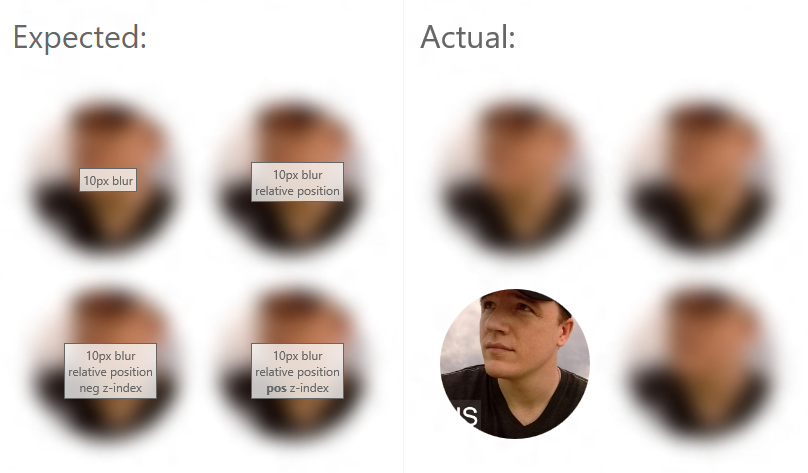
/* Above Fiddle contains sample CSS */
Filed Issue: https://developer.microsoft.com/en-us/microsoft-edge/platform/issues/9318580/
CSS pseudo class for leaving hover
Put the transitions on a.squares not a.squares:hover
a.squares {
    -webkit-transition: color 0.1s ease-in-out, background-color 0.1s ease-in-out, box-shadow 0.1s ease-in-out;
    -moz-transition: color 0.1s ease-in-out, background-color 0.1s ease-in-out, box-shadow 0.1s ease-in-out;
    transition: color 0.1s ease-in-out, background-color 0.1s ease-in-out, box-shadow 0.1s ease-in-out;
}
a.squares:hover, a.squares:active {
    color: black;
    background-color: #E8E8E8;
    box-shadow: 0 0 12px black;
    -webkit-border-radius: 15px;
    -moz-border-radius: 15px;
    border-radius: 15px;
}
I went through this exact thing when I was just leaving about transitions :)
:hover pseudo class not working on some elements
Your selector
.content:hover{
  filter: blur(10px);
}
Is being overridden by another selector
.showcase:hover::before {
  filter: blur(0px);
  -webkit-filter: blur(0px);
}
No matter if you hover over it, the showcase selector is taking effect instead.
The solution is setting a more specific hover selector.
.content:hover, .showcase:hover .content:hover {
  filter: blur(10px); // Covers the "double" hover.
}
body {
  background: rgba(0, 0, 0, 0.9);
  margin: 0;
  color: #fff;
  font-family: "Segoe UI", Tahoma, Geneva, Verdana, sans-serif;
}

.showcase::before {
  content: "";
  height: 100vh;
  width: 100%;
  background-image: url(https://image.ibb.co/gzOBup/showcase.jpg);
  background-size: cover;
  background-repeat: no-repeat;
  background-position: center;
  display: block;
  filter: blur(10px);
  -webkit-filter: blur(10px);
  transition: all 1000ms;
}

.content:hover, .showcase:hover .content:hover {
  filter: blur(10px);
}

.showcase:hover::before {
  filter: blur(0px);
  -webkit-filter: blur(0px);
}

.showcase:hover .content {
  filter: blur(2px);
  -webkit-filter: blur(2px);
}

.content {
  position: absolute;
  z-index: 1;
  top: 10%;
  left: 50%;
  margin-top: 105px;
  margin-left: -145px;
  width: 300px;
  height: 350px;
  text-align: center;
  transition: all 1000ms;
}

.content .logo {
  height: 180px;
  width: 180px;
}

.content .title {
  font-size: 2.2rem;
  margin-top: 1rem;
}

.content .text {
  line-height: 1.7;
  margin-top: 1rem;
}
<header class="showcase">
<div class="content">
<img
src="https://image.ibb.co/ims4Ep/logo.png"
class="logo"
alt="Traversy Media"
/>
<div class="title">Welcome To Traversy Media</div>
<div class="text">
Lorem ipsum dolor sit amet consectetur adipisicing elit. Vitae, vel.
</div>
</div>
</header>Related Topics
How to Automatically Crop and Center an Image
Select All Child Elements Recursively in Css
Difference Between CSS Height: 100% VS Height: Auto
Css: Center Element Within a ≪Div≫ Element
Set Flexbox Children to Have Different Heights to Use Up Available Space
Maintain Div Aspect Ratio According to Height
Add a CSS Class to Single Code Chunks in Rmarkdown
How to Change the Height of an Image in CSS :Before/:After Pseudo-Elements
Transition of Background-Color
Smallest Data Uri Image Possible For a Transparent Image
How to Build a 2 Column (Fixed - Fluid) Layout With Twitter Bootstrap
100Vw Causing Horizontal Overflow, But Only If More Than One
Ie7 Z-Index Issue - Context Menu
Css @Font-Face Absolute Url from External Domain: Fonts Not Loading in Firefox