How do min-content and max-content work?
Note: "width" in this text refers to the "logical width", not CSS's width; that is, the values are also valid for CSS's height, if the language direction is vertical (like east-asian languages) or in flexbox or grid. min-content and max-content are valid values for width, height, min-width, min-height, max-width, max-height and even more properties (like flex-basis).
What are the intrinsic dimensions of a box?
CSS sizing level 3 introduced the concept of intrinsic dimensions - the opposite of extrinsic. An extrinsic dimension of a box is calculated on the box's parent box. For example width: 80% is said an extrinsic dimension as the width of the subject depends on the width of its containing box.
Contrarily to that, width: min-content is said intrinsic as the width of the box is calculated on the dimension of the contents that the box itself contains.
Intrinsic dimensions are properties of the box itself, extrinsic dimensions are only available if the box is placed in the document and in a context that permits these values to be calculated. For example, in CSS-flow (the classic CSS layout mode), as you probably know, height: 20% has only effect if height is defined in the parent element (i.e. it's inheritable); that is a case of an extrinsic dimension that is not calculable (when an extrinsic value is not available, CSS fallbacks to its intrinsic equivalent). Instead height: min-content is always calculable, as it is intrinsic to the box itself, and it is always the same regardless of the box's placement (or the box's absence) in the document.
The definition of min-content and max-content has changed many times over the years but the result always stayed the same, and it is pretty straightforward to grasp. They were originally requested by the community as keywords for width, whose computed value would match the widths of a box when the box is floating. And indeed, the definition of these two properties was originally based on the behavior of float; now they are more generically defined as follows:
min-content
https://www.w3.org/TR/css-sizing-3/#min-content
The smallest size a box could take that doesn’t lead to overflow that could be avoided by choosing a larger size.
In other words, the smallest width of a box where the box's contents don't overflow the box itself.
A good way to visualize this is using, in fact, float.
/* the computed width of #red in this example
   equals to specifying #red { width: min-content } */
#blue        { width: 0px; }
#blue > #red { float: left; }
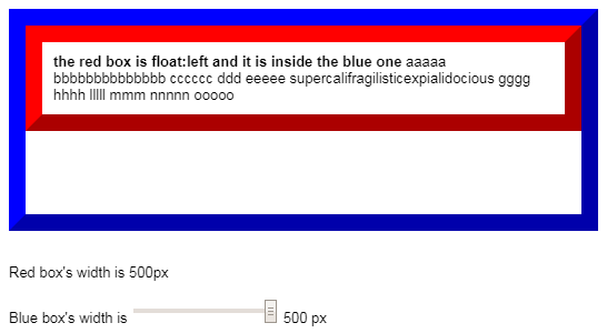
(GIF source: http://jsfiddle.net/6srop4zu/)
In the above GIF, the red box's min-content width equals the red box's width at the time the blue box's width is 0px (234px in the GIF, might be different in the jsfiddle).
As you can see, if the red box was made smaller, the word supercalifragilisticexpialidocious would overflow the red box, hence in this case the min-content equals the width of that particular word, as it is the one that takes the most space horizontally.
max-content
https://www.w3.org/TR/css-sizing-3/#max-content
A box’s “ideal” size in a given axis when given infinite available space. Usually this is the smallest size the box could take in that axis while still fitting around its contents, i.e. minimizing unfilled space while avoiding overflow.
/* the computed width of #red in this example
   equals to specifying #red { width: max-content } */

#blue        { width: 99999999999999999px; } /* ~infinite */
#blue > #red { float: left; }
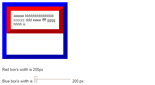
(GIF source: http://jsfiddle.net/nktsrzvg/)
In the above GIF, the red box's max-content width equals the red box's width when the blue box's width is infinite (386px in the GIF, might be different in the jsfiddle).
Here, the red box fully takes advantage of the available space on the x axis in the blue box, but without wasting it. The contents are allowed to expand on the relevant axis without restrictions, and the red box wraps them and at the point of maximum expansion.
What about fit-content, stretch and others? These properties are currently being revisited and as such they are not stable (date: July 2018). They will be added here when they get a bit more mature (hopefully soon).
What does `min-height: max-content` mean?
It's a bit tricky and you need to refer to the specification to understand this:
max-content
If specified for the inline axis, use the max-content inline size; otherwise behaves as the property’s initial value.
In your case you will fall in to the initial value because the inline size is the width and the block size is the height.
In the same specification you can also understand how to identify inline/block size

In other words, setting min-height:max-content will have no effect since it will get computed to the initial value but It works for the min-width since it's the inline size.
More details: https://www.w3.org/TR/css-writing-modes-4/#abstract-axes
What is the difference between min-content and max-content in a CSS Grid row?
You won't really see a difference since in most of the case, the width is first defined based on the text then the height will get computed later.
You may see a difference if you have a vertical text where the logic is inverted:
ul{ list-style-type: none; width: 400px; height: 200px; padding: 0; display: grid; grid-gap: 5px; grid-template-columns: repeat(2, 1fr); grid-template-rows: min-content max-content; box-shadow: 2px 2px 6px grey;}li { writing-mode: vertical-lr;}li:nth-child(1){ background-color: #b9e2ff;}
li:nth-child(2){ background-color: #ffa733;}
li:nth-child(3){ background-color: #8b33ff;}
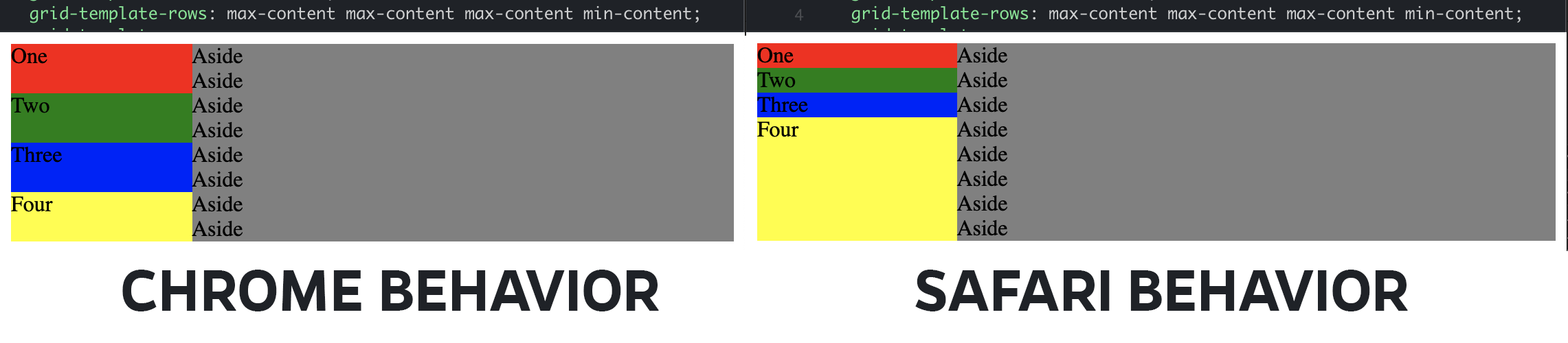
li:nth-child(4){ background-color: #ff3333;}<ul> <li>hello world hello world hello world hello world</li> <li>hello</li> <li>hello</li> <li>hello world hello world hello world hello world</li></ul>How max-content and min-content are evaluated for a row aside to a big grid-area in CSS grid?
If i'm not wrong, it's an edge case, the situation is due to how elements on multiple Grid Tracks are handled (by the browser implementation of the specification) to determine grid sizing.
In your example the algorithm to determine row allocated space failed to satisfy the repartition according to the grid-template-rows property value, so in Chrome currently (December 2021) all rows are set to auto: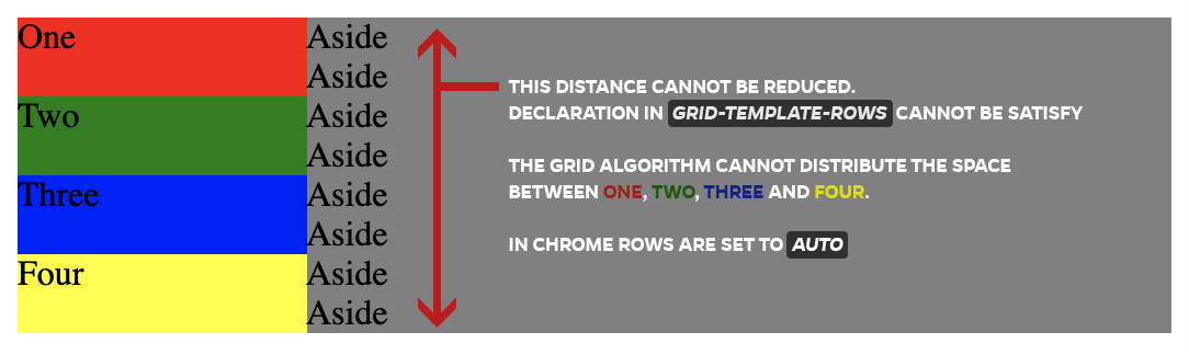
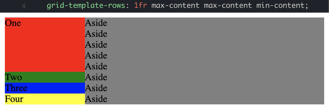
If you set at least one row to 1fr, the algo dispatch correctly the space between the rows :
Difference between browsers to handle the issue:
(Currently Firefox do the same as Google Chrome)
What is the difference between CSS fit-content and max-content?
fit-content uses max-content, unless available < max-content, then it uses available. Unless available < min-content, then it uses min-content.
What happens when minmax is: minmax(auto, auto)
Here is an illustration of your quote:
.container {  display: grid;  grid-template-columns: minmax(auto, 10px) 1fr;  grid-gap: 5px;  border: 1px solid;}
.container>div {  height: 50px;  background: red;  color: #fff;}
<div class="container"> <div>some text</div> <div></div></div>
<div class="container"> <div style="min-width:200px;">some text</div> <div></div></div>In CSS how can I use the max between 100% and max-content
You can try this
width : 100%;
max-width: max-content;
Related Topics
Css: Center Element Within a ≪Div≫ Element
Dynamically Change Color to Lighter or Darker by Percentage Css
Css Selector to Select First Element of a Given Class
How to Cancel Opacity for a Child Element
Bootstrap 3 - Desktop View on a Mobile Device
CSS Justify Text, Fill Space with Dots
Have a Variable in Images Path in SASS
How to Change an Input Button Image Using Css
How to Make the Items in the Last Row Consume Remaining Space in CSS Grid
How to Rotate the Background Image in the Container
How to Build a 2 Column (Fixed - Fluid) Layout With Twitter Bootstrap
Css Flexbox Not Working in Ie10
Why Does the Linear-Gradient Disappear When I Make an Element Position:Absolute