How to change btn color in Bootstrap
The easiest way to see which properties you need to override is to take a look at Bootstrap's source code, specifically the .button-variant mixin defined in mixins/buttons.less. You still need to override quite a lot of properties to get rid of all of the .btn-primary styling (e.g. :focus, disabled, usage in dropdowns etc).
A better way might be to:
- Create your own customized version of Bootstrap using Bootstrap's online customization tool
- Manually create your own color class, e.g.
.btn-whatever - Use a LESS compiler and use the
.button-variantmixin to create your own color class, e.g..btn-whatever
how to change bootstrap version 4 button color
2019 Update for Bootstrap 4.1+
Now that Bootstrap 4 uses SASS, you can easily change only the button color using the button-variant mixins. Since you only want to change the primary button color, and not the entire primary theme color, you need to use the button-variant mixins in SASS. You can set whatever $mynewcolor and/or lighten() and darken() percentages you'd like.
$mynewcolor:teal;

.btn-primary {
    @include button-variant($mynewcolor, darken($mynewcolor, 7.5%), darken($mynewcolor, 10%), lighten($mynewcolor,5%), lighten($mynewcolor, 10%), darken($mynewcolor,30%));
}

.btn-outline-primary {
    @include button-outline-variant($mynewcolor, #222222, lighten($mynewcolor,5%), $mynewcolor);
}
https://www.codeply.com/go/f3uTwmsCVZ (SASS demo)
This SASS compiles into the following CSS...
.btn-primary{color:#fff;background-color:teal;border-color:#005a5a}

.btn-primary:hover{color:#fff;background-color:#004d4d;border-color:#009a9a}
.btn-primary:focus,.btn-primary.focus{box-shadow:0 0 0 .2rem rgba(0,90,90,0.5)}
.btn-primary.disabled,.btn-primary:disabled{color:#fff;background-color:teal;border-color:#005a5a}
.btn-primary:not(:disabled):not(.disabled):active,.btn-primary:not(:disabled):not(.disabled).active,.show>.btn-primary.dropdown-toggle{color:#fff;background-color:#00b3b3;border-color:#000}
.btn-primary:not(:disabled):not(.disabled):active:focus,.btn-primary:not(:disabled):not(.disabled).active:focus,.show>.btn-primary.dropdown-toggle:focus{box-shadow:0 0 0 .2rem rgba(0,90,90,0.5)}

.btn-outline-primary{color:teal;background-color:transparent;background-image:none;border-color:teal}.btn-outline-primary:hover{color:#222;background-color:#009a9a;border-color:teal}
.btn-outline-primary:focus,.btn-outline-primary.focus{box-shadow:0 0 0 .2rem rgba(0,128,128,0.5)}
.btn-outline-primary.disabled,.btn-outline-primary:disabled{color:teal;background-color:transparent}
.btn-outline-primary:not(:disabled):not(.disabled):active,.btn-outline-primary:not(:disabled):not(.disabled).active,.show>.btn-outline-primary.dropdown-toggle{color:#fff;background-color:#009a9a;border-color:teal}
.btn-outline-primary:not(:disabled):not(.disabled):active:focus,.btn-outline-primary:not(:disabled):not(.disabled).active:focus,.show>.btn-outline-primary.dropdown-toggle:focus{box-shadow:0 0 0 .2rem rgba(0,128,128,0.5)}
https://www.codeply.com/go/l9UGO7J6V1 (CSS demo)
To change the primary color for all contextual classes (bg-primary, alert-primary, etc..) see: Customizing Bootstrap CSS template and How to change the bootstrap primary color?
Also see:
https://stackoverflow.com/a/50973207/171456
How to theme bootstrap
Customizing bootstrap 5 button colors and properties in it
"There must be a function to modify the text color according to the
color brightness in bootstrap."
Yes, it's using the WCAG 2.0 algorithm explained here. The red color you're using is just light enough to flip the text color to dark according to the WCAG algorithm.
Buttons are created by mixins (see: Buttons in the docs). In this case the 3rd parameter of the button-variant mixin $color is defined as:
$color: color-contrast($background, $color-contrast-dark, $color-contrast-light, $min-contrast-ratio)
So the button's color is either $color-contrast-dark or $color-contrast-light, depending on the WCAG 2.0 calculation using the $min-contrast-ratio.
Therefore, making the custom red color color slightly darker will flip the text color to white...
$primary: #d73b11;

@import "bootstrap";
Or, you can use the original custom color and force white bold text on btn-primary like this...
$primary: #e84c22;

@import "bootstrap";

.btn-primary {
    color: #fff;
    font-weight: bold;
}
Demo
Or,
You can set a lower value on the $min-contrast-ratio variable (3, 4.5, and 7 are the acceptable values) as shown in this answer
Also note that the way you're re-defining the theme-color map is wiping out all the other theme colors. You only need to change the value of $primary to change the primary theme color.
Bootstrap btn-group change color
Add this code in your css file and try.
First is to hide the radio controls, but second is I think what you need if you want to change the background color when button is :checked
input[type="radio"]{
    display: none;
}

input[type="radio"]:checked + .btn {
    color: #fff;
    background: #ff60bd!important;
}

input[type="radio"]:hover + .btn {
  color: #fff;
  background-color: red;
}
Can I change Bootstrap button color?
You need to override your css so you can change the background to black. A simple way to do this is to create a custom css class (you can either put this in a <style type="text/css"> tag in your HTML or put this in a separate CSS file)
.black-background {background-color:#000000;}
.white {color:#ffffff;}
Then, give your button these classes
<input type="submit" class="btn btn-primary black-background white" value="Text" />
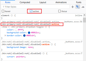
How to change button active color in bootstrap 4
you have to overwrite .btn-primary:not(:disabled):not(.disabled):active{
inspect the element and in the dev tool, click on toggle pseudo class then check active to see what rules are applied when the button is active, you'll see if your rules are overwritten or what you have to overwrite.
couldn't get it to work in the snippet , here's a fiddle : https://jsfiddle.net/takius/h9sj80kx/14/
EDIT : ( based on the comment )
to change the blue shadow, it's in : .btn-primary:not(:disabled):not(.disabled):focus{
updated fiddle : https://jsfiddle.net/takius/h9sj80kx/32/
How do i change the secondary button text color with bootstrap?
Override bootstrap variables
First you have to import bootstrap, then you can define custom styling for every bootstrap component.
for example:
@import 'node_modules/bootstrap/scss/bootstrap';

.btn-secondary {
  color: white;
}
Related Topics
iOS 7 iPad Safari Landscape Innerheight/Outerheight Layout Issue
CSS Rotate a Pseudo :After or :Before Content:""
Make Child Visible Outside an Overflow:Hidden Parent
How to Transition CSS Display + Opacity Properties
What Is the Meaning of 'Auto' Value in a CSS Property
Automatically Resize Images with Browser Size Using CSS
Disable Antialising When Scaling Images
Complete Styles for Cross Browser CSS Zoom
Safari/Chrome (Webkit) - Cannot Hide Iframe Vertical Scrollbar
Defining Variable Variables Using Less CSS
Freeze Screen in Chrome Debugger/Devtools Panel For Popover Inspection
Preventing "Double" Borders in CSS
Bootstrap 3 - Disable Navbar Collapse
How to Make Internet Explorer 8 to Support Nth Child() CSS Element
How to Clear the Cache of Nginx
"Text-Decoration" and the ":After" Pseudo-Element, Revisited