CSS-only position-x: fixed
You can use margin-top and position: sticky. It will give you the result you want.
$(window).scroll(function() {
  var $win = $(window);
  $('#box1').css('top', 20 - $win.scrollTop());
  $('#box2').css('left', 20 - $win.scrollLeft());
});
html,
body {
width: 2000px;
height: 2000px;
}
.box {
width: 400px;
height: 80px;
background: gray;
position: fixed;
}
#box3 {
margin-top: 220px; /* use 'margin-top' instead of 'top' */
position: sticky;
left: 20px;
}<script src="https://cdnjs.cloudflare.com/ajax/libs/jquery/3.3.1/jquery.min.js"></script>
<div id="box1" class="box" style="left:20px;top:20px;">
My position-x is fixed but position-y is absolute.
</div>
<div id="box2" class="box" style="left:20px;top:120px;">
My position-x is absolute but position-y is fixed.
</div>
<div id="box3" class="box">
Im positioned fixed on both axis.
</div>CSS how to position element fixed just for y-axis?
The position attribute applies to the element as a whole. What you're really asking is for a new kind of position attribute.
You could apply the fixed positioning to an element that contains your two anchors, and if your anchors are set to float, they will wrap if they need to:
<style type="text/css">
  #fixed {
    position: fixed;
  }
  .left {
    float: left;
  }
  .right {
    float: right;
  }
</style>

...

<div id="fixed">
  <div class="left">Lorem ipsum dolor sit amet,</div><div class="right">consectetur adipiscing elit.</div>
</div>
<div id="content">
  <p>something here...</p>
</div>
CSS fixed position on X axis but absolute on Y axis?
You can change
<ul id="menu-main" class="sf-menu sf-js-enabled sf-shadow">...</ul>
<div class="topsocial right">...</div>
into
<ul id="menu-main" class="sf-menu sf-js-enabled sf-shadow">...</ul>
<div class="right">
  <img src="http://combined-effort.com/wp-content/uploads/telephone-18005174660.png" alt="Phone Number 1-800-517-4660">
  <div class="topsocial right">...</div>
</div>
And then delete the othe image.
How to fix position of table while scrolling vertically. fix position at y-axis but scroll-able at x-axis
Best way is using javascript. You can find the answer here
But you still want use pure CSS. We need a bit walk around:
.scroll-container {  width: 300px;  height: 300px;  border: solid 1px #000;  overflow: auto;}
.scroll-content {  width: 500px;  height: calc(100% - 50px);  overflow-y: auto;}
td {  min-width: 100px;  height: 50px;}
<div class="scroll-container"> <table> <tr> <td>Head1</td> <td>Head2</td> <td>Head3</td> <td>Head4</td> <td>Head5</td> </tr> </table> <div class="scroll-content"> <table> <tr> <td>content1</td> <td>content2</td> <td>content3</td> <td>content4</td> <td>content5</td> </tr> <tr> <td>content1</td> <td>content2</td> <td>content3</td> <td>content4</td> <td>content5</td> </tr> <tr> <td>content1</td> <td>content2</td> <td>content3</td> <td>content4</td> <td>content5</td> </tr> <tr> <td>content1</td> <td>content2</td> <td>content3</td> <td>content4</td> <td>content5</td> </tr> <tr> <td>content1</td> <td>content2</td> <td>content3</td> <td>content4</td> <td>content5</td> </tr> <tr> <td>content1</td> <td>content2</td> <td>content3</td> <td>content4</td> <td>content5</td> </tr> <tr> <td>content1</td> <td>content2</td> <td>content3</td> <td>content4</td> <td>content5</td> </tr> <tr> <td>content1</td> <td>content2</td> <td>content3</td> <td>content4</td> <td>content5</td> </tr> </table> </div>
</div>javascript (but not jQuery please) fixed position on x-axis but not y?
This is for people who view this post - I wound up going with the solution I initially put together in the jsFiddle that used a simple javascript to mimic fixed x.
The javascript in the first answer was hefty and wound up buggy, and the second answer sounded good but did not work in practice. So, I'm recommending the javascript from the jsFiddle (below) as the best answer to fixed x and fluid y without a javascript library. It's not perfect and has a minimal delay but is the best answer I've found.
function fixLeft() {

            function getScrollX() {
                var x = 0, y = 0;
                if( typeof( window.pageYOffset ) == 'number' ) {
                    x = window.pageXOffset;
                } else if( document.body && ( document.body.scrollLeft) ) {
                    x = document.body.scrollLeft;
                } else if( document.documentElement && ( document.documentElement.scrollLeft) ) {
                    x = document.documentElement.scrollLeft;
                }
                return [x];
            }

            var x = getScrollX();
            var x = x[0];

        // have to get and add horizontal scroll position px
        document.getElementById('header').style.left = x + "px";
        document.getElementById('tabs').style.left = x + "px";
        document.getElementById('footer').style.left = x + "px";
    }

    window.onscroll = fixLeft;
Css position fixed for horizontal scroll but scroll vertically
Try this link, it uses a plugin called scrollspy to do the stuff. Pretty easy...
http://www.rickyh.co.uk/css-position-x-and-position-y/
Also, see this SO question: CSS: fixed position on x-axis but not y?
Thanks to semir.babajic : here is the actual snippet. You will need jQuery.
$(window).scroll(function(){
    $('#header').css({
        'left': $(this).scrollLeft() + 15 //Always 15px from left
    });
});
position fixed div in absolute positioned div works - but why?
An element with position: fixed is indeed positioned relative to the viewport (or browser). However, because it is an absolutely positioned element, it is "positioned relative to the initial containing block established by the viewport".
This is laid out in the position documentation:
An absolutely positioned element is an element whose computed
positionvalue isabsoluteorfixed. Thetop,right,bottom, andleftproperties specify offsets from the edges of the element's containing block. (The containing block is the ancestor relative to which the element is positioned.) If the element has margins, they are added to the offset.
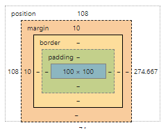
That is to say, when you specify margin-top and margin-left, these values are relative to the parent. And because the element is positioned relative to the parent, the default top and left are inherited from the parent. In your example, the .fixed element has a top value of 100px because it inherits the top value of 100px from .sidebar (the parent). When you set top: 0 on .fixed, you are overriding this value (going from top: 108px to top: 0):
Because of this, the element appears to be taken 'out of flow'. However, it is still always positioned relative to the viewport; it just had an initial offset (which it inherited from its parent).
CSS fixed position div not clickable in Android
I decided not to use fixed positioning to be able to address a wide variety of devices including the ones with Android 4.2.2. So, I used absolute positioning:
html {
    position: relative;
    min-height: 100%;
}
body {
    margin: 0 0 100px; /* bottom = footer height */
}
footer {
    position: absolute;
    left: 0;
    bottom: 0;
    height: 100px;
    width: 100%;
}
(There is a good article about this topic at: http://mystrd.at/modern-clean-css-sticky-footer/)
Is it possible to fix a div on an X-axis, but scroll on the Y-axis?
Try this fairly simple option:
$(window).scroll(function(){
    $('#header').css({
        'top': $(this).scrollTop() + 15
    });
});
Along with:
#header {
    top: 15px;
    left: 15px;
    position: absolute;
}
I've added a 15px offset top and left to show you how to do an offset, but you can delete these parts if you want the element tight in the corner of the view pane.
Related Topics
Repeat Table Headers in Print Mode
A Grid Layout With Responsive Squares
Vertical-Align Aligns Everything Else Except Self
How to Display List Items as Columns
Draw Diagonal Lines in Div Background With Css
Css3 Transition on Click Using Pure CSS
CSS Div Stretch 100% Page Height
Greyscale Background CSS Images
Css: Fixed to Bottom and Centered
Css Properties: Display Vs. Visibility
How to Create an Angled Corner in Css
Resize Font-Size According to Div Size
Defined Edges With Css3 Filter Blur
Creating CSS Global Variables:Stylesheet Theme Management
How to Align an Image Dead Center with Bootstrap
Using CSS, Can You Apply a Gradient Mask to Fade to the Background Over Text