Greyscale Background Css Images
Here you go:
<html xmlns="http://www.w3.org/1999/xhtml">
<head runat="server">
<title>bluantinoo CSS Grayscale Bg Image Sample</title>
<style type="text/css">
    div {
        border: 1px solid black;
        padding: 5px;
        margin: 5px;
        width: 600px;
        height: 600px;
        float: left;
        color: white;
    }
     .grayscale {
         background: url(yourimagehere.jpg);
         -moz-filter: url("data:image/svg+xml;utf8,<svg xmlns=\'http://www.w3.org/2000/svg\'><filter id=\'grayscale\'><feColorMatrix type=\'matrix\' values=\'0.3333 0.3333 0.3333 0 0 0.3333 0.3333 0.3333 0 0 0.3333 0.3333 0.3333 0 0 0 0 0 1 0\'/></filter></svg>#grayscale");
         -o-filter: url("data:image/svg+xml;utf8,<svg xmlns=\'http://www.w3.org/2000/svg\'><filter id=\'grayscale\'><feColorMatrix type=\'matrix\' values=\'0.3333 0.3333 0.3333 0 0 0.3333 0.3333 0.3333 0 0 0.3333 0.3333 0.3333 0 0 0 0 0 1 0\'/></filter></svg>#grayscale");
         -webkit-filter: grayscale(100%);
         filter: gray;
         filter: url("data:image/svg+xml;utf8,<svg xmlns=\'http://www.w3.org/2000/svg\'><filter id=\'grayscale\'><feColorMatrix type=\'matrix\' values=\'0.3333 0.3333 0.3333 0 0 0.3333 0.3333 0.3333 0 0 0.3333 0.3333 0.3333 0 0 0 0 0 1 0\'/></filter></svg>#grayscale");
     }

    .nongrayscale {
        background: url(yourimagehere.jpg);
    }
</style>
</head>
<body>
    <div class="nongrayscale">
        this is a non-grayscale of the bg image
    </div>
    <div class="grayscale">
        this is a grayscale of the bg image
    </div>
</body>
</html>
Tested it in FireFox, Chrome and IE. I've also attached an image to show my results of my implementation of this.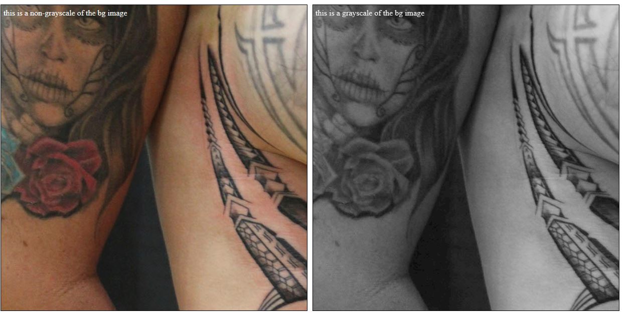
EDIT: Also, if you want the image to just toggle back and forth with jQuery, here's the page source for that...I've included the web link to jQuery and and image that's online so you should just be able to copy/paste to test it out:
<html xmlns="http://www.w3.org/1999/xhtml">
<head runat="server">
<title>bluantinoo CSS Grayscale Bg Image Sample</title>
<script src="http://code.jquery.com/jquery-1.11.0.min.js"></script>
<style type="text/css">
    div {
        border: 1px solid black;
        padding: 5px;
        margin: 5px;
        width: 600px;
        height: 600px;
        float: left;
        color: white;
    }
     .grayscale {
         background: url(http://www.polyrootstattoo.com/images/Artists/Buda/40.jpg);
         -moz-filter: url("data:image/svg+xml;utf8,<svg xmlns=\'http://www.w3.org/2000/svg\'><filter id=\'grayscale\'><feColorMatrix type=\'matrix\' values=\'0.3333 0.3333 0.3333 0 0 0.3333 0.3333 0.3333 0 0 0.3333 0.3333 0.3333 0 0 0 0 0 1 0\'/></filter></svg>#grayscale");
         -o-filter: url("data:image/svg+xml;utf8,<svg xmlns=\'http://www.w3.org/2000/svg\'><filter id=\'grayscale\'><feColorMatrix type=\'matrix\' values=\'0.3333 0.3333 0.3333 0 0 0.3333 0.3333 0.3333 0 0 0.3333 0.3333 0.3333 0 0 0 0 0 1 0\'/></filter></svg>#grayscale");
         -webkit-filter: grayscale(100%);
         filter: gray;
         filter: url("data:image/svg+xml;utf8,<svg xmlns=\'http://www.w3.org/2000/svg\'><filter id=\'grayscale\'><feColorMatrix type=\'matrix\' values=\'0.3333 0.3333 0.3333 0 0 0.3333 0.3333 0.3333 0 0 0.3333 0.3333 0.3333 0 0 0 0 0 1 0\'/></filter></svg>#grayscale");
     }

    .nongrayscale {
        background: url(http://www.polyrootstattoo.com/images/Artists/Buda/40.jpg);
    }
</style>
    <script type="text/javascript">
        $(document).ready(function () {
            $("#image").mouseover(function () {
                $(".nongrayscale").removeClass().fadeTo(400,0.8).addClass("grayscale").fadeTo(400, 1);
            });
            $("#image").mouseout(function () {
                $(".grayscale").removeClass().fadeTo(400, 0.8).addClass("nongrayscale").fadeTo(400, 1);
            });
        });
</script>
</head>
<body>
    <div id="image" class="nongrayscale">
        rollover this image to toggle grayscale
    </div>
</body>
</html>
EDIT 2 (For IE10-11 Users): The solution above will not work with the changes Microsoft has made to the browser as of late, so here's an updated solution that will allow you to grayscale (or desaturate) your images.
<svg> <defs> <filter xmlns="http://www.w3.org/2000/svg" id="desaturate"> <feColorMatrix type="saturate" values="0" /> </filter> </defs> <image xlink:href="http://www.polyrootstattoo.com/images/Artists/Buda/40.jpg" width="600" height="600" filter="url(#desaturate)" /></svg>Applying gray scale only to one background image using Multiple Backgrounds in CSS?
This is a bit hack-y but you can add an overlay that contains the "hover" photo and add the greyscale filter to it. Take a look at this example - it is just using 2 images and both are in colour.
(FYI I have specified the height & width of the div for this example, but its not necessary)
#example1 {
background-image: url(https://lorempixel.com/output/nature-q-c-200-200-2.jpg), url(https://lorempixel.com/output/nature-q-c-200-200-5.jpg);
  background-position: right bottom, left top;
  background-repeat: no-repeat, no-repeat;
  height: 200px;
  width:400px;
  position:relative;
  border:1px solid #ccc;
}

#example1:hover:before {
  background-image: url(https://lorempixel.com/output/nature-q-c-200-200-5.jpg);
  background-position: left top;
  background-repeat: no-repeat;
  filter: grayscale(100%);
  content:"";
  position:absolute;
  top:0;
  bottom:0;
  left:0;
  right:0;
  z-index:10;
}
<div id="example1"></div>CSS Greyscale On Background Image with Positioned Layers
I think it makes sense that if you filter a parent it also affects its child. I have not heard about being able to do anything differently to stop that, and if you could, it would be a bit hacky and complicated.
The easier way would be to try to separate out your different layers and control them individually. Pseudo elements will help us avoid introducing several new divs here.
The approach:
::afterpseudo element gets the background image and afiltertransition::beforepseudo element gets the overlay logo and anopacitytransition- As we hover a thumbnail, the
::aftertransitions to grayscale while the::beforefades in
Doing all that while also grouping repeated styles together to dry out your code (relevant code moved to the top):
.stills-logo {
  position: absolute;
  width: 100%;
  height: 100%;
  top: 0;
  left: 0;
}

.stills-logo::before,
.stills-logo::after {
  content: '';
  position: absolute;
  width: 100%;
  height: 100%;
  top: 0;
  left: 0;
}

.stills-logo::before {
  z-index: 2;
  background: url(https://upload.wikimedia.org/wikipedia/commons/e/ed/Wikipedia-logo-white.svg) center center / 45% no-repeat;
  opacity: 0;
  transition: opacity .3s ease;
}

.stills-logo::after {
  z-index: 1;
  transition: filter .3s ease;
}

.stills-logo:hover::before {
  opacity: 1;
}

.stills-logo:hover::after {
  filter: grayscale(100%);
}

#client-1-photo .stills-logo::after {
  background: url(https://i.ibb.co/4dKVVXd/example-photo-1.png) top left / 100%;
}

#client-2-photo .stills-logo::after {
  background: url(https://i.ibb.co/rft8jSV/example-photo-2.png) top left / 100%;
}

#client-3-photo .stills-logo::after {
  background: url(https://i.ibb.co/Ryjkryn/example-photo-3.png) top left / 100%;
}


/* layout stuff not related to the hover effect */

.site-content {
  /* Establishes a main div for video thumbnails, with a max-width of 1300px. */
  margin: auto;
  width: 95%;
  max-width: 1300px;
}

.video-thumbs {
  /* Flexbox for a grid of video thumbnails. Left-most and right-most thumbnails
are flush with the walls of .siteContent. */
  width: 100%;
  display: flex;
  flex-wrap: wrap;
  justify-content: space-between;
}

.stills-photo {
  /* Sets up flex containers to flow 3 thumbnails per line,
with a "margin" of 30px between each thumbnail.

If I just used a width of calc(1/3*100%), all 3 thumbnails
would be perfectly flush with one another.

There are three thumbnails with two spaces between (AKA two gutters):
one between the first and second thumbnail, and one between the
second and third thumbnail.

If you subtract 30px from the width, calc(1/3*100%), that amounts
to 90px of blank space (one for each of the three videos) split
between two gutters (remember: "space-between"). Since I only want
to specify what the length two gutters (and not three), I multiply by 2/3.

To keep a responsive ratio without placing an image in the div,
I've set the padding to 56.25%, which is 9/16.
(More info: https://css-tricks.com/aspect-ratio-boxes/) */
  margin-bottom: 30px;
  line-height: 0;
  width: calc(1/3*100% - (1 - 1/3)*30px);
  height: 0;
  padding: calc(1/3*56.25% - (1 - 1/3)*30px) 0 0 0;
  position: relative;
}
<main class="site-content">
<section class="video-thumbs">
<div class="stills-photo" id="client-1-photo">
<div class="stills-logo" id="client-1-logo"></div>
</div>
<div class="stills-photo" id="client-2-photo">
<div class="stills-logo" id="client-2-logo"></div>
</div>
<div class="stills-photo" id="client-3-photo">
<div class="stills-logo" id="client-3-logo"></div>
</div>
</section>
</main>Related Topics
What Is the Correct "-Moz-Appearance" Value to Hide Dropdown Arrow of a <Select> Element
How Does #Iefix Solve Web Fonts Loading in IE6-IE8
Bootstrap 4 Card-Deck with Number of Columns Based on Viewport
Background Image for Select (Dropdown) Does Not Work in Chrome
Using CSS, Can You Apply a Gradient Mask to Fade to the Background Over Text
Display:Block Inside Display:Inline
Gwt Theme Style Overrides My CSS Style
Stylesheet Not Updating When I Refresh My Site
How to Horizontally Align My Divs
Maintain Aspect Ratio According to Width and Height
Ampersand (&) at the End, and Part of, a Selector in SASS
My Position: Sticky Element Isn't Sticky When Using Flexbox
Why Percentage Value Within Grid-Gap Create Overflow in CSS Grid