How to display a list in two rows?
Here is a simple way to do it using jquery. I know it is mentioned that a CSS way is needed, but this is just for future reference if anyone wants to refer to this question.
Get the number of LI items and divide it by the number of rows and set that value to column-count property.
Jquery
$(document).ready(function() {
var numitems =  $("#myList li").length;

$("ul#myList").css("column-count",Math.round(numitems/2));
});
CSS
ul {
  width: 900px;
}
li {
width: 75px;
height: 75px;
margin-top: 10px;
margin-right: 10px;
display: inline-block;
}
HTML
<ul id="myList">
<li>One</li>
<li>Two</li>
<li>Three</li>
<li>Four</li>
<li>Five</li>
<li>Six</li>
<li>Seven</li>
<li>Eight</li>
<li>Nine</li>
</ul>
Fiddle here
EDIT:
Same implementation using simple javascript.
var ul = document.getElementById("myList");
var li = ul.getElementsByTagName("li");
var numItems = li.length;

var css = document.createElement("style");
css.type = "text/css";
css.innerHTML = "ul { column-count: " + Math.round(numItems/2) + "; }";
document.body.appendChild(css);
You need to set the width of UL, because number of rows will depend on the width also even after setting the column-count. You can set it to 100% too, but then the number of rows will change based on the window size. To restrict the number of rows to 2, fixed width for UL may be required.
CSS: Arrange a list in multiple rows and columns
I hacked away at this for hours and haven't managed to find a suitable solution that didn't involve a fixed height on the container. The closest thing I found was using the column-count property and adding a column break before the last element, which for now only works on Chrome:
ul {
  -webkit-column-count: 2;
  column-count: 2;
}

li:last-of-type {
  -webkit-column-break-before: always;
}
JSFiddle
Break row of list items across multiple rows
An initial setting of a flex container is flex-wrap: nowrap. This means that flex items are forced to stay on a single line. That's the main problem you're having.
You can override the default with flex-wrap: wrap.
.product_ul {

  display: flex;

  flex-wrap: wrap;

  list-style-type: none;

  padding-left: 0;

}

li {

  flex: 0 0 30%; /* flex-grow, flex-shrink, flex-basis */

  height: 100px;

  background-color: green;

  margin: 5px;

}
<div class="product_area">
<ul class="product_ul">
<li><div class="product"></div></li>
<li><div class="product"></div></li>
<li><div class="product"></div></li>
<li><div class="product"></div></li>
<li><div class="product"></div></li>
<li><div class="product"></div></li>
<li><div class="product"></div></li>
<li><div class="product"></div></li>
</ul>
</div>Displaying ul in two rows instead of one
You can use css grid system
ul {

  display: grid;

  grid-template-columns: 1fr 1fr;

}
<ul>
<li>1</li>
<li>1</li>
<li>1</li>
<li>1</li>
<li>1</li>
<li>1</li>
<li>1</li>
<li>1</li>
<li>1</li>
<li>1</li>
<li>1</li>
<li>1</li>
<li>1</li>
<li>1</li>
</ul>How to display an unordered list in two columns?
Modern Browsers
leverage the css3 columns module to support what you are looking for.
http://www.w3schools.com/cssref/css3_pr_columns.asp
CSS:
ul {
  columns: 2;
  -webkit-columns: 2;
  -moz-columns: 2;
}
http://jsfiddle.net/HP85j/8/
Legacy Browsers
Unfortunately for IE support you will need a code solution that involves JavaScript and dom manipulation. This means that anytime the contents of the list changes you will need to perform the operation for reordering the list into columns and reprinting. The solution below uses jQuery for brevity.
http://jsfiddle.net/HP85j/19/
HTML:
<div>
    <ul class="columns" data-columns="2">
        <li>A</li>
        <li>B</li>
        <li>C</li>
        <li>D</li>
        <li>E</li>
        <li>F</li>
        <li>G</li>
    </ul>
</div>
JavaScript:
(function($){
    var initialContainer = $('.columns'),
        columnItems = $('.columns li'),
        columns = null,
        column = 1; // account for initial column
    function updateColumns(){
        column = 0;
        columnItems.each(function(idx, el){
            if (idx !== 0 && idx > (columnItems.length / columns.length) + (column * idx)){
                column += 1;
            }
            $(columns.get(column)).append(el);
        });
    }
    function setupColumns(){
        columnItems.detach();
        while (column++ < initialContainer.data('columns')){
            initialContainer.clone().insertBefore(initialContainer);
            column++;
        }
        columns = $('.columns');
    }

    $(function(){
        setupColumns();
        updateColumns();
    });
})(jQuery);
CSS:
.columns{
    float: left;
    position: relative;
    margin-right: 20px;
}
EDIT:
As pointed out below this will order the columns as follows:
A  E
B  F
C  G
D
while the OP asked for a variant matching the following:
A  B
C  D
E  F
G
To accomplish the variant you simply change the code to the following:
function updateColumns(){
    column = 0;
    columnItems.each(function(idx, el){
        if (column > columns.length){
            column = 0;
        }
        $(columns.get(column)).append(el);
        column += 1;
    });
}
How to display ul list in two columns in one row?
How about this:
<!DOCTYPE html PUBLIC "-//W3C//DTD XHTML 1.0 Transitional//EN"
  "http://www.w3.org/TR/xhtml1/DTD/xhtml1-transitional.dtd">
<html xmlns="http://www.w3.org/1999/xhtml" xml:lang="en" lang="en">
<head>
<title>Sandbox</title>
<meta http-equiv="Content-type" content="text/html; charset=utf-8" />
<style type="text/css" media="screen">
* { margin: 0; padding: 0; }

.ListStyle ul li {
 float: left;
 list-style-type: none;
}

.ListStyle ul li ul li {
 float: none;
 margin-left: 20px;
}
</style>
</head>
<body>
<div class="ListStyle">
   <ul>
      <li>List1
         <ul>
            <li>ChildList1</li>
            <li>ChildList2</li>
         </ul>
      </li>
      <li>List2
           <ul>
            <li>ChildList1</li>
           </ul>
      </li>
   </ul>
</div>
</body>
</html>
Live Example.
Make the first li in a separate row, and rest li in two rows & columns
You can achieve with help of display: flex property & first list should be 100% width like li:first-child { width: 100% }.
I hope this snippet will help you.
*{
    margin:0;
    padding:;
    box-sizing:border-box;
  }
  body{
    display: flex;
    justify-content: center;
    align-items: center;
    min-height: 100vh;
  }
  ul {
    display: -ms-flexbox;
    display: flex;
    -ms-flex-wrap: wrap;
    flex-wrap: wrap;
    list-style-type: none;
    padding: 0;
    margin: 0;
    width: 250px;
  }
  ul li{
    width: 50%;
    padding: 1px;
  }
  ul li:first-child {
    width: 100%;
    min-width: 100%;
  }
  ul li span{
    display: block;
    background-color: #ccc;
    padding: 4px 8px;
  }
<ul>
<li><span>A</span></li>
<li><span>B</span></li>
<li><span>C</span></li>
<li><span>D</span></li>
<li><span>E</span></li>
</ul>Using CSS to make a li two rows tall?
A potential solution would be to use EM's for a height as the EM unit is based off font size.
So the theory here is that if you have one line of text and font size is 12px tall, then 1em = 12px.
By setting the height of the LI to 2em you are effectively making the height 24px, or two lines worth of height. That said, this doesn't take into account line-height, if we have a lineheight of say 15px, that's 3px per line of extra space for a total of 6, 24+6=30=2.5em
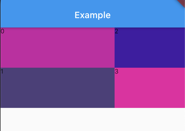
Flutter Listview builder show data in two rows depending upon `index` is odd or event
GridView.builder is probably what you are looking for.
Just give it scrollDirection: Axis.horizontal to make it horizontal.
Then give it gridDelegate: SliverGridDelegateWithFixedCrossAxisCount(crossAxisCount: 2) to make sure you have only 2 rows.
Then use SizedBox to restrict the height of the GridView to 90 + 90.
Finally, use the childAspectRatio property of the SliverGridDelegateWithFixedCrossAxisCount to specify that you want your aspect ratio to be 90 / 256.
Color randomColor() => Color.fromARGB(255, Random().nextInt(255), Random().nextInt(100), Random().nextInt(200));

class MyApp extends StatelessWidget {
    List<String> array = ["0", "1", "2", "3"];

    @override
    Widget build(BuildContext context) {
        return MaterialApp(
            home: Scaffold(
                appBar: AppBar(title: Text('Example')),
                body: SizedBox(
                    height: 90 + 90,
                    child: GridView.builder(
                        itemCount: 4,
                        scrollDirection: Axis.horizontal,
                        gridDelegate: SliverGridDelegateWithFixedCrossAxisCount(
                            childAspectRatio: 90 / 256,
                            crossAxisCount: 2,
                        ),
                        itemBuilder: (context, index) {
                            return Container(
                                color: randomColor(), child: Text(array[index])
                            );
                        }
                    ),
                ),
            ),
        );
    }
}
Related Topics
Concatenate Values in Less (Css) Without a Space
Hover and Click on CSS Triangle
How to Send an Inner <Div> to the Bottom of Its Parent <Div>
How to Use Bootstrap Modals Without Loading the Entire Library
Align Bootstrap Navigation to Center
How to Position Background Image in Bottom Right Corner? (Css)
Styling the New Twitter Widget (Embedded Timeline)
CSS Fixed Position with Auto Margin
How to Make a Text Stroke with Transparent Text
How to Recreate Perspective-Origin Effect by Transforming Child Elements
Default Textbox Border-Style and Width