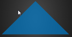
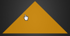
Hover and click on CSS triangle
To prevent hover and click outside the CSS triangle you can use transforms to make the the triangle.
This technique is described here : CSS Triangles with transform rotate
The point is to use a wrapper with hidden overflow and rotate the clickable/hoverable element so that it actualy has a triangular shape and prevent the click event or hover state outside the triangle.
Demo: Click and hover on a CSS triangle
.tr {

  width: 40%;

  padding-bottom: 28.2842712474619%; /* = width / sqrt(2) */

  position: relative;

  overflow: hidden;

}

.tr a {

  position: absolute;

  top: 0; left: 0;

  width: 100%; height: 100%;

  background-color: rgba(0, 122, 199, 0.7);

  transform-origin: 0 100%;

  transform: rotate(45deg);

  transition: background-color .3s;

}

/** hover effect **/

.tr a:hover {

  background: rgba(255, 165, 0, 0.7);

}
<div class="tr"><a href="#"></a></div>Make Only Triangle Have Hover Effect using CSS
This can be done with pure CSS if we construct the triangle using transforms and overflow:hidden
FIDDLE
#triangleholder {

  width: 100px;

  height: 100px;

  border: 1px solid red;

}

#triangle {

  position: relative;

  height: 50px;

  overflow: hidden;

}

#triangle:before {

  content: '';

  position: absolute;

  width: 71px; /*using pythagorus: sqrt( (100^2) /2 ) */

  height: 71px;

  background: blue;

  transform: rotate(45deg)translateX(29%);

  cursor: pointer;

}
<div id="triangleholder">
<div id="triangle">
</div>
</div>CSS Triangle Under Link On Hover (WITHOUT UL/LI/SPAN)?
You probably do want to use display:block;, however, you need to position the element so that it is below the line.
.mainnav a:hover + .arrow {
    display: block;
    position: relative; /* you could also try 'absolute' here */
    top: -50px; /* this will be how far down you want the triangle */
}
Edit:
I created a JSFiddle to demonstrate. I had to add some CSS definitions so that the rest of it would show up like described.
For posterity, here are the relevant rules:
.mainnav a, .mainnav a:hover{ text-decoration:none;}
.mainnav a:hover:after {
    display: block;
    position:relative;
    width:100%;
    text-align:center;
    content : "\25B2";

    color:yellow;
}

.columns {float : left; margin:10px;}
content : "\25B2"; inserts the unicode ▲. This can be substituted of course with a background-image: url(...) or whatever you need it to be.
Edit 2:
See this version of the JSFiddle. Instead of putting the border on the a (which caused a weird ever-expanding width issue), I put it on the div which wraps the a and added margin and padding to that div, then gave the "arrow" a height: 0; so that the box would not expand on :hover.
Here is the complete solution:
.mainnav a {

    font-family:"Quicksand", Verdana, sans-serif;

    color: #8cc63f;

    font-size: 1.75em;

}

.mainnav a:hover {

    color: #c97932;

}

.arrow {

    width: 0;

    height: 0;

    border-left: 10px solid transparent;

    border-right: 10px solid transparent;

    border-top: 10px solid #c97932;

    margin: 25px auto;

    display: none;

}

.mainnav a, .mainnav a:hover {

    text-decoration:none;

}

.mainnav a:hover:after {

    display: block;

    position:relative;

    top:5px;

    width:100%;

    height:0;

    text-align:center;

    content :"\25B2";

    color:#c97932;

}

.columns {

    float : left;

    margin:0;

    padding:5px 10px;

    border-bottom:1px solid #f00;

    overflow:visible;

}
<nav class="mainnav">
<div>
<div class="columns"><a href="#">Work</a></div>
<div class="columns"><a href="#">About</a></div>
<div class="columns"><a href="#">Contact</a></div>
<div class="columns"><a href="#">Blog</a></div>
</div>
</nav>Hover effect on 4 triangle div
just solved by using two div, one with "overflow: hidden" and another with "transform: rotate(45deg)"
works perefect for me
here is fiddle:
jsfiddle.net/Coffeeh/tg3ER
Triangle at right of div on hover
You can do something like this:
.container {
    margin-left: 15px;
    width: 200px;
    background: #FFFFFF;
    border: 1px solid #CAD5E0;
    padding: 4px;
    position: relative;
    min-height: 200px;
}

.container:after {
content: '';
display: block;
position: absolute;
top: 80px;
left: 100%;
width: 0;
height: 0;
border-color: transparent transparent transparent #CAD5E0;
border-style: solid;
border-width: 10px;
}
Fiddle Demo
How can I create a triangle div with CSS which will disappear when clicked but not when the 'overflow' part is clicked?
You can make the triangle with a divelement, instead of a pseudoelement.
fiddle
document.querySelector('.triangle').onclick = function() {

  this.style.display = "none";

}
.triangle-container {
overflow: hidden;
height: 100px;
}
.triangle {
width: 100%;
height: 100%;
background-color: #0079C6;
transform-origin: 0 100%;
transform: rotate(45deg);
}<div class="triangle-container">
<div class="triangle"></div>
</div>Hover box and change triangle on top
You're trying to style the triangle as if it was a child of vw-post-box-read-more
Try this code:
.vw-post-box-read-more {

  line-height: 1em;

  padding: 20px 15px 15px 15px;

  -webkit-transition: all 0.2s ease-out;

  -moz-transition: all 0.2s ease-out;

  transition: all 0.2s ease-out;

  background-color: #393939;

  /*background-color: rgba(255, 255, 255, 0.15);*/

}

.triangle {

  width: 0;

  height: 0;

  border-style: solid;

  border-width: 0 10px 10px 10px;

  -webkit-transition: all 0.2s ease-out;

  -moz-transition: all 0.2s ease-out;

  transition: all 0.2s ease-out;

  border-color: transparent transparent #393939 transparent;

  margin-bottom: 20px;

}

.hover-box:hover > .vw-post-box-read-more {

  background-color: red;

}

.hover-box:hover > .triangle {

  border-color: transparent transparent red transparent;

}
<div class="hover-box">
<div class="triangle"></div>
<a class="vw-post-box-read-more" href="">
<span>Read More</span>
<i class="vw-icon icon-iconic-right-circle"></i>
</a>
</div>CSS triangle to fit variable sized div elements
Achieving this effect with border will not be possible for dynamically sized containers because they cannot take percentage values or adapt based on a change in dimension of the container. They can only use either pixel or viewport units. Both those wouldn't be of much use for a dynamic container.
Transforms can be used by placing a pseudo-element on top of the containers but they would need calculations for height and width of the element based on trigonometric equations. The simpler ones would be the gradient and SVG approaches.
Using Gradient:
You can do this using a gradient with to [side] [side] syntax. This is responsive and would work for all container sizes. The only drawback is that there would be jagged lines in some cases where the width or height is too large compared to the other.
One advantage of this is that it doesn't require any extra elements (SVG or HTML, not even pseudos) but the drawback will be when hover and click effects are required for the triangle alone (restricted to the triangle's boundaries). Since the element is still a rectangle/square, the hover or click effect will be triggered even when the mouse is outside the triangle but within the container.
.one {

  width: 100px;

  height: 30px;

  background-color: #ccc;

}

.two {

  width: 40px;

  height: 90px;

  background-color: #aaa;

}

.three {

  width: 70px;

  height: 70px;

  background-color: #aaa;

}

div {

  background-image: linear-gradient(to top left, blue 50%, transparent 51%);

}
<div class="one"></div>
<br>
<div class="two"></div>
<br>
<div class="three"></div>
<br>Related Topics
@ Sign and Variables in CSS Keyframes Using Less CSS
How to Make CSS Letter-Spacing: 0.5 Px
What Does Unset Value Mean in CSS
Adjacent Divs with Angled Borders
Why Doesn't a Child's Margin Affect a Parent's Height
Workaround for CSS Variables in Ie
How to Convert Markdown + CSS -> PDF
Performance Differences Between Color Declarations
How to Hide Element Label by Element Id in CSS
Firebug Lite Messagequeue Null
Ampersand (Parent Selector) Inside Nested Selectors
The "Before" Pseudo Element Not Working in Font Awesome V.5
How to Set a Specific CSS Class to a Widget in Gtk3? (C)
Reverting CSS Style of <Input Type=Submit Button to Its Default Style
Bootstrap Modal Window Inside Another Div
Cross Browser Support for CSS Flexbox
Font-Awesome Not Properly Displaying on Firefox/How to Vend via Cdn