How to create fluid trapezoid image with css?
Updated Answer (Pure CSS3)
Extreme requirements sometimes need extreme solutions. I've built upon my original answer (below) to make a pure css solution that works (and can be made to work better, if you want to invest the time in it). The current example is a bit "choppy" in rendering, which may be okay for you, but if not, you will need to extend the already obscene number of @media queries that are driving it (it would likely be much easier to implement using LESS or SASS; I put together a formula driven excel spreadsheet to help rapidly generate the numbers). It uses this code:
HTML
<div class="box">
   <img src="yourImage.jpg" />
</div>
CSS
.box{
    height:300px;
    min-width: 100px; /*could be different, but you ought to have some min*/
    overflow:hidden;
}

.box img {
    height: 100%;
    width: 100%;
    -ms-transform-origin: 100% 100%; /* IE 9 */
    -webkit-transform-origin: 100% 100%; /* Safari and Chrome */
    -moz-transform-origin: 100% 100%; /* Firefox */
    -o-transform-origin: 100% 100%; /* Opera */
    transform-origin: 100% 100%;
}

/*Sample... you need alot of these--my fiddle example has 51*/
@media screen and (min-width:  100px) {
  .box {
    -ms-transform:skewY(45deg);
    -moz-transform:skewY(45deg);
    -webkit-transform:skewY(45deg);
    -o-transform:skewY(45deg);
    transform:skewY(45deg);
  }
  .box img {
    -ms-transform:skewY(-90deg);
    -moz-transform:skewY(-90deg);
    -webkit-transform:skewY(-90deg);
    -o-transform:skewY(-90deg);
    transform:skewY(-90deg);
  }
}
Here's how to calculate the degrees
Assuming height: 300px with the narrow side approximately 100px tall and equal angles on the trapezoid. This means the upper and lower offset is (300px - 100px) / 2 = 100px. Then the .box angles are set off the @media query min-width amounts according to this formula:
Angle = arctan(100/min-width) /*100 is the upper/lower offset as above*/
For the .box img angle take the Angle and multiply by -2. So that will yield your .box and .box img media queries and transforms as this pseudocode:
@media screen and (min-width: [your target min-width]) {
  .box {transform: skewY(Angle)}
  .box img {transform: skewY(-2*Angle)}
}
How smooth it functions depends completely upon how micro scale you make your changes to min-width to get a new angle setting. As I stated in my comment in the CSS code above, my example uses 51 media query calls and still has some choppiness to it.
Would it be better to use some javascript solution instead... probably, but that is totally up to the designer, so I offer this here as purely a proof of concept that it can be made to work with pure css.
Original Answer
This seems to be achieving a fluid width. I don't know how much control you want of either how much or what part of the image is being shown, so it may not entirely fit your needs, but it does make a flexible width image using transforms to give it a fake perspective look.
Putting an image inside a basic trapezoid done with pure CSS?
clip-path might come in handy.
#rectangle { width: 400px; height: 100px; background-image: url('https://image.ibb.co/e5Kaw7/image.png'); background-size: contain; clip-path: polygon(0 0, 100% 0, calc(100% - 100px) 100%, 100px 100%);}<div id="rectangle"></div>CSS create this shape as background only, content remain straight
The whole thing for a trapezium shape can be done using perspective and rotateY. Just wrap all your things in a div like -
<div id="persp">...</div>
and then use this CSS to apply perspective field to the div
#persp {
    perspective: 200px;
}
(adjust 200px according to your needs)
after that just rotate your .we-are along X, Y or Z-axis whichever you prefer (feel free to experiment).
.we-are {
    transform:rotateY(10deg);
    perspective: 200px; /* mention this to make the contents of p appear straight */
}
/* and this too */
.we-are p {
    padding-top: 125px;
    transform: rotateY(-10deg);
}
Demo
css trapezoid image transparent cut
Without any code and any tips of what you want to do in the end, i can go with this idea of gradient and image mixed in the background of a container.
On each side some content ?
Here is a free interpretation of your unclear question, hopping it will make you give us some info usable.
background:
    url(http://i.stack.imgur.com/WJ3MT.png)   center  no-repeat,
    linear-gradient(47deg, tomato 50.1%, transparent 50%) left no-repeat,
    linear-gradient(47deg, transparent 50%, #333 50.1%) right no-repeat;
Create a trapezoid that has transparent borders and background?
Personally, I think it's overkill, but it can be done like this:
demo
HTML:
<div class='outer'>
    <div class='content'><!--stuff here--></div>
    <div class='label l1'></div>
    <div class='label l2'></div>
</div>
CSS:
.outer {
    position: relative;
    width: 500px; /* whole thing breaks if this is not a multiple of 100px */
    border: solid .5em rgba(0,0,255,.5);
    border-bottom: solid 0px transparent;
    margin: 7em auto 0;
    background: rgba(0,0,0,.5);
    background-clip: padding-box;
}
.outer:before, .outer:after {
    position: absolute;
    top: 100%;
    height: .5em;
    background: rgba(0,0,255,.5);
    content: ''
}
.outer:before { left: -.5em; width: 15%; border-left: solid .5em transparent; }
.outer:after { right: -.5em; width: 55%; border-right: solid .5em transparent; }
.content {
    padding: .5em;
    margin: 1.5em;
    border-bottom: solid 1.5em transparent;
    background: lightblue;
    background-clip: padding-box;
}
.label {
    overflow: hidden;
    position: absolute;
    top: 100%;
    width: 15%;
    height: 3em;
}
.l1 { left: 15%; }
.l2 { left: 30%; }
.label:before {
    position: absolute;
    top: -.5em;
    width: 100%;
    height: 2.5em;
    border: solid .5em rgba(0,0,255,.5);
    background: rgba(0,0,0,.5);
    background-clip: padding-box;
    content: '';
}
.l1:before { left: 9%; transform: skewX(30deg); }
.l2:before { right: 9%; transform: skewX(-30deg); }
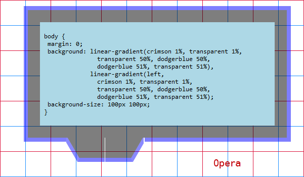
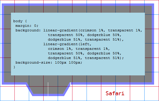
It works in Firefox, Chrome, Opera and Safari (I was afraid to test it in IE9, though both transform and background-clip work) but only if the width for .outer has a value that's a multiple of 100px.
Unless using a width that's a multiple of 100px, it only works in Firefox and Chrome (there is a little glitch in Chrome - could be fixed by using a WebKit-only left to right linear gradient that sharply goes from transparent to that semitransparent blue really close to the start).
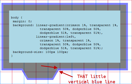
It breaks in Opera and Safari (if using a width that is not a multiple of 100px):
how do you create a trapezoid-like div with CSS
You may use multiple border-radius values to cut them off.
you may use different border-radius within imbricated tags (parent then childs) to tune your final shape. example
img { overflow: hidden;/* not necessary for img */ border-radius: 0 0 5% 5% / 0 0 100% 100%;}<img class="img-responsive" src="https://placehold.it/350x250" />CSS trapezoid shape with text
If the width/height of the trapezoid shape should be changed dynamically, you could achieve the effect by using CSS transforms as follows:
.box {  width: 300px;        /* optional - feel free to remove it */  /* height: 150px; */ /* optional - feel free to remove it */  position: relative;  padding: 5px;}
.box:before {  content: "";  position: absolute;  border: 3px solid teal;    top: -4%; bottom: -11%; left: -3%; right: -3%;  z-index: -1;
  -webkit-transform: perspective(50em) rotateX(-30deg);  transform: perspective(50em) rotateX(-30deg);}
<div class="box"> Lorem ipsum dolor sit amet, consectetur adipisicing elit. Voluptatibus sed unde voluptate non temporibus quae amet possimus dolorum quisquam atque nemo reprehenderit quasi suscipit vero cum delectus quibusdam optio asperiores.</div>Related Topics
Django Forms and Bootstrap - CSS Classes and <Divs>
Vertically Centering Content of :Before/:After Pseudo-Elements
How to Extend a Class/Mixin Which Has Dynamically Formed Selector
Creating an Isoceles Trapezoid Shape
Zoom Control and Streetview Not Showing on My Google Map
Continuous CSS Rotation Animation on Hover, Animated Back to 0Deg on Hover Out
How to Prevent a CSS Keyframe Animation from Running on Page Load
How to Decrease Image Brightness in CSS
How to Use Vertical Align in Bootstrap
Styling Mat-Select in Angular Material
CSS Two Div Width 50% in One Line with Line Break in File
Div with Cut Out Edges, Border and Transparent Background
Vertical and Horizontal Align (Middle and Center) with CSS
Bootstrap Table Striped: How to Change the Stripe Background Colour
How to Set Up Custom Styles for Restructuredtext, Sphinx, Readthedocs, etc.