What Does 'zoom' do in CSS?
Zoom is not included in the CSS specification, but it is supported in IE, Safari 4, Chrome (and you can get a somewhat similar effect in Firefox with -moz-transform: scale(x) since 3.5). See here.
So, all browsers
 zoom: 2;
 zoom: 200%;
will zoom your object in by 2, so it's like doubling the size. Which means if you have
a:hover {
   zoom: 2;
}
On hover, the <a> tag will zoom by 200%.
Like I say, in FireFox 3.5+ use -moz-transform: scale(x), it does much the same thing.
Edit: In response to the comment from thirtydot, I will say that scale() is not a complete replacement. It does not expand in line like zoom does, rather it will expand out of the box and over content, not forcing other content out of the way. See this in action here. Furthermore, it seems that zoom is not supported in Opera.
This post gives a useful insight into ways to work around incompatibilities with scale and workarounds for it using jQuery.
What exactly changes in the css rendering, when desktop browsers zoom in or out on a website?
Zooming as implemented in modern browsers consists of nothing more
than “stretching up” pixels. That is, the width of the element is not
changed from 128 to 256 pixels; instead the actual pixels are doubled
in size. Formally, the element still has a width of 128 CSS pixels,
even though it happens to take the space of 256 device pixels.In other words, zooming to 200% makes one CSS pixel grow to four times
the size of one device pixels. (Two times the width, two times the
height, yields four times in total).
Source:
Concept of device pixels and CSS pixels
What does *zoom:1 do in bootstrap?
It's like an inline conditional statement for IE5.5 - IE7. Only IE 5.5, IE6, and IE7 will display zoom: 1 because of the inline * (known as the "star property hack"). Similar to the IE6 hack with the underscore _.
See: http://snook.ca/archives/html_and_css/targetting_ie7
Zoom Vs. Scale in CSS3
Transform is more predictable than zoom across browsers.
Zoom affects positioning differently in different browsers.
example:position:absolute; left:50px; zoom: 50%;
- IE will not change the
leftvalue at all. - Chrome will change the left value to
25px. Effectively it does doleft = left * zoom. But DevTools Computed Values in DevTools will still displayleft: 50px, even though that is effectively not true due to the zoom.
Transform is handled the same way in all browsers (as far as I can tell).
example:position:absolute; left:50px; transform: scale(0.5)
leftwould effectively be set to25pxin both Chrome and IE. (again, computed values will still not reflect this, it will displayleft:50px)- To avoid changing the
leftvalue, simply usetransform-origin: 0 0. That will ensure left is still 50px.
Demo: http://jsfiddle.net/4z728fmk/ shows 2 boxes where the small one is zoomed or scaled to 50%. Looks like this:
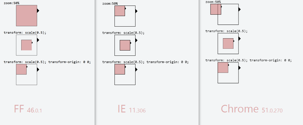
edit: img updated 2016-06-16 with Firefox (nothing had change in Chrome or IE since last time)
CSS zoom property
The CSS3 equivalent is in the CSS 2D Transforms module, in particular transform: scale().
Because this module is still at Working Draft stage, you'll need browser-specific prefixes:
transform: scale(2);
-moz-transform: scale(2);
-webkit-transform: scale(2);
-o-transform: scale(2);
You may also need transform-origin (and browser-specific versions) to make it behave the same way as zoom, and you'll have to be careful to target zoom only at IE, because WebKit supports both transform and zoom so would double-scale.
Reduce the size of all elements in html like zooming out the page
All HTML content inside of the body tag can be "zoomed" in and out by using the CSS zoom attribute.
For example, to zoom content to 90% simply modify the body element to
body {
  zoom: 90%;
}
zoom css/javascript
The Firefox & Chrome (Webkit) equivalents to the IE-specific zoom property are, respectively, -moz-transform and -webkit-transform.
A sample code would be:
.zoomed-element {
    zoom: 1.5;
    -moz-transform: scale(1.5);
    -webkit-transform: scale(1.5);
}
You'd have to be a bit more careful with Javascript (test for existence first), but here's how you'd manipulate them:
el.style.zoom = 1.5;
el.style.MozTransform = 'scale(1.5)';
el.style.WebkitTransform = 'scale(1.5)';
CSS: How to zoom in the background-image only slightly
My suggestion would be to attempt using the 'transform' CSS attribute. You can then give a value of 'scale()' with a number passed into the parentheses. The higher the number, the more the zoomed the image will appear. The good news is that you can use decimals too. This will allow you to zoom the image just a bit at a time. This would look a bit something like this...
#zoom-in {
   background-image: url("https://static.agcanada.com/wp-content/uploads/sites/4/2018/10/wheat-moosomin-sask-09022018-gberg.jpg");
   transform: scale(1.2);
}
You can see an example of this being done here https://css-tricks.com/zooming-background-images/
Related Topics
CSS Selector for <Input Type=""
Fonts Looks Different in Firefox and Chrome
How to Render Multiple Columns with Markdown in Github Readme
Why Use an Attribute Selector to Match Classes
How to Reset a CSS-Counter to the Start-Attribute of the Given List
CSS Selector Involving Pseudo Class First-Child and Dropcap
Define an <Img>'s Src Attribute in CSS
Turning Off Twitter Bootstrap Navbar Transition Animation
Up/Down Arrow Key Issue with Typeahead Control (Angular Bootstrap Ui)
Can Flex Items Wrap in a Container with Dynamic Height
CSS Selector (Id Contains Part of Text)
On Ie CSS Font-Face Works Only When Navigating Through Inner Links
Blocky Gradient Effect in CSS3
How to Prevent a CSS Keyframe Animation from Running on Page Load
Less Mixin a Variable Class Name
Select Odd Even Child Excluding the Hidden Child
Image Scaling by CSS: Is There a Webkit Alternative for -Moz-Crisp-Edges