Good rules for setting up print css?
Here are some general print styles to use to get better print outs:
/* Print styles */
@media print
{
    tr, td, th {page-break-inside:avoid}
    thead {display:table-header-group}
    .NoPrint {visibility:hidden; display:none}
    a {color:#000000}
}
The top one prevents page breaks inside of a table row
The thead style makes any rows in the thead tag repeat for each page that the table spans across.
NoPrint is a class I use to show something on the screen, but not in print.
And, I like to turn off link colors.
Faster way to develop and test print stylesheets (avoid print preview every time)?
You can use the Chrome Media Type Emulation as accepted in the post See print css in the browser.
UPDATE 21/11/2017
The updated DevTools doc can be found here: View a page in print mode.
To view a page in print mode:
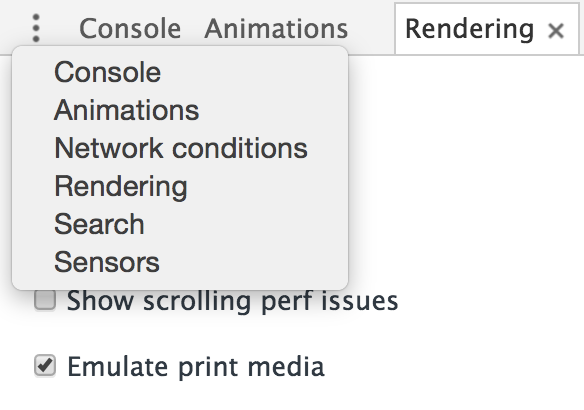
1. Open the Command Menu. (tl;dr Cmd+Shift+P (Mac) or Ctrl+Shift+P (Windows, Linux))
2. Start typing Rendering and selectShow Rendering.
3. For the Emulate CSS Media dropdown, select print.
UPDATE 29/02/2016
The DevTools docs have moved and the above link provides inaccurate information. The updated docs regarding Media type emulation can be found here: Preview styles for more media types.
Open the DevTools emulation drawer by clicking the More overrides ••• more overrides icon in the top right corner of the browser viewport. Then, select Media in the emulation drawer.
UPDATE 12/04/2016
Unfortunately, it seems the docs have not been updated in regards to print emulation. However, the Print Media Emulator has moved (again):
- Open Chrome DevTools
- Hit esc on your keyboard
- Click ⋮ (vertical ellipsis)
- Choose Rendering
- Tick Emulate print media
See screenshot below:
UPDATE 28/06/2016
Google Developers Docs around Chrome DevTools and the "Emulate Media" option have been updated for Chrome >51:
https://developers.google.com/web/tools/chrome-devtools/settings?hl=en#emulate-print-media
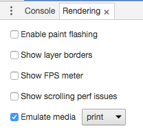
To view a page in print preview mode, open the DevTools main menu, select More Tools > Rendering Settings, and then enable the emulate media checkbox with the dropdown menu set to print.
UPDATE 24/05/2016
The naming of settings have changed once again:
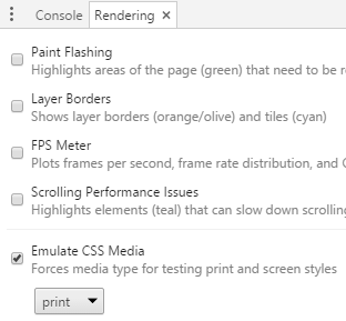
To view a page in print preview mode, open the DevTools main menu, select More Tools > Rendering, and then enable the Emulate CSS Media checkbox with the dropdown menu set to print.
How to only show certain parts with CSS for Print?
Start here. But basically what you are thinking is the correct approach.
Thanks, Now my question is actually
becoming: How do I apply CSS to a
class AND ALL OF ITS DESCENDANT
ELEMENTS? So that I can apply
"display:block" to whatever is in the
"printable" zones.
If an element is set to display:none; all its children will be hidden as well. But in any case. If you want a style to apply to all children of something else, you do the following:
.printable * {
   display: block;
}
That would apply the style to all children of the "printable" zone.
How to apply css to print div
at last I found an answer. I don't know the reason why @media was not working correctly. So I used css styling in the print function itself.
w.document.write('<style>h1{font-size:20px;color:#76C04E;width:90%;}</style>');
w.document.write('<style>body{background: #FFFFFF; color: #000000; font: 85% arial, verdana, helvetica, sans-serif; }</style>');

w.document.write('<style>.res td{font-size: 12px;font-family: open sans, arial; border-top: 1px solid #ddd; width: auto;padding: 4px;} </style>');
Now the css is correctly taken in the print preview page.
But it works only in firefox.Will update the answer accordingly when I find the solution for chrome
Thanks.
Is there a way to use the same CSS stylesheet for print media and the default layout?
There's this syntax, although I honestly don't know if it's supported across all browsers (it should be):
@media print {
    body {
        background: #fff;
        color: #000;
    }
    /* etc */
}
See the media part of the CSS2 standard at W3.
CSS to set A4 paper size
I looked into this a bit more and the actual problem seems to be with assigning initial to page width under the print media rule. It seems like in Chrome width: initial on the .page element results in scaling of the page content if no specific length value is defined for width on any of the parent elements (width: initial in this case resolves to width: auto ... but actually any value smaller than the size defined under the @page rule causes the same issue).
So not only the content is now too long for the page (by about 2cm), but also the page padding will be slightly more than the initial 2cm and so on (it seems to render the contents under width: auto to the width of ~196mm and then scale the whole content up to the width of 210mm ~ but strangely exactly the same scaling factor is applied to contents with any width smaller than 210mm).
To fix this problem you can simply in the print media rule assign the A4 paper width and hight to html, body or directly to .page and in this case avoid the initial keyword.
DEMO
@page {
  size: A4;
  margin: 0;
}
@media print {
  html, body {
    width: 210mm;
    height: 297mm;
  }
  /* ... the rest of the rules ... */
}
This seems to keep everything else the way it is in your original CSS and fix the problem in Chrome (tested in different versions of Chrome under Windows, OS X and Ubuntu).
How to make HTML pages print at a consistent size from Chrome?
I found a solution. The key is to ensure that in each document, the "logical page" that Chrome splits elements into for printing is the same size. E.g. if one document has lots of 200x200px squares and Chrome decides to group them in a rectangle 5x4 to print landscape, then you need to make sure that Chrome will print every other consistent document split into elements of size 1000x800px.
For documents that are simply a number of spans or inline-block divs in sequence, it suffices to have a div set to exactly your chosen width (1100px), and ensure that that div occupies the full page width in print preview. Then just make sure your CSS contains something like:
@media print {
  @page {
    size: 297mm 210mm; /* landscape */
    /* you can also specify margins here: */
    margin: 25mm;
    margin-right: 45mm; /* for compatibility with both A4 and Letter */
  }
}
If this isn't sufficient, then putting everything inside one or more divs with fixed size (width: 1100px; height: 800px; overflow: hidden;) does the job, as a way to force Chrome to split into the pages you want (and therefore keep elements the same size when printed).
Related Topics
Custom.CSS Has Stopped Working in 32.0.1700.76 M Google Chrome Update
Display:Inline Resets Height and Width
Css: Background Image on Background Color
Styling Password Fields in CSS
Are Alternate Nested Styles Possible in CSS
Dynamically Updating CSS in Angular 2
Next.Js Global CSS Cannot Be Imported from Files Other Than Your Custom <App>
Css3 3D Transform Doesn't Work on Ie11
Forcing Child to Obey Parent's Curved Borders in CSS
Twitter Bootstrap 3 - Panels of Equal Height in a Fluid Row
The Use of /Deep/ and >>> in Angular 2
Is There a 'Box-Shadow-Color' Property
Word-Wrap:Break-Word Not Working in IE8