Forcing child to obey parent's curved borders in CSS
According to the specs:
A box's backgrounds, but not its
border-image, are clipped to the
appropriate curve (as determined by
‘background-clip’). Other effects that
clip to the border or padding edge
(such as ‘overflow’ other than
‘visible’) also must clip to the
curve. The content of replaced
elements is always trimmed to the
content edge curve. Also, the area
outside the curve of the border edge
does not accept mouse events on behalf
of the element.
http://www.w3.org/TR/css3-background/#the-border-radius
This means that an overflow: hidden on #outer should work. However, this won't work for Firefox 3.6 and below. This is fixed in Firefox 4:
Rounded corners now clip content and images (if overflow: visible is not set).
https://developer.mozilla.org/en/CSS/-moz-border-radius
So you'll still need the fix, just shorten it to:
#outer {
  overflow: hidden;
}

#inner {
  -moz-border-radius: 10px 10px 0 0;
}
See it working here: http://jsfiddle.net/VaTAZ/3/
Why child element corners with border-radius: inherit; doesn't align with parent's
Simply setting your childs border to a lower px value will solve this - or as I've done below, you can remove border-radius: inherit.
Your issue was you applied a 20px border-radius on both elements, and as the child element was smaller than the parent, it means the border-radius appears more harsh, as the <p> tag was smaller - causing them to both be unaligned.
Updated CodePen
MDN - Border Radius
EDIT:
If you wanted to negate the overflow property - the only other way I can think of if you needed to keep your parent properties as they are would be to set the border-radius of the child to the same scale of radius as the parent - in this case about 12px as seen below.
* {  box-sizing: border-box;}
.parent {  border: 7px solid #888;  border-radius: 20px;  background: lime;}
.child-text {  border-radius: 12px;  background: linear-gradient(90deg, tomato, purple);  margin: 0;  padding: 10px;  color: #fff;}
<div class="parent"> <p class="child-text">Lorem ipsum dolor sit amet consectetur adipisicing elit. A, distinctio? Pariatur voluptas officia placeat dolores, quam soluta laborum commodi voluptates cum quos illum labore eum nihil, perspiciatis nobis et reiciendis?</p></div>Chrome not honoring border radius on children
You need to remove the position: relative
If your really need position relative then you can double wrap your element:
HTML:
<div class="outer">
    <div class="wrapper">
        <div class="inside">
        </div>
    </div>
</div>
CSS:
.outer {
    position: relative;
}
.wrapper {
    width: 100px;
    height: 100px;
    overflow: hidden;
    border: 3px solid red;
    border-radius: 20px;
}
.inside {
    width: 100px;
    height: 100px;
    background-color: #333;
}
http://jsfiddle.net/eprRj/
See these related questions:
- Forcing child to obey parent's curved borders in CSS
- CSS Border radius not trimming image on Webkit
- How to make CSS3 rounded corners hide overflow in Chrome/Opera
CSS3 border-radius parent child question
overflow: hidden will fix that :)
#wrap {
   overflow: hidden;
   ...
}
jsFiddle.
Example
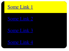
I made the background yellow to see it clearly. As you can see there is some blackness bleeding in on the edge. The example is from Chrome 10 on OS X.
Clip child to parent element with border-radius
When you add a css 3d transform to the child, you kinda move it to the separate GPU layer. You can move parent element to GPU layer instead adding null-transform hack transform: translateZ(0) to .item. Or you can replace translate with translateY (In this case child is clipped only when not being animated).
border-radius on parent element
You need box-sizing : border-box
The width and height properties include the padding and border, but
not the margin. This is the box model used by Internet Explorer when
the document is in Quirks mode. Note: Padding & border will be inside
of the box e.g. IF .box {width: 350px}; THEN you apply {border: 10px
solid black;} RESULT {rendered in the browser} .box {width: 350px;}
overflow: hidden
The content is clipped and no scrollbars are provided.
and border-radius: 50%
#container {
border-radius: 50%
overflow:hidden;
}
here is a demo
*{box-sizing: border-box}:root{ padding-top: 40px; background: #ccc}#container{ border-radius: 50%; overflow: hidden; width: 480px; height: 480px; padding: 70px; /*you need this to keep all child visible (horizontally)*/ background: white; color: #ccc; text-align: center}<div id="container"> <div id="header">Header</div> <div id="content"> Lorem Ipsum is simply dummy text of the printing and typesetting industry. Lorem Ipsum has been the industry's standard dummy text ever since the 1500s, when an unknown printer took a galley of type and scrambled it to make a type specimen book. It has survived not only five centuries, but also the leap into electronic typesetting, remaining essentially unchanged. It was popularised in the 1960s with the release of Letraset sheets containing Lorem Ipsum passages, and more recently with desktop publishing software like Aldus PageMaker including versions of Lorem Ipsum </div></div>Background of parent leaking when child's border radius is the same
You can change the CSS to obtain a similar layout without this issue:
#outer {  width: 200px;  height: 200px;  background:   linear-gradient(to bottom,steelblue 50px,white 0);  border-radius: 20px;}

body {  background-color: steelblue;}
<div id="outer"></div>Related Topics
Css3 Transform Order Matters: Rightmost Operation First
What's the Maximum Pixel Value of CSS Width and Height Properties
Newline Character Sequence in CSS 'Content' Property
Selenium Webdriver Get Text from CSS Property "Content" on a ::Before Pseudo Element
Sass Indented Syntax on Multiple Lines
Bootstrap Button Shows Blue Outline When Clicked
Next.Js Global CSS Cannot Be Imported from Files Other Than Your Custom <App>
Generate Random Number in Less CSS
Multiple Font-Weights, One @Font-Face Query
Text-Overflow Ellipsis on Flex Child Not Working
How to Select the Last N Items with Nth-Child
What's the Difference Between CSS3's :Root Pseudo Class and HTML