How to create collapsed borders around flex items and their container?
There are two primary ways to achieve this. Under each method you will find a working demo that you can expand to see how it behaves. Hovering over elements will give them a red border to make choosing the approach that works best for you easier.
Parent-child border alignment
You need to define the border like this:
ul, ul > li {
  border-style: solid;
  border-color: rgba(0,0,0,.3);
}
ul      { border-width: 2px  0   0  2px }
ul > li { border-width:  0  2px 2px  0  }
The key here is in the border-width property:
- On the container, the values for the
topandleftare set to the desired size while therightandbottomare set to0 - On the items, the values for the
rightandbottomare set to the desired size while thetopandleftare set to0
By doing this, the borders will add up in a way that they form a nicely collapsed, consistent border around the elements and the container.
:hover { border-color: red }

#limited-width {

  width: 100%;

  max-width: 200px;

  margin: 0 auto;

  font-size: 18px;

}

ul, ul > li {

  border-style: solid;

  border-color: rgba(0,0,0,.3);

}

ul {

  display: flex;

  flex-flow: row wrap;

  list-style: none;

  padding: 0;

  margin: 20px;

  border-width: 2px 0 0 2px;

}

ul > li {

  display: block;

  text-align: center;

  flex: 1 0 auto;

  max-width: 100%;

  box-sizing: border-box;

  margin: 0;

  padding: 4px 7px;

  border-width: 0 2px 2px 0;

  background-color: rgba(0,0,0,.03);

}
<div id="limited-width">
<ul>
<li>Apple</li>
<li>Orange</li>
<li>Pineapple</li>
<li>Banana</li>
<li>Tomato</li>
<li>Pear</li>
<li>Lemon</li>
</ul>
</div>Collapse borders of div
Hope the below code helps.
In the css ,the below line matches the first element of the last row
.grid-table .row .col:nth-child(4n+1):nth-last-child(-n+4)
How means.for example n will 0,1,2 ...
so .grid-table .row .col:nth-child(4n+1) matches 1st and 5th element in our case.
when n is 0
.grid-table .row .col:nth-child(4(0)+1):nth-last-child(-0+4) equates to
.grid-table .row .col:nth-child(1):nth-last-child(4)
first condition
.grid-table .row .col:nth-child(1) selects the 1 div
second condition
.grid-table .row .col:nth-last-child(4) selects the 4 div from last
since 1 & 4 is not the same element ,the condition fails
when n is 1;
.grid-table .row .col:nth-child(4(1)+1):nth-last-child(-1+4) equates to
.grid-table .row .col:nth-child(5):nth-last-child(3)
first-condition:.grid-table .row .col:nth-child(5) matches 5th element
Second condition: .grid-table .row .col:nth-last-child(3) matches 3rd element from last(which is actually 5th element from the first)
since the first & second condition pointing to the same element.
.grid-table .row .col:nth-child(4n+1):nth-last-child(-n+4) selects the 5th element.
the next line
.grid-table .row .col:nth-child(4n+1):nth-last-child(-n+4) ~ .col selects the elements after 5th ie 6th and 7th in our case
In this way we can select the last row of the grid and remove border bottom
* {
box-sizing: border-box;
font-family: monospace;
}
.grid-table {
border: 1px solid #ddd;
}
.grid-table .row {
margin: 0;
display: flex;
flex-wrap: wrap;
}
.grid-table .row .col {
padding: 20px;
border-right: 1px solid #ddd;
border-bottom:1px solid #ddd;
width: 25%;
height: 70px;
margin: 0;
}
.grid-table-tile .checkbox-custom {
width: auto;
}
.grid-table-head .col.m12.s12 {
height: 40px;
background: #e7e7e7;
padding: 10px 20px;
flex: 1 1;
}
.grid-table .row .col:nth-child(4n) {
border-right: 0;
}
.grid-table .row .col:nth-child(4n+1):nth-last-child(-n+4),
.grid-table .row .col:nth-child(4n+1):nth-last-child(-n+4) ~ .col {
border-bottom:none;
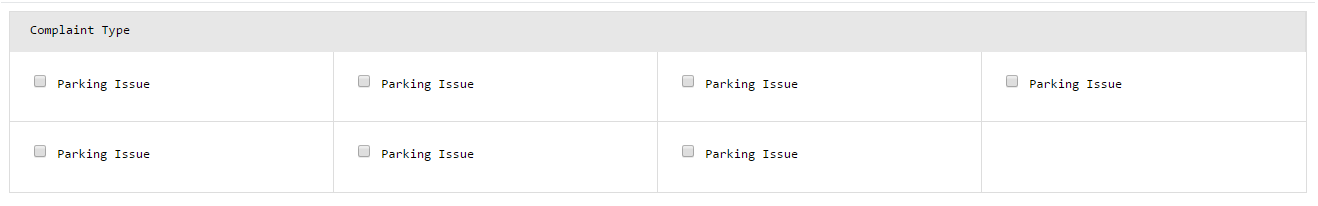
}<div class="grid-table">
<div class="row grid-table-head">
<div class="col m12 s12">Complaint Type</div>
</div>
<div class="row">
<div class="col m3 s12">
<div class="grid-table-tile">
<div class="checkbox-custom">
<input type="checkbox" class="filled-in" id="ctype-0" />
<label for="ctype-0">Parking Issue</label>
</div>
<div class="grid-table-tile-title"></div>
</div>
</div>
<div class="col m3 s12">
<div class="grid-table-tile">
<div class="checkbox-custom">
<input type="checkbox" class="filled-in" id="ctype-0" />
<label for="ctype-0">Parking Issue</label>
</div>
<div class="grid-table-tile-title"></div>
</div>
</div>
<div class="col m3 s12">
<div class="grid-table-tile">
<div class="checkbox-custom">
<input type="checkbox" class="filled-in" id="ctype-0" />
<label for="ctype-0">Parking Issue</label>
</div>
<div class="grid-table-tile-title"></div>
</div>
</div>
<div class="col m3 s12">
<div class="grid-table-tile">
<div class="checkbox-custom">
<input type="checkbox" class="filled-in" id="ctype-0" />
<label for="ctype-0">Parking Issue</label>
</div>
<div class="grid-table-tile-title"></div>
</div>
</div>
<div class="col m3 s12">
<div class="grid-table-tile">
<div class="checkbox-custom">
<input type="checkbox" class="filled-in" id="ctype-0" />
<label for="ctype-0">Parking Issue</label>
</div>
<div class="grid-table-tile-title"></div>
</div>
</div>
<div class="col m3 s12">
<div class="grid-table-tile">
<div class="checkbox-custom">
<input type="checkbox" class="filled-in" id="ctype-0" />
<label for="ctype-0">Parking Issue</label>
</div>
<div class="grid-table-tile-title"></div>
</div>
</div>
<div class="col m3 s12">
<div class="grid-table-tile">
<div class="checkbox-custom">
<input type="checkbox" class="filled-in" id="ctype-0" />
<label for="ctype-0">Parking Issue</label>
</div>
<div class="grid-table-tile-title"></div>
</div>
</div>
</div>
</div>White border between flex items
I guess it can be due to wrong use of flexbox. If you use display: flex; you shoul use flex: 0 1 50%; in child to benefit from it.
.parent{
    display: flex;
}
.child{
    //this
    flex: 0 1 50$;
    //is equivalent of this
    flex-grow: 0
    flex-shrink: 1;
    flex-basis: 50%;
}
My second guess it's box-sizing or some styles are being inherited...
Anyway maybe it'll help you
https://codepen.io/jerrykck/pen/eYZbpGN
Better way to set distance between flexbox items
- Flexbox doesn't have collapsing margins.
- Flexbox doesn't have anything akin to
border-spacingfor tables (edit: CSS propertygapfulfills this role in newer browsers, Can I use)
Therefore achieving what you are asking for is a bit more difficult.
In my experience, the "cleanest" way that doesn't use :first-child/:last-child and works without any modification on flex-wrap:wrap is to set padding:5px on the container and margin:5px on the children. That will produce a 10px gap between each child and between each child and their parent.
Demo
.upper {
  margin: 30px;
  display: flex;
  flex-direction: row;
  width: 300px;
  height: 80px;
  border: 1px red solid;

  padding: 5px; /* this */
}

.upper > div {
  flex: 1 1 auto;
  border: 1px red solid;
  text-align: center;

  margin: 5px;  /* and that, will result in a 10px gap */
}

.upper.mc /* multicol test */ {
  flex-direction: column;
  flex-wrap: wrap;
  width: 200px;
  height: 200px;
}
<div class="upper">
<div>aaa<br/>aaa</div>
<div>aaa</div>
<div>aaa<br/>aaa</div>
<div>aaa<br/>aaa<br/>aaa</div>
<div>aaa</div>
<div>aaa</div>
</div>
<div class="upper mc">
<div>aaa<br/>aaa</div>
<div>aaa</div>
<div>aaa<br/>aaa</div>
<div>aaa<br/>aaa<br/>aaa</div>
<div>aaa</div>
<div>aaa</div>
</div>Collapsing margin on Flexbox children
It's a bit of a hack, but you can add a negative margin on the flex container to cancel out the items' margins along the edges, and then move its "background" styling to a parent wrapper-element.
Updated JSBin
Updated CSS (SASS):
.wrapper
  background: #eef
  border: 1px solid darkgray

.container
  display: flex
  flex-wrap: wrap
  margin: -1em

.item
  flex-grow: 1
  margin: 1em
  border: 1px solid black
  padding: 1em
  min-width: 6em
Related Topics
CSS Vertically Centering a Fixed Positioning Div
CSS Link Color Styles Best Practice
Fixed Header in CSS for Conditional Scroll Down
How to Add a Scroll Bar to a Div
Tools to Optimize (Remove Redundancy and Merge) CSS
Horizontally Centering/Evenly Distributed <Li> Inside of <Ul> Inside a <Div>
Center Navbar in Twitter Bootstrap 2.0
How to Customize Twitter Widget Style
ASP.NET MVC - Style List Item Based on Controller
How to Use a Hex Value for Svg in Firefox
How to Write CSS Fallbacks for Vh Vw
How to Select Multiple Elements That Are Children of Given Element
How to Keep Aspect Ratio of a Background-Image