div blur of part of Background image with css
If it has to be dynamic, you should have some trouble, but you can have somewhere to start with this :
HTML
<div class="background"></div>
<div class="mask">
    <div class="bluredBackground"></div>
</div>
<div class="content"></div>
CSS
.content {
    width: 70%;
    height: 70%;
    border:2px solid;
    border-radius:20px;
    position: fixed;
    top: 15%;
    left: 15%;
    z-index:10;
    background-color: rgba(168, 235, 255, 0.2);
}
.background {
    width:100%;
    height:100%;
    background-image:url('http://www.travel.com.hk/region/time_95.jpg');
    z-index:2;
    position:fixed;
}
.bluredBackground {
    width:100%;
    height:100%;
    display:block;
    background-image:url('http://www.travel.com.hk/region/time_95.jpg');
    z-index:1;
    position:absolute;
    top:-20%;
    left:-20%;
    padding-left:20%;
    padding-top:20%;
    -webkit-filter: blur(2px);
}
.mask {
    width: 70%;
    height: 70%;
    border:2px solid;
    border-radius:20px;
    position: fixed;
    top: 15%;
    left: 15%;
    z-index:10;
    overflow:hidden;
}
FIDDLE
Blur part of an image with CSS
I have set the overflow property of the outer div to hidden and the margin-right of the inner one to -1 and it worked like a charm.
#image {
    ...
    overflow: hidden;
}

#image .blur {
    ...
    margin-right: -1px;
}
Here is the working example in JSFiddle.
#image {

    width: 940px;

    height: 360px;

    overflow: hidden;

    background-image: url('https://upload.wikimedia.org/wikipedia/commons/thumb/e/e3/Nuvola_wikipedia_icon.png/240px-Nuvola_wikipedia_icon.png');

}

#image .blur {

    background-image: url('https://upload.wikimedia.org/wikipedia/commons/thumb/e/e3/Nuvola_wikipedia_icon.png/240px-Nuvola_wikipedia_icon.png');

    background-position: center right;

    -webkit-filter: blur(3px);

    -moz-filter: blur(3px);

    -o-filter: blur(3px);

    -ms-filter: blur(3px);

    filter: blur(3px);

    filter: blur(3px);

    float: right;

    height: 100%;

    width: 360px;

    margin-right: -1px;

}
<div id="image">
<div class="blur"></div>
</div>Blur a part of the background image css
Alternatively, you can achieve the same effect with javascript - CSS is better -
as shown in this JSFiddle
var blurredDiv = document.createElement('div');

blurredDiv.className = 'blurry';

document.body.appendChild(blurredDiv);
body {
margin:0;
padding:0;
background-image:url('//cdn01.wallconvert.com/_media/wallpapers_2880x1800/1/4/silver-bmw-i8-39331.jpg');
background-size:cover;
}
.blurry {
width:calc(100% + 6px);
height:73px;
position:fixed;
top:-3px;
left:-3px;
background-image:url('//cdn01.wallconvert.com/_media/wallpapers_2880x1800/1/4/silver-bmw-i8-39331.jpg');
background-size:cover;
background-position:0 3px;
-webkit-filter: blur(3px);
filter: blur(3px);
}How to Blur part of an image in a box css
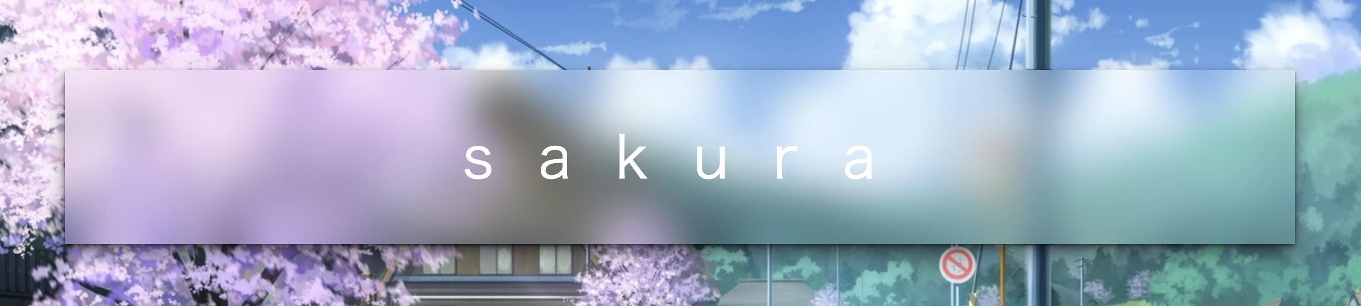
You may need backdrop-filter
The backdrop-filter CSS property lets you apply graphical effects such as blurring or color shifting to the area behind an element. Because it applies to everything behind the element, to see the effect you must make the element or its background at least partially transparent.
backdrop-filter: blur(20px);
An amazing online demo: https://codepen.io/alphardex/pen/pooQMVp
body {
  display: flex;
  justify-content: center;
  align-items: center;
  height: 100vh;
  /* background: URL(); */
  background-size: cover;
  background-position: center;
}

.bgimage {
  display: flex;
  justify-content: center;
  align-items: center;
  width: 72vw;
  height: 36vh;
  /* box-shadow: ; */
  backdrop-filter: blur(20px);
  transition: 0.5s ease;

  &:hover {
    /* box-shadow: ; */
  }

  .title {
    padding-left: 0.375em;
    font-size: 3.6em;
    font-family: Lato, sans-serif;
    font-weight: 200;
    letter-spacing: 0.75em;
    color: white;

    @media (max-width: 640px) {
      font-size: 2em;
    }
  }
}
Blurring part of background in a css background image cover
Not sure if this is what your expected output: check the updated fiddle https://jsfiddle.net/nw3spoLz/
i have added scale on your blur div
.block{
    width: 50%;
    margin: 30px auto 30px auto;
    box-shadow: 0px 0px 5px 0px rgba(0,0,0,0.40);
    position: relative;
    overflow: hidden;
}

.blur{
    background: url('https://i.imgur.com/iKvNL2a.jpg') no-repeat center center;
    background-size: cover;
    overflow: hidden;
    z-index: 50;
    position: absolute;
    top: 0;
    bottom: 0;
    left: 0;
    right: 0;
    transform: scale(2);
    filter: blur(10px);
}
.container{

    background: url('https://i.imgur.com/iKvNL2a.jpg') no-repeat center center;

    background-size: cover;

    width: 100%;

    height: 100%;

    overflow: auto;

}

.block{

    width: 50%;

    margin: 30px auto 30px auto;

    box-shadow: 0px 0px 5px 0px rgba(0,0,0,0.40);

    position: relative;

    overflow: hidden;

}

.blur{

    background: url('https://i.imgur.com/iKvNL2a.jpg') no-repeat center center;

    background-size: cover;

    overflow: hidden;

    z-index: 50;

    position: absolute;

    top: 0;

    bottom: 0;

    left: 0;

    right: 0;

    transform: scale(2);

    filter: blur(10px);

}

.content{

  width: 100%;

  height: 100%;

  z-index: 100;

  position: relative;

}
<div class="container">
<div class="block">
<div class="blur">
</div>
<div class="content">
<h3>
A bunch of stuff
</h3>
<p>
This is supposed to be content.
</p>
<p>
That the box will wrap around
</p>
</div>
</div>
</div>Blur a background image via css
You can use the following CSS declaration to blur a background image:
filter: blur(value);
N.B. If you want the <div> to contain other content but you wish to blur only the background image, then apply the background image and the blur to a ::before pseudo-element.
Working Example:
.wpd-page-title {

position: relative;

width: 100%;

height: 180px;

}

.wpd-page-title::before {

content: '';

display: block;

position: absolute;

top: 0;

left: 0;

width: 100%;

height: 100%;

background: url(https://picsum.photos/300/300) no-repeat;

}

.blur-3px::before {

filter: blur(3px);

}

.blur-6px::before {

filter: blur(6px);

}

.blur-9px::before {

filter: blur(9px);

}
<div class="wpd-page-title"></div>
<div class="wpd-page-title blur-3px"></div>
<div class="wpd-page-title blur-6px"></div>
<div class="wpd-page-title blur-9px"></div>How do I make the background image for my page blurry without affecting any of the other content on the page?
After body, you need to add a<div>tag with the css property:backdrop-filter: blur (1px);before the rest of the page.
Here's an example:
body {
  margin: 0;
  padding: 0;
  background: url('https://upload.wikimedia.org/wikipedia/commons/thumb/c/c3/NGC_4414_%28NASA-med%29.jpg/1024px-NGC_4414_%28NASA-med%29.jpg');
  color: #fff;
  width: 100%
}

main {
  width: 50%;
  border: 5px solid red;
}

#amazing__filter{
  backdrop-filter: blur(4px);
  background: #ffffff20;
  width: 100vw;
  display: flex;
  justify-content: center;
  align-content: center;
  align-items: center;
  flex-direction: column;
}
footer {
  width: 100%;
  height: 40px;
}
<html>
<head>
</head>
<body>
<div id="amazing__filter">
<main>
<header>
<h1>
A spectacular solution to the problem
</h1>
</header>
<h2>
List of the same words to fill the page
</h2>
<ol>
<li>List element</li>
<li>List element</li>
<li>List element</li>
<li>List element</li>
<li>List element</li>
<li>List element</li>
<li>List element</li>
<li>List element</li>
<li>List element</li>
<li>List element</li>
<li>List element</li>
<li>List element</li>
<li>List element</li>
<li>List element</li>
<li>List element</li>
<li>List element</li>
<li>List element</li>
<li>List element</li>
<li>List element</li>
<li>List element</li>
<li>List element</li>
<li>List element</li>
<li>List element</li>
<li>List element</li>
<li>List element</li>
<li>List element</li>
<li>List element</li>
<li>List element</li>
<li>List element</li>
<li>List element</li>
<li>List element</li>
<li>List element</li>
<li>List element</li>
<li>List element</li>
<li>List element</li>
<li>List element</li>
<li>List element</li>
<li>List element</li>
<li>List element</li>
<li>List element</li>
<li>List element</li>
<li>List element</li>
<li>List element</li>
<li>List element</li>
<li>List element</li>
<li>List element</li>
<li>List element</li>
<li>List element</li>
<li>List element</li>
<li>List element</li>
<li>List element</li>
<li>List element</li>
<li>List element</li>
<li>List element</li>
<li>List element</li>
<li>List element</li>
<li>List element</li>
<li>List element</li>
<li>List element</li>
<li>List element</li>
<li>List element</li>
<li>List element</li>
<li>List element</li>
</ol>
</main>
<aside>
</aside>
<footer>
<p>Footer</p>
</footer>
</div>
</body>
</html>How to apply a CSS filter to a background image
Check out this pen.
You will have to use two different containers, one for the background image and the other for your content.
In the example, I have created two containers, .background-image and .content.
Both of them are placed with position: fixed and left: 0; right: 0;. The difference in displaying them comes from the z-index values which have been set differently for the elements.
.background-image {
  position: fixed;
  left: 0;
  right: 0;
  z-index: 1;
  display: block;
  background-image: url('https://i.imgur.com/lL6tQfy.png');
  width: 1200px;
  height: 800px;
  -webkit-filter: blur(5px);
  -moz-filter: blur(5px);
  -o-filter: blur(5px);
  -ms-filter: blur(5px);
  filter: blur(5px);
}

.content {
  position: fixed;
  left: 0;
  right: 0;
  z-index: 9999;
  margin-left: 20px;
  margin-right: 20px;
}
<div class="background-image"></div>
<div class="content">
<p>Lorem ipsum dolor sit amet, consectetur adipiscing elit. Duis aliquam erat in ante malesuada, facilisis semper nulla semper. Phasellus sapien neque, faucibus in malesuada quis, lacinia et libero. Sed sed turpis tellus. Etiam ac aliquam tortor, eleifend
rhoncus metus. Ut turpis massa, sollicitudin sit amet molestie a, posuere sit amet nisl. Mauris tincidunt cursus posuere. Nam commodo libero quis lacus sodales, nec feugiat ante posuere. Donec pulvinar auctor commodo. Donec egestas diam ut mi adipiscing,
quis lacinia mauris condimentum. Quisque quis odio venenatis, venenatis nisi a, vehicula ipsum. Etiam at nisl eu felis vulputate porta.</p>
<p>Fusce ut placerat eros. Aliquam consequat in augue sed convallis. Donec orci urna, tincidunt vel dui at, elementum semper dolor. Donec tincidunt risus sed magna dictum, quis luctus metus volutpat. Donec accumsan et nunc vulputate accumsan. Vestibulum
tempor, erat in mattis fringilla, elit urna ornare nunc, vel pretium elit sem quis orci. Vivamus condimentum dictum tempor. Nam at est ante. Sed lobortis et lorem in sagittis. In suscipit in est et vehicula.</p>
</div>Related Topics
Prevent a Pseudo Element from Triggering Hover
My Svg Image Ignores Its Stylesheet When Used as Background Image
Apply Background-Size to Individual Layer of a Multiple Background
Responsive Iframe (Google Maps) and Weird Resizing
Centering a Button Vertically in Table Cell, Using Twitter Bootstrap
A Simple Example of Django and CSS
CSS How to Print a Table with Background Color (Without Print Settings Changes)
Media Query Syntax for Reactjs
Hover on Element and Highlight All Elements with the Same Class
CSS Transitions Between Absolute and Relative Positioning
Why Does a Grid-Area Name Absent in Grid-Template-Areas Create Additional Tracks
Footer Consisting of Two Right Triangles
Parent Selector Nested Inside &:Hover
How to Make Dynamic Styles in React Native
Line-Height as a Percentage Not Working