How do I make a CSS grid cell collapse when empty or using display:none?
The problem is related to the definition of auto for a grid row. According to grid-row-template MDN docs auto is:
Is a keyword that is identical to maximal content if it's a maximum. As a minimum it represents the largest minimum size (as specified by min-width/min-height) of the grid items occupying the grid track.
So when there is content in the track, it acts as a maximum and sizes correctly. But when there is no content in the clue-nav element, it appears to fallback to the minimum definition, and since the only grid item occupying the track is the image in clue-logo so the minimum ends up getting set to a much larger value. As everything resolves itself, the "empty" grid cell gets a bunch more space, and the clue-title grid cell ends up taking up the actual "minimum" amount of space that it needs.
To work around this issue, instead of setting the height to auto, you can use minmax(0, auto). This allows the actual minimum height of the row to go to zero instead of the clue-logo height, and it properly collapses when clue-nav is hidden.
I stumbled on this while fiddling around with Sølve's suggested answer, I noticed a bit more odd behavior around how it would decide to resize the row. So kudos to him for helping me stumble onto the right answer.
CSS Grid. Hide unused area
Do you need named template areas?
Could you just define how many columns certain grid items should span?
.name {
  grid-column: span 3;
}

.lastname {
  grid-column: span 3;
}

.phone {
  grid-column: span 6;
}

.wrapper {
  gap: 10px;
  display: grid;
  grid-template-columns: repeat(6, 1fr);
}
How to remove unused columns / rows in CSS Grid
Don't set explicit columns and rows. These are the tracks you define using grid-template-columns and grid-template-rows.
Let the implicit grid do the work for you. It will create columns and rows as needed. The default sizing for these tracks is grid-auto-rows: auto and grid-auto-columns: auto.
You just need to set the items in their proper columns.
article {
  display: grid;
  grid-column-gap: 1em;
  grid-auto-flow: column;
  margin-bottom: 1em;
  background: aqua;  /* adjusted for easier viewing */
}

 /* place items 1-4 in column 1 */
div:nth-child(-n + 4) { grid-column: 1; }

/* place items 5-8 in column 2 */
div:nth-child(n + 5):nth-child(-n + 8) {
  grid-column: 2;
}

/* Styling Purpose */
div {
  padding: 0.5em;
}
div:nth-child(odd) {
  background: gray; /* adjusted for easier viewing */
}
<article>
<div>Article 1</div>
</article>
<article>
<div>Article 1</div>
<div>Article 2</div>
</article>
<article>
<div>Article 1</div>
<div>Article 2</div>
<div>Article 3</div>
</article>
<article>
<div>Article 1</div>
<div>Article 2</div>
<div>Article 3</div>
<div>Article 4</div>
</article>
<article>
<div>Article 1</div>
<div>Article 2</div>
<div>Article 3</div>
<div>Article 4</div>
<div>Article 5</div>
</article>
<article>
<div>Article 1</div>
<div>Article 2</div>
<div>Article 3</div>
<div>Article 4</div>
<div>Article 5</div>
<div>Article 6</div>
</article>
<article>
<div>Article 1</div>
<div>Article 2</div>
<div>Article 3</div>
<div>Article 4</div>
<div>Article 5</div>
<div>Article 6</div>
<div>Article 7</div>
</article>
<article>
<div>Article 1</div>
<div>Article 2</div>
<div>Article 3</div>
<div>Article 4</div>
<div>Article 5</div>
<div>Article 6</div>
<div>Article 7</div>
<div>Article 8</div>
</article>How can I collapse a row (remove a row) which doesn't have content in an explicitly declared CSS grid layout?
You're defining the rows at the container level.
.card {
  display: grid;
  grid-template-columns: 1fr 1fr 1fr;
  grid-template-rows: 2fr 1fr 1fr 2fr;
  grid-gap: 5px;
}
But content is handled at the grid item level.
Therefore, when the container is asked to layout explicit tracks, it does the job without regard for the existence of content.
In your case, when content appears or disappears, there is no change to the container rules, so there is no reason for rows to disappear.
But I don't see any reason for explicit rows to make this layout work. Just take them out.
Note that fr units distribute free space in the container. But you haven't set a height on the container, which means there is no free space to distribute. This may lead to unexpected behavior across major browsers (depending on how they chose to render such a scenario). Try setting a height on the container for more proper and stable behavior.
.card {  display: grid;  grid-template-columns: 1fr 1fr 1fr;  /* grid-template-rows: 2fr 1fr 1fr 2fr; */  grid-gap: 5px;}.card * {  /*   styles for demonstational purposes */  background: #02750b;  color: #fff;  display: flex;  justify-content: center;  align-items: center;  padding: 5px;}.card :nth-child(2) {  grid-area: 1 / 2 / 3 / 3;}.card :nth-child(5) {  grid-area: 3 / 2 / 5 / 3;}.card :nth-child(4) {  grid-area: 2/ 1 / 4/ 2;}.card :nth-child(6) {  grid-area: 2/ 3 / 4/ 4;}
p  {  padding: 5px;  background: #b5b53f;}
<div class="card"> <div>1</div> <div>2</div> <div>3</div> <div>4</div> <div>5</div> <div>6</div> <div>7</div> <div>8</div></div><p>Keep in mind you're using <i>fr</i> units in a container with no defined height. So expect free space to be distributed unevenly across examples.</p>
<div class="card"> <div>1</div> <div>2</div> <div>3</div> </div><p>less space = smaller <i>fr</i> units = potentially shorter grid areas (browser behavior may vary)</p>Why are empty columns not collapsing in CSS Grid?
When I inspected the output I found that the last row's blank columns have not collapsed. Why?
Because the columns for the grid were already established in the first row.
Also why the last two images have not taken equal remaining space which it should take?
Because there are column tracks standing in the way.
Once grid items start wrapping you can infer three things:
- All space in the first row has been consumed.
- All columns tracks in the grid have been created.
- There is no extra space available for
auto-fitto work.
All of this can be seen in the image you posted in your question.
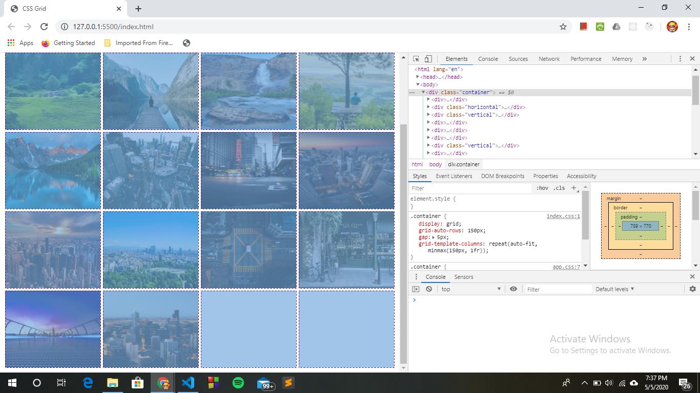
Here's how auto-fit works when more space is available.
.container {  display: grid;  grid-auto-rows: 150px;  gap: 5px;  grid-template-columns: repeat(auto-fit, minmax(150px, 1fr));}
.container > div {  border: 1px dashed red;}
div > img {  height: 100%;  width: 100%;  object-fit: contain;}
<div class="container"> <div><img src="http://i.imgur.com/60PVLis.png" alt="image" /></div> <div><img src="http://i.imgur.com/60PVLis.png" alt="image" /></div> <div><img src="http://i.imgur.com/60PVLis.png" alt="image" /></div></div>Show/hide grid-template-row of empty content or if grid area not rendered
Updated Answer (based on changes to the question)
If the Player grid area must be explicitly defined, then change its row in grid-template-rows to auto or min-content. You can then define the height in the component itself (i.e., height: 90px).
Original Answer
Consider leaving the Player component out of the explicit grid. In other words, don't define it in grid-template-areas or grid-template-rows.
Use grid-auto-rows: 90px.
If necessary, apply grid-row: 3 to the component.
Or even grid-area: 3 / 1 / auto / -1, which is equivalent to:
grid-row-start: 3grid-column-start: 1grid-row-end: autogrid-column-end: -1
Related Topics
CSS to Make Bootstrap Navbar Transparent
Css: Left, Center, & Right Align Text on Same Line
How to Add Automatic Class in Image for Wordpress Post
Keep Background Image Fixed During Scroll Using CSS
How to Create Multi Columns from a Single Unordered List
How to Remove All Default Webkit Search Field Styling
Translate X and Y Percentage Values Based on Elements Height and Width
Two CSS Files Defining Same Class
Ml-Auto Is Not Pushing Navbar Links to the Right
How to Apply Custom Animation Effect @Keyframes in Mui
Using a Custom (Ttf) Font in CSS
Css: Transform: Translate(-50%, -50%) Makes Texts Blurry