How often is the default font size in the browser not 16px?
This avoids answering your question, but IMHO such statistics shouldn't matter even if it were near zero percent.
Even if 16px were the de-facto standard, you should start from the position that this is something that the designer doesn't ultimately control, and it should be left up to the user to choose their font size. Your decision process should lead to designs that are flexible based on the user's needs.
Is the default font-size of every browser 16px? Why?
The base font-size is determined by the users pre-defined preferences within the browser.
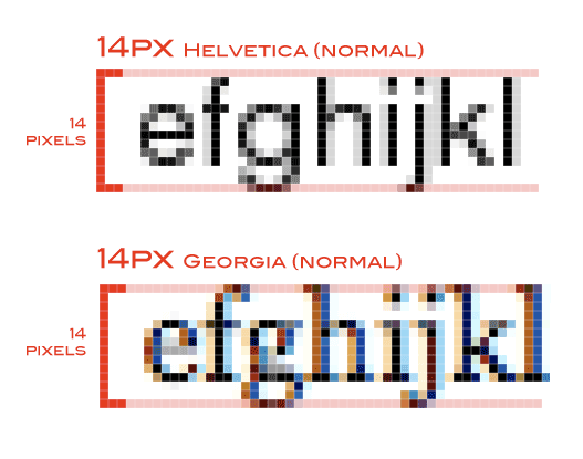
In almost every browser, 16px is the standard for proportional fonts. This can also change dependant on if the font uses serifs or is a fixed width font.
Just remember, em is relative to the element it is used on or relative to the inherited parents font-size, and is proportional to that. rem however, uses the root html elements.
For example:
html {
  font-size: 16px;
}
h1 {
  font-size: 2em; // 32px
}
p {
  font-size: 1em; // 16px
}
.someClass {
  font-size: .75em; // 12px
}
.someClass p {
  font-size: 2em; // 24px
}
.someClass p .test {
  font-size: 1.25rem; // 20px
}
<html>
<h1>2em Title Text</h1>
<p>Normal Element Text</p>
<div class="someClass">
someClass font size
<p>SomeClass with em</p>
<p><span class="test">someClass p element with class test</span>
</p>
</div>
</html>How does increasing a browser's default font size work?
Increasing the browser's default font size only means the browser will use a larger font size when no font size is otherwise specified.
If nothing on a page specifies a font-size the browser's default is used, so that larger font size will be used. Once you specify a font-size on something, that is the font size used on that element and its descendants.
If you specify that font-size on the html element, everything is a descendant of that, so everything has a specified font size, so the browser's default size is not used.
If you specify a font-size further down the DOM tree then the default size will be used until a specified size is encountered, if the specified size is a relative size it is relative to the current size, which could be the browser's default; for example:
<body>
    <div>
        <!-- the text below is the browser's default size -->
        <p>Some text in a paragraph</p>
    </div>
    <div style="font-size: 16px">
        <!-- the text below is 16px *regardless* of the browser's default -->
        <p>Some text in another paragraph</p>
    </div>
    <div style="font-size: 2em">
        <!-- the text below is twice the browser's default size -->
        <p>Some text in a paragraph</p>
    </div>
</body>
Chrome and other browsers may also have a setting for the minimum font size; fonts specified in a page that are smaller than the minimum will be increased to the minimum — but that is not part of a standard and will (probably) be browser dependent.
Default reference font-size of em?
Most major browsers have standard text set to a default font size of 16px.
From MDN:
If you haven't set the font size anywhere on the page, then it is the
browser default, which is often 16px.
It continues on to say:
So, by default 1em = 16px, and 2em = 32px. If you set a
font-sizeof
20px on thebodyelement, then 1em = 20px and 2em = 40px. Note that
the value 2 is essentially a multiplier of the current em size.
Whether the initial font size is declared on the body or html element is at the discretion of the browser maker. The W3C recommended default style sheet doesn't specify an element (or even a font size, for that matter).
What happens when the user sets the browser font size?
The user-defined font size determines the base font size of the root element html. The initial value of font-size as specified by CSS is medium, which in all desktop browsers corresponds to this user-defined size (except Microsoft Edge which follows Windows DPI and accessibility settings rather than having its own). Mobile browsers don't seem to honor the system-wide preference typical of mobile devices, unfortunately. At least, none of Safari on iOS, Internet Explorer on Windows Phone 8.1 or Microsoft Edge on Windows 10 Mobile do.
All other keyword values of the font-size property defined here are scaled to this size, so if the user-defined size is 20px, medium corresponds to 20px and small will almost certainly correspond to a size smaller than 20px.
Media query rems and ems are calculated directly off of this user-defined size, irrespective of the specified font-size property of the root element. Each of the following media expressions:
(max-width: 30rem)
(max-width: 30em)
is equivalent to (max-width: 480px) when the user-defined size is 16px, and (max-width: 600px) when the user-defined size is 20px.
Style rule rems on the other hand are calculated off of the specified font-size of the root element. The following rule:
:root { font-size: 50%; }
makes 1rem in a style rule equivalent to 8px when the user-defined size is 16px, and 10px when the user-defined size is 20px.
Style rule ems and percentages are always calculated relative to ancestor elements so their behavior doesn't change. If the font size of body is declared in ems or percentages then it'd be based off of whatever the font size of html (its parent) is, for example. So on and so forth for all its descendants that don't specify some other size.
The px unit corresponds to a CSS pixel and so its metrics are never affected by the user-defined font size.
The behavior of viewport units and calc() doesn't change, since none of those things depends on an element's font size. As their name suggests, viewport units scale to the size of the viewport.
The most noticeable overall effect this can have on a layout that sizes everything (including widths and heights of boxes) in rems and ems, is that the user can scale the entire layout just by changing their preferred font size. I don't know how useful this is anymore, especially when zoom is a thing.
So, to ensure that your copy is able to accommodate the user's preferred font size without forcing them to zoom, specify all your font sizes in rems or ems where possible. Especially do not specify a pixel font size on html, as that will override the preference completely. You don't necessarily have to specify widths and heights in rems or ems — this really depends on your layout. Not all fluid layouts scale well with different sizes. The most important aspect of this, really, is the size of text, since this feature is intended to scale text to improve readability.
1rem not always equal to 16px
When setting 16px as font size it doesn't mean the actual character will be 16px.
It means the total height of the text will be 16 pixel, big letters, small letter, letter like "j" sit lower than for example "n" and "f" sits higher.
Src: https://css-tricks.com/css-font-size/
Does the html contain the browser's default font-size?
I may not have understood your question completely, in which case I apologise.
Anyway, I hope this helps.
1rem is equal to the font size of the html element. No matter if your stylesheet assigns a font-size to html or not.
So for example, if a user has 15px for a default font size, then a stylesheet saying
div {font-size:2rem}
will display all divs with a font size of 30px.
If, on the other hand, you have this for a stylesheet
html {font-size:12px}
div {font-size:2rem}
then 1rem will be 12px, and all divs will display at 24px, regardless of the user's default font settings.
html {font-size:12px;}div {font-size:2rem;}This is normal size text<div>This is a div</div>Related Topics
CSS Circle Border Fill Animation
How to Import CSS File for into Component .Jsx File
Css: How to Have to Divs Side by Side with Height 100%
Evenly-Spaced Navigation Links That Take Up Entire Width of Ul in CSS3
How to Make Placeholder and Label Transitions
Css: How Could I Deactivate Kerning for My Font
Color (Colour) Differences Between Browsers
Css: How to Get Two Floating Divs Inside Another Div
Unable to Get the Scroll When Position:Fixed -- Elements Disappears Form the Screen
In CSS Grid Layout, Do We Count the Span Even Starting on Implicit Grid Lines
How to Set Up a Dynamic Grid Based on Flex or Grid
How Do Make My Website Resize Automatically When the Screen Resolution Changes
How to Create Circle with Four Quarters
How to Override Bootstrap 3 Styles with External Custom CSS