navigation bar entire width spaced items evenly
I'd rework your CSS like this jsFiddle example.
CSS
ul.nav {
width:100%;
margin:0 auto;
padding:0;
list-style:none;
background-color:#62564A;
text-align:center;
font-family: sans-serif;
}
.nav li {
display:inline-block;
width:33%;
margin:0;
padding:0;
}
.nav a {
text-align:center;
padding:12px 0 13px 0;
margin:0;
border-left: 1px solid #fff;
border-right: 1px solid #fff;
display:block;
}
.nav a:hover {
background:#A26A42;
border:none;
}
ul.nav li:first-child a{
border:none;
}
ul.nav li:last-child a {
border:none;
}
Full width horizontal nav bar with evenly spaced items
With a static number of elements it's easy - http://jsfiddle.net/X56cJ/
However, if you want to have uniform spacing between the text, not the elements themselves - it becomes tricky. Again, if the number of elements doesn't change, you do it with css classes and static widths. Otherwise it'll have to be javascript
EDIT: Here's the JavaScript way of getting same space between elements.
HTML:
<ul class="menu">
    <li>About Us</li>
    <li>Our Products</li>
    <li>FAQs</li>
    <li>Contact</li>
    <li>Login</li>
</ul>
JS:
function alignMenuItems(){
    var totEltWidth = 0;
    var menuWidth = $('ul.menu')[0].offsetWidth;
    var availableWidth = 0;
    var space = 0;

    var elts = $('.menu li');
    elts.each(function(inx, elt) {
        // reset paddding to 0 to get correct offsetwidth
        $(elt).css('padding-left', '0px');
        $(elt).css('padding-right', '0px');

        totEltWidth += elt.offsetWidth;
    });

    availableWidth = menuWidth - totEltWidth;

    space = availableWidth/(elts.length);

    elts.each(function(inx, elt) {
        $(elt).css('padding-left', (space/2) + 'px');
        $(elt).css('padding-right', (space/2) + 'px');
    });
}
Full example here
Evenly spaced, justified horizontal nav links: How to remove vertical space in empty :after content
Strange issue.
I assume it has something to do with the fact that inline elements respect whitespace in the markup, though the whitespace is necessary for text-align:justify to work, thus it can't be removed.
Since the whitespace is determined by the font's size, you can set the parent's font-size to 0, and then set the children's font-size accordingly. It works.. jsFiddle example
#nav {
    text-align: justify;
    outline: 1px solid grey;
    font-size:0;
}
#nav li {
    display: inline-block;
    background-color: green;
    font-size:16px;
}
Can't think of anything better at the moment. I will let you know if I do.
How to stretch a fixed number of horizontal navigation items evenly and fully across a specified container
The modern way to distribute items evenly is to set the following two declarations on the container element:
.container {
  display: flex; /* (1) */
  justify-content: space-between; /* (2) or space-around or space-evenly */
}
The value to use for justify-content depends on which kind of even distribution is needed.
See MDN
ul {
list-style: none;
padding: 0;
width: 90vw;
border: 3px solid gold;
display: flex;
}
a {
background: gold;
}
ul {
justify-content: space-between;
}
ul ~ ul {
justify-content: space-around;
}
ul ~ ul ~ ul {
justify-content: space-evenly;
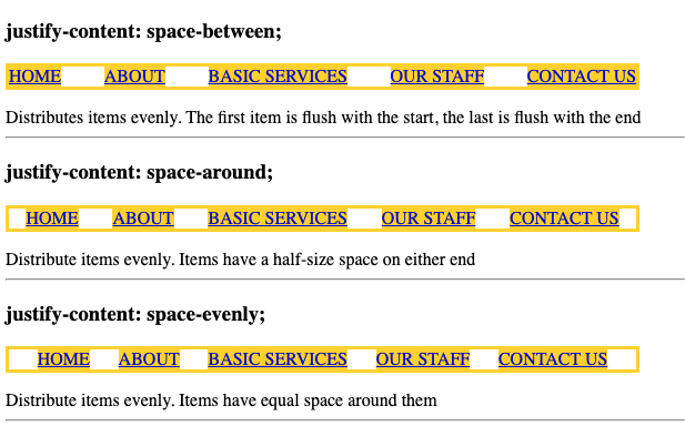
}<h3>justify-content: space-between; </h3>
<ul id="nav">
<li><a href="#">HOME</a></li>
<li><a href="#">ABOUT</a></li>
<li><a href="#">BASIC SERVICES</a></li>
<li><a href="#">OUR STAFF</a></li>
<li><a href="#">CONTACT US</a></li>
</ul>
<div>Distributes items evenly. The first item is flush with the start, the last is flush with the end </div>
<hr>
<h3>justify-content: space-around;</h3>
<ul id="nav">
<li><a href="#">HOME</a></li>
<li><a href="#">ABOUT</a></li>
<li><a href="#">BASIC SERVICES</a></li>
<li><a href="#">OUR STAFF</a></li>
<li><a href="#">CONTACT US</a></li>
</ul>
<div>Distribute items evenly. Items have a half-size space on either end</div>
<hr>
<h3>justify-content: space-evenly;</h3>
<ul id="nav">
<li><a href="#">HOME</a></li>
<li><a href="#">ABOUT</a></li>
<li><a href="#">BASIC SERVICES</a></li>
<li><a href="#">OUR STAFF</a></li>
<li><a href="#">CONTACT US</a></li>
</ul>
<div>Distribute items evenly. Items have equal space around them</div>
<hr>Fluid navigation items of different widths with equidistant spacing
I thought about this for a while and came up with two reasonable approaches, both of which are pretty good but not exactly pixel perfect. One is CSS based only and the second is aided by jQuery (JavaScript).
CSS Approach - pretty good approximation
Consider the following HTML:
<ul class="nav ex1">
    <li class="first"><a href="#">Home</a></li>
    <li><a href="#">Collections</a></li>
    <li class="tight"><a href="#">About Us</a></li>
    <li><a href="#">Slocklists</a></li>
    <li class="tight"><a href="#">Trade Enquiries</a></li>
    <li><a href="#">Press</a></li>
    <li class="last"><a href="#">Contact Us</a></li>
</ul>
I added some classes as hooks for the styling.
The CSS is as follows:
.nav.ex1 {
    outline: 1px dashed blue;
    width: 100%;
    margin: 0;
    padding: 0;
    display: table;
}
.nav.ex1 li {
    display: table-cell;
    outline: 1px dotted gray;
    width: 20%;
    white-space: pre;
    text-align: center;
}
.nav.ex1 li.first {
    width: 1%;
}
.nav.ex1 li.last {
    width: 1%;
}
.nav.ex1 li.tight {
    width: 1%;
}
In Example 1, the ul.nav parent container uses display: table and width: 100%. The child li elements are table-cell's. I added white-space: pre to prevent some of the links from wrapping into two lines, and text-align: center to keep the text centered.
The trick is to force some of the table-cell's to shrink-to-fit the text, and you can do this by setting width: 1% which is non-zero but too small to hold the text (unless your screen is 10,000 pixels wide). I shrink-to-fit the first and last cells which forces them to align to the left and right edges of the parent container. I then force every other table-cell to shrink-to-fit by added the .tight class.
The remaining table's cells will have a width of 20% which will keep them evenly spaced between their two nearest neighbors. HOWEVER, there will be some slight variation in spacing among the links in the row, which is why I call it an approximation.
jQuery Aided Solution
In Example 2, the markup is essentially the same and the CSS is:
.nav.ex2 {
    outline: 1px dashed blue;;
    margin: 0;
    padding: 0;
    display: block;
    overflow: auto;
    width: 100%;
}
.nav.ex2 li {
    float: left;
    display: block;
    outline: 1px dotted gray;
    width: auto;
}
In this case, the li elements are floated left and I use width: auto.
The trick is to calculate the magic left-margin value and apply it to all the li elements except for the first one.
The jQuery action is:
$(window).resize(function () {
    navResizer();
});

// On load, initially, make sure to set the size.
navResizer();

function navResizer() {
    var $li_w = 0;
    var $ul_w = $(".nav.ex2").innerWidth();

    $( ".nav.ex2 li" ).each(function( index ) {
        $li_w += $(this).innerWidth();
    });

    var li_margin = Math.floor(($ul_w-$li_w)/6);
    $(".nav.ex2 li").not(".first").css("margin-left",li_margin);
    $("p.note").text( "Widths: ul.nav: " + $ul_w + " all li: " + $li_w + " Left margin: " + li_margin);
}
Basically, the action calculates the width of ul.nav ($ul_w), and the total widths of all the li child elements ($li_w).
The left-margin is calculated by ($ul_w - $li_w)/6 where 6 is the number of gaps between the 7 links.
The key line of code is: $(".nav.ex2 li").not(".first").css("margin-left",li_margin);
I use .not(".first") to omit the first li element and then .css to set the left margin.
The one slight defect is at the far right where the link is not quite right justified, but you can fix that by floating the last li to the right.
For the most part, if your link texts were similar in length, you would be hard pressed to distinguish the two. Both approaches are not quite pixel perfect, but pretty good.
Fiddle: http://jsfiddle.net/audetwebdesign/xhSfs/
Footnote
I tried some other approaches using text-align: justify and inline-block, but the CSS engine does not treat inline-blocks like regular words, so will not justify a line of inline-blocks.
Setting left-margin to a % value will not quite work at some window widths and the right-most link will not be on the edge as desired.
The jQuery approach has been tried before, see:
Evenly-spaced navigation links that take up entire width of ul in CSS3
Evenly space horizontal navigation items
The following should fix your issues:
Remove the padding-right found in many of your menu items.
Many of the menu items, specifically the <a> tags, have a padding-right: 23px;
Make the following change to your CSS:
.jqueryslidemenu ul li a
{
     width: auto;
     margin: 0 20px 0 20px;    //Adjust this to fit your needs.
     ...
}
This would make each item evenly spaced based on the width of the menu items.
You should be able to use the following script, simply place it in the head section of your page and this should fix your issue:
<script type='text/javascript'>
    for(i = 0; i < document.getElementsByClassName('menu-item-object-page').length; i++){
    document.getElementsByClassName('menu-item-object-page')[i].firstChild.style.paddingRight = "0px";}
</script>
Evenly spread links over a horizontal navigation
Use display: table for UL and display: table-cell for LI. And display-table.htc for IE6/7 if they matter.
How do I get any number of links to space evenly?
A pure CSS solution, based on justification of the links, though still as semantic list items:
See demo fiddle.
Tested on W7 in IE7, IE8, IE9, Chrome 12, SafariWin 5, Opera 11, FF 4.
Update:
Concerning the width: Since you dynamically inject the navigation links into the HTML page, it likely is also possible to classify the navigation bar style.
See updated fiddle.
css - stretched and evenly spaced horizontal menu
Not sure of all the parameters here ("stretch" is not very clear), but wouldn't some left and right padding on the links do it? Because this is a menu, I won't use a table but a <ul> instead. There are plenty of variations on this if it's not what you want:
<!DOCTYPE html>
<html lang="en">
<head>
<meta charset="utf-8">

<style media="all">
ul, li {margin: 0; padding: 0;}
ul {list-style: none; display: table; border-spacing: 5px; }
li {display: table-cell; background: #f7f7f7; border: 1px solid blue; }
li a {padding: 0 30px;}
</style>

</head>
<body>

<ul>
    <li><a href="#">aa</a></li>
    <li><a href="#">Evenly-Spaced Navigation Links That Take Up Entire Width of Ul in CSS3aaaaa</a></li>
    <li><a href="#">Evenly-Spaced Navigation Links That Take Up Entire Width of Ul in CSS3a</a></li>
</ul>

</body>
</html>
Trying to evenly space out an image nav link with the rest of the text links in navigation
.nav {    background: tomato;    padding: 25px;    display: flex;    list-style: none;    flex-direction: row;    /* vertical alignement */    align-items: center;    /* how you want horizontal distribution */    /* space-evenly | space-around | space-between */    justify-content: space-evenly;}
.item {    background: rgba(0, 0, 0, 0.2);}
.item:first-child {    height: 50px;    line-height: 50px;}
<ul class="nav"> <li class="item">navA</li> <li class="item">navB</li> <li class="item">my third item</li> <li class="item">Blah</li> <li class="item">Contact</li></ul>Related Topics
Absolute Positioning and Its Parent Element
Css/Webkit: Background Images for Table Row
How to Style a Gtklabel with CSS
CSS Equivalent to Photoshop's Justify-All
Best Way to Structure a CSS Stylesheet
::Before/::After + Flexbox in Mdn
Best Practices - Only Download CSS You Need, or Use a Minification Process
Bootstrap 3 Nav-Bar Change Color Cause Showing a White Border or White Line
Iframe Horizontal Scrolling Not Rendering on iOS
Chrome Columns Bug When Number of Columns Is Less Then Column-Count
CSS 3 or Svg Wave in a Background
Angular Material Mat-Spinner Custom Color
How to Shift a Background Image with CSS
Min/Max Width/Height with Multiple Values
Can the :Before and :After Pseudo-Elements Inherit Height from the Parent Element