Forward slash / in CSS border radius syntax
From W3C :
If values are given before and after the slash, then the values before
the slash set the horizontal radius and the values after the slash set
the vertical radius. If there is no slash, then the values set both
radii equally.
As far as the support goes, IE8 doesn't support border-radius property be it whatever syntax you write in. There are polyfills available like CSS3 Pie if you want to make border-radius work on IE8.
You can check on CanIUse for border-radius support across browsers.
what does / mean in css border-radius property?
The / is used to separate the values of the horizontal and vertical radii.
Paraphrasing from W3C: Values before the slash will set the horizontal radius and values after the slash will set the vertical radius. If no radius is given, then both radii will be equal.
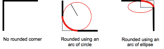
To give an idea of how the horizontal and vertical radii work, you can draw a quarter of a circle on the relevant corner (such as the top-left corner). If you set the border-radiusto: border-radius:1000px 0 0 0 /90px 0 0 0;, the horizontal radius will stretch by 1000px and thus stretch the curve of the top-left corner by 1000px to the right. The vertical radius will stretch by 90px and thus the curve of the top-left corner will stretch 90px downward.
You can check out this article for another explaination.
Why is my border-radius value with two slashes not working?
The spec only allows one / like this: border-radius: .6em 0 0 .6em / .9em 0 0 .9em
.round {

    background:red;

    height:200px;

    width:200px;

    border-radius: .6em 0 0 .6em / .9em 0 0 .9em

}
<div class="round"></div>/ (forward slash) in css style declarations
It simply means font-size and line-height
font: 12px/18px /*12px font-size and 18px line-height*/
That's a short-hand notation...There are many more in CSS which you can use, for example
margin-top: 10px;
margin-right: 20px;
margin-bottom: 30px;
margin-left: 40px;
Can be simply written as
margin: 10px 20px 30px 40px
         ^----^----^----^
       Top/Right/Bottom/Left
Or say for example this
border-width: 1px;
border-style:solid;
border-color: #ff0000;
Can be written as
border: 1px solid #f0000;
Here's a cool list of CSS shorthand.
Why is SimpLESS giving syntax error on forward-slash symbol within the background shorthand?
Specifying background-size as a part of shorthand background is a relatively recent addition to background syntax.
So SimpLESS CSS parser is probably just incompatible with this newer background syntax. Try to specify background-size separately from (after) background.
.box1 {
    background: #000 url(../img/2.jpg) center top;
    background-size: cover;
}
Border radius second statement followed by / in css
The second statement is for a second radius. This can be used to make the curvature eliptical.
div {
  width:100px;
  height:100px;
  background:#00FF00;
  border-radius: 30px/10px; /* horizontal radius / vertical radius */
}
like this
Avoid elliptical shape in CSS border-radius
(source: mozilla.org)
Formally, the syntax for the border-radius property accepts 2 values for each corner: a horizontal radius and a vertical radius (separated by a slash). The following line would create an elliptical border-radius similar to the third image above.
border-radius: 10px / 5px;
Usually, we only specify one value. In this case, that value gets used as both the vertical and horizontal radii. The following line would create a circular border-radius similar to the second image above.
border-radius: 10px;
Using Percentages
The Mozilla Developer's Network defines the possible value types for this property as follows:
<length>
Denotes the size of the circle radius or the semi-major and semi-minor axes of the ellipsis. It can be expressed in any unit allowed by the CSS data types. Negative values are invalid.<percentage>
Denotes the size of the circle radius, or the semi-major and semi-minor axes of the ellipsis, using percentage values. Percentages for the horizontal axis refer to the width of the box, percentages for the vertical axis refer to the height of the box. Negative values are invalid.
Using a single value to create a circular radius is fine when we're using absolute length units like pixels or ems, but gets more complicated when we're using percentages. Since the single-value usage of this property is synonymous with using the same value twice, the following two lines are equivalent; however, these would not necessarily create a circular border-radius.
border-radius: 50%;
border-radius: 50%/50%;
These lines say to "create an ellipse or circle whose vertical radius is equal to 50% of the element's height and whose horizontal radius is equal to 50% of the element's width, and use that as the border-radius.". If the element is 200 pixels wide and 100 pixels tall, this results in an ellipse rather than a circle.
Solution
If you want a circular border-radius, the easiest thing to do is to use absolute measurement units (like pixels or ems or anything besides percentage), but sometimes that doesn't fit your use case and you want to use percentages. If you know the aspect-ratio of the containing element, you still can! In the example below, since my element is twice as wide as it is tall, I've scaled the horizontal radius in half.
#rect {
  width: 200px;
  height: 100px;
  background: #000;
  border-radius: 25%/50%;
}
<div id="rect"></div>CSS border-radius shorthand
It should be border-radius: 10px 10px 50% 50% / 10px 10px 15px 15px;
See https://developer.mozilla.org/de/docs/Web/CSS/border-radius
#shorthand {

  border-radius: 10px 10px 50% 50% / 10px 10px 15px 15px;

   /*

    It's follwing order 1 2 3 4 / 5 6 7 8

    1: horizontal top left

    2: horizontal top right

    3: horizontal bottom right

    4: horizontal bottom left

    5: vertical top left

    6: vertical top right

    7: vertical bottom right

    8: vertical bottom left

    That means starting from top left clockwise, before the slash horizontal and after the slash vertical

   */

}

#original, #shorthand {

  border-color: silver;

  border-width: 1px;

  width: 161px;

  height: 100px;

  background-color: goldenrod;

  margin: 20px;

  float: left;

  display: flex;

  align-items: center;

  justify-content: center;

}

#original {

  border-radius: 50%/15px;

  border-top-left-radius: 10px;

  border-top-right-radius: 10px;

}
<div id="original">Original</div>
<div id="shorthand">Shorthand</div>Related Topics
Page-Break-* Doesn't Work on Google Chrome
Different Behaviours of Treating \ (Backslash) in the Url by Firefox and Chrome
Understanding Display:Table-Cell; Functioning
Change the Default Responsive Navbar Breakpoint
Why Does Space-Around Allow Flex Items to Overflow on the Left Side
How to Set CSS Hover Effect, on Parent and Child Elements
Asset Pipeline Undefined Variable SASS
Which One Is Faster: Hex Color Codes or Color Names
Using Createmuitheme to Override Default Styles on Div'S, P'S, Body
Concatenate String and Var Less CSS
Nesting Inside CSS :Not() Selectors
Nth-Child with Mod (Or Modulo) Operator
Can You Use CSS Transitions on Svg Attributes? Like Y2 on a Line
Add SCSS File to the Stackblitz
Clip-Path:Circle() Radius Doesn't Seem to Be Calculated Correctly