Webkit linear gradient stops render incorrectly
Update 2015-11-25
A fix for this is finally in the pipeline - see https://codereview.chromium.org/1457783005.
tl;dr;
It is a bug feature in chrome.
Details
I have simplified my test cases massively at http://codepen.io/elliz/pen/fCsay and it still appears to be an issue in Chrome - and I have found a bug report (below).
<div class="wrapper">
    <div>
        Try resizing this page, the border between two colours should be smooth in most browsers, but will jump around in Chrome.
    </div>
</div>
css
.wrapper {
  background: linear-gradient(to right, #c93 66%, #2989d8 66%);
}

.wrapper div {
  width:66%;
  border-right: 1px dotted white;
}
May have to go back to using Faux Columns or other old-school designs ... or if your user-base only uses the latest browsers try out the new shiny and use flexbox ;)
Edit
I found a bug at - http://code.google.com/p/chromium/issues/detail?id=233879 and https://code.google.com/p/chromium/issues/detail?id=281489
skia discretizes the colors into 256 levels for (lots of) speed. hard-edged
gradients like this (where there are two colors at the same color-stop)
definitely show up this limitation. We can look at ways to increase
precision, but there will be a real performance cost, so we have to decide
how important this particular behavior is in practice.
Why do Safari and Firefox seem to incorrectly render my gradient and how can I fix it?
The problem was that I used the keyword transparent rather than a transparent version of the color that it was gradating to. The browsers that didn't render the gradient as expected were treating transparent as transparent black. That meant that different gradations between black and my color were present in the gradient.
I'm using SASS so the fix is pretty simple: Just use the rgba() function to convert my hex color to rgba.
background-image: linear-gradient(to top right, rgba($brand-primary, 0), $brand-primary);
I updated the code on CodePen to show the solution.
linear-gradient not working in Chrome
First of all note that -webkit-gradient was intended by Apple and implemented in 2008 in Webkit based web browsers (for instance Safari 4) which has a pretty different syntax than the W3C standard:
-webkit-gradient(<type>, <point> [, <radius>]?, <point> [, <radius>]? [, <stop>]*)
For instance:
background: -webkit-gradient(linear, left top, right top, color-stop(0%,#87e0fd), color-stop(40%,#53cbf1), color-stop(100%,#05abe0));
This is why you couldn't get it to work in your case.
A year later Mozilla introduced -moz-linear-gradient (since Firefox 3.6) which has also a different syntax than the old Webkit version but then it implemented in Webkit under -webkit-linear-gradient:
-moz-linear-gradient([ [ [top | bottom] || [left | right] ],]? <color-stop>[, <color-stop>]+)
However the W3C standard version of linear-gradient is quiet different, the formal syntax of linear-gradient() expression is:
linear-gradient() = linear-gradient(
  [ <angle> | to <side-or-corner> ]? ,
  <color-stop-list>
)
<side-or-corner> = [left | right] || [top | bottom]
As can be seen in your posted code, the other mistake is the lack of to <side> in the W3C version. Therefore, in your case it should be:
Example Here.
background: -webkit-gradient(linear, left top, right top, color-stop(0%, transparent), color-stop(50%,#fff), color-stop(100%,transparent)); /* Chrome, Safari4+ */
background: -webkit-linear-gradient(left, transparent 0%,#fff 50%,transparent 100%); /* Chrome10+, Safari5.1+ */
background: -moz-linear-gradient(left, transparent 0%,#fff 50%,transparent 100%);    /* FF3.6+ */
background: linear-gradient(to left, transparent 0%,#fff 50%,transparent 100%);      /* W3C */
css3 linear gradient color stop works differently on webkit
From some attempts to reproduce this in a test case, it appears the issue may be that Webkit's implementation has trouble calculating the exact height of html when there's no height specified directly. Setting a height of 100% or a fixed pixel height seems to clear it up. However I doubt that's a practical solution. In my own use I've not noticed this as an issue with other elements, so maybe it's particular to the use of a linear-gradient on html.
If it is a bug with Webkit, then your best solution maybe to rework your css so that the grey background can be applied to an element. Obviously that's a big change to accomodate Webkit, but it would also make the background compatible with older versions of IE as well.
Convert linear-gradient syntax to -webkit-gradient syntax
You do it like this:
-webkit-gradient(<type>, <point> [, <radius>]?, <point> [, <radius>]? [, <stop>]*)
<type> is either linear or radial.
<point> is a pair of space-separated values. The syntax supports numbers, percentages or the keywords top, bottom, left and right for point values.
[, <radius>]? is a number and is only used when <type> is radial.
<stop> is a function, color-stop, to, or from. color-stop takes 2 arguments: the stop value (either a percentage or a number between 0 and 1.0), and a color (any valid CSS color). to(color) is the equaivalent of color-stop(0, color) and from(color) is the equaivalent of color-stop(1.0, color).
Example: -webkit-gradient(linear, left top, left bottom, from(#00abeb), to(#fff), color-stop(0.5, #fff), color-stop(0.5, #66cc00))
You can also use -webkit-linear-gradient(angle, startColor, endColor)
Example: -webkit-linear-gradient(135deg, white, black)
Your specific example will just be this:
-webkit-linear-gradient(180deg, rgba(230, 230, 231, 1) 1px, rgba(0, 0, 0, 0) 1px, rgba(0, 0, 0, 0) 100%);
Sources:
https://webkit.org/blog/175/introducing-css-gradients/
https://webkit.org/blog/1424/css3-gradients/
Linear gradient not applying in Webkit with d3 generated SVG
Seems like the Safari developers marked the bug as works for me, based on it working in xhtml. For Safari it seems you'd have to serve your webpages with a mime type of application/xhtml+xml or petition the Safari developers to reopen the bug. FWIW it seems like a bug to me.
webkit-linear-gradient causes banding in Chrome/Safari
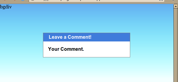
Looks like a webkit bug. I came up with the work-around below, tested on the latest Chrome and FF. In short, you'll position a div containing the background behind your main content. I also added a few styles to make IE happier.
Given this HTML:
<html lang="en">
<head>
    <style>
        ...
    </style>
</head>
<body>
    <div class="background">bgdiv</div>
    <div class="content_pane">
        <div class="titlebar">Leave a Comment!</div>
        <div class="comment">Your Comment.</div>
    </div>
</body>
</html>
Combined with this stylesheet:
    body{
        background-color: #f3ffff;
        min-height: 100%;
        margin:0px;
    }
    .background {
        height: 250px;
        left: 0;
        position: absolute;  /* could use fixed if you like. */
        right: 0;
        top: 0;
        z-index: -10;

        background-image:
            -webkit-linear-gradient(top,
                rgba(99, 173, 241, 1) 0px,
                rgba(0, 255, 255, 0) 250px
            );
        background-image:
            -moz-linear-gradient(top,
                rgba(99, 173, 241, 1) 0px,
                rgba(0, 255, 255, 0) 250px
            );
        background-image:
            -o-linear-gradient(top,
                rgba(99, 173, 241, 1) 0px,
                rgba(0, 255, 255, 0) 250px
            );
        background-image:
            -ms-linear-gradient(top,
                rgba(99,173,241,1) 0%,
                rgba(0,255,255,0) 250px
            ); /* IE10+ */
        filter: progid:DXImageTransform.Microsoft.gradient( startColorstr='#63adf1', endColorstr='#0000ffff',GradientType=0 ); /* IE6-9 */
        background-image:
            linear-gradient(top,
                rgba(99,173,241,1) 0%,
                rgba(0,255,255,0) 250px
            ); /* W3C */
        background-position: center top, center top;
        background-repeat: no-repeat, repeat-x;
    }
    .content_pane {
        background: white;
        border: 1px dotted white;
        border: 1px solid grey;
        font-family: arial, sans;
        font-weight: bold;
        margin: 6em auto 5em;
        width: 50%;
    }
    .titlebar {
        background: #3f7cdb;
        color: white;
        font-family: arial, sans;
        padding: .25em 2ex .25em;
    }
    .comment {
        padding: 1em;
    }
It should come out looking like this, regardless of window size:
Related Topics
How to Display CSS3 Columns on Ie
Understanding Display:Table-Cell; Functioning
Why Doesn't My Child Element Inherit Color from Its Parent When Parent Has More Specific Selector
Draw a Static Line Between Two Divs
What's the Difference Between CSS3 Translate Method and CSS2 Relative Positioning
Remove Default Focus Outline and Change to Different Color
Less: Inheritance Using a Variable
How to Style the Dropdown on Google Places Autocomplete API
Reducing the Gap Between a Bullet and Text in a List Item
Add "Watermark" Effect with CSS
Nth-Child with Mod (Or Modulo) Operator
Twitter Bootstrap - Border Pushing Contents Down
How to Load CSS Rules Dynamically in Webkit (Safari/Chrome)
Why Is a Pseudo-Class So Called
Css-Grid: Bleed Background Outside Container