how to handle 'double opacity' of two overlapping divs
SUMMARY:
Depending on what is needed it can be tricky but the basic approach is pretty straight forward.
This approach is a little different from my first thought... but this has the same result.
- I made a black/transparent pattern for the circle and set it to
:before. - The circle is then transformed
rotate(180deg)and moved to fit on
the corner of the<div>. - Then I set the
opacityof that circle to0.6. - The
<div>itself is not affected by theopacity. - Next I added the
:afterelement and put an image asbackground
(you can control this via js if needed) - I added some effects to the image (
border-radius,box-shadow,border) to show how easily and independent this element can be
controlled. - I used a lighter background and set the
opacityto0.3to show
the result
HERE'S THE FIDDLE: http://jsfiddle.net/pixelass/nPjQh/4/
Look at this version for some crazy results: http://jsfiddle.net/pixelass/nPjQh/5/
each of these examples only use a single div element
Basic rules. (these rules "could" be used to create a dynamic behavior with js)
position = absolute;
top = circleHeight / -2;
left = circleHeight / -2; //(left = top)
rotation = 180deg;
opacity = valueAofBackground;
bgColor = valueRGBofBackground;
#inner {
    width: 100%;
    height: 100%;
    position: absolute;
    left: 0;
    top: 0;
    z-index: -1;
    background-color: rgba(0, 0, 0, 0.3);
    padding:20px;
    border-radius: 20px;
    border-top-left-radius: 0;
}
#inner:before {
    content: "";
    background-image: -webkit-linear-gradient(transparent 50%, rgb(0, 0, 0) 50%, rgb(0, 0, 0)),
        -webkit-linear-gradient(0deg, transparent 50%, rgb(0, 0, 0) 50%, rgb(0, 0, 0));
    height: 40px;
    width: 40px;
    border-radius: 40px;
    position: absolute;
    top: -20px;
    left: -20px;
    -webkit-transform: rotateZ(180deg);
    opacity:0.3;
}
#inner:after {
    content: "";
    background: url('http://lorempixel.com/10/10/sports/1/') no-repeat;
    background-position:0;
    height: 10px;
    width: 10px;
    border-radius: 10px;
    position: absolute;
    top: -6px;
    left: -6px;
    -webkit-box-shadow: 0 0 10px rgb(255,255,255);
    border: 1px rgb(255,255,255) solid;

}
Better explanaition
Original commented version
http://jsfiddle.net/pixelass/nPjQh/10/
see the comments in the code below
#inner {
background: rgba(0,0,0,0.5) /*this is the full color-code of the div (with alpha)*/
}
#inner:before {
    /*the solid color of the circle = rgbValue of the div*/
    background-image: -webkit-linear-gradient(transparent 50%, rgb(0, 0, 0) 50%, rgb(0, 0, 0)),
        -webkit-linear-gradient(0deg, transparent 50%, rgb(0, 0, 0) 50%, rgb(0, 0, 0));
    /*opacity of the circle = alpha of the div*/
    opacity: 0.5;
}
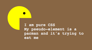
This example has a full transparent div ...the circle is a "pacman"- shape: http://jsfiddle.net/pixelass/nPjQh/14/
Managing the offset of the circle
Look at these examples that handle the offset of the circle (NOT USING PSEUDEO-ELEMENTS)
1:1 copy of the OP's code (15px offset): http://jsfiddle.net/pixelass/nPjQh/12/
With a lot smaller offset (5px): http://jsfiddle.net/pixelass/nPjQh/13/
(the content has the same opacity as the circle)
How does the offset work?
Control the background-size vs. the top and left
Rules:
top = left;
background-size = elementHeight * 2 + top * 2;
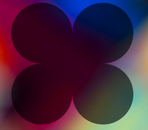
Look at the flower (it is also only one <div> with pseudo-elements)
the background-size is bigger than the circle. which creates the green leaves on the bottom
http://jsfiddle.net/pixelass/nPjQh/15/

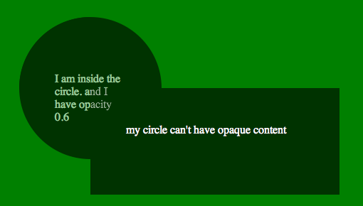
CURRENT PROBLEM
See this fiddle: http://jsfiddle.net/pixelass/nPjQh/16/
If not using another layer as seen in the examples at the top of the post the content will be transparent. So if you only need an image inside the circle the above examples will work fine.
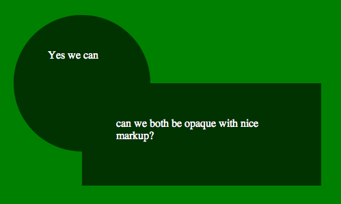
HOW TO SOLVE THIS ISSUE
If you need a canvas or another div inside the circle you would have to put the circle on the div and layer the needed div over the circle
See this fiddle: http://jsfiddle.net/pixelass/nPjQh/17/
change around a little and it will work fine. GET THE CODE FROM THE FIDDLE
Different shape /advanced Styling
If you use a different shape with flat sides, you could even put a border around the sum of the two divs.. or even add a box shadow
still using the simple markup of....
<div id="foo">
    <div id="bar">
    </div>
</div>
See the fiddle for the box-shadow: http://jsfiddle.net/pixelass/nPjQh/21/

Apply a border to the circle
Using -webkit-mask-image we could add a border to the circle.
http://jsfiddle.net/pixelass/nPjQh/24/

More examples:
Four circles around the div
http://jsfiddle.net/pixelass/nPjQh/25/
Markup:
<div id="foo">
    <div id="bar1"></div>
    <div id="bar2"></div>
    <div id="bar3"></div>
    <div id="bar4"></div>
</div>
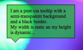
Using this technique to make a tooltip
http://jsfiddle.net/pixelass/nPjQh/31/
Markup:
<div id="foo">
    <div id="bar"></div>
    I am a pure css tooltip with a semi-transparent background and a black border. <br/>
    My width is static an my height is dynamic...
</div>
CSS overlapping elements & opacity issue
Try and think of it like percentage sales. It's a bit different, but the analogy gives sense of what's happening. When a $10 item is 80% off, then you take off an additional 20%, it's' not 100% off (80% + 20%). You calculate final price like this:
$10 * (1 - 0.8) = $2 * (1 - 0.2) = $1.60.
50% opacity means, 50% of the light is blocked. So when you stack two 50% opacity elements, that means 50% of the light is blocked and 50% more light is blocked by the additional layer. Since only 50% light is coming through the first layer, only 50% of that additional light is blocked. So the calculation would be:
50% + (50% * 50%) = 75% opacity.
DEMO
.num2 {
    opacity: 0.75;
}
Overlapping CSS elements with different opacity
Your code seems to be working great, it just doesn't look all that transparent as the .8 transparency of the black background creates a dark grey which perhaps you aren't quite distinguishing from fully opaque. If you want to check this on your local copy, apply a basic background image (e.g. http://purelycss.com/data-uri-tileable-transparent-patterns/) and you should be able to just about see it below your wrapper and input field.

EDIT: If you're looking to reduce the "black on black" effect, you might want to just reduce the opacity of the 'rgba' - so something more like rgba(0, 0, 0, 0.5) for example. If not this, changing the colour of the base RBG colour might help you out here. It's one of those things you probably just want to play with and tweak.
Overlapped elements with opacity and handling the 'hover' on those
There's a CSS only solution, which makes it a bit more efficient. Like this for example:
body {

  background-image: linear-gradient(45deg, transparent 50%, #aaa 75%);

  background-size: 20px 20px;

}

#a {

  position: absolute;

  width: 150px;

  height: 150px;

  top: 50px;

  left: 50px;

  background: rgba(255, 0, 0, 1);

}

#b {

  position: absolute;

  width: 150px;

  height: 150px;

  top: 125px;

  left: 125px;

  background: rgba(255, 0, 0, 1);

}

#wrapper {

  opacity: 0.5;

}

/* instead of changing the classes,

you can use selectors like this:*/

#wrapper:hover #a:hover,

#wrapper:hover #b:hover {

  opacity: 1;

  z-index: 10;

}

#wrapper:hover {

  opacity: 1;

}

#wrapper:hover #b,

#wrapper:hover #a {

  opacity: 0.5;

  z-index: -1;

}
<div id=wrapper>
<div id="a">
</div>
<div id="b">
</div>
</div>Setting opacity on image causes an overlapping element's box-shadow to go away
Quite Simple.
Thank you for clean formatting.
Change opaque ID to this:
#opaque {
    opacity: .99;
    z-index:-10;
    position:relative;
}
http://jsfiddle.net/SinisterSystems/GbAYU/3/
What is happening is whenever opacity is set, the back-end method of CSS3 to interpret it throws some pretty wild z-index's.
Just set it to stack behind the other elements and all will work fine for you.
position:relative; - Cause otherwise it wouldn't accept your z-index property.
z-index:-10; - So that it places it behind the z-index of 0 of your other objects.
EDIT:
The default value of HTML elements does not support static as an object that z-index will apply to, hence the position declaration.
And it totally does with absolute, fixed, relative, or inherit, but not static.
How to remove double opacity caused by use of pseudo elements
Ok, I see the problem now. If you don't want specific elements to be partially opaque between them but want to be partially opaque with the rest, I recommend to add all those elements inside another element and use the opacity CSS property. Because :before and :after pseudo-elements are already inside its "parent" element, you can simply modify the parent opacity, like so:
.circle {

  background-color: #d6dadc;

  width: 400px;

  height: 400px;

  overflow: hidden;

  border-radius: 50%;

  position: relative;

}

.circle_segment {

  height: 100%;

  width: 100%;

  position: absolute;

  top: 0;

  left: 0;

  overflow: undefined;

  opacity: 0.7;

  background-color: rgb(75, 0, 250);

  transform-origin: 50% 100%;

  transform: translate(-100%, -50%) rotate(90deg);

}

.circle_segment:before {

  height: 100%;

  content: " ";

  width: 100%;

  position: absolute;

  background-color: rgb(75, 0, 250);

  transform-origin: center bottom;

  transform: translate(0%, -100%) rotate(-90deg)

}

.circle_segment:after {

  height: 100%;

  width: 100%;

  background-color: rgb(75, 0, 250);

  content: " ";

  position: absolute;

}

.wildelement {

  position: absolute;

  left: 0px;

  top: 190px;

  height: 20px;

  width: 450px;

  background-color: red;

}
<!DOCTYPE html>
<html>
<head>
</head>
<body>
<div class="circle">
<div class="wildelement"></div>
<div class="circle_segment" />
</div>
</body>How to make an transparent element overlap other elements?
It's impossible to cover element by element with transparent background - always visible is element under him. You can try this
#arrow_up {
   position: absolute;
   top: 0;
   border-left: 20px solid transparent;
   border-right: 20px solid transparent;
   border-bottom: 20px solid #ccc;
   z-index: 3;
}
#arrow_up2 {
   position: absolute;
   top: 10px;
   left: 18px;
   border-left: 10px solid transparent;
   border-right: 10px solid transparent;
   border-bottom: 10px solid #fff;
   z-index: 4;
}
(let's customize sizes to make regular shapes).
Anyway, I prefer to use simple png or drawing with js canvas ;)
CSS element with opacity overlaps html5 video
just add z-index:1 to your .podPressPlayerSpace, it will look like this:
.podPressPlayerSpace {
  position: absolute;
  z-index: 1;
}
Why is my opacity declaration affecting other elements?
Change the ordering of your elements, so the image is first, and h2 and span after them. That will fix the problem.
  <img src="https://i.imgur.com/EENJU66.gif">
  <h2>Lorem Ipsum project title</h2>
  <span class="f-cta">View Project</span>
Related Topics
Margin-Top Percentage Does Not Change When Window Height Decreases
Make Text in Select Element Wrap When Too Long
Set Textfield Height Material-Ui
CSS - Opaque Text on Low Opacity Div
Create Line After Text with CSS
How to Increase the Bullet Size in a Li
Nesting CSS @Supports and @Media Queries
Page-Break-* Doesn't Work on Google Chrome
Why Doesn't Font Awesome Work in My Shadow Dom
Css3Pie in MVC, Where to Place the Pie.Htc File
Opera and Custom Cursor in CSS
Leaflet for R: How to Change Default CSS Cluster Classes
CSS Fluid Layout: Margin-Top Based on Percentage Grows When Container Width Increases
Clamping Lines Without '-Webkit-Line-Clamp'
Bootstrap Collapsed Menu Not Pushing Content Down When Expanded