Draw half circle with CSS or SVG
You can do it with CSS:
.partial-circle { position: relative; height: 20px; width: 100px; overflow: hidden;}.partial-circle:before { content: ''; position: absolute; height: 100px; width: 100px; border-radius: 50%; bottom: 0; background: #D08707;}<div class="partial-circle"></div>How to create rounded corners in semi circle SVG
<svg version="1.1" id="Layer_1" xmlns="http://www.w3.org/2000/svg" xmlns:xlink="http://www.w3.org/1999/xlink" x="0px" y="0px"
     width="200px" height="103px" viewBox="0 0 200 103" enable-background="new 0 0 200 103" xml:space="preserve">
<path fill="none" stroke="#000000" stroke-width="8.774" stroke-linecap="round" stroke-miterlimit="10" d="M195.675,98.851
    c0-52.17-42.822-94.463-95.644-94.463c-52.823,0-95.644,42.293-95.644,94.463"/>
</svg>
draw semicircle at the end of an svg path element
You need first to get the values for the points where the arc begins and where it ends. You are working with lowercase (relative) commands so everything is relative to the previous command.
The starting point for the arc is X: -39.1875 + 78.375 = 39.1875 and y: -40
The end point uses the same x (0) and the y is -40 + 100.31399917602539 = 140.31399917602539
140.31399917602539 is also the height of your first path, so the radius for the arc is 140.31399917602539 / 2 = 70.1569995880127
Putting it all together your second path should be:
M39.1875,-40 a70.1569995880127,70.1569995880127 0 0 1 0,140.31399917602539
or
M39.1875,-40 A70.1569995880127,70.1569995880127 0 0 1 39.1875,100.31399917602539
svg{border:1px solid}path{stroke:black; fill:none;}<svg class="hierarchy-icon__container" viewBox="-70 -50 250 160"><g> <circle cx="39.1875" cy="-40" r="3" /> <circle cx="39.1875" cy="100.31399917602539" r="3" /> <path class="hierarchy-icon__path__cover" d=" M-39.1875,-40 h78.375 a20,20 0 0 1 20,20 v100.31399917602539 a20,20 0 0 1 -20,20 h -78.375 a20,20 0 0 1 -20,-20 v -100.31399917602539 a20,20 0 0 1 20,-20 z "></path><path class="hierarchy-icon__path__menu" d=" M39.1875,-40 a70.1569995880127,70.1569995880127 0 0 1 0,140.31399917602539"></path></g> </svg>SVG Half Circle: Why is it rotated?
When using the lineto command, uppercase-L (L) specifies an absolute coordinate while lowercase-L (l) specifies a relative move. It seems like you wanted to use the relative command.
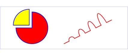
As far as an example, the pie-chart-like one on the W3 path's page uses a single path:
<path d="M300,200 h-150 a150,150 0 1,0 150,-150 z"
    fill="red" stroke="blue" stroke-width="5" />
produces the red part in this image:
Note the liberal use of lowercase (relative) commands.
SVG semi-arc clockwise animation over 180 degrees (half of a circle) with pure CSS/JS
A possible solution would be animating a very thick stroke (the double of the radius of the circle).
In this case the radius of the circle is 20 so the stroke-width="40"
In the next example I'm animating the stroke-dasharray of the path from: 62.84,0 (stroke length = 62.84, gap = 0) to 0, 62.4 (stroke length = 0, gap = 62.84) where 62.84 is the length of the path.
Please read about how How SVG Line Animation Works
path {
  stroke-dasharray: 62.84,0;
  animation: anim 5s linear infinite;
}

@keyframes anim {
  to {
    stroke-dasharray: 0, 62.84;
  }
}
<svg viewBox="-50 -50 100 100" width="90vh">
<path stroke-width="40" fill="none" stroke="black" d="M20,0A20,20 0 0 0 -20,0"/>
</svg>Drawing half a circle in CSS
Something like this would probably work:
.box {  width: 604px;  border-width: 0 1px 1px;  border-color: #ddd;  border-style: solid;  overflow: hidden;}.circles {  border-top: 1px solid #ddd;  display: flex;  list-style-type: none;  margin: 0;}
.circles li {  background-color: white;  width: 30px;  height: 30px;  border-radius: 100%;  border-width: 0 1px 1px;  border-color: #ddd;  border-style: solid;  margin: 0 17px;  position: relative;  transform: translateY(-50%);}
<div class="box"> <ul class="circles"> <li></li> <li></li> <li></li> <li></li> <li></li> <li></li> <li></li> <li></li> </ul> Circles for the win </div>Cutting out half a circle header with an SVG
Your SVG background needs to be a rectangle with a circular hole cut out of it.
If you don't want to draw this shape in a vector editor, then you'll need to use a <mask> to make a circular hole in a rectangle.
<svg xmlns='http://www.w3.org/2000/svg' version='1.1' viewBox='0 0 500 250' preserveAspectRatio='xMinYMin meet'> <mask id="circular-hole"> <rect width="100%" height="100%" fill="white"/><!-- part to keep --> <circle cx='250' cy='250' r='250' fill="black"/><!-- black for the hole --> </mask> <rect width="100%" height="100%" fill="#51d88a" mask="url(#circular-hole)"/></svg>Related Topics
CSS - <Li> Items in Horizontal Menu Have a Gap Between Them
How to Add Multiple Linear-Gradients to a CSS Background
Weird Webkit Issue with Position: Fixed
Lato Font Missing Letters in Ie and Firefox
How to Make a Fix Positioned Menu Bar
How to Have an Image Placeholder in Angularjs
Trouble (Vertically) Centering Text in Another Div with Relative % Sizing
Two Divs Side by Side, One 100% Width Others Width Depended on Content
Height Style Property Doesn't Work in Div Elements
Ie8 Horizontal Scrollbar Problem
I Want to Change the Select Icon/Dropdown Icon to (Fa-Chevron-Down). How Can I
How to Use '&' and a Tag on the Same Selector
Which CSS Pseudo-Classes Don't Have Specificity
Remove Unwanted Space with Position Sticky
Simulate "Inner Border" in CSS
Doing a Input Type="Text" with CSS3 and Fixed Image on the Background