:before and :after pseudo elements on html tag is wonky in Chrome
Your CSS should work as expected, as your pseudo-element should be drawn in the context of the initial containing block (the viewport, represented by the html element) anyway, which is exactly what Firefox is doing.
Your particular issue was reported as a Chrome bug, but it hasn't been addressed. As a workaround, you can apply your pseudo-element to body instead:
body:before {
    content: "";
    display: block;
    background-color: #000;
    width: 100%;
    height: 138px;
    bottom: 0px;
    position: absolute;
}
Depending on your layout, you may need to either keep your html rule or change it to body as well.
Why the :before and :after pseudo-elements work only in Firefox?
Whether there is a restriction is undefined, hence the inconsistent behavior. This is mentioned at the bottom of the relevant section in the spec:
Note. This specification does not fully define the interaction of :before and :after with replaced elements (such as IMG in HTML). This will be defined in more detail in a future specification.
Most HTML form elements are considered replaced elements, including select and option.
Weird CSS :after pseudoselector issue in Chrome alone
I'm seeing the same error, can't seem to figure it out. Might be a bug in chrome. Either way, I'd just use a class of required and use label.required:after as the selector. That seems to work properly.
::after pseudo-element not appearing on Chrome Mobile
Check your background. This is not a valid value. It's 8 chars long, but only can have 6.
a {
  text-decoration: none;
  display: inline-block;
  color: #000;
  overflow: visible;
}

a::after {
  content: '';
  display: block;
  height: 8px;
  width: 98%;
  background: #8BC8F690; <-- This is not valid. *1*2
  margin-top: -9px;
  margin-left: 2px;
}
*1: You could try background-color: rgba(139, 200, 246, 0.565) instead.
*2: Or just use #8BC8F6.
See these examples below:
a {  text-decoration: none;  display: inline-block;  color: #000;  overflow: visible;}
a::after {  content: '';  display: block;  height: 8px;  width: 98%;  background-color: rgba(139, 200, 246, 0.565);  margin-top: -9px;  margin-left: 2px;}
#test {  text-decoration: none;  display: inline-block;  color: #000;  overflow: visible;}
#test::after {  content: '';  display: block;  height: 8px;  width: 98%;  background: #8BC8F6;  margin-top: -9px;  margin-left: 2px;}
<a>hello</a>
<a id="test">hello2</a>How do I add / insert a before or after pseudo element into Chrome's Inspector?
This is the easiest way and the way I do it:
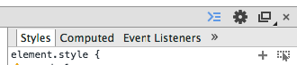
Inspect the element you want to add the ::before or ::after to by right clicking it and going to "Inspect Element".
Now in the Developer Tools Console, click on the plus sign icon aka. "New Style Rule". See the image below, the plus sign is next to the "Toggle Element State" button.
Next, you will be able to edit the selector so add ::before / ::after to it:

Now edit the content to whatever you like, i.e.
Like so:
.grp-row::before {
   content: '> ';
}
That's all there is to it :)
Extra pixel in before and after pseudo elements
This looks like antialiasing. I guess you have either your browser's either your OS's zoom level set to something else than 100%.
Some browsers will try to round the positionning, but at some zoom level, this can't be done properly and you'll end up having one side floored and the other ceiled.
To circumvent this, you can use the translate property which should allow proper antialiasing to kick in (it will be blurry, but of the same size).
*, *::before, *::after{ box-sizing: border-box; }
body {    display: flex;    flex-flow: column wrap;    justify-content: center;    align-items: center;    background-color: #111;}
img {    max-width: 300px;    display: block;    padding: 4px;}
.main-box {    position: relative;}
.img-box {    padding: 0;    margin: 0;    background-color: #000;}
.img-box::before{    content: '';    position: absolute;    top: 0px;    left: 0px;    width: calc( 100% + 2px );    height: calc( 100% + 2px );    transform: translate(-1px,-1px);    filter: blur(10px);    z-index: -2;}
.img-box::after{    content: '';                  position: absolute;    top: 0px;    left: 0px;    width: calc( 100% + 2px );    height: calc( 100% + 2px );    transform: translate(-1px,-1px);    z-index: -1;}
.img-box::before, .img-box::after{    background-image: linear-gradient(45deg, #ff0000, #111, #0000ff);    opacity: 0.7;    transition: opacity ease-out 150ms;}
.main-box:hover .img-box::after {    opacity: 1;}
<div class="main-box"> <div class="img-box"><img src="https://upload.wikimedia.org/wikipedia/commons/4/47/PNG_transparency_demonstration_1.png" alt="keyboard"></div></div>Chrome not showing :after pseudo selector
The content property is required for :before and :after pseudo selectors. If it is not included, it will have no effect on the element. If you are using the selectors to preform a clearfix, or some other case where you don't actually want any content, you can simply leave the content property blank with content:''; Like you have already done for the :before selector. Your CSS should look like this:
.form-horizontal .form-group:after {
  content: '';
  clear: both;
}
Learning To Use The :before And :after Pseudo-Elements In CSS
JSFiddle
CSS Pseudo-elements :before & :after work differently in Internet Explorer
You can fix this by using absolute positioning on the pseudo elements. To make this work correctly, set the position of ul li to relative (which will cause elements positioned absolutely within it to be relative to the li). Then, update the position of the pseudo elements to use left instead of margin-left:
ul li{
    position: relative; // Add this.
    float:left;
    width: 300px;
    height:50px;
    line-height:50px;
    text-indent:10%;
    background: grey;
    margin-bottom:10px;
    border:1px solid black;
}
ul li:before {
    content:"";
    position:absolute;
    margin-top:-1px;
    border-top: 26px solid transparent;
    border-bottom: 26px solid transparent;
    border-right: 21px solid black;
    left:-22px; // Update from margin-left to left
}
ul li:after {
    content:"";
    position:absolute;
    border-top: 25px solid transparent;
    border-bottom: 25px solid transparent;
    border-right: 20px solid grey;
    left:-20px; // Update from margin-left to left
}
http://jsfiddle.net/ryanbrill/jSdWR/5/
JAWS not able to read ins/del elements with ::before and ::after pseudo-elements in Chrome
The content is not in the DOM and screen readers are reading the DOM, not the visible content on the screen.
So put your content inside the HTML only with sr-only i.e. not visible on Screen but available in the DOM for screen-reader.
<div contenteditable="true" style="border: 1px solid black;">
    <p>This is a div where I am
       <span class="sr-only">start insert</span>
       <ins>removing</ins>
       <span class="sr-only">end insert</span>
       <span class="sr-only">start delete</span>
       <del>adding</del>
       <span class="sr-only">end delete</span>
     text
    </p>
    <p>
        <span>Regular text just to see how JAWS handles reading this.
    </p>
 </div>
and the css for sr-only class :-
.sr-only {
    position: absolute;
    width: 1px;
    height: 1px;
    padding: 0;
    overflow: hidden;
    clip: rect(0,0,0,0);
    white-space: nowrap;
    border: 0;
}
Why don't :before and :after pseudo elements work with `img` elements?
The spec says...
Note. This specification does not fully define the interaction of
::beforeand::afterwith replaced elements (such as IMG in HTML). This will be defined in more detail in a future specification.
I guess this means they don't work with img elements (for now).
Also see this answer.
Related Topics
Matrix 3D Transform for Obtaining Trapezoid
CSS Modules - Exclude Class from Being Transformed
Scale an Image to Maximally Fit Available Space and Center It
How to Use CSS to Distort Borders So They Look Like Sketched
Change Colour Navbar Header Ionic 2
Does Chrome Have Issue with Setting A:Visited CSS Properties
Custom Input[Type="Submit"] Style Not Working with Jquerymobile Button
Why Is Absolute Child of a Sticky Is Always Hiding Behind Another Sticky
CSS Display Property When a Float Is Applied
Mozilla 3.0.8 and Chrome Height in Em Bug Workaround
100% Width Divs Not Spanning Entire Width of the Browser in Webkit
Wrap Text Around an Image on Bootstrap 3
Modernizr Reporting Laptop as Touch Device in Chrome and Ff
Unset Width to Revert Back to Inline HTML Attribute "Width=Xx"
Box-Sizing: How to Get Rid of the Scrollbar Padding in Firefox