How to create a div with an irregular shape?
THE SVG WAY
Since the shape you request is not possible with only CSS, I suggest you use SVG to draw the shape.
The following piece of code will create the below shape:
<svg height="150" width="150">
    <polygon points="20,10 100,30 120,100 0,100" style="fill:red;" />
</svg>
How to create parallelograms divs?
You can use the negative SkewX transform to get the desired effect:
div { margin: 20px; width: 200px; height: 100px; display: inline-block; background: yellow; border: 1px solid black; transform: skewX(-10deg); }<div></div> How to draw a trapezium/trapezoid with css3?
You can use some CSS like this:
#trapezoid { border-bottom: 100px solid red; border-left: 50px solid transparent; border-right: 50px solid transparent; height: 0; width: 100px;}<div id="trapezoid"></div>div slanted in 2 directions
You cannot skew an element like this directly, you'll need to use two elements (or generated content) and hide certain overflow to make the flat bottom edge:
http://jsfiddle.net/6DQUY/1/
#skew {
    height: 240px;
    overflow: hidden;
}
.skew {
    background: #000;
    display: inline-block;
    height: 300px;
    width: 500px;
    margin-top: 100px;
    transform: skew(-8deg, -8deg);
}
Note: I removed the cross browser definitions for better readability.
UPDATE: This would be a more fluid example which resizes in set dimensions: http://jsfiddle.net/6DQUY/3/. Note the padding-bottom on the wrapper which defines the ratio. You may have to play around with the percentage amounts.
#skew {
    padding-bottom: 20%;
    overflow: hidden;
    position: relative;
}
.skew {
    background: #000;
    position: absolute;
    top: 30%;
    right: 8%;
    left: 8%;
    height: 100%;
    transform: skew(-8deg, -8deg);
}
Avoid elliptical shape in CSS border-radius
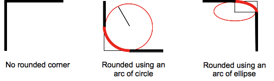
(source: mozilla.org)
Formally, the syntax for the border-radius property accepts 2 values for each corner: a horizontal radius and a vertical radius (separated by a slash). The following line would create an elliptical border-radius similar to the third image above.
border-radius: 10px / 5px;
Usually, we only specify one value. In this case, that value gets used as both the vertical and horizontal radii. The following line would create a circular border-radius similar to the second image above.
border-radius: 10px;
Using Percentages
The Mozilla Developer's Network defines the possible value types for this property as follows:
<length>
Denotes the size of the circle radius or the semi-major and semi-minor axes of the ellipsis. It can be expressed in any unit allowed by the CSS data types. Negative values are invalid.<percentage>
Denotes the size of the circle radius, or the semi-major and semi-minor axes of the ellipsis, using percentage values. Percentages for the horizontal axis refer to the width of the box, percentages for the vertical axis refer to the height of the box. Negative values are invalid.
Using a single value to create a circular radius is fine when we're using absolute length units like pixels or ems, but gets more complicated when we're using percentages. Since the single-value usage of this property is synonymous with using the same value twice, the following two lines are equivalent; however, these would not necessarily create a circular border-radius.
border-radius: 50%;
border-radius: 50%/50%;
These lines say to "create an ellipse or circle whose vertical radius is equal to 50% of the element's height and whose horizontal radius is equal to 50% of the element's width, and use that as the border-radius.". If the element is 200 pixels wide and 100 pixels tall, this results in an ellipse rather than a circle.
Solution
If you want a circular border-radius, the easiest thing to do is to use absolute measurement units (like pixels or ems or anything besides percentage), but sometimes that doesn't fit your use case and you want to use percentages. If you know the aspect-ratio of the containing element, you still can! In the example below, since my element is twice as wide as it is tall, I've scaled the horizontal radius in half.
#rect {
  width: 200px;
  height: 100px;
  background: #000;
  border-radius: 25%/50%;
}
<div id="rect"></div>Non-rectangular CSS grid elements
There is no support for non-rectangular grid items. From the spec:
Every grid item is associated with a grid area, a rectangular set of adjacent grid cells that the grid item occupies.
And:
Note: Non-rectangular or disconnected regions may be permitted in a future version of this module.
(which does not imply that such a feature has been planned, only that there is nothing stopping such a feature from being added in the future)
How do I create a trapezoidal button using CSS?
Join a triangle and a div http://jsfiddle.net/togwsmme/21/
.btn { width: 100px; height: 100px; background: red; float: left;}.rit { float: left; width: 0; height: 0; border-top: 100px solid red; border-right: 100px solid transparent;}<div class="btn">Content</div><div class="rit"></div>Related Topics
Twitter Bootstrap Custom Carousel Indicators
Bootstrap 3 - Add an Asterisk to the Input on the Same Row
Blinking Loading Text in R Shiny
CSS - Position Absolute & Document Flow
Placing a Fixed Element Above Browser's Scrollbar
Google Fonts Font-Weight of 100 Is Not Working
Symfony2, Loading CSS Files Without Cache
CSS Inverted Trapezium When Width Will Differ
Access the Locale in Ruby in CSS Files
Make HTML5 Video Poster Be Same Size as Video Itself
How to Align a Div to The Top of Its Parent But Keeping Its Inline-Block Behaviour
Set Div Height Equal to Screen Size
Using Background-Attachment:Fixed in Safari on The Ipad
Preventing an Image from Being Draggable or Selectable Without Using Js
CSS Background Shorthand Property Not Working with Background-Size