CSS inverted trapezium when width will differ
One Wrapper Only Needed (IE8+)
This fiddle demonstrates that only a single wrapper is needed. It uses a single pseudo-element to get the angles. The wrapper must either be floated or an inline-block. Here's the code:
HTML
<div class="trapizium">
   Test text
</div>
CSS
.trapizium {
    position: relative;
    float: left; /* wrap the text */
    clear: left; /* for demo */
    margin: 10px 20px; /* left/right margin will be diagonal width */
    /* needs some set height */
    font-size: 1em;
    line-height: 1em;
    padding: .2em 0;
    background-color: cyan;
}

.trapizium:before {
    content: '';
    height: 0;
    width: 100%;
    position: absolute;
    top: 0;
    left: -20px; /* stick out into margined area */
    z-index: -1; /* make it the background */
    border: 20px solid transparent; /* left/right diagonals */
    border-top: 1.4em solid cyan;
    border-bottom: 0px solid transparent;
}
How do I turn the trapezoid opposite?
Your best option is to use pseudo elements so you dont have to use absolute positioning on the text element.
Using both :before and :after will help create the desired shape. The borders are also transparent so you don't have to worry about background images being coloured over.
#trapezoid { width: 260px; height: 190px; background: red; margin-left: 45px; position: relative;}#trapezoid:before { content: ''; border-right: 45px solid red; border-bottom: 190px solid transparent; position: absolute; left: -45px; top: 0;}#trapezoid:after { content: ''; border-left: 45px solid red; border-bottom: 190px solid transparent; position: absolute; right: -45px; top: 0;}<div id="trapezoid"> Text in here</div>CSS custom the trapezoid with inverted border radius
You can use something like this:
div {  border-top: solid 1px #06f;  margin: 1rem;  padding: 0;  border-radius: .2em 0 0 .2em;  overflow: hidden;  font-size: 2rem;}
h1 {  display: inline-block;  margin: 0 0 0 -1em;  padding: 0 1em 0 2em;  line-height: 1.4;  border-radius: 0 0 .2em 0;  background: #06f;  transform: skewX(-25deg);  font-size: inherit;  font-weight: 500;}
span:before,span:after {  content: '';  position: absolute;  width: .4em;  height: .4em;  background: #06f;  right: -1.57em;  border-radius: 0 0 .2em 0;}
span:after {  width: .5em;  height: .5em;  transform: skewX(-25deg);  border-radius: .2em 0 0;  background: #fff;  right: -1.7em}
span {  position: relative;  display: inline-block;  color: #fff;  transform: skewX(25deg);}
<div> <h1><span>Header</span></h1></div><div> <h1><span>Header with a short text</span></h1></div><div> <h1><span>Header with a long long long text</span></h1></div>How to write text inside inverted-trapezoid (shape)?
If the similar question I shared in the comment doesn't help, here's another way with CSS pseudo classes. The caveat being the text is in the CSS instead of the div
.trapezoid2 {  width: 23px;  height: 0px;  border-top: 140px solid #20a3bf;  border-left: 70px solid transparent;  border-right: 70px solid transparent;}
.trapezoid2::after {  content: "Thanky";  display: block;  position: relative;  top: -100px;  left: -10px;}

/* Small devices (landscape phones, 576px and up) */
@media only screen and (min-width: 576px) {  .trapezoid2 {    border-top-color: red;  }}

/* Medium devices (tablets, 768px and up) */
@media only screen and (min-width: 768px) {  .trapezoid2 {    border-top-color: #bf2090;  }}

/* Large devices (desktops, 992px and up) */
@media only screen and (min-width: 992px) {  .trapezoid2 {    border-top-color: rebeccapurple;  }}

/* Extra large devices (large desktops, 1200px and up) */
@media only screen and (min-width: 1200px) {  .trapezoid2 {    border-top-color: cyan;  }}
<div class="trapezoid2"></div>CSS trapezoid shape clickable area issue in chrome browser
Please have look at this code:
.prodcaptions {
    position: relative;
    height: 150px;
    width: 150px;
    margin: 50px;
    padding: 10px;
    perspective: 150px;
    perspective-origin: 50% 0;
}
a{
    padding: 50px;
    position: absolute;
    border: 1px solid black;
    transform: rotateX(-15deg);
}
Seems to work the way you want it. fiddle
Is it possible to style a div to be trapezoidal?
It is possible, here is the rough idea:
div {    width: 200px;    height: 100px;    background: #ddd;    margin: 20px 150px;    position: relative}
div:before {    content: '';    line-height: 0;    font-size: 0;    width: 0;    height: 0;    border-top: 50px solid transparent;    border-bottom: 50px solid #ddd;    border-left: 50px solid transparent;    border-right: 50px solid #ddd;    position: absolute;    top: 0;    left: -99px;}
div:after {    content: '';    line-height: 0;    font-size: 0;    width: 0;    height: 0;    border-top: 50px solid transparent;    border-bottom: 50px solid #ddd;    border-left: 50px solid #ddd;    border-right: 50px solid transparent;    position: absolute;    top: 0;    right: -99px;}
<div>Hello</div>
<div>Lorem ipsum dolor sit amet, consectetur adipiscing elit. Etiam cursus ex quis enim posuere auctor.</div>Can CSS create a multi-colored trapezoid?
The CSS approach: transformation and gradient
You can achieve the shape with tranksform: perspective and a linear-gradient. The gradient can also create the line in the middle. For the outer line, just use a border and adjust its width on the four sides according to your needs.
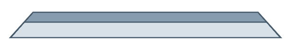
Here is a working example:
.trapezoid {  width: 500px;  height: 50px;  transform: perspective(5px) rotateX(1deg);  margin: 50px;  background: linear-gradient(to bottom, #889cb0, #889cb0 40%, #465b6c 40%, #465b6c 45%, #d8e0e8 45%);  border-top: 3px solid #465b6c;  border-bottom: 2px solid #465b6c;  border-right: 4px solid #465b6c;  border-left: 4px solid #465b6c;}
.flipped {  transform: perspective(5px) rotateX(-1deg);  background: linear-gradient(to top, #889cb0, #889cb0 40%, #465b6c 40%, #465b6c 45%, #d8e0e8 45%);  border-top-width: 2px;  border-bottom-width: 3px;}
<div class="trapezoid"></div><div class="trapezoid flipped"></div>Related Topics
Pass SASS List to Mixin with Multiple Arguments
Syntax Highlighting in Jekyll Using Redcarpet
CSS: How to Align Vertically a "Label" and "Input" Inside a "Div"
How to Make The Overflow CSS Property Work with Hidden as Value
How to Get Floating Divs Inside Fixed-Width Div to Continue Horizontally
Phonegap + Windows Phone 8: Viewport Meta & Scaling Issue
How to Get Rid of The Gap at The Edge of The Page
When 1 Px Border Is Added to Div, Div Size Increases, Don't Want to Do That
Make Video Fit 100% with Any Screen Resolution
Setting Element Height in Responsive Layout
Trouble (Vertically) Centering Text in Another Div with Relative % Sizing
Best Replacement for Font Tag in HTML
Why Box-Sizing Is Not Working with Width/Height Attribute on Canvas Element
Style Lower and Upper Fill in HTML5 Range Input
How to Center This Menu with CSS
What's the Point of the ::Before and ::After Pseudo-Element Selectors in CSS