Confusion as to how clearfix actually works
The CSS :after pseudoelement means "after the element's content, but still inside an element", not "after the element itself". This is why it works.
The mozilla documentation describes it as follows: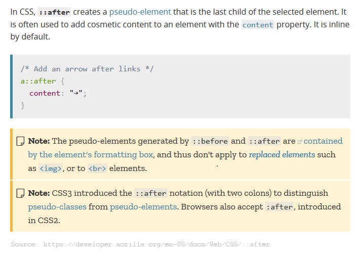
.clearfix class vs :after
With the use of :after, one must considered the cross-browser issue. If we are to provide support for all browsers, including old ones, pseudo-elements may not be the way:
CSS selectors and pseudo selectors browser compatibility
Related to generic class vs specific class
By definition:
A generic class can be applied to any element in the markup, is best suited for use with generic formatting instructions that all elements will support, or for formatting instructions that need to be used on several types of element.
A specific class serves its purpose by only being applied to a specific element in the markup is best suited for formatting instructions which are specific to only one type of element.
The goals for using a Generic Class over a Specific one are: among others
- Cleaner markup
- Reutilization
- Smaller files (browser contents download performance)
- Easy to maintain or update
How CSS floated div behaving without clearfix
The text inside .p is wrapping around the floated divs as it should, but you've left no room for it to do so at the sides, so it falls below. The text in the p tag is outside div.p, so it appears below. Again, this is expected. Div.p is a block-level element, so it's full-width even without you explicitly stating so.
Your parent div expands to wrap the text that has wrapped below the floated divs. This is expected.
Why inline-flex element with clearfix has a weird white space?
display: inline-flex
When you use display: inline-flex, you establish a flex container.
An initial setting of a flex container is flex-direction: row.
This means that all in-flow child elements of the container (including in-flow pseudo-elements) will line up in a row. The display value of these children (table, in this case) is overridden/ignored, in accordance with the rules of a flex formatting context.
Your flex container has two flex items (the pseudo-elements) in one line:
.a,.b { border: 1px solid red;}.a { text-align: center;}.b { display: inline-flex; height: 20px; width: 20px;}.cf:before,.cf:after { content: "x"; display: table;}.cf:after { clear: both;}<div class="a"> <div class="b cf"></div></div>Is white space in content: ignored in clearfix hack?
Why doesn't the clearfix hack clear floating elements?
Every float generates its own block formatting context. An element (or pseudo-element) in one block formatting context cannot clear floats in another block formatting context. In your examples, there are essentially no floats for any of the clearfixes to clear, and the floats themselves aren't being cleared by anything. In other words, there is absolutely no clearance taking place in any of your examples.
Is white space in
content: " "completely ignored by the web browsers?
Whitespace in the content property is governed by the same whitespace processing rules in section 16.6.1 of the CSS2.1 spec via the white-space property. A lone space in a block box is treated as insignificant and collapsed away, so the pseudo-elements effectively become empty even with content: " ", but you will see them if you set white-space: pre:
 .rowx div:nth-of-type(even) {  background-color: darkgray; }
.rowx div:nth-of-type(odd) {  background-color: lightgray; }
.hack:after, .hack:before {  content: " "; clear: both; display: block; white-space: pre;}.fitty {  width: 20%; float: left;}
<div class="rowx"> <div class="fitty">.col-xs-4 </div> <div class="fitty hack">.col-xs-4</div> <div class="fitty">.col-xs-4</div> <div class="fitty">.col-xs-4 </div> </div>Confusion with height:auto
You have to add a clear property to clear left float you have applied to .wrap divs.
What are float and clear for?
If you look in a typical magazine you’ll see images illustrating the
articles, with the text flowing around them. The float property in CSS
was created to allow this style of layout on web pages. Floating an
image—or any other element for that matter—pushes it to one side and
lets the text flow on the other side. Clearing a floated element means
pushing it down, if necessary, to prevent it from appearing next to
the float. Although floating was intended for use with any elements,
designers most commmonly use it to achieve multi-column layouts
without having to abuse table markup.
html,body { width: 100%; height: 100%; padding: 0; margin: 0;}#wrapper { background-color: black; margin-top: 2%; width: 100%; height: auto;}#content { background-color: green; width: 400px; height: auto; margin: auto; text-align: center;}#top { background-color: pink; height: 400px; width: 60%; margin: auto;}.dash { width: 80%; margin: auto; margin-bottom: 1%; height: 2px; background-color: black;}p#header { margin: 0; text-align: center;}.wrap { background-color: orange; margin: 1%; float: left; width: 48%; height: 400px;}.clear { clear: left;}<div id="wrapper"> <div id="content"> <div id="top"></div> <div class="dash"></div> <p id="header">Header</p> <div class="wrap"></div> <div class="wrap"></div> <div class="clear"></div> </div> </divRelated Topics
Bootstrap 4 Navbar Doesnt Collapse in Angular4
Background Url Path in a Jsf Template
Combining Pseudo-Selectors in CSS
Wrap Text Around an Image on Bootstrap 3
Remove Padding from Unordered List
What's the Point of the ::Before and ::After Pseudo-Element Selectors in CSS
Css: @Import VS. <Link Href="">
Box-Sizing: How to Get Rid of the Scrollbar Padding in Firefox
How to Remove Fade from Gradient in CSS
Overflow:Hidden Not Working as Expected in Google Chrome
Why Can't I Make My Div 100% Height If I Use an HTML5 Doctype? How to Get It 100% Height