CSS width 100% including overflow
Just use display: inline-block. You can read more in the W3C specs.
Replace width:100% with display:inline-block in those two element styles.
CSS Input with width: 100% goes outside parent's bound
According to the CSS basic box model, an element's width and height are applied to its content box. Padding falls outside of that content box and increases the element's overall size.
As a result, if you set an element with padding to 100% width, its padding will make it wider than 100% of its containing element. In your context, inputs become wider than their parent.
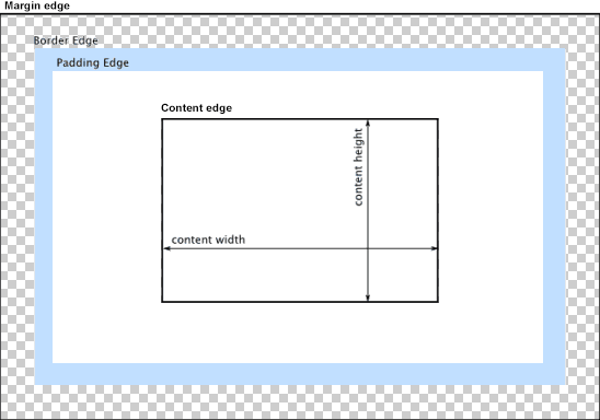
You can change the way the box model treats padding and width. Set the box-sizing CSS property to border-box to prevent padding from affecting an element's width or height:
border-box : The width and height properties include the padding and border, but not the margin... Note that padding and border will be inside of the box.
Note the browser compatibility of box-sizing (IE8+).
At the time of this edit, no prefixes are necessary.
Paul Irish and Chris Coyier recommend the "inherited" usage below:
html {
  box-sizing: border-box;
}
*, *:before, *:after {
  box-sizing: inherit;
}
For reference, see:
* { Box-sizing: Border-box } FTW
Inheriting box-sizing Probably Slightly Better Best-Practice.
Here's a demonstration in your specific context:
#mainContainer {
  line-height: 20px;
  font-family: "Helvetica Neue", Helvetica, Arial, sans-serif;
  background-color: rgba(0, 50, 94, 0.2);
  margin: 20px auto;
  display: table;
  -moz-border-radius: 15px;
  border-style: solid;
  border-color: rgb(40, 40, 40);
  border-radius: 2px 5px 2px 5px / 5px 2px 5px 2px;
  border-radius: 2px;
  border-radius: 2px 5px / 5px;
  box-shadow: 0 5px 10px 5px rgba(0, 0, 0, 0.2);
}
.loginForm {
  width: 320px;
  height: 250px;
  padding: 10px 15px 25px 15px;
  overflow: hidden;
}
.login-fields > .login-bottom input#login-button_normal {
  float: right;
  padding: 2px 25px;
  cursor: pointer;
  margin-left: 10px;
}
.login-fields > .login-bottom input#login-remember {
  float: left;
  margin-right: 3px;
}
.spacer {
  padding-bottom: 10px;
}
input[type=text],
input[type=password] {
  width: 100%;
  height: 30px;
  padding: 5px 10px;
  background-color: rgb(215, 215, 215);
  line-height: 20px;
  font-size: 12px;
  color: rgb(136, 136, 136);
  border-radius: 2px 2px 2px 2px;
  border: 1px solid rgb(114, 114, 114);
  box-shadow: 0 1px 0 rgba(24, 24, 24, 0.1);
  box-sizing: border-box;
}
input[type=text]:hover,
input[type=password]:hover,
label:hover ~ input[type=text],
label:hover ~ input[type=password] {
  background: rgb(242, 242, 242);
  !important;
}
input[type=submit]:hover {
  box-shadow: inset 0 1px 0 rgba(255, 255, 255, 0.3), inset 0 -10px 10px rgba(255, 255, 255, 0.1);
}
.login-top {
  height: auto;/*85px;*/
}
.login-bottom {
  padding: 35px 15px 0 0;
}
<div id="mainContainer">
<div id="login" class="loginForm">
<div class="login-top">
</div>
<form class="login-fields" onsubmit="alert('test'); return false;">
<div id="login-email" class="login-field">
<label for="email" style="-moz-user-select: none;-webkit-user-select: none;" onselectstart="return false;">E-mail address</label>
<span><input name="email" id="email" type="text" /></span>
</div>
<div class="spacer"></div>
<div id="login-password" class="login-field">
<label for="password" style="-moz-user-select: none;-webkit-user-select: none;" onselectstart="return false;">Password</label>
<span><input name="password" id="password" type="password" /></span>
</div>
<div class="login-bottom">
<input type="checkbox" name="remember" id="login-remember" />
<label for="login-remember" style="-moz-user-select: none;-webkit-user-select: none;" onselectstart="return false;">Remember my email</label>
<input type="submit" name="login-button" id="login-button_normal" style="cursor: pointer" value="Log in" />
</div>
</form>
</div>
</div>Width 100% goes outside the wrap
This is the default box-model behavior :
Width = width + padding-left + padding-right + border-left + border-right
Therefore, your width is 100% + 2*10px which is larger than the footer's width...
You can :
- Remove
width: 100%which will result on an implicit use ofwidth: auto(which is just fine because block elements automatically fill the width of their parent) - Use the
box-sizing: border-boxproperties
For deeper explanations, just take a look at this resource and this one!
Regards.
CSS footer width:100% causes horizontal scroll
As @Lal mentioned the problem is caused by the left padding on .footer.
I'm assuming this padding is a necessary part of your design so a better solution would be to set the box-sizing property of your footer to border-box:
.footer {
    padding-left:5%
    box-sizing: border-box;
}
DEMO
Edit
Ok try this:
DEMO
.footer {
   padding-left:5%;
   margin: 0;
}
Child element 100% width of it's parent with overflow: scroll
I wasn't sure if you wanted the child to be the width without scrolling or with scrolling, so I came up with both:
Without Scrolling:
.parent {
    background: skyblue;
    width: 350px;
    overflow-x: scroll;
    white-space: nowrap;
    padding: 40px 20px;
}
.child {
    background: springgreen;
    width: calc(100% + 40px);
    padding: 0 0 0 20px;
    margin: 0 0 0 -20px;
}
<div class="parent">
I'm a wide parent. My text-content will wrap my box.
My child should get my new size as 100% width.
<div class="child">
I would go over the full width if I could.
</div>
</div>width 100% on an overflow scroll element in flex container
You can add overflow: hidden to the green box to make it stay in the bounds of it's parent.
section {
    width: 100%;
    padding: 5px;
    box-sizing: border-box;
    background: green;
    overflow-x: hidden;
}
CSS | Overflow child element with width 100%
Change overflow: scroll; to overflow: auto
Cannot make DIV width 100% with scrollbar
There is no way (perfectly dynamically--without fixing any widths--and with pure CSS--no JavaScript) to get a block-level element to inherit the width of a sibling block-level element via a block-level parent element.
The workaround is to put display: inline-block on the parent element, since an inline-block calculates its width property from its widest child.
In your case, don't put display: inline-block on the body element. I would suggest wrapping your 100% div and table elements in another wrapper element, thus:
<!DOCTYPE html><html lang="en"><body> <div class="wrapper" style="display: inline-block; min-width: 100%;"> <div style="background-color:yellow;">100% DIV</div> <table style="width:100%; background-color:orange;"> <thead> <tr> <th style="padding-left:20px; padding-right:20px;">Very_Long_Header_1</th> <th style="padding-left:20px; padding-right:20px;">Very_Long_Header_2</th> <th style="padding-left:20px; padding-right:20px;">Very_Long_Header_3</th> </tr> </thead> </table> </div></body></html>How to make an element width: 100% minus padding?
box-sizing: border-box is a quick, easy way to fix it:
This will work in all modern browsers, and IE8+.
Here's a demo: http://jsfiddle.net/thirtydot/QkmSk/301/
.content {
    width: 100%;
    box-sizing: border-box;
}
The browser prefixed versions (-webkit-box-sizing, etc.) are not needed in modern browsers.
Related Topics
Filter: Progid:Dximagetransform.Microsoft.Gradient Is Not Working in Ie7
How to Get The Cursor to Change to The Hand When Hovering a <Button> Tag
Transition Only for The Border on Hover, But Not for Background
Using Proper CSS Media Queries in Angular
CSS for a Sidebar Menu That Folds in and Out
How to Position a Background Image in Reveal.Js
Make Bootstrap Carousel Responsive on Height
CSS: Possible to "Push" Webkit Scrollbars into Content
Why Won't Opera (11.00) Display Custom (@Font-Face) Fonts
CSS Table Border Spacing Inside Only
How to Increase Bootstrap 3 Navbar Height While Keeping Menu Height Small When Collapsed
How to Position a Dropdown at Cursor Position Inside a Textarea
What Is a Good CSS Cleanup Tool
CSS Background-Position Animate Right to Left