CSS Drop Shadow for CSS drawn arrow
Applying the box shadow to the css border triangle will not work, it will only ever apply it to the whole element box.
You can achieve what you are trying to do by changing your css border triangle into a square div, rotating it 45 degrees using css3 and then applying the box-shadow
-webkit-transform: rotate(45deg);
-moz-transform: rotate(45deg);
-o-transform: rotate(45deg);
transform: rotate(45deg);
position: absolute;
Edit:
Updated
Edit:
See the link below for another approach using css content and :after
http://css-tricks.com/triangle-with-shadow/
Box shadow for css generated arrow
Sadly, using the border hack doesn't work when using box-shadow.
CSS
Instead, you will want to use css transform to rotate an element and hide the overflow. You will need to use a pseudo-element.
.triangle {

  width: 100px;

  height: 50px;

  position: relative;

  overflow: hidden;

  box-shadow: 0 16px 10px -17px rgba(0, 0, 0, 0.5);

}

.triangle:after {

  content: "";

  position: absolute;

  width: 50px;

  height: 50px;

  background: #999;

  transform: rotate(45deg);

  top: 25px;

  left: 25px;

  box-shadow: -1px -1px 10px -2px rgba(0, 0, 0, 0.5);

}
<div class="triangle"></div>CSS arrow with border add box shadow
The solution of your problem can be solved, like the one posted here:
https://codepen.io/ryanmcnz/pen/JDLhu
Basically:
1. Create a square (::after), rotate it and add box shadow.
2. Create a second square (::before) that overlaps the box shadow casted inside the balloon.
body {
background-color: #fff;
}
.triangle {
position: relative;
margin: 3em;
padding: 1em;
box-sizing: border-box;
background: #fff;
border: 1px solid #fafafa;
box-shadow: 0px 3px 3px 0 rgba(0, 0, 0, 0.4);
}
.triangle::after{
z-index: -10;
content: "";
position: absolute;
width: 0;
height: 0;
margin-left: 0;
bottom: 0;
top: calc(50% - 5px);
left:0;
box-sizing: border-box;
border: 5px solid #fff;
border-color: transparent transparent #fff #fff;
transform-origin: 0 0;
transform: rotate(45deg);
box-shadow: 0 3px 3px 0 rgba(0, 0, 0, 0.4);
}
.triangle::before{
z-index: 10;
content: "";
position: absolute;
width: 0;
height: 0;
margin-left: 0;
bottom: 0;
top: calc(50% - 5px);
left:0;
box-sizing: border-box;
border: 5px solid black;
border-color: transparent transparent #fff #fff;
transform-origin: 0 0;
transform: rotate(45deg);
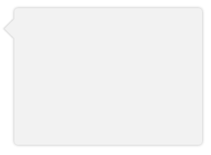
}<div class="triangle">This is a CSS3 triangle with a proper box-shadow!</div>Popover Box shadow needs to be for arrow also
To make a triangular box-shadow you might just rotate a square by 45 degrees and apply the shadow:
.popover.right .arrow:before {
  content: "";
  display:block;
  position:absolute;
  z-index:-1;
  height:14.14px;
  width:14.14px;
  bottom:-8px;
  left:4px;
  background:transparent;
  transform: rotate(45deg);
  box-shadow: 0 5px 10px rgba(0, 0, 0, 0.2);
}
I also had to add the background to the content element since the shadow was on top of it. You can also work with overflow:hidden if you can't just add any background (or background color) to content.
.popover-content{
  background-color:#FFF;
}
Fiddle: https://jsfiddle.net/ke35nzag/
How to give shadow to dropdown with a pointed triangle?
So you have two way to achieve what you want :
First use unicode caractere:
HTML :
<div class="unicode">▲</div>
CSS :
.unicode {
   color: #999;
   text-shadow: 0 0 10px rgba(0,0,0,0.5);
   font-size:3em;
}
Second use pseudo element after to add a rotate div and crop them inside the parent:
HTML :
<div class="triangle"></div>
CSS :
.triangle {
   width: 100px;
   height: 100px;
   position: relative;
   overflow: hidden;
   box-shadow: 0 16px 10px -17px rgba(0,0,0,0.5);
}
.triangle::after {
   content: "";
   position: absolute;
   width: 50px;
   height: 50px;
   background: #999;
   transform: rotate(45deg);
   top: 75px;
   left: 25px;
   box-shadow: 0 0 10px rgba(0,0,0,0.5);
}
Think to add all prefixe for more browser compatibility
DEMO: http://jsfiddle.net/j4hcev21/3
CSS Speech Bubble with Box Shadow
Instead of using a triangle hack, you can just rotate a div using transform and get a real box-shadow. Since you only want the shadow on one side of the div (the visible triangle side), you have to make the blur smaller and lower the opacity.
Demo: http://jsfiddle.net/ThinkingStiff/mek5Z/
HTML:
<div class="bubble"></div>
CSS:
.bubble{
    background-color: #F2F2F2;
    border-radius: 5px;
    box-shadow: 0px 0px 6px #B2B2B2;
    height: 200px;
    margin: 20px;
    width:  275px;
}

.bubble::after {
    background-color: #F2F2F2;
    box-shadow: -2px 2px 2px 0 rgba( 178, 178, 178, .4 );
    content: "\00a0";
    display: block;
    height: 20px;
    left: -10px;
    position: relative;
    top: 20px;
    transform:             rotate( 45deg );
        -moz-transform:    rotate( 45deg );
        -ms-transform:     rotate( 45deg );
        -o-transform:      rotate( 45deg );
        -webkit-transform: rotate( 45deg );
    width:  20px;
}
Output:
Unexpected box-shadow behaviour
I think that what you're trying to do is relevant to this previous post on SA: CSS Drop Shadow for CSS drawn arrow
is it possible to set multiple shadow using filter: drop-shadow?
Yes it is possible, as you can see from MDN, filter: <filter-function> [<filter-function>]* | none filter accepts one or more filter functions,
this is an example:
filter: drop-shadow(10px 3px 5px #000000) drop-shadow(3px 10px 2px #ff0000);
Css arrow with drop shadow
Try this.
All I did was put a relatively positioned div around the one you want, and that's the div you move around. As per MDN, as long as there's an ancestor div that's positioned, your absolute positioning works off of the ancestor's position.
Html:
<div class="positioner" style="position: relative; top: 200px;">
    <div class="inline-popup"></div>
</div>
Related Topics
CSS Negative Z-Index: What Does It Mean
What Are Differences Between Rgb VS Rgba Other Than 'Opacity'
Inline CSS Formatting Best Practices - Two Questions
Override Rmarkdown Theme in Order to Change HTML Page Width
List of CSS Features Not Supported by IE6
Background:None VS Background:Transparent What Is the Difference
How to Hide Element Label by Element Id in CSS
The "Before" Pseudo Element Not Working in Font Awesome V.5
Bootstrap Modal Window Inside Another Div
Bottom of Custom Font Cut Off in Opera and Webkit
How to Adjust a Font's Vertical Scaling Using CSS
Print Footer on Every Printed Page from Website, Across All Browsers (Chrome)
CSS Transform: Scale Does Not Change Dom Size
What CSS3 Features Still Need Vendor Prefixes
CSS Animations with Spritesheets in a Grid Image (Not in a Row)
Make Outer Div Be Automatically the Same Height as Its Floating Content