Create concave corners in css
Here is a good example of how I would tackle this:
http://jsfiddle.net/x4wLf/
HTML:
<div class='concave'>
    <div class='topleftconcave'></div>
    <div class='botleftconcave'></div>
</div>
CSS:
 div.concave {
    background:blue;
    width:150px;
    height:120px;
    position:relative;
}
div.topleftconcave {
    position:absolute;
    background:white;
    width:25px;
    height:35px;
    border-bottom-right-radius:500px;
}
div.botleftconcave {
    position:absolute;
    background:white;
    width:25px;
    height:35px;
    bottom:0;
    left:0;
    border-top-right-radius:500px;
}
Is a concave border radius possible?
You can give the impression of a concave border using radial gradients on the background. For example, something like this:
#test {
    width: 200px;
    height: 200px;
    background: #888888;
    background:
      radial-gradient(circle 20px at -20% 50%,transparent,transparent 100px,#888888 100px),
      radial-gradient(circle 20px at 120% 50%,transparent,transparent 100px,#888888 100px);
    background-size:100px 200px, 100px 200px;
    background-position:0 0,100% 0;
    background-repeat:no-repeat;
}
Note that most webkit browsers still require prefixes for radial-gradients, and if you want to fully support older browsers you may need to implement the older gradient syntax too.
Is there a better way to create convex / concave borders on an element
Border radius, radial gradient and a filter can do it:
.box {
  width:200px;
  height:200px;
  background:#9baaad;
  position:relative;
  border-bottom-right-radius:50px; /* convexe part */
  filter:drop-shadow(0px 3px 3px grey); /* shadow */
}
/* concave part */
.box::before{
  content:"";
  position:absolute;
  top:100%;
  right:0;
  left:0;
  height:50px;
  background:
    radial-gradient(farthest-side at bottom right,transparent 98%,#9baaad 100%)
    0/50px no-repeat;
}
<div class="box">
</div>How to make rounded corners in css on different background
You can also achieve that using the :after pseudo element for the top section and bring that element back using z-index so it won't overlap the bottom section.
Here's an example:
.container {
  width: 50%;
  height: 200px;
  display: flex;
  margin: 0 auto;
  overflow: hidden;
  border-radius: 5px;
  flex-direction: column;
  box-shadow: 0 2px 6px rgba(0, 0, 0, 0.4);
}

.top-section {
  flex-grow: 1;
  background-color: #1B2149;
  border-radius: 0 0 0 25px;
  position: relative;
}

.top-section:after {
  content: " ";
  z-index: -1;
  right: 0;
  bottom: -30px;
  height: 30px;
  width: 40px;
  position: absolute;
  background-color: inherit;
}

.bottom-section {
  flex-grow: 1;
  border-radius: 0 25px 0 0;
  background-color: #FFFFFF;
}
<div class="container">
<div class="top-section"></div>
<div class="bottom-section"></div>
</div>Concave Curve With only CSS,A Compound Shapes in CSS
Here you go: http://jsfiddle.net/XXbJ5/
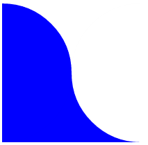
HTML:
<div id="bg">
    <div id="bg-bottom"></div>
    <div id="top"></div>
    <div id="bottom"></div>
</div>
CSS:
#bg {
    width:200px;
    height:200px;
    overflow:hidden;
    position:relative
}
#bg-bottom {
    position:absolute;
    bottom:0px;
    left:0px;
    width:100%;
    height:50%;
    background:blue
}
#top {
    position:absolute;
    background:blue;
    top:0px;
    left:-100px;
    width:200px;
    height:200px;
    border-radius:100px
}
#bottom {
    position:absolute;
    background:white;
    top:0px;
    left:100px;
    width:200px;
    height:200px;
    border-radius:100px
}
How can i create concave border?
Here's one way to do it. The fiddle you provided is using pseudo elements (:before and :after) to achieve the effect, so I adjusted their height/width and border-radius values:
#test{
    width: 100px;
    height: 300px;
    background: green;
    position: relative;
    display: inline-block;
}

#test:before{
    background: white;
    height: 15px;
    width: 100px;
    border-radius: 0 0 50% 50%;
    display: inline-block;
    content: '';
    position: absolute;
    top: 0;
    left: 0;
}

#test:after{
    background: white;
    height: 15px;
    width: 100px;
    border-radius: 50% 50% 0 0 ;
    display: inline-block;
    content: '';
    bottom: 0;
    position: absolute;
}
fiddle: http://jsfiddle.net/KcP5k/24/
CSS image with concave shape cut out?
The solution without using svg is very tricky, the idea is you need some wrapper containing your actual image, this wrapper should have a very large size (in this example, I used the size 945 x 500) so that it can render a large curve. We need to set the overflow:hidden for this container to hide other overflow part of the inner image. This trick will function like a clipper which can cut off the image by the curve.
Also note that we will use some fairly new feature of CSS3 in this example (without them I don't think we can do at best), that is the clip property, in fact we don't really need this (because the background of the container is transparent which will be seen through). For clip to work, we have to apply position:absolute for the container, that means we have to use absolute position for the container. So to position the container, you have to change the left and top property. In fact there are offsets between the actual image and the container, so there will be a problem, for example, the horizontal offset is 200px, but when you set the left position for the container as 100px, you want that is exactly the left of the inner image. If we don't do anything, normally the left of the inner image will be 100 + 200 = 300px. So to deal with this, we have to apply some translate transform to the container (translate it horizontally about -200px, so the final computed value for the left will be 300px - 200px = 100px which is the result we want. Here are the code details:
HTML:
<div id='clipper'>
   <div></div>
</div>
CSS:
#clipper > div {
  width:400px;
  height:200px;
  background:url(http://placekitten.com/400/200);
  position:absolute;
  left:calc(50% - 300px);
  top: calc(100% - 200px);
  -webkit-filter: blur(1px);
}
#clipper {
  border-bottom-left-radius:1800px 500px;
  border-bottom-right-radius:1800px 800px;
  overflow:hidden;
  height:500px;
  width: 945px;
  position:absolute;
  clip: rect(300px, 573px, 500px,173px);
  -webkit-transform: translate(-173px, -300px);
  left: 100px;
  top:50px;
}
Working Demo.
NOTE: The blur effect I used in the example is just for demonstrative purpose, it works only on webkit-based browsers, I know it's hard to have a cross-browser solution and I suppose it's your own part. The last thing I want to note is I've already mentioned that this is very tricky, it requires trial and error, if you want to change the size of the image, you may have to redo the steps with trial and error to achieve the effect you want. This answer just mainly shows the principle and mechanism to achieve the effect.
Issue: Looks like there is still a nasty issue, although the large container clipper is clipped and transparent but it is still able to make the horizontal scrollbar appear. I think this issue is fairly annoying. We can set the body { overflow-x:hidden;} but it depends on other contents... I hope someone will find a nice solution for this issue and post directly or as link reference in the comment. I would be appreciated that.
Update: Just found the solution for the issue above, we need to wrap another container with the size being equal to the inner image, set overflow:hidden for this outermost container. Of course to position the inner image, we just change the left and top of this outermost container (instead of the clipper as before). Here is the Complete Demo.
Is it possible to do a concave and rounded corner of the same element?
I think I actually figured it out with very little markup/css.
http://jsfiddle.net/o22b4uyz/2/
Markup
<div class='wrapper'>
  <div class='concave'><span class="percent">20%</span></div>
</div>
CSS
div.wrapper {
    background:blue;
    width:80px;
    height:20px;
    position:relative;
    border-radius: 50px;
}
div.concave {
    position:absolute;
    background:white;
    width:20px;
    height:20px;
    border-radius:50px;
left:-3px;
    }
span.percent {
    padding-left: 40px;
    color: #fff;
}
Related Topics
What Is The Use of @Namespace in CSS
Sass Importing Without Compiling
Chrome Does Not Support The CSS @Page
How to Resolve The CSS Warnings for Browser Specific Selectors in Bootstrap 3
CSS Color Rendering Different in Safari
How Specify Two CSS Classes: from Property and Conditional Class
How to Make Image Responsive Inside a Div
How to Have a Progress Bar Move from Right to Left Based on a Negative Value in Twitter Bootstrap
CSS Background Gradient with Offset
Mobile Safari Text Input Width Bug
How to Set Different Duration/Delay for Transform Options
Actionview::Template::Error (Variable @Fontawesomeeotpath_Iefix Is Undefined)
How to Offset Line-Height Base Line
Unwanted CSS Injected into Posts
Material-Ui - Apply Max-Height to Select Children