Create a Button with right triangle/pointer
Have you tried something using html/css??
#vert_menu{   overflow: hidden;  width: 100%; }#vert_menu li{  float: left; }#vert_menu a{  padding: 8px 20px 8px 40px;  float: left; text-align:center;  text-decoration: none; font: normal 16px Myriad Pro, Helvetica, Arial, sans-serif;  text-shadow:0px 1px 0px #000;  color: #e6e2cf;  position: relative; text-shadow:1px 0 0 #000;  background: #525252;  min-width:181px; width:auto}
#vert_menu a::after,#vert_menu a::before{  content: "";  position: absolute;  top: 50%;  margin-top: -19px;     border-top: 19px solid transparent;  border-bottom: 19px solid transparent;  border-left: 1em solid;  right: -1em;}#vert_menu a::after{   z-index: 2;  border-left-color: #525252;   }
<ul id="vert_menu"><li><a href="#" class="current">test</a></li></ul>Pure HTML/CSS to create triangle pointer under button
Generate your own div with an arrow at http://cssarrowplease.com/
You can configure it like you want and become a clean CSS
How it works:
Lets' create a very simple triangle with this technique:
.container {  position: relative;  display: block;  width: 120px;  height: 50px;  background: blue;}
.container:after{  position: absolute;  bottom: 0;  height: 0;  width: 0;  left: 50%;  border: 40px solid transparent;  border-bottom-color: red;  content: "";}
<div class="container"></div>How to make a triangular onfocus?
You could use clip-path to give a triangular shape to the button and apply the same shape to button::before pseudoelement slightly enlarged to mimic an outline, e.g.
Codepen Demo
Note: working only on browser supporting clip-path
Markup
<button><span>button</span></button>
CSS
button {
  position: relative;
  border: 0;
  padding: 0;
  cursor: pointer;
  -webkit-clip-path: polygon(0 0, 0 100%, 100% 100%, 100% 50% 100% 0);
  clip-path: polygon(0 0, 0 100%, 100% 100%, 100% 50% 100% 0);
}

button span {
  position: relative;
  z-index: 1;
  display: block;
  background: linear-gradient(#f4f4f4, #d4d4d4);
  padding: 10px 20px;
}

button:focus {
  outline: none;
  -webkit-clip-path: polygon(0 0, 0 100%, 90% 100%, 100% 50%, 90% 0);
  clip-path: polygon(0 0, 0 100%, 90% 100%, 100% 50%, 90% 0);
}

button::before,
button span {
   -webkit-clip-path: inherit;
   clip-path: inherit;
}

button:focus::before {
   content: "";
   position: absolute;
   height: calc(100% + 4px);
   width: calc(100% + 4px);
   left: -2px;
   top: -2px;
   background: rgba(81,153,219, .7);
}
Create a div with a triangular pointer on the left
Html5 Canvas can do your indicator using it’s clipping capability


Here’s the way it works:
- Put the canvas in a div.
- Tell the canvas where to position the indicator (the "Y" coordinate).
- Tell the canvas which image you want to clip inside your irregular canvas div.
This is the function you call to change the canvas image and indicator:
drawCanvasDiv(indicatorYPosition,yourImage);
This is the code that draws the irregular box with the image clipped inside:
Once you style your irregular canvas-div exactly as you like it…this code will not change.
    function drawCanvasDiv(indicatorY,img){
        ctx.save();
        ctx.clearRect(0,0,w,h);

        // this call will define the path inside which the image will be clipped
        definePath(indicatorY);

        // clip any image inside the irregularly shaped path
        ctx.clip();

        // draw your desired image
        ctx.drawImage(img,0,0,img.width,img.height);

        // finally draw the gray border of the irregular shape
        definePath(indicatorY);
        ctx.lineWidth=2;
        ctx.strokeStyle="lightgray";
        ctx.stroke();
        ctx.restore();
    }
Here’s code and a Fiddle: http://jsfiddle.net/m1erickson/KYMFn/
<!doctype html>
<html>
<head>
<link rel="stylesheet" type="text/css" media="all" href="css/reset.css" /> <!-- reset css -->
<script type="text/javascript" src="http://code.jquery.com/jquery.min.js"></script>

<style>
    body{ background-color: ivory; padding:20px; }
    button{ margin:20px; }
</style>

<script>
$(function(){

    var canvas=document.getElementById("canvas");
    var ctx=canvas.getContext("2d");

    var canvasOffset=$("#canvas").offset();
    var offsetX=canvasOffset.left;
    var offsetY=canvasOffset.top;

    var w=canvas.width;
    var h=canvas.height;
    var leftOffset=15;
    var indicatorHeight=20;
    var currentY=125;

    var img=new Image();
    img.onload=function(){
        drawCanvasDiv(currentY,img);
    }
    img.src="https://dl.dropboxusercontent.com/u/139992952/stackoverflow/skyGrass.png";

    function drawCanvasDiv(indicatorY,img){
        ctx.save();
        ctx.clearRect(0,0,w,h);
        definePath(indicatorY);
        ctx.clip();
        ctx.drawImage(img,0,0,img.width,img.height);
        definePath(indicatorY);
        ctx.lineWidth=2;
        ctx.strokeStyle="lightgray";
        ctx.stroke();
        ctx.restore();
    }

    function definePath(indicatorY){
        ctx.beginPath();
        ctx.moveTo(leftOffset,0);
        ctx.lineTo(w,0);
        ctx.lineTo(w,h);
        ctx.lineTo(leftOffset,h);
        ctx.lineTo(leftOffset,indicatorY+indicatorHeight/2);
        ctx.lineTo(0,indicatorY);
        ctx.lineTo(leftOffset,indicatorY-indicatorHeight/2);
        ctx.closePath();
    }

    $("#up").click(function(){
        if(currentY-20-indicatorHeight/2>0){
            currentY-=20;
            drawCanvasDiv(currentY,img);
        }
    });

    $("#down").click(function(){
        if(currentY+20+indicatorHeight/2<h){
            currentY+=20;
            drawCanvasDiv(currentY,img);
        }
    });

}); // end $(function(){});
</script>

</head>

<body>
    <canvas id="canvas" width=300 height=248></canvas><br>
    <button id="up">Indicator Up</button>
    <button id="down">Indicator Down</button>
</body>
</html>
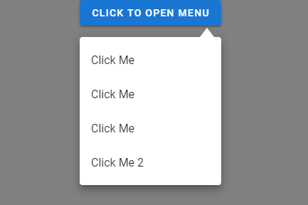
How can I create a triangle pointer in Vuetify v-menu component?
Codepen solution
I belive you need something like this:
.my-menu {
  margin-top: 40px;
  contain: initial;
  overflow: visible;
}
.my-menu::before {
  position: absolute;
  content: "";
  top: 0;
  right: 10px;
  transform: translateY(-100%);
  width: 10px;
  height: 13px;
  border-left: 10px solid transparent;
  border-right: 10px solid transparent;
  border-bottom: 13px solid #fff;
}
Effect:
Note: Here is an explanation of how it works: css tricks
Center Triangle at Bottom of Div
Can't you just set left to 50% and then have margin-left set to -25px to account for it's width: http://jsfiddle.net/9AbYc/
.hero:after {
    content:'';
    position: absolute;
    top: 100%;
    left: 50%;
    margin-left: -50px;
    width: 0;
    height: 0;
    border-top: solid 50px #e15915;
    border-left: solid 50px transparent;
    border-right: solid 50px transparent;
}
or if you needed a variable width you could use: http://jsfiddle.net/9AbYc/1/
.hero:after {
    content:'';
    position: absolute;
    top: 100%;
    left: 0;
    right: 0;
    margin: 0 auto;
    width: 0;
    height: 0;
    border-top: solid 50px #e15915;
    border-left: solid 50px transparent;
    border-right: solid 50px transparent;
}
How to create a right triangle gradient
Use a conic-gradient
.play {
  -webkit-appearance: none;
  appearance: none;
  box-sizing: border-box;
  margin: 0;
  padding: 0;
  width: 90px;
  height: 90px;
  cursor: pointer;
  background: conic-gradient(from -135deg at right,red 90deg,#0000 0) 55% 50%/22px 44px no-repeat;
  border: 9px solid red;
  border-radius: 50%;
  }
<button class="play" type="button" aria-label="Close"></button>Related Topics
Do Inline Elements Establish a Line Box for Their Content
Twitter Bootstrap Modal Opening/Closing Causes Fixed Header to Jump
How to Tell Gulp to Skip or Ignore Some Files in Gulp.Src([...])
Global Disable Magnifying Glass on iOS 9 in Meteor Cordova App
Selecting an Element That Doesn't Have a Child with a Certain Class
Jquery-Ui Datepicker CSS Problem
Multiline Grid with Elements of Same Height Using Flexbox
Css: Fit Relative Positioned Parent to Height of Absolute Positioned Child
How to Style the Scrollbar of on Iframe
Change the Color of Mui Autocomplete Option
How to Use Both Rel="Preload" and Rel="Stylesheet" for the Same Tag
Centering a Single Column Using Bootstrap 4 Grid System
Arabic Ttf (Truetype Font) in Uiwebview iOS 4.2.1
Set Width of Ng-Multiselect-Dropdown