How to animate the css zoom property
function zoomIn(tg) {    let fr = 100;    setInterval(function() {        if(fr < 200) {            fr++;            tg.style.zoom = fr + "%";        };    }, 5);}
function zoomOut(tg) {    let fr = 200;    setInterval(function() {        if(fr > 100) {            fr--;            tg.style.zoom = fr + "%";        };    }, 5);}

document.querySelector('div').addEventListener('click', function(e) {  if(e.target.classList.contains('zoom')) {      e.target.classList.remove("zoom")      zoomOut(e.target);  } else {      e.target.classList.add("zoom");      zoomIn(e.target);  }});
div { width: 50px; height: 50px; background: red; cursor: pointer; transition: .5s;}<div>click me!</div>Zoom Vs. Scale in CSS3
Transform is more predictable than zoom across browsers.
Zoom affects positioning differently in different browsers.
example:position:absolute; left:50px; zoom: 50%;
- Chrome will effectively compute the
leftvalue to50px * 50%, that is25px...but this is not reflected in DevTools Computed Values. - IE will not change the
leftvalue at all.
Transform is handled the same way in all browsers (as far as I can tell).
example:position:absolute; left:50px; transform: scale(0.5)
leftwould effectively be set to25pxin both Chrome and IE. (DevTools Computed Values will not reflect this - it will display the source code only)- To avoid changing the
leftvalue, simply usetransform-origin: 0 0. That will ensure left is still 50px.
Demo: http://jsfiddle.net/4z728fmk/ shows 2 boxes where the small one is zoomed or scaled to 50%. Looks like this:
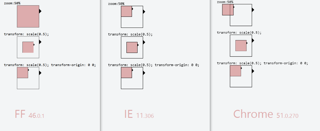
EDIT: Added Firefox in 2016. At the time it was the most problematic browser out of the three, as zoom:50% had no effect at all. And with transform: scale(0.5) the borders around the inner box have different thickness... but that could be a subpixel issue
zoom css/javascript
The Firefox & Chrome (Webkit) equivalents to the IE-specific zoom property are, respectively, -moz-transform and -webkit-transform.
A sample code would be:
.zoomed-element {
    zoom: 1.5;
    -moz-transform: scale(1.5);
    -webkit-transform: scale(1.5);
}
You'd have to be a bit more careful with Javascript (test for existence first), but here's how you'd manipulate them:
el.style.zoom = 1.5;
el.style.MozTransform = 'scale(1.5)';
el.style.WebkitTransform = 'scale(1.5)';
Is it possible to use CSS zoom value based on vw units?
New Answer:
According to MDN, CSS Zoom is:
Non-standard
This feature is non-standard and is not on a standards track. Do not use it on production sites facing the Web: it will not work for every user. There may also be large incompatibilities between implementations and the behavior may change in the future.
Therefore there will be issues. Zoom currently does not seem to accept calc values as options (exact reason is unclear, maybe multiple).
However, as stated on MDN:
transform: scale()should be used instead of this property, if possible. However, unlike CSS Transforms, zoom affects the layout size of the element.
So, you should be using transform: scale(); instead of zoom. But transform scale only accepts a unitless number; 1 = 100% zoom level.
What you're trying to achieve can't be done in CSS3 with the approach you're currently looking at.
Therefore you would need to auto generate numbers in LESS CSS (see link below) or to auto generate values in Javascript. Finally, and the most time consuming would be to set all the contents of your page to scale based on vw and vh - so every length measurement above 1920px is set as a viewport width or a viewport height value.
Options:
- 1) Use CSS LESS (method 1 - numbers and percentage types)
- 2) Use CSS LESS (method 2 - string interpolation)
- 3) Use
Transform: scale()Recommended and combine with other options here. - 4) Use Javascript to update values once the DOM is loaded.
5) Set all values within your
bodyto be percentage based above a certain media size, typically using theremlength value.- a) Set all length values in your page above a certain media size to using
remwhich will be dynamically adjusted. b) Use
calcon thehtmlelement to set the size of a singleremunit. This willscalethe contents. (please read the link above for scaling font size to screen size)@media screen (min-width:1980px){
:root {
font-size: calc( #{$min_font}px + (#{$max_font} - #{$min_font}) * ( (100vw - 1920px) / ( #{$max_width} - 1920) ));
}
.some-other-element {
width: 4rem;
}
}
- a) Set all length values in your page above a certain media size to using
Original (incorrect answer)
You should specify the length value of each value used in the calc that is not a multiple or division number. Therefore the result of the calc will be, for example 0.22vw.
I understand calc as using the length unit provided by the variables within the calc operation, so simply multiplying the result by 1 x the required length unit should convert any unitless or incorrectly-set length unit to the required value unit type.
Zoom accepts percentages so you can force the resultant vw value of calc(100vw / 1920); as a percentage by doing:
zoom: calc(100% * calc(100vw / 1920));
Which will give you on a screen width 2500px:
100% * ( 2500px / 1920 ) = 130.2% Zoom value.
For your example of 2880px.
zoom: calc(100% * calc(2880px / 1920)); = 100% * 1.5 = 150% = 1.5
I do not know how you calculated that the zoom should be 2 for these figures?
Related Topics
How to Use Both Rel="Preload" and Rel="Stylesheet" for the Same Tag
Css3 Grid Layouts: New Row After Specific Element - Possible
Scale an Image to Maximally Fit Available Space and Center It
Text Color Change on Hover Over Button
What Is a Parse Error and How to Fix It
Outlook 2010 Not Respecting CSS, Even <Font> Tags for Every Text
How to Have an Image Placeholder in Angularjs
Best Replacement for Font Tag in HTML
IE9 Not Applying Linked Style Sheets
Setting CSS Style Attributes with Thymeleaf
Wrap Text Around an Image on Bootstrap 3
Setting a Cursor [With CSS] on an Image Map Area
Browser Handling of CSS "Transparent" in Gradients
What Is the Recommended Way to Dynamically Set Background Image in Angular 4
Doing a Input Type="Text" with CSS3 and Fixed Image on the Background