Can Bootstrap 3 Grid Be Extended?
.col-sm-6 is dynamic generate on compilation time, so can not extended.
.search {
  .make-sm-column(6);
}
generates:
.search {
  position: relative;
  min-height: 1px;
  padding-left: 15px;
  padding-right: 15px;
}
@media (min-width: 768px) {
  .search {
    float: left;
    width: 50%;
  }
}
Which is a little overhead, but small in relation to the other source.
In theory you can can compile twice:
lessc bootstrap.less> bootstrap.csslessc test.less> test.css, with test.less:@import (less) "bootstrap.css";
.search {
&:extend(.col-sm-6);
}
doing a diff over bootstrap.css and test.css i found as expected among others:
>   .col-sm-6,
>   .search {
1010c1082,1093
<   .col-md-1, .col-md-2, .col-md-3, .col-md-4, .col-md-5, .col-md-6, .col-md-7, .col-md-8, .col-md-9, .col-md-10, .col-md-11, .col-md-12 {
---
recompiling seems futher:
- put .col-md-* etc. on a new line
- change for example 0.75 to .75
- change
(enabled = false)into(enabled=false)
which all make no sense on the first sight
Adaptive Bootstrap 3 grid with column that takes up remaining viewport space
What you can do is, for the row where the map needs to be added is introduce a containing element (after the .container closing ) and set position to relative.
Then inside that add another container and row which will maintain the current websites structure. make the map column positioned absolute and right:0 so that it takes up all the space of the viewport on the right.
the map colum should have css something like this:
.make-absolute {
  position:absolute;
  right:0;
  top:0;
}
see a working example here
Bootstrap 3 grid, does it *really* matter how many columns are in a row?
No, there's nothing to mandate that the bootstrap grid must add up to 12 columns.
It's just a preference / stylistic thing.
Less than 12 Columns -> Aligns Left:
If you have less than twelve of the columns filled, by default they will left align, leaving empty space to the right.
The following code:
<div class='row'>
    <div class="col-xs-2">Hi</div>
    <div class="col-xs-2">Hi</div>
</div>
.row > div {
    background: lightgrey;
    border: 1px solid grey;
}
Results in this: (Demo in Fiddle)

More than 12 Columns -> Wraps:
If the total adds to more than 12 columns, as long as the columns are within a row class, they will just wrap to additional rows. A good use case would be a photo grid system where you would like to add tons of photos but don't know how many rows you'll have and would still like to define the number of columns.
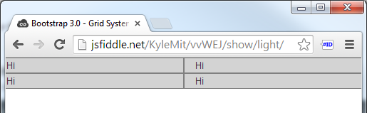
The following code:
<div class='row'>
    <div class="col-xs-6">Hi</div>
    <div class="col-xs-6">Hi</div>
    <div class="col-xs-6">Hi</div>
    <div class="col-xs-6">Hi</div>
</div>
Results in this: (Demo in Fiddle)
Other than that, sometimes it's the case that 12 column layouts look better, but you don't have to use them; it's not a sudoku :)
Why would anyone extend bootstrap's grid limit of 12?
Whenever arow exceeds 12 columns in bootstrap the rest of the columns move to the next row, as if a next row is being created.
but according to bootstrap documentation you should always wrap the columns inside a row. so it is a bad practice.
see the effect in the example
<link rel="stylesheet" href="http://maxcdn.bootstrapcdn.com/bootstrap/3.3.6/css/bootstrap.min.css">          <script src="https://ajax.googleapis.com/ajax/libs/jquery/1.12.4/jquery.min.js"></script>          <script src="http://maxcdn.bootstrapcdn.com/bootstrap/3.3.6/js/bootstrap.min.js"></script><div row="container"><div class="col-md-4 col-sm-6 portfolio-item" style="background-color:blue;">...</div><div class="col-md-4 col-sm-6 portfolio-item" style="background-color:black;">...</div><div class="col-md-4 col-sm-6 portfolio-item" style="background-color:green;">...</div><div class="col-md-4 col-sm-6 portfolio-item" style="background-color:brown;">...</div><div class="col-md-4 col-sm-6 portfolio-item" style="background-color:grey;">...</div><div class="col-md-4 col-sm-6 portfolio-item" style="background-color:yellow;">...</div></div>
<br><br><div class="col-md-12 col-xs-8 portfolio-item" style="background-color:blue;">...</div><div class="col-md-12 col-xs-4 portfolio-item" style="background-color:black;">...</div><div class="col-md-12 col-xs-8 portfolio-item" style="background-color:green;">...</div><div class="col-md-4 col-xs-8 portfolio-item" style="background-color:brown;">...</div><div class="col-md-4 col-xs-5 portfolio-item" style="background-color:grey;">...</div><div class="col-md-4 col-xs-4 portfolio-item" style="background-color:yellow;">...</div></div>
Bootstrap column to extend out side of the container
i think i figured it out, instead of using a normal container i would have to use container fluid as i said before but just an offset
<div class="container-fluid">
  <div class="row">
    <div class="col-sm-offset-2 col-xs-4 first">

    </div>
    <div class="col-sm-6 second">

    </div>
  </div>
</div>
Bootstrap 3: How to set default grid to 960px width?
For Bootstrap3, you can customize it to get 960px by default (http://getbootstrap.com/customize/)
- change @container-large-desktop from ((1140px + @grid-gutter-width)) to ((940px + @grid-gutter-width)).
- change @grid-gutter-width from 30px to 20px.
then download your custom version of bootstrap and use it. It should be 960px by default now.
Bootstrap 3 two columns full height
Edit:
In Bootstrap 4, native classes can produce full-height columns (DEMO) because they changed their grid system to flexbox. (Read on for Bootstrap 3)
The native Bootstrap 3.0 classes don't support the layout that you describe, however, we can integrate some custom CSS which make use of css tables to achieve this.
Bootply demo / Codepen
Markup:
<header>Header</header>
<div class="container">
    <div class="row">
        <div class="col-md-3 no-float">Navigation</div>
        <div class="col-md-9 no-float">Content</div>
    </div>
</div>
(Relevant) CSS
html,body,.container {
    height:100%;
}
.container {
    display:table;
    width: 100%;
    margin-top: -50px;
    padding: 50px 0 0 0; /*set left/right padding according to needs*/
    box-sizing: border-box;
}

.row {
    height: 100%;
    display: table-row;
}

.row .no-float {
  display: table-cell;
  float: none;
}
The above code will achieve full-height columns (due to the custom css-table properties which we added) and with ratio 1:3 (Navigation:Content) for medium screen widths and above - (due to bootstrap's default classes: col-md-3 and col-md-9)
NB:
1) In order not to mess up bootstrap's native column classes we add another class like no-float in the markup and only set display:table-cell and float:none on this class (as apposed to the column classes themselves).
2) If we only want to use the css-table code for a specific break-point (say medium screen widths and above) but for mobile screens we want to default back to the usual bootstrap behavior than we can wrap our custom CSS within a media query, say:
@media (min-width: 992px) {
  .row .no-float {
      display: table-cell;
      float: none;
  }
}
Codepen demo
Now, for smaller screens, the columns will behave like default bootstrap columns (each getting full width).
3) If the 1:3 ratio is necessary for all screen widths - then it's probably a better to remove bootstrap's col-md-* classes from the markup because that's not how they are meant to be used.
Codepen demo
Related Topics
Using Bootstrap, How to Create Multiple Fullscreen Div's to Stack on One Another
Mysterious Horizontal Lines on My Site When Rendered on Ipad
Bootstrap 4 Center Pagination in Column
How to Make Bootstrap Icon Display Inline with Text in a Tag
Horizontal Scrollbar Only Appearing at Bottom of Page
Difference Between Initial Containing Block and Viewport
HTML5Shiv - Why Is It Only for Ie
How to Remove Disqus Footer from Webpage
Should I Locally Store CSS Generated by The Google Web Fonts API
Overriding CSS Properties That Don't Have Default Values
How to Make Bootstrap 4 Carousel Images Responsive
How to Use The Bootstrap Form Select CSS with a Rails Model
How to Set Different Font-Weight for Fallback Font
Make a Material UI Component in React Sticky When Scrolling (Not Appbar)
Pixel Border and Percentage Width in Proportion
CSS- Target Text Links with Bottom Border on Hover, But Image Links with No Border