Make a Material UI Component in React Sticky when scrolling (not AppBar)
I was able to get it working with material ui themes
here is my styles. I added a z-index because my table selects and table header data were still visible in <RenderTeamSelections {...this.props] /> in the sticky as I scrolled.
Here is the final component with styles.
const styles = theme => ({
    root: {
        background: 'white',
        position: '-webkit-sticky',
        position: 'sticky',
        top: 20,
        bottom: 20,
        paddingTop: '40px',
        paddingBottom: '40px',
        zIndex: 5,
    },
    details: {
        display: 'flex'
    },
    progressWrapper: {
        marginTop: theme.spacing(2)
    },
    linearProgress: {
        height: 20
    },
});

export function ProgressBar(props) {
    const { profileDetail, classes } = props;
    const [completeness, setCompleteness] = useState(0)

    useEffect(() => {
        if (profileDetail) {
            setCompleteness(profileDetail.teamKeysTier1.split(",").filter(x => { return x.length != 0 }).length + profileDetail.teamKeysTier2.split(",").filter(x => { return x.length != 0 }).length)
        }
    }, [profileDetail])

    return (
        <Portlet className={classes.root} >
            <PortletContent >
                {completeness > 8 ?
                    <div className={classes.progressWrapper}>
                        <Typography variant="h3" color="textSecondary">Team Selection Completeness: {completeness * 10 + 10}%</Typography>
                        <br />
                        <br />
                        <LinearProgress
                            className={classes.linearProgress}
                            value={completeness * 10 + 10}
                            variant="determinate"
                            position="fixed"
                        /> </div> :
                    <div className={classes.progressWrapper}>
                        <Typography variant="h3" color="textSecondary">Team Selection Completeness: {completeness * 10}%</Typography>
                        <br />
                        <br />
                        <LinearProgress
                            className={classes.linearProgress}
                            value={completeness * 10}
                            variant="determinate"
                            position="fixed"
                        />
                    </div>}
            </PortletContent>
        </Portlet>

    )

}

export default withStyles(styles)(ProgressBar);
Material UI Sticky AppBar below the other AppBar
Just put your second AppBar inside the first one. Move the closing tag </AppBar> of your first AppBar under the closing tag of the second AppBar.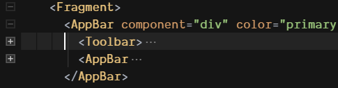
How to make AppBar component from material-ui-next react to scroll events
For those who are still looking for built-in feature, Hide appbar on scroll is available in material-ui.
How to add a sticky navbar below the top navbar section? ReactJS
EDIT
This is the only solution I have found...
PS:
1/ Use position: "fixed" instead of position: "sticky"
2/ There are other modifications to do... (add scroll listener,...)
Header.js
import React, { useEffect, useState } from "react";
import { makeStyles } from "@material-ui/core/styles";
import { AppBar, IconButton, Toolbar, Collapse } from "@material-ui/core";
import SortIcon from "@material-ui/icons/Sort";
import ExpandMoreIcon from "@material-ui/icons/ExpandMore";
import { Link as Scroll } from "react-scroll";

const useStyles = makeStyles(theme => ({
  root: {
    fontFamily: "Nunito"
  },
  appbar: {
    position: "fixed",
    zIndex: "9999",
    background: "black"
  },
  appbarTitle: {
    flexGrow: "1"
  },
  appbarWrapper: {
    width: "80%",
    margin: "0 auto"
  },
  icon: {
    color: "#fff",
    fontSize: "2rem"
  },
  colorText: {
    color: "#34cbc2"
  },
  container: {
    textAlign: "center",
    height: "100vh",
    marginTop: "80px",
    display: "flex",
    flexDirection: "column",
    justifyContent: "center",
    alignItems: "center"
  },
  title: {
    color: "#333",
    fontSize: "4rem"
  },
  goDown: {
    color: "#34cbc2",
    fontSize: "4rem"
  }
}));

export default function Header() {
  const classes = useStyles();
  const [checked, setChecked] = useState(false);
  useEffect(() => {
    setChecked(true);
  }, []);

  return (
    <div className={classes.root} id="header">
      <AppBar className={classes.appbar} elevation={0}>
        <Toolbar className={classes.appbarWrapper}>
          <h1 className={classes.appbarTitle}>
            Logo <span className={classes.colorText}>Colored</span>
          </h1>
          <IconButton>
            <SortIcon className={classes.icon} />
          </IconButton>
        </Toolbar>
      </AppBar>

      <Collapse
        in={checked}
        {...(checked ? { timeout: 1000 } : {})}
        collapsedHeight={50}
      >
        <div id="mainheader" className={classes.container}>
          <h1 className={classes.title}>
            Main header <br />
            at <span className={classes.colorText}>title.</span>
          </h1>
          <Scroll to="info-card" smooth={true}>
            <IconButton>
              <ExpandMoreIcon className={classes.goDown} />
            </IconButton>
          </Scroll>
        </div>
      </Collapse>
    </div>
  );
}
StickyHeader.js
import React, { useEffect, useState } from "react";
import { makeStyles } from "@material-ui/core/styles";
import { AppBar, IconButton, Toolbar, Collapse } from "@material-ui/core";

const useStyles = makeStyles(theme => ({
  root: {
    fontFamily: "Nunito"
  },
  appbar: {
    background: "purple"
  },
  list: {
    display: "flex",
    justifyContent: "center",
    alignItems: "center"
  }
}));

export default function StickyHeader() {
  const classes = useStyles();
  const [checked, setChecked] = useState(false);
  const [scrollY, setScrollY] = useState({ position: "relative" });

  useEffect(() => {
    window.addEventListener("scroll", () => {
      const heightVh = document.querySelector("#mainheader").offsetHeight / 100;

      if (window.scrollY > heightVh * 100) {
        setScrollY({ position: "fixed", top: "80px" });
      } else {
        setScrollY({ position: "relative" });
      }
    });
    return () => {
      window.removeEventListener("scroll");
    };
  }, [scroll]);

  useEffect(() => {
    setChecked(true);
  }, []);

  return (
    <>
      {console.log(scrollY)}
      <div className={classes.root} id="stickyheader">
        <AppBar className={classes.appbar} style={scrollY} elevation={4}>
          <Toolbar className={classes.appbarWrapper}>
            <ul className={classes.list} style={{ listStyleType: "none" }}>
              <li>
                <a href="#product" data-id="product" data-is-active="true">
                  Database
                </a>
              </li>
            </ul>
          </Toolbar>
        </AppBar>
      </div>
    </>
  );
}
Demo : stackblitz
How to make a Material UI grid element sticky?
In your sandbox I realized that you have a nested grid item inside another grid item, I don't know if this was intentional, but I removed it anyway.
<Grid item xs={12} sm={6} md={5} lg={5}>
  <Grid item xs elevation={3}> <==== THIS ONE
    <OrderSummaryItem />
  </Grid>
</Grid>
Then I set the position of the OrderSummaryItem component to sticky and some tweaks and I think it's working fine. Check this fork I made from your sandbox: https://codesandbox.io/s/amazing-darkness-q0o5h
Related Topics
Is There an Inverse to The CSS "Clip" Property; Hide The Clipped Area
Bootstrap: How to Create a Series of Div on One Line Hiding The Overflowing Divs
Diamond Menu Items Using CSS and Svg
Add Strikethrough to Checked Checkbox
How to Iterate Keyframe Percentages Less CSS
Align Flex-Box Items to Baseline of Last Text Line in a Block
Should I Locally Store CSS Generated by The Google Web Fonts API
Web Fonts and Providing Fallback Fonts
Bootstrap-Affix: Div Underneath Affix "Jumps" to Top. How to Make It Smoothly Scroll Behind
Prevent Highlighter Cursor in CSS
Add Additional Box-Shadow to an Element Where Existing Shadow Is Unknown