Add additional box-shadow to an element where existing shadow is unknown
An absolutely positioned pseudo-element (with the original container having position set) seems like the only solution:
See the fiddle. (I did different size/color for visual).
.test:before {
    content: '';
    position: absolute;
    top: 0;
    right: 0;
    bottom: 0;
    left: 0;
    box-shadow:3px 3px rgba(275,0,0,.25);
}
How to get box-shadow on left & right sides only
NOTE: I suggest checking out @Hamish's answer below; it doesn't involve the imperfect "masking" in the solution described here.
You can get close with multiple box-shadows; one for each side
box-shadow: 12px 0 15px -4px rgba(31, 73, 125, 0.8), -12px 0 8px -4px rgba(31, 73, 125, 0.8);
http://jsfiddle.net/YJDdp/
Edit
Add 2 more box-shadows for the top and bottom up front to mask out the that bleeds through.
box-shadow: 0 9px 0px 0px white, 0 -9px 0px 0px white, 12px 0 15px -4px rgba(31, 73, 125, 0.8), -12px 0 15px -4px rgba(31, 73, 125, 0.8);
http://jsfiddle.net/LE6Lz/
Add inline box-shadow option without overriding existing property
With your inline style a new rule will simply overwrite the old rule. The only way I can think of doing it with only CSS is using an absolutely positioned pseudo element, although that also relies on your .foo being relatively positioned.
CSS
.foo:after {
    position: absolute;
    content: '';
    top: 0; right: 0; bottom: 0; left: 0;
    box-shadow: 0 0 10px 0 #000000 inset, 0 0 2px 0 #3C3C3C inset
}

.foo {
    position:relative;
    width:100px; /* added for demo */
    height:100px; /* added for demo */
}
jsFiddle demo
CSS box-shadow: Only apply to part of an element
It is indeed possible to achieve this effect with CSS only, but the CSS is mind-bending:
.container {
  background-color: rgba(168,214,255,1);
  padding: 20px;
}
.tab {
  height: 50px;
  background-color: #4790CE;
  margin-bottom: 10px;
  border-radius: 20px;
  position: relative;
}

.tab.active {
  background-color: #63B6FF;
  border-radius: 20px 0 0 20px;
   box-shadow: 0 0 15px #3680BD;
}

.tab .shadow {
  position: absolute;
  top: -10px;
  left: 50px;
  right: -20px;
  bottom: -10px;
  border-radius: 20px;
  background-color: transparent;
  -webkit-border-image: -webkit-gradient(linear, left top, right top, color-stop(10%,rgba(168,214,255,0)), color-stop(80%,rgba(168,214,255,1))) 50 50 stretch;
  border-width: 10px 20px 10px 0;
}
You basically use border-image to mask the dropshadow. You would be able to achieve this without extra markup through the :after pseudo-selector, but :after doesn't play nice with animation.
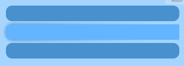
View the demo on jsfiddle (Webkit only, but you can adapt it easily to FF. IE9 would be out of luck, unfortunately).
box shadows on multiple elements at same level but without overlap?
If you can use filter and drop-shadow then you can apply a drop-shadow to the container. This shadow differs as it conforms to the alpha channel of the image (in this case, the outline of the content) instead of a simple rectangle:
body {  background: darkgrey;  padding-top: 50px}
#box-one,#box-two {  background: white;  width: 200px;  height: 200px;  margin: auto;  position: relative;}
#box-one {  left: -50px;  z-index: 1;}
#box-two {  right: -50px;  z-index: 1;}
#top {  filter: drop-shadow(0 0 20px black);}
<div id="top"> <div id="box-one"></div> <div id="box-two"></div></div>How to add details to CSS (example Box shadow)
No. You cannot add a box-shadow to something that has one, as it will overwrite it (or, more specifically, the one with the higher specificity wins). You need to define both shadows at one time for the :first-child / :last-child case.
However, using a pseudo-element you can effectively "add" a shadow, though it is not truly adding it.
Change direction of existing CSS shadow
As of I know there is no sub-attribute like background-repeat, margin-left, border-bottom for box-shadow, text-shadow CSS3 attributes. For more details, please refer: http://www.w3.org/TR/css3-background/#box-shadow .
The ‘box-shadow’ property attaches one or more drop-shadows to the
box. The property is a comma-separated list of shadows, each specified
by 2-4 length values, an optional color, and an optional ‘inset’
keyword. Omitted lengths are 0; omitted colors are a UA-chosen color.Where
<shadow> = inset? && [ <length>{2,4} && <color>? ]
So, you can't give a sub-attribute like box-shadow-direction:2px 0; after defining box-shadow to an HTML element until it or similar sub-attribute came to live in next versions of CSS.
Related Topics
How to Make a Div Full Screen and Scrollable
Animating Elements Sequentially in Pure CSS3 on Loop
How to Divide Bootstrap Col-Md Div to Half Vertically
How to Make Bootstrap 4 Carousel Images Responsive
Font Awesome Icons Not Working in Osx Safari
Adding Hovertext on Kendoui Grid Column Headers
CSS, Centering Links Inside Div
Mvc Bundling and Relative CSS Image When Website Is Deployed to an Application
How to Insert an Element's Index (Child Number) as Text Within The Element Solely Using CSS
Fixed Width Variable Height Grid CSS
CSS Selector to Check That Attribute Does Not Contain Both Values
Pixel Border and Percentage Width in Proportion
Bootstrap Button Active Color Change
CSS <Img> Relative Positioning VS. Background-Image + Background-Position
CSS- Target Text Links with Bottom Border on Hover, But Image Links with No Border