Building a 4 corners-colors CSS3 gradient
in your case
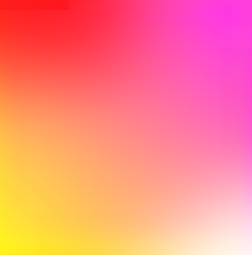
Method 1:
jsFiddle Demo
div{
overflow: hidden;
background: #f06;
background: linear-gradient(45deg, #fff722, #ff26f9);
min-height: 100%;
width: 256px;
height: 256px;
position: relative;
z-index: 1;
box-shadow: inset -20px 0 38px -18px #ff26f9,inset -3px -13px 65px -18px yellow;
}

div:before,div:after{
    content:'';
    position:absolute;
    width:100%;
    height:100%;
}
div:before{
    background: red;
    box-shadow: 0 0 140px 64px red;
    z-index:2;
    top: -96%;
left: -72%;
    opacity: 0.8;
}
div:after {
background: white;
z-index: 3;
bottom: -96%;
right: -72%;
box-shadow: 0 0 140px 64px white;
opacity: 1;
border-radius: 100%;
}
Method 2:
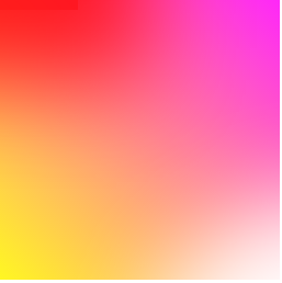
div{
overflow: hidden;
background: #f06;
background: linear-gradient(45deg, #fff722, #ff26f9);
min-height: 100%;
width:256px;
height:256px;
position:relative;
    z-index:1;
}

div:before,div:after{
    content:'';
    position:absolute;
    width:100%;
    height:100%;
}
div:before{
    background: red;
    box-shadow: 0 0 140px 64px red;
    z-index:2;
    top: -96%;
left: -72%;
    opacity: 0.8;
}
div:after {
background: white;
z-index: 3;
bottom: -96%;
right: -72%;
box-shadow: 0 0 140px 64px white;
opacity: 1;
border-radius: 100%;
}
jsFiddle Demo
Method 3: multiple background:
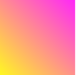
div{
background: #f06;
background: linear-gradient(45deg, #fff722, #ff26f9),linear-gradient(142deg, transparent, white),linear-gradient(108deg, red, transparent);
min-height: 100%;
width:256px;
height:256px;
position:relative;
    z-index:1;
}
jsFiddle Demo
Method 4: pseudo element
div{
background: #f06;
background: linear-gradient(45deg, #fff722, #ff26f9);
min-height: 100%;
width:256px;
height:256px;
position:relative;
    z-index:1;
}

div:before,div:after{
    content:'';
    position:absolute;
    width:100%;
    height:100%;
    opacity: 0.8;
}
div:before{
    background: linear-gradient(108deg, red, transparent);
    z-index:2;
    top:0;
    left:0;
}
div:after{
    background: linear-gradient(142deg, transparent, white);
    z-index:3;
    bottom:0;
    right:0;
}
the markup:
<div></div>
jsFiddle Demo
Method 5:
div{
overflow: hidden;
background: #f06;
background: linear-gradient(45deg, #fff722, #ff26f9);
min-height: 100%;
width:256px;
height:256px;
position:relative;
    z-index:1;
}

div:before,div:after{
    content:'';
    position:absolute;
    width:100%;
    height:100%;
}
div:before{
    background: linear-gradient(108deg, red, transparent);
    z-index:2;
    top:0;
    left:0;
    opacity: 0.8;
}
div:after {
background: white;
z-index: 3;
bottom: -96%;
right: -72%;
box-shadow: 0 0 110px 54px white;
opacity: 1;
border-radius: 100%;
}
jsFiddle Demo
Update: many thanks to Ana-Maria Tudor <3
body{
position:fixed;
top:0;
right:0;
bottom:0;
left:0;
}

body:before {
  content: '';
  position:absolute;
  top:0;
  right:0;
  bottom:0;
  left:0;
  display: block;
  width: 100%;
  height: 600px;
  border-radius: 0%;
  background:
    radial-gradient(circle at 50% 0,
         rgba(255,0,0,.5), rgba(255,0,0,0) 70.71%),
    radial-gradient(circle at 6.7% 75%,
         rgba(0,0,255,.5), rgba(0,0,255,0) 70.71%),
    radial-gradient(circle at 93.3% 75%,
         rgba(0,255,0,.5), rgba(0,255,0,0) 70.71%);
}
jsFiddle Demo
Is this possible to create 2-axis 4 color gradient in css (bilinear gradient)?
mask combined with linear-gradient can do it:
.box {
  height: 200px;
  width: 300px;
  background: linear-gradient(to right, rgb(238, 252, 83), rgb(120, 239, 197))
}
.box::before {
  content: "";
  display: block;
  height: 100%;
  background: linear-gradient(to right, rgb(253, 67, 205), rgb(74, 68, 215));
  -webkit-mask: linear-gradient(to bottom,#0000, #000);
          mask: linear-gradient(to bottom,#0000, #000);
}
<div class="box"></div>Create a border gradient for each of the 4 borders
How about using a radial gradient? Although this is just a mock up, you can see the basic effect.
.outer {  vertical-align:top;  display:inline-block;  height: 100px;  width: 100px;  position: relative;background: -moz-radial-gradient(center, ellipse cover,  rgba(0,0,0,1) 1%, rgba(0,0,0,1) 50%, rgba(0,0,0,0) 90%, rgba(0,0,0,0) 99%, rgba(0,0,0,0) 100%); /* FF3.6+ */background: -webkit-gradient(radial, center center, 0px, center center, 100%, color-stop(1%,rgba(0,0,0,1)), color-stop(50%,rgba(0,0,0,1)), color-stop(90%,rgba(0,0,0,0)), color-stop(99%,rgba(0,0,0,0)), color-stop(100%,rgba(0,0,0,0))); /* Chrome,Safari4+ */background: -webkit-radial-gradient(center, ellipse cover,  rgba(0,0,0,1) 1%,rgba(0,0,0,1) 50%,rgba(0,0,0,0) 90%,rgba(0,0,0,0) 99%,rgba(0,0,0,0) 100%); /* Chrome10+,Safari5.1+ */background: -o-radial-gradient(center, ellipse cover,  rgba(0,0,0,1) 1%,rgba(0,0,0,1) 50%,rgba(0,0,0,0) 90%,rgba(0,0,0,0) 99%,rgba(0,0,0,0) 100%); /* Opera 12+ */background: -ms-radial-gradient(center, ellipse cover,  rgba(0,0,0,1) 1%,rgba(0,0,0,1) 50%,rgba(0,0,0,0) 90%,rgba(0,0,0,0) 99%,rgba(0,0,0,0) 100%); /* IE10+ */background: radial-gradient(ellipse at center,  rgba(0,0,0,1) 1%,rgba(0,0,0,1) 50%,rgba(0,0,0,0) 90%,rgba(0,0,0,0) 99%,rgba(0,0,0,0) 100%); /* W3C */filter: progid:DXImageTransform.Microsoft.gradient( startColorstr='#000000', endColorstr='#00000000',GradientType=1 ); /* IE6-9 fallback on horizontal gradient */

}.inner {  height: 90%;  width: 90%;  position: absolute;  left: 5%;  top: 5%;  background: white;}
<div class="outer"> <div class="inner"> text </div></div><div class="outer" style="height:100px; width:200px"> <div class="inner"> text </div></div>CSS background Image plus gradient in 4 corners
You can use box-shadow:
background:url('http://i.imgur.com/7TX9BQU.jpg?1?9512');
box-shadow: inset 0px 0px 200px 10px #000;
The key to make this work is the 'inset' value. Tt makes the shadow appear on the inside of the element.
Fiddle: http://jsfiddle.net/KhLsQ/5/
info about box-shadow: http://www.css3.info/preview/box-shadow/
Linear Gradient with Round corners
The cleanest might actually be to use svg for this instead of css-gradients.
You'll load it as a data-uri in the background-image property.
To make the rounded corner, you can use the rx and ry attributes of the <rect> element.
To make the gradients, you can use svg's <linearGradient> elements.
.mystyle {  height: 900px;  width: 500px;  background-image: url("data:image/svg+xml,<svg xmlns='http%3A%2F%2Fwww.w3.org%2F2000%2Fsvg' width='500' height='900' viewBox='0 0 500 900'><defs><linearGradient id='blue-grad' gradientTransform='rotate(90)'><stop stop-color='lightgrey' offset='0%'/><stop stop-color='blue' offset='100%'/></linearGradient></defs><rect x='0' y='0' width='100' height='40' rx='15' fill='url(%23blue-grad)'/><rect x='0' y='80' width='500' height='60' rx='15' fill='url(%23blue-grad)'/><rect x='0' y='160' width='250' height='50' rx='15' fill='url(%23blue-grad)'/><rect x='0' y='220' width='250' height='60' rx='15' fill='url(%23blue-grad)'/></svg>");  background-size: cover;  background-repeat: no-repeat;}
/*  SVG Image unminified:  <svg xmlns="http://www.w3.org/2000/svg" width="500" height="900">  <defs>    <linearGradient id="blue-grad" gradientTransform="rotate(90)">      <stop stop-color="lightgrey" offset="0%"/>      <stop stop-color="blue" offset="100%"/>    </linearGradient>  </defs>  <rect x="0" y="0" width="100" height="40" rx="15" fill="url(#blue-grad)"/>  <rect x="0" y="80" width="500" height="60" rx="15" fill="url(#blue-grad)"/>  <rect x="0" y="160" width="250" height="50" rx="15" fill="url(#blue-grad)"/>  <rect x="0" y="220" width="250" height="60" rx="15" fill="url(#blue-grad)"/></svg>*/
<div class="mystyle"></div>html5 canvas gradient in 4 corners
There is no direct operation for something like this. In certain special cases (ie. colorpicker) you can get away with two separate gradients.
If you want arbitrary color per corner, you will have to perform it pixel-wise. In other words do linear interpolation on both x and y for each pixel. I've done something like this for triangle gradients myself.
Compared to that four corner variant without any special transformation would be simple. You would simply have to go through each x and y of the canvas while keeping track of the state (two lerps per pixel).
Code Example
HTML
<canvas id="canvas" width="300" height="300"></canvas>
JS
main();

function main() {
    var canvas = document.getElementById("canvas");

    quadGradient(canvas, {
      topLeft: [1, 1, 1, 1],
      topRight: [0, 0, 0, 1],
      bottomLeft: [0, 0, 0, 1],
      bottomRight: [1, 1, 1, 1]
    });
}

function quadGradient(canvas, corners) {
    var ctx = canvas.getContext('2d');
    var w = canvas.width;
    var h = canvas.height;
    var gradient, startColor, endColor, fac;

    for(var i = 0; i < h; i++) {
        gradient = ctx.createLinearGradient(0, i, w, i);
        fac = i / (h - 1);

        startColor = arrayToRGBA(
          lerp(corners.topLeft, corners.bottomLeft, fac)
        );
        endColor = arrayToRGBA(
          lerp(corners.topRight, corners.bottomRight, fac)
        );

        gradient.addColorStop(0, startColor);
        gradient.addColorStop(1, endColor);

        ctx.fillStyle = gradient;
        ctx.fillRect(0, i, w, i);
    }
}

function arrayToRGBA(arr) {
    var ret = arr.map(function(v) {
        // map to [0, 255] and clamp
        return Math.max(Math.min(Math.round(v * 255), 255), 0);
    });

    // alpha should retain its value
    ret[3] = arr[3];

    return 'rgba(' + ret.join(',') + ')';
}

function lerp(a, b, fac) {
    return a.map(function(v, i) {
        return v * (1 - fac) + b[i] * fac;
    });
}
JSbin
Trying to create 2 cut off corners with linear-gradient
consider background-size and background-position:
.box { background: linear-gradient(-135deg, transparent 20px, red 0) right, linear-gradient( 135deg, transparent 20px, red 0) left; background-size:51% 100%; /* width height */ background-repeat:no-repeat; height:100px;}<div class="box"></div>Gradient borders
The border-image property can accomplish this. You'll need to specify border-style and border-width too.
border-image: linear-gradient(#f6b73c, #4d9f0c) 30;
border-width: 4px;
border-style: solid;
Read more on MDN.
How to create diagonal gradient from corner to corner?
You have used 45 degree gradient so the height and the width of cells must be equal. Yours are not. So if you make the width and height are equal then it will be ok. And i changed the gradient stop %51 to %50
.slider-menu div {
  background: #006bac;
  position: relative;
  margin-bottom:5px;
  height: 228px; }
  .slider-menu div img {
    position: relative;
    z-index: 999; }

.slider-menu div:after {
  content: "";
  position: absolute;
  top: 0;
  left: 0;
  opacity: 0.1;
  width: 100%;
  height: 100%;
  z-index: 1;
  /* Permalink - use to edit and share this gradient: http://colorzilla.com/gradient-editor/#000000+0,ffffff+52,000000+52,ffffff+100,000000+100,ffffff+100 */
  /* Permalink - use to edit and share this gradient: http://colorzilla.com/gradient-editor/#000000+0,ffffff+51,000000+51,ffffff+100 */
  background: black;
  /* Old browsers */
  background: -moz-linear-gradient(45deg, black 0%, white 50%, black 50%, white 100%);
  /* FF3.6+ */
  background: -webkit-gradient(linear, left bottom, right top, color-stop(0%, black), color-stop(50%, white), color-stop(50%, black), color-stop(100%, white));
  /* Chrome,Safari4+ */
  background: -webkit-linear-gradient(45deg, black 0%, white 50%, black 50%, white 100%);
  /* Chrome10+,Safari5.1+ */
  background: -o-linear-gradient(45deg, black 0%, white 50%, black 50%, white 100%);
  /* Opera 11.10+ */
  background: -ms-linear-gradient(45deg, black 0%, white 50%, black 50%, white 100%);
  /* IE10+ */
  background: linear-gradient(45deg, black 0%, white 50%, black 50%, white 100%);
  /* W3C */
  filter: progid:DXImageTransform.Microsoft.gradient( startColorstr='#000000', endColorstr='#ffffff',GradientType=1 );
  /* IE6-9 fallback on horizontal gradient */ }

.slider-menu .row {
  padding: 0px; }

.slider-menu img {
  display: block;
  margin: 0 auto; }

.slider-menu p {
  text-align: center;
  color: #fff;
  margin-top: 20px; }

.col-xs-5ths,
.col-sm-5ths,
.col-md-5ths,
.col-lg-5ths {
  position: relative;
  min-height: 1px;
  padding-right: 10px;
  padding-left: 10px; }

.col-xs-5ths {
  width: 20%;
  float: left; }

@media (min-width: 768px) {
  .col-sm-5ths {
    width: 20%;
    float: left; } }

@media (min-width: 992px) {
  .col-md-5ths {
    width: 20%;
    float: left; } }

@media (min-width: 1200px) {
  .col-lg-5ths {
    width: 20%;
    float: left; } }

@media (min-width: 320px) {
  .container {
    padding: 0px 15px; }
  .site-header .container {
    padding: 0px; }
  .slider-menu div {
    padding: 50px 0px 24px 0px; }
  .slider-menu p {
    font-size: 12px; }
  body {
    margin: 0 0 65px;
    /* bottom = footer height */ }
  .site-footer {
    height: 65px;
    padding: 0px 10px; }
    .site-footer p.pull-left {
      display: none; }
    .site-footer p.pull-right {
      float: left !important; }
  .list-image > div {
    margin-top: 15px; }
  .container > .navbar-collapse {
    margin-left: 0px;
    margin-right: 0px; }
  .navbar-nav > li > p > a {
    color: #fff; }
  .navbar-nav {
    margin: 0px auto;
    width: 100%; }
    .navbar-nav li {
      width: 100%; }
    .navbar-nav .container {
      margin-left: 0px;
      margin-right: 0px; }
  .site-header .container > .navbar-header {
    margin-left: auto;
    margin-right: auto; } }
http://codepen.io/anon/pen/eNjQmO
Related Topics
How to Scale Text Size Compared to Container
How to Pass a Parameter to a CSS Class Using Less
>*' Selector Not Working from Parent to Child Component
How to Select The Last-Child of The Last-Child
Can a Div Fill Up The Entire Viewport with a Pixel-Based Margin, Not Using The CSS3 Calc Property
Vuetify Without Vue-Cli Sass/Scss Conflict
Using SASS Map Function Instead of Variable Interpolation
Responsive Irregular Background Shape with CSS
Class Selector Not Working in CSS, But Id Works for Add Some Styles
How to Scale Svg Path to Fit The Window Size
Facebook Like Button - How to Disable Comment Pop Up Box
Neatly Display Images of Different Sizes Sequentially in The Same UI Element
Why Does My Site Change My CSS for Me
In HTML Table How to Force Cell Text to Truncate and Not Increase The Width of The Cell or Wrap
How to Select Nth Child of Specific Tag with CSS
Using Bootstrap Cards as a Hyperlink