Border-radius CSS property curve outside
Yes you can do this without any extra mark up. Write like this:
CSS
.active{
    border:1px solid red;
    border-bottom:0;
    width:80px;
    height:40px;
    margin:30px;
    position:relative;
    -moz-border-radius:5px 5px 0 0;
    -webkit-border-radius:5px 5px 0 0;
    border-radius: 5px 5px 0 0;
}
.active:after,
.active:before{
    content:'';
    width:40px;
    height:30px;
    border:1px solid red;
    position:absolute;
    bottom:-3px;
    border-top:0;
}
.active:after{
    border-left:0;
    -moz-border-radius:0 0 5px 0;
    -webkit-border-radius:0 0 5px 0;
    border-radius: 0 0 5px 0;
    left:-41px;
}
.active:before{
    border-right:0;
    -moz-border-radius:0 0 0 5px;
    -webkit-border-radius:0 0 0 5px;
    border-radius: 0 0 0 5px;
    right:-41px;
}
HTML
<div class="active">hi</div>
Check this http://jsfiddle.net/p6sGJ/
How can I make my border-radius curve outward?
Using :before and :after
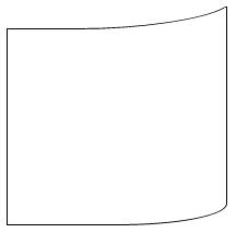
The top border is created with the :before:
Its height is the same as the border radius
It is positioned just outside with
topand lines up with the left border thanks toleftIts width is calculated with
calcto precisely line up the top of the curveThe curve can be refined with
transform: skewX(-60deg)
The left border is created with the :after:
- It is given a 100% height minus the height of the before and the thickness of the border with
calc
Examples
Number 1 - a bit pointy
div {
  border-bottom-right-radius: 100px 20px;
  border: 1px solid #000;
  border-top: none;
  height: 500px;
  width: 200px;
  position: relative;
  border-left: none;
}
div:before,
div:after {
  content: '';
  display: block;
  position: absolute;
  left: -1px;
}
div:before {
  height: 20px;
  width: 100%;
  width: calc(100% + 1px);
  border-bottom-right-radius: 100px 20px;
  border-bottom: 1px solid #000;
  border-right: solid 1px #000;
  top: -1px;
}
div:after {
  height: calc(100% - 18px);
  border-left: 1px solid #000;
  top: 19px;
}<div></div>CSS inverse border-radius outside element's bounding box to create a mobile phone notch design
There are four ways to do that, from simple to more complex:
Adding 2 pseudoelements with
radial-gradient.Simplest and well-supported solution. Probably the one I would use.
Adding 2 pseudoelements with
mask-image(same as above, but with worse support).Quite similar, code-wise, to the previews one, but with really bad support (needs browser prefixes for those that support it).
Adding 2 pseudoelements with a
border-radius,box-shadowandbackground: transparent.Needs a bit more code, but it looks a bit smoother, at least on
Chrome Version 78.0.3904.108, so maybe it's worth it for you, although the difference is minimal. In any case, the shapes you can do can't be as complex as with the previous alternatives, especially if you want to work with ellipses rather than circles, like in this other question: https://stackoverflow.com/a/59278227/3723993.Using an SVG.
I think the SVG solution is not worth it here, but it would be a good alternative for more complex shapes or animated/transitioning shapes.
Here you can check the first 3 solutions:
const notch = document.getElementById('notch');

const button = document.getElementById('button');

const xrayCheckbox = document.getElementById('xrayCheckbox');

const xrayLabel = document.getElementById('xrayLabel');

const label = document.getElementById('label');

const solutions = [{

  name: 'pseudoelements + radial-gradient',

  classes: 'notch notch-gradient'

}, {

  name: 'pseudoelements + box-shadow',

  classes: 'notch notch-shadow'

}, {

  name: 'pseudoelements + mask-image',

  classes: 'notch notch-mask'

}];

let currentSolutionIndex = 0;

let currentSolution = solutions[currentSolutionIndex];

let xRayEnabled = false;

button.onclick = () => {

  currentSolutionIndex = (currentSolutionIndex + 1) % solutions.length;

  currentSolution = solutions[currentSolutionIndex];


  updateLabels();

};

xrayCheckbox.onchange = () => {

  xRayEnabled = xrayCheckbox.checked;


  updateLabels();

};

function updateLabels() {

  if (xRayEnabled) {

    notch.className = `${ currentSolution.classes }-xray`;

    label.innerText = `${ currentSolution.name } (X-Ray)`;

    xrayLabel.innerText = 'Disable X-Ray';

  } else {

    notch.className = currentSolution.classes;

    label.innerText = currentSolution.name;

    xrayLabel.innerText = 'Enable X-Ray';

  }

}
body {
position: relative;
overflow: hidden;
height: 100vh;
margin: 0;
}
.phone {
width: 420px;
height: 800px;
padding: 12px 12px 24px;
position: absolute;
top: 32px;
left: 50%;
transform: translate(-50%, 0);
background: #000;
box-shadow: 0 8px 32px 0 rgba(0, 0, 0, .5);
border-radius: 16px;
}
.screen {
height: 100%;
overflow: hidden;
position: relative;
background: #FFF;
border-radius: 8px;
}
.viewport {
height: 100%;
position: relative;
overflow-x: hidden;
overflow-y: scroll;
}
.notch {
top: 12px;
left: 50%;
width: 24px;
height: 12px;
z-index: 10;
position: absolute;
transform: translate(-50%, 0);
background: #000;
border-bottom-left-radius: 1024px;
border-bottom-right-radius: 1024px;
}
.notch::before,
.notch::after {
top: 0;
width: 8px;
height: 8px;
content: "";
position: absolute;
}
.notch-gradient-xray,
.notch-shadow-xray,
.notch-mask-xray {
background: red;
}
/* RADIAL GRADIENT SOLUTION */
.notch-gradient::before {
left: -6px;
background: radial-gradient(circle at bottom left, transparent 0, transparent 70%, black 70%, black 100%);
}
.notch-gradient::after {
right: -6px;
background: radial-gradient(circle at bottom right, transparent 0, transparent 70%, black 70%, black 100%);
}
.notch-gradient-xray::before {
left: -6px;
background: green radial-gradient(circle at bottom left, transparent 0, transparent 70%, cyan 70%, cyan 100%);
}
.notch-gradient-xray::after {
right: -6px;
background: green radial-gradient(circle at bottom right, transparent 0, transparent 70%, cyan 70%, cyan 100%);
}
/* BOX-SHADOW SOLUTION */
.notch-shadow::before {
left: -6px;
background: transparent;
border-radius: 0 8px 0 0;
box-shadow: 0 -4px 0 0 #000;
}
.notch-shadow::after {
right: -6px;
background: transparent;
border-radius: 8px 0 0 0;
box-shadow: 0 -4px 0 0 #000;
}
.notch-shadow-xray::before {
left: -6px;
background: green;
border-radius: 0 8px 0 0;
box-shadow: 0 -4px 0 0 cyan;
}
.notch-shadow-xray::after {
right: -6px;
background: green;
border-radius: 8px 0 0 0;
box-shadow: 0 -4px 0 0 cyan;
}
/* MASK SOLUTION */
.notch-mask::before {
left: -6px;
background: #000;
-webkit-mask-image: radial-gradient(circle at bottom left, transparent 0, transparent 70%, black 70%, black 100%);
}
.notch-mask::after {
right: -6px;
background: #000;
-webkit-mask-image: radial-gradient(circle at bottom right, transparent 0, transparent 70%, black 70%, black 100%);
}
.notch-mask-xray::before {
left: -6px;
background: cyan;
-webkit-mask-image: radial-gradient(circle at bottom left, transparent 0, transparent 70%, black 70%, black 100%);
}
.notch-mask-xray::after {
right: -6px;
background: cyan;
-webkit-mask-image: radial-gradient(circle at bottom right, transparent 0, transparent 70%, black 70%, black 100%);
}
.camera {
top: 0;
left: 50%;
width: 12px;
border: 4px solid #33244A;
height: 12px;
position: absolute;
transform: translate(-50%, -50%);
background: #304A58;
border-radius: 1024px;
box-sizing: border-box;
}
#button {
font-family: monospace;
font-size: 16px;
padding: 8px 16px;
margin: 32px auto 16px;
background: transparent;
border: 2px solid black;
display: block;
border-radius: 2px;
}
#xray {
font-family: monospace;
font-size: 16px;
padding: 0 16px;
text-align: center;
display: block;
margin: 0 0 16px;
display: flex;
align-items: center;
justify-content: center;
}
#xrayCheckbox {
margin: 0 8px 0 0;
}
#label {
font-family: monospace;
font-size: 16px;
padding: 0 16px;
text-align: center;
}<div class="phone">
<div id="notch" class="notch notch-gradient">
<div class="camera"></div>
</div>
<div class="screen">
<div class="viewport">
<button id="button">Change Solution</button>
<label id="xray">
<input id="xrayCheckbox" type="checkbox" />
<span id="xrayLabel">Enable X-Ray</span>
</label>
<div id="label">pseudoelements + radial-gradient</div>
</div>
</div>
</div>CSS - border radius and solid border curved inside
you can use border-radius values as twice the border-size value to obtain inside-rounded corners.
-webkit-border-radius: 16px;
-moz-border-radius: 16px;
border-radius: 16px;

border:white solid 8px;
Using CSS border-radius (rounded corners), how can we prevent the rounded corners from disappearing if the image is scaled down (max width/height)?
just add border radius in anchor tag too
<a style="border-radius:20%" > img </a>
How do I achieve a thick border with inner border radius only
the simple way: you can have 2 dives

<div class="a">
   <div class="b">
   </div>
</div>

.b{
    display: block;
    width: 50px;
    height: 50px;
    background-color: yellow;
    border-radius: 5px;
}
 .a{
    border: 15px solid;
    width: auto;
    height: auto;
    display: inline-block;
    background-color: black;
}
Avoid elliptical shape in CSS border-radius
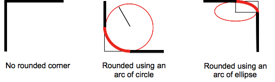
(source: mozilla.org)
Formally, the syntax for the border-radius property accepts 2 values for each corner: a horizontal radius and a vertical radius (separated by a slash). The following line would create an elliptical border-radius similar to the third image above.
border-radius: 10px / 5px;
Usually, we only specify one value. In this case, that value gets used as both the vertical and horizontal radii. The following line would create a circular border-radius similar to the second image above.
border-radius: 10px;
Using Percentages
The Mozilla Developer's Network defines the possible value types for this property as follows:
<length>
Denotes the size of the circle radius or the semi-major and semi-minor axes of the ellipsis. It can be expressed in any unit allowed by the CSS data types. Negative values are invalid.<percentage>
Denotes the size of the circle radius, or the semi-major and semi-minor axes of the ellipsis, using percentage values. Percentages for the horizontal axis refer to the width of the box, percentages for the vertical axis refer to the height of the box. Negative values are invalid.
Using a single value to create a circular radius is fine when we're using absolute length units like pixels or ems, but gets more complicated when we're using percentages. Since the single-value usage of this property is synonymous with using the same value twice, the following two lines are equivalent; however, these would not necessarily create a circular border-radius.
border-radius: 50%;
border-radius: 50%/50%;
These lines say to "create an ellipse or circle whose vertical radius is equal to 50% of the element's height and whose horizontal radius is equal to 50% of the element's width, and use that as the border-radius.". If the element is 200 pixels wide and 100 pixels tall, this results in an ellipse rather than a circle.
Solution
If you want a circular border-radius, the easiest thing to do is to use absolute measurement units (like pixels or ems or anything besides percentage), but sometimes that doesn't fit your use case and you want to use percentages. If you know the aspect-ratio of the containing element, you still can! In the example below, since my element is twice as wide as it is tall, I've scaled the horizontal radius in half.
#rect {
  width: 200px;
  height: 100px;
  background: #000;
  border-radius: 25%/50%;
}
<div id="rect"></div>CSS3's border-radius property and border-collapse:collapse don't mix. How can I use border-radius to create a collapsed table with rounded corners?
I figured it out. You just have to use some special selectors.
The problem with rounding the corners of the table was that the td elements didn't also become rounded. You can solve that by doing something like this:
    table tr:last-child td:first-child {
        border: 2px solid orange;
        border-bottom-left-radius: 10px;
    }

    table tr:last-child td:last-child {
        border: 2px solid green;
        border-bottom-right-radius: 10px;
    }
<table>
<tbody>
<tr>
<td>
1
</td>
<td>
2
</td>
</tr>
<tr>
<td>
3
</td>
<td>
4
</td>
</tr>
</tbody>
</table>Related Topics
Unwanted Outline on Border When Parent Is Transformed
What's the CSS Filter Alternative for Firefox
Mobile Orientation Change Not Applying CSS
Seek to Specific Keyframe in CSS3 Animation
How to Update SASS Variables in Media Queries
Support 'Background-Size' Property on Older Browsers
Thymeleaf into <Style>< /Style>
Create Multicolor Icons. Icomoon
CSS Style - Percentage VS Em VS Px
CSS Display Inline-Block Issue with Ie
Specificity Rules for Comma Delineated Lists
Rendering Font Differs from Ie Compared to Ff and Chrome
Why Does Internet Explorer Need the "Haslayout" Flag
Consistent Origin in CSS Rotation Between IE8 and Everything Else